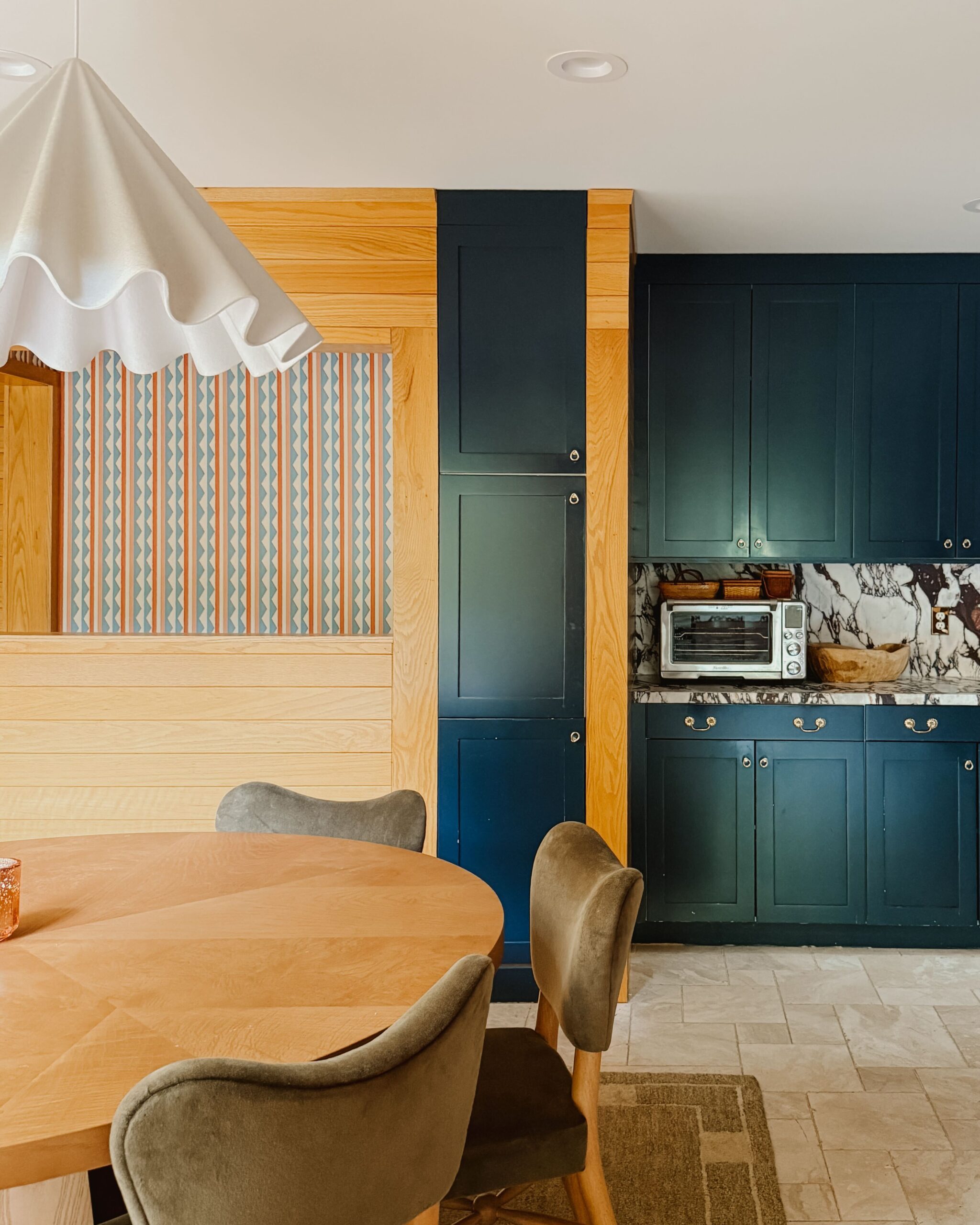
More often than I care to admit, I’ve stared at the walls in my home wondering if I can live with my decisions. Not the introspective, life-changing decisions one ruminates on in the middle of the night, but staring at the walls and wondering if I’ve made a horrible mistake.
It’s not that I’m indecisive, I’m simply too decisive.
When it comes to décor, I’ve always been picky about color, and tend to steer toward a neutral palette. One would think this would make life easier. However, the smallest variances in tonality and color have driven me mad. Do you know how many shades of white there are? Much more than one could imagine. Joe and I laugh (well, I *now* laugh) about the first few nights after work we spent painting the entire house gray, only to realize that it looked aqua in the cold, harsh light of day.

After that moment, I vowed to never paint without a patch test first. If one were to visit my home (or Studio 125) a few months ago, little 4″ x 4″ squares in varying neutral shades adorned the walls, waiting for me to make a final decision. That decision took two weeks. It seems as if I had overcorrected and became paralyzed by indecision.

If you’ve been following my home-owner journey, you know the house is almost unrecognizable from what it once was. Walls have been knocked down and built back up; furniture has been moved and replaced; rooms change and go back to what they once were. When we first moved in, we had a master bedroom, office, and guest room. In the course of a year, the guest room became the office, and the office became a nursery. As I’m now officing out of Studio 125, I no longer need a home base, and we are transforming the old office back into a guest room. Still with me?


There were only two options I could see at this point: live with the blue and ignore that little voice in my head saying “you should’ve changed it” or spend WAY too much time, energy and money on multiple shades of paint, which might not work.
Because I have tunnel vision, I didn’t even consider a third option: using technology to curtail my (entirely justifiable) fears about choosing a color.
HGTV HOME™ by Sherwin-Williams reached out to see if I wanted to experience the new and improved formula of Showcase Interior Paint + Primer and the 2017 Color Collection of the Year, Natural Wonder. What excited me, almost as much as my final color select, was that I could “paint” my room without picking up a brush. HGTV HOME™ by Sherwin-Williams, available at Lowe’s nationwide, has a Color Visualizer tool, in which I can test out any color by uploading a picture or experimenting with one of the brand’s premade rooms.
The Color Visualizer tool made the selection process so simple. I could sit at my desk and decide if I was more of a Software (HGSW1463) or a Hopsack (HGSW3143). (In all seriousness, I want to be the person that names paint!)
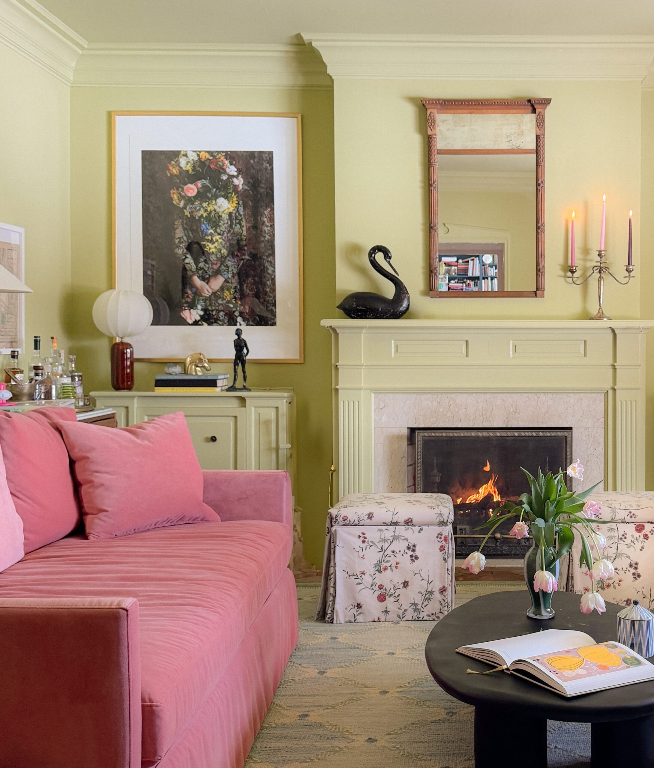
 At the end of the day, after much deliberation, we chose Privilege Green (HGSW3253) for the guest room, one of the eight trending colors within Natural Wonder, the 2017 Color Collection of the Year. Privilege Green “lightened” the guest room and was neutral without feeling dull. It has the same punch of color without feeling like the walls were caving in. My dark, cavernous office (in the best possible sense) transformed into a serene oasis. The paint was easy to apply, and I was reassured that we made the right decision the moment the first stroke was applied.


Even more reassuring, is the fact that HGTV HOME™ by Sherwin-Williams Showcase® Interior Paint & Primer is easily washed and cleaned, something that I now need to take into consideration with an ever mobile (and often mischievous) little one. (Oh, the things I have started taking into consideration!)
Even if we end up repurposing the room (who am I kidding, when we end up repurposing the room) Privilege Green won’t be an issue, only a matter of me being less decisive.
—
Ed. note: This post was sponsored by HGTV HOME™ by Sherwin-Williams. The compensation received in exchange for placement on Wit & Delight is used to purchase props, hire a photographer, write/edit the blog post and support the larger team behind Wit & Delight.
While compensation was received in exchange for coverage, all thoughts and opinions are always my own. Sponsored posts like these allow for the development of additional dynamic content to be produced, unsponsored. Thank you for supporting our partners!

Kate is the founder of Wit & Delight. She is currently learning how to play tennis and is forever testing the boundaries of her creative muscle. Follow her on Instagram at @witanddelight_.
BY Kate Arends - August 10, 2017
Most-read posts:
Did you know W&D now has a resource library of Printable Art, Templates, Freebies, and more?
take me there
Get Our Best W&D Resources
for designing a life well-lived
Thank you for being here. For being open to enjoying life’s simple pleasures and looking inward to understand yourself, your neighbors, and your fellow humans! I’m looking forward to chatting with you.


I love ALL the shades. I don’t blame you for being indecisive – I wouldn’t be able to choose myself!
–
Charmaine Ng | Architecture & Lifestyle Blog
http://charmainenyw.com
nice tips.
I spy a Mutual Benefit from the SOUNDS DELICIOUS vinyl series! 🙂
Big fan of Privelige Green….that grey undertone makes all the difference
Just like “greige” has reinvigorated the dreaded beige, maybe privelige green can make me love green again 🙂
Good. Thanks for your post.
Are you interested in Feng Shui when choosing paint color. If you are interested. Please visit my website
http://phongthuyhoc.vn/menh-tho-hop-mau-gi.html
how did you paint your radiator and all the molding? i’ve been painting our house like crazy and it seems like the dark paint i chose for one of the rooms is a bit bland without the extra moldings added to the wall. any tips?
I love to do things in a different way. DIY for house painting can be good idea. You are right when you do some trials there are chances of ending up into errors. Its ok to make mistakes but try to pick up good color shades for your house. Otherwise it may end up in worst DIY.
Wow never imagined the dark green would be so soothing and enriching to the interior. It’s great to know that you can only change the color of the walls whenever you want to renovate or redecorate and nothing else and everything will still look totally renewed and different. Thanks for the great coloring tips.
Yes, you are right. We get to learn many things while doing trial and error. But at some point, you always need a professional help for painting your house. They know how to choose the colors, what precautions can be taken if anything goes wrong while painting.