interiors & decor
fashion & Style
health & wellness
relationships
w&D product
lifestyle
food & entertaining
beauty
parenthood
travel & leisure
career development
Browse By Category
About W&D
interiors & decor
fashion & Style
health & wellness
Home
relationships
w&D product
lifestyle
food & entertaining
beauty
parenthood
travel & leisure
career development
Contact
Meet Kate
Shop W&D
Browse By Category
Shop My Home
Book a Consultation
MEet Kate
contact
FOLLOW US:
HOME
ABOUT
categories
Shop
subscribe
Book a consultation
Products
Amazon Shop
SHOPMY
Shop my home
Book a consultation
products
designing a life well-lived
SEARCH
Search for:
Search for:
SHARE
Search for:
Search for:
Search for:
INTERIORS & DECOR
8 Quick and Easy Spring Decor Ideas That Will Refresh Your Home
A Color Skeptic’s Guide to Color Theory in Interior Design
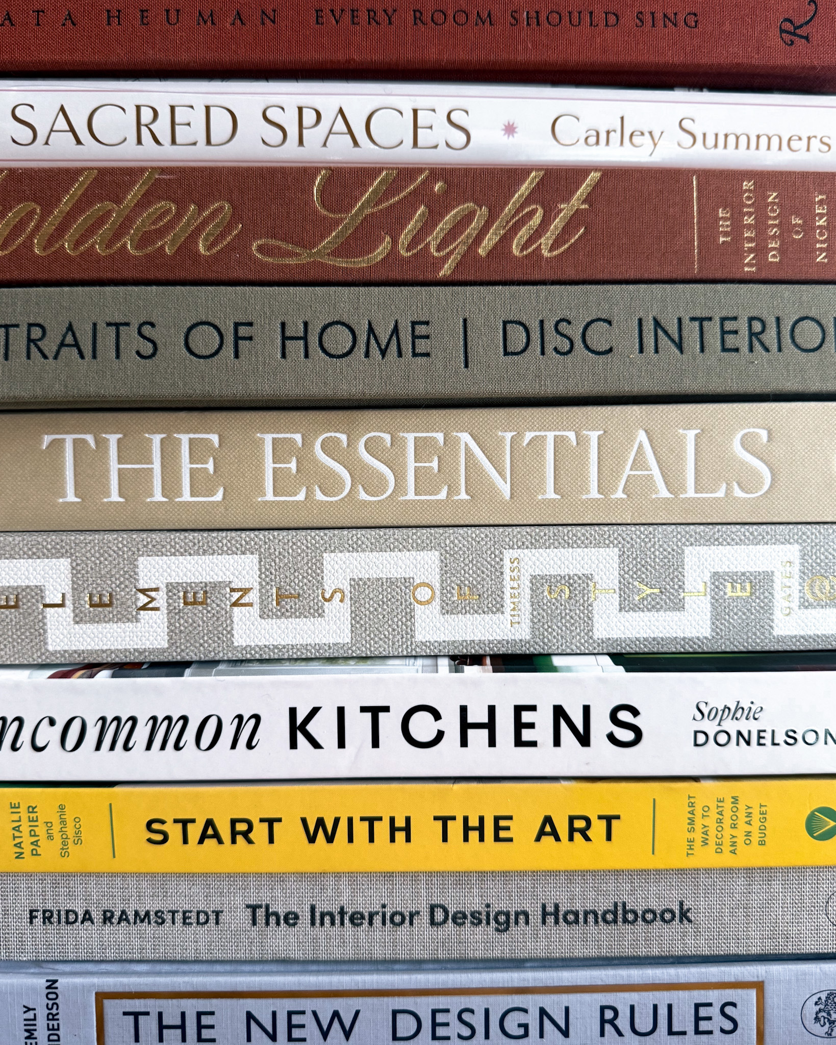
10 of the Best Interior Design Books I’m Loving Right Now
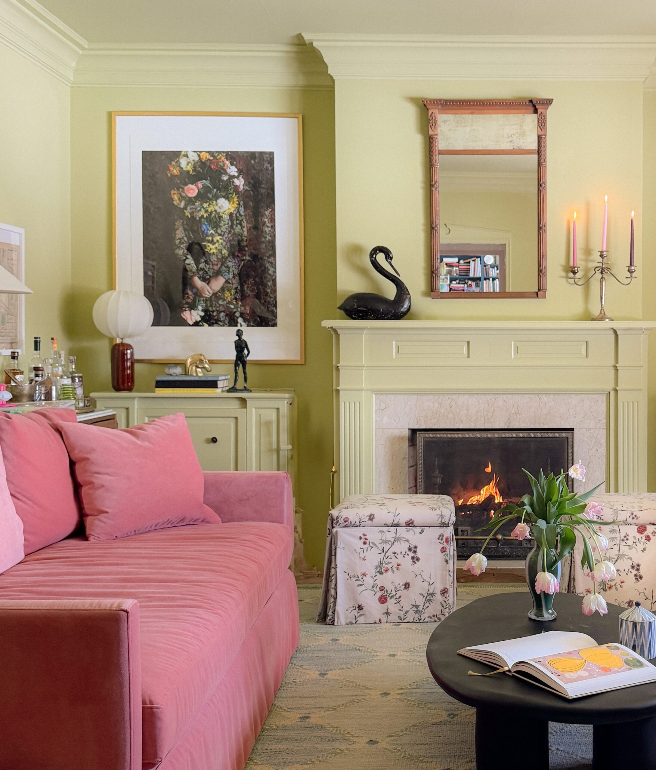
2 Pink Sofas, 1 Giant Piece of Art, and Everything Else I Changed in Our Family Room
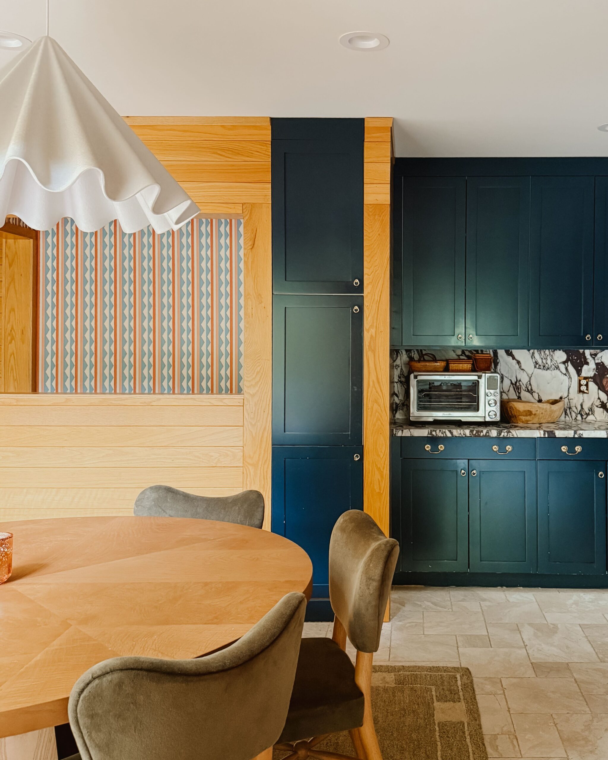
Why a Round Dining Table and Pops of Green Were Exactly What Our Kitchen Needed
5 Important Questions to Ask Yourself *Before* Redecorating Your Home
5 Basement Family Room Ideas to Make a Dark Space Feel Bright and Inviting
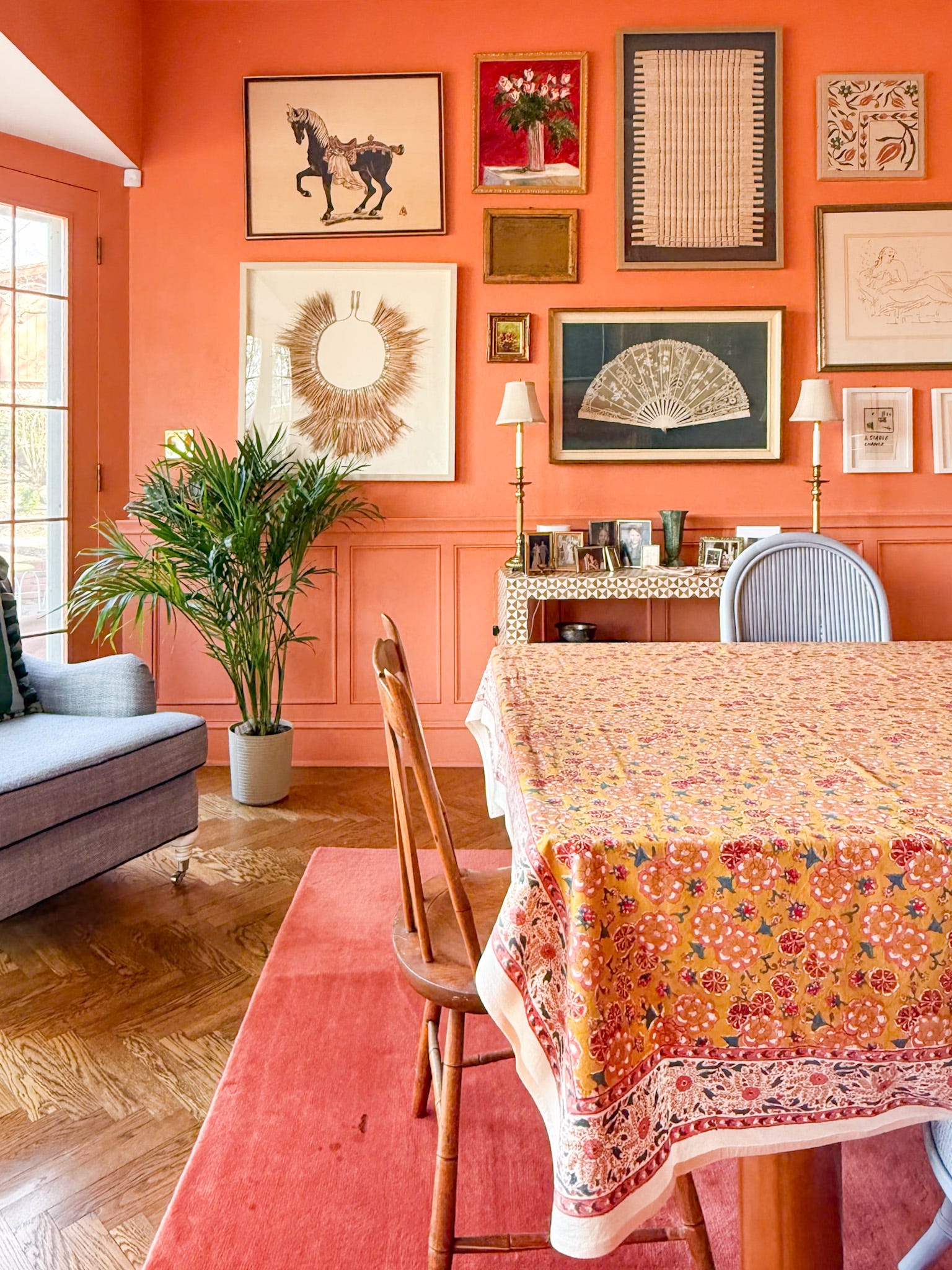
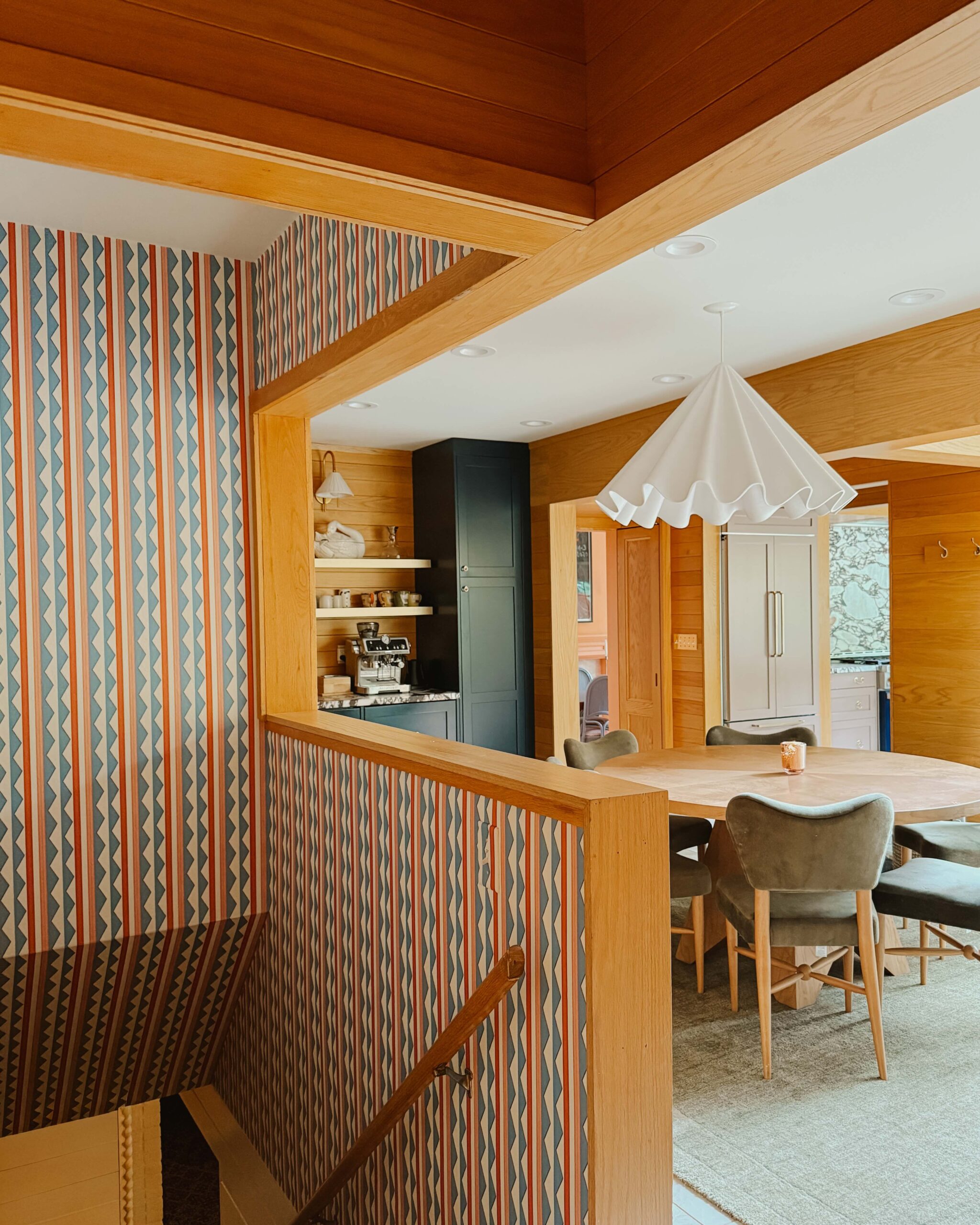
All the Wallpapers in Our Home and What I Love About Each Pattern
load more posts
Subheading
follow @WITANDDELIGHT
ELSEWHERE
PINTEREST
FACEBOOK
317k
2.9m
15k
INSTAGRAM
CREATE
A LIFE THAT
follow us on instagram @witanddelight_
DELIGHTS
“