

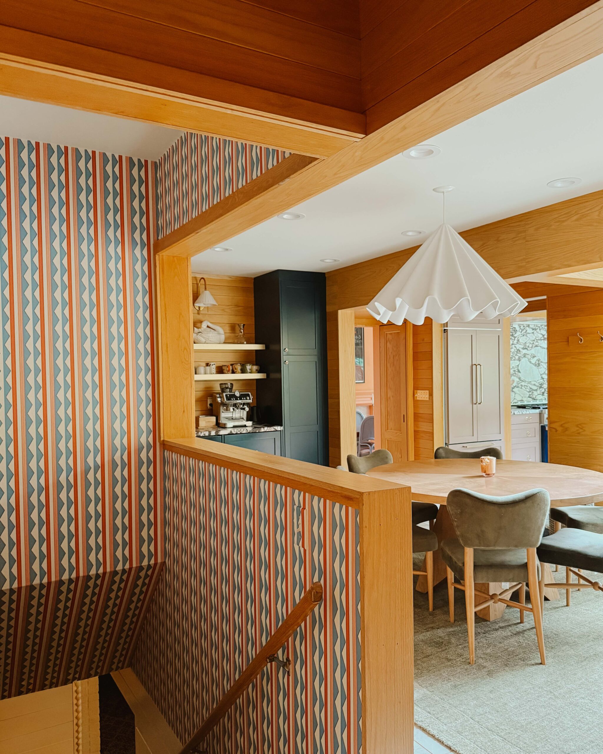
When I first saw photos of Jess Bruggink‘s midcentury modern home back in March, my jaw dropped. The wood ceilings, the wildly inviting living spaces, the beautiful kitchen that was remodeled entirely by Jess and her husband, Ross—all of it had me at first glance.
Jess is a designer by trade (as is Ross), and their delightfully vibrant aesthetics are on full display all throughout the home. Today we’re sharing a full tour of this dazzling space, along with a sneak peek into Jess’s life, career, and all of the details behind the design (hint: available product sources can be found at the bottom, for those interested!).
We hope you enjoy taking a tour of this midcentury modern home.


You’re a surface and graphic designer. Can you tell us about your business and how you first got started in the design field?
I studied graphic design in college and began my career as an intern at an advertising agency. My favorite part of design has always been working with print, pattern, and color palettes. After a couple of more traditional design jobs, I landed my dream job as a stationery designer. At this job, I was able to combine my design skills with my love for surface design. In order to create unique prints, I developed my painting and lettering skills. I loved seeing so much of my art applied to real-life products.
I now freelance as a surface designer and work under a representative, Pink Light Studio. With limited time, it’s super nice to be able to focus on the design portion of my profession while my rep can handle the business and promotion end. I love that I work on my own but still stay connected with the talented artists that she represents.


Who do you live with?
I live with my husband, Ross, our daughters, Alma and Rosie, and our dog, Merlin.
What does a typical day look like for you?
Before the COVID-19 pandemic, my days were split between staying home with my kids half the week and working the other half. When I worked, the kids were in childcare and I had the whole day to focus. When I was home with them, I tried my best to not work much at all besides checking emails.
I work best (especially on creative projects) when I have a big chunk of time to sit down and focus completely. So, I’ve never been great at getting much done during short nap time windows or at night. I definitely love the flexibility that working as a freelancer offers and love that I can work and still have a lot of family time.


A typical workday for me starts with checking and responding to emails and Slack chats. If I’m making new art for a project, I’ll start off by painting and drawing. I like to create lots of art and little elements to scan. Once I’ve got my art all scanned, I’ll digitally manipulate the colors and move around elements on my computer. I usually don’t know exactly what I’m going to create until I start playing with all of the artwork.
Right now, with social distancing, a typical day is all over the place! Our kids are home with us now, so my husband and I swap back and forth working and hanging out with the kids. My work chunks are much shorter so it’s a real challenge but we’re making it work as best we can! It’s definitely helped me to be more efficient with the limited work time I have. I’ve also tried to incorporate creating more art with the kids, and sometimes what I create with them I can use for work.


Tell us about the process you went through while looking for your place. Do you rent or own? How long have you lived in your home?
We bought our home a little less than two years ago. We weren’t necessarily looking to move at the time but were casually looking at house listings. When we saw this home listed, we knew we had to go see it. We instantly fell in love with the wood ceilings and the layout so we put in an offer. I was hesitant at the time since we were due with our second daughter in just a couple of months but I’m so glad we went for it. We love our home!


How would you describe your interior design style?
I’d say my style is modern but warm. I’m drawn to simpler lines in furniture but also love color, texture, and natural elements. As a surface designer, having lots of prints that work together is super important to me too! Our home was built in the ’50s so we also try to incorporate midcentury modern details.
I’d say my style is modern but warm. I’m drawn to simpler lines in furniture but also love color, texture, and natural elements.


You share your home with your husband and kids. How did you combine your personal decor aesthetics to create a space you and your entire family love?
My husband is also a graphic designer so we both have a lot of interior opinions. At this point, I think our styles have begun to merge but it hasn’t always been that way. When we were engaged, our first big argument was over which bathroom accessories to register for, haha!
His aesthetic has always leaned more modern and clean and mine is a bit more eclectic. Over time, we’ve learned how to blend our styles into something we both really love. He is great at visualizing new layouts and potential for a room, whereas I love to pick colors, layer textures, and style shelves. We use Photoshop to mock up room layouts anytime we are unsure about a design decision. It helps us to visualize the end result and find a solution we both love. We agree that our combined style is better than anything we’d come up with on our own.


With kids in the mix, the biggest challenge is organizing and storing all the toys, art supplies, books, etc. My go-to solution is lots and lots of baskets of all shapes and sizes. It helps for everything to have a place and I can’t resist a cute storage basket.
As our eldest daughter gets older, I’m realizing how important it is to include her in decisions. For instance, we painted her closet doors recently. I was all set to paint them a muted blue color but she was certain that they NEEDED to be pink. If it was totally up to her, they’d be neon but we came to a compromise of a soft petal pink and I think it turned out so sweet. She loves it too. While I certainly have a vision of how I’d love our home to look, it’s my whole family’s house and I want everyone to love it. Growing up, my parents always let me make design choices in my room and I think that was such an important part of developing my creativity as a child.


You and your husband remodeled your kitchen on your own! Can you walk us through the remodeling process?
Yes! We knew when we bought our house that we’d definitely want to remodel the kitchen. It had not been remodeled since probably the ’80s or ’90s so we felt pretty good about completely redoing everything in the way we’d like it. It was dated but we decided to live with it for at least a year. The decision was made partly because we had a newborn but also because we wanted to see how we used the space and what made the most sense in terms of functionality.
The Kitchen Before the Remodel


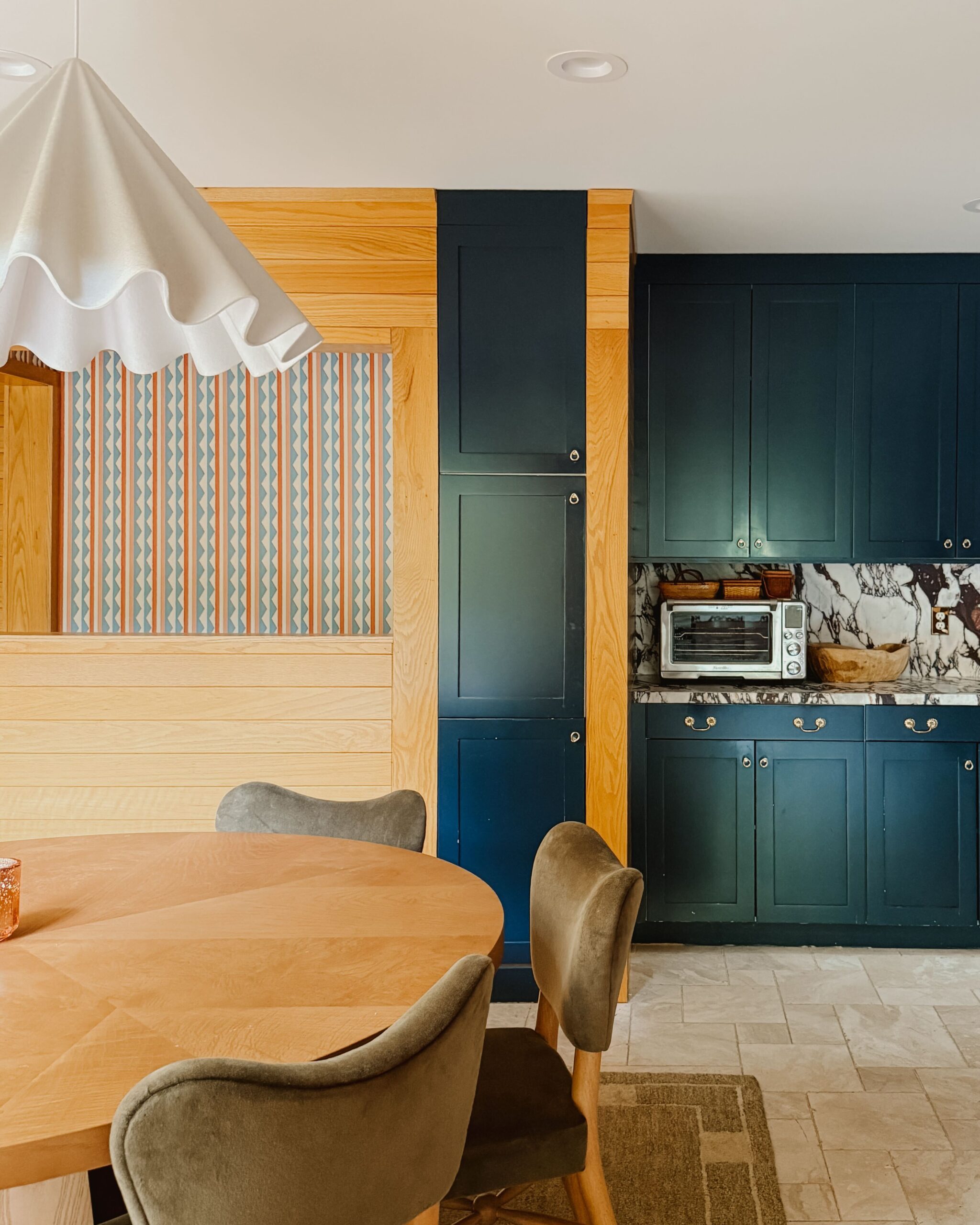
Ross gets the credit for designing the layout. We cook a lot and have a fairly small kitchen space so we needed to make good use of every inch. We knew we wanted to use IKEA cabinet bases with Semihandmade cabinet fronts. He designed the layout with the IKEA kitchen planner and then ordered the Semihandmade pieces accordingly.


To save money, we decided to order the DIY slab fronts that we would paint ourselves. The painting and sanding were quite a process but worth it in the end. We knew we wanted a green from the beginning but it took quite some time to decide on the final shade. We wanted something that was clearly green and not gray but also not too saturated. It also had to look good with all of the warm wood we have going on in our house. We ended up picking a color that matched a green side table that we have and love. We went with Sherwin-Williams Jade Dragon.
Have you tackled any other remodeling or DIY projects in your home?
Besides the kitchen, we don’t have any major interior projects to tackle for a while. We added a small office to our basement when we moved in and we’d love to redo the bathrooms and laundry room someday, but those will be pretty far down the road.


Right now, our big project is our backyard. We are currently building a deck and have lots of long-term landscaping plans that we are slowly making progress on. We have a vegetable and cut flower garden in raised beds. We plan to beautify that area a bit, add a paver patio, a fire pit, a stone path, a studio office shed with a pergola, and even a small stream to block out road noise!
Although it’s a huge project, our timeline for the yard is five years so we feel like we can be a little more relaxed with it all. The beauty of outdoor projects is that things can stay partially unfinished for a while without becoming a major stressor in the way an unfinished interior project can.


What are your favorite pieces or elements in your home?
I love our wood ceilings. They add so much warmth and personality to the home. I also love the painted stone fireplace. The kitchen bar area is our gathering spot and I love picturing our kids using it in different ways as they grow up. I’m really excited about the potential of our backyard as we work on it more.
What is the space in your home you retreat to most often when you need a mental break?
Our bedroom is where I usually head for a break. I’m picturing the deck as a new retreat spot. I’m hoping to use it for morning yoga and meditation before the kids wake up this summer (hello 5:00 a.m.!).


Do you have any advice for those looking to decorate their space on a tight budget?
I think the most interesting spaces use a mix of items collected from all over. Don’t be afraid to decorate with items from IKEA, Target, and Craigslist! One of our favorite chairs was bought for $40 on Craigslist. We then had it restored and reupholstered a few years later which gave it more life and longevity.
I think the most interesting spaces use a mix of items collected from all over. . . . One of our favorite chairs was bought for $40 on Craigslist. We then had it restored and reupholstered a few years later which gave it more life and longevity.


We mix and match pieces we’ve owned for a long time or have been handed down from family. I love thrift stores too, especially for decorative items and frames. Also, always look for a coupon code when buying things online. 🙂
Of course, doing DIY projects can save a lot of money on renovation projects. I also think a fresh coat of paint can go a long way to freshen up walls and doors in a space.


Are there any other people or designers you look to for design inspiration?
Historical Favorites
Vera Neumann, Maija Isola, Charles and Ray Eames, Henri Matisse
Favorite Modern Artists and Designers
- @julietmeeksdesign
- @tactilematter
- @jenbpeters
- @brookgossen
- @aspoonfuloffaith
- @joycharde
- @corinnelent
Favorites for Interiors


Product Sources
Kitchen
- Cabinet bases: IKEA
- Cabinet doors: Semihandmade
- Cabinet paint color: Sherwin-Williams Jade Dragon
- Cabinet pulls: CB2
- Island lighting: CB2 (no longer available)
- Stools: CB2
Dining Room
- Table: Room & Board (found at the Room & Board outlet)
- Chairs: Target (no longer available)
- Shelving unit: West Elm


Living Room
- Sofa: Room & Board (found at the Room & Board outlet)
- Eames chair replica: Manhattan Home Design
- Ottoman: Article (no longer available)
- Danish style chair: Found on Craigslist; reupholstered by Miller Upholstering and restored by Prairie Woodworking
- Black spindle chair: Room & Board (found at the Room & Board outlet)
- Rug: West Elm
- Black floor lamp: Article
Main Bedroom
- Bed: Overstock
- Nightstands: Target (no longer available)
- Rug: West Elm (no longer available)
- Dresser: Room & Board
- Stacked bookshelf: Family antique
Kid’s Bedroom
- Bed: IKEA
- Rug: Target (no longer available)
- Mirror: Land of Nod (no longer available)
Nursery
- Crib: IKEA
- Hanging quilt: Huck and Skottie (not currently available)
- Rug: West Elm (no longer available)


Editor’s Note: This article contains affiliate links. Wit & Delight uses affiliate links as a source of revenue to fund the operations of the business. Have a question or want to learn more about how we use affiliate links? Shoot us an email.
Jackie is the editorial director at Wit & Delight. In her spare time, you can find her running around the lakes of Minneapolis, grabbing a bite at a local restaurant, or recharging at home. Find more info at jackiesaffert.com and follow her on Instagram @jackiesaffert.
BY Jackie Saffert - July 20, 2020
Most-read posts:
Did you know W&D now has a resource library of Printable Art, Templates, Freebies, and more?
take me there
Get Our Best W&D Resources
for designing a life well-lived


Thank you for being here. For being open to enjoying life’s simple pleasures and looking inward to understand yourself, your neighbors, and your fellow humans! I’m looking forward to chatting with you.
Hi, I'm Kate. Welcome to my happy place.







these interior looks awesome, even dogs color match with it.
Ohh I could look and fawn over midcentury homes aaaallll day <3 These photos and the corners of this house are SO beautiful!! That kitchen especially, what a dream.
Jo | http://www.withrisa.com/
SAME. I love browsing through them. Glad you liked the tour, Jo!
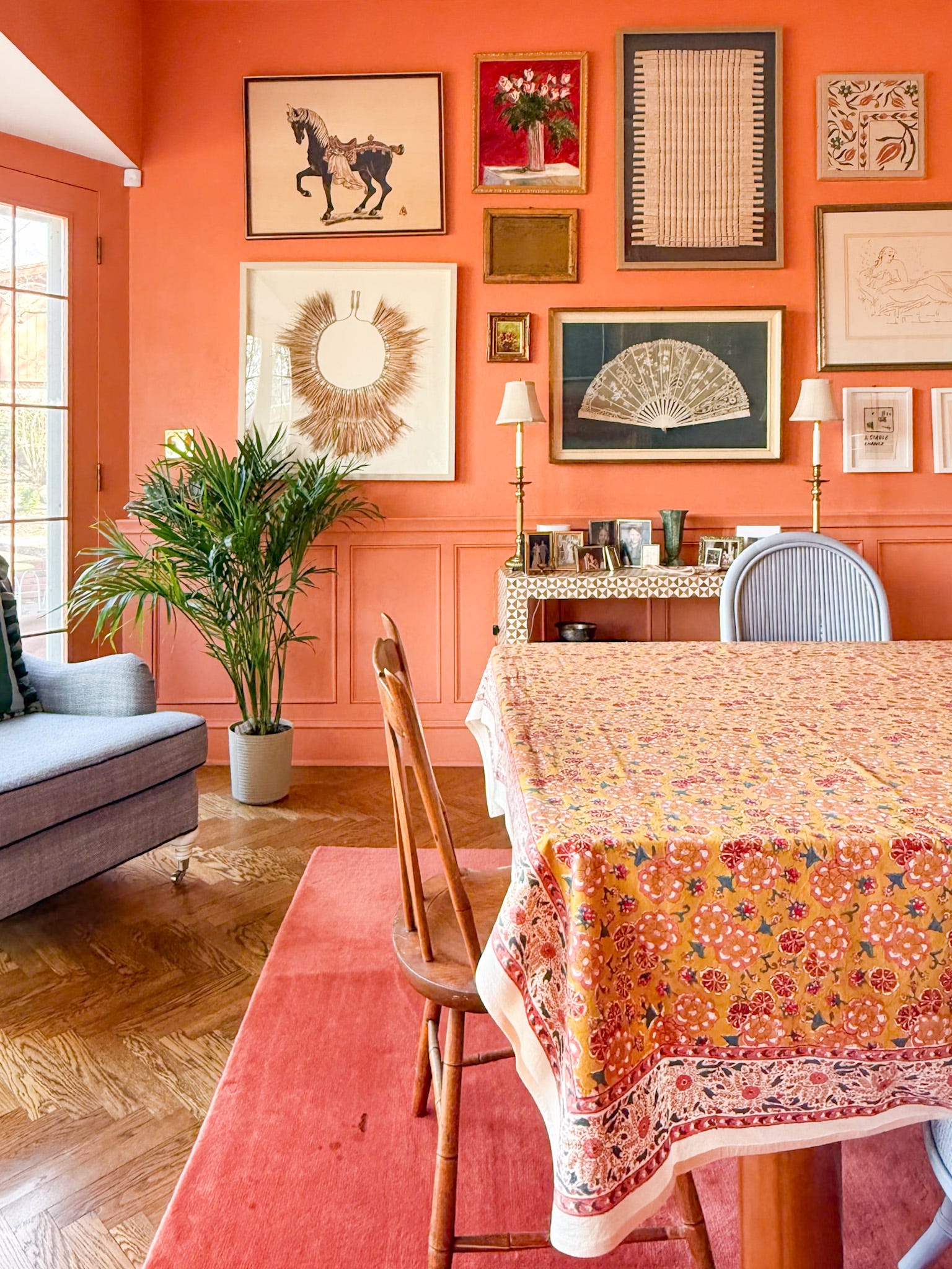
Beautiful! Would love to know the paint color used on the dining room accent wall!
Hi Katie! I touched base with Jess and the color is called Ripe Olive by Sherwin Williams.
This house is my dream come true!! I love every single detail. Thanks for sharing!
This home is absolutely lovely! The kitchen remodel – it looks like a completely different room! Having twin daughters (3.5 years), I really like the idea of baskets for toys, they end up everywhere! Thank you for sharing your beautiful home and ideas! ~Rachel
http://www.homesweethomestore.com
What kind of flooring do you have and how are they holding up? We just purchased a home with very similar architecture and are going for a similar look as you have. We would love to put in hardwood floors but also have a dog and a baby on the way. Thanks!
Thanks for your comment, Maddy! I’d recommend connecting with the homeowner, Jess, for this info. Here’s her Instagram link if you want to connect via DM!
Home looks cozy and beautiful. love your design ! Curious about statement fireplace wall, what kind of stone being used ?
A very lovely home, I agree! I’m not sure what kind of stone was used for their fireplace, but I love it as well.