

Home sweet home. While home has always had a special meaning for most of us, in 2020, it’s taken on an even bigger role in our day-to-day lives.
Our home is often viewed in terms of function to contain and shelter us. How many bedrooms are there? Where can we entertain? How much storage does it provide?
In 2020, for many of us, home has moved beyond shelter and has also become our school and our playground. Our office and our studio. Our healthy retreat, meditation space, gym, and meeting backdrop. Our writing space, our spa, our movie theatre, and our favorite always-open restaurant.
At its best, our home should be a calm haven, a space for ourselves and loved ones to connect, unwind, create, and rest. It should be an original expression of us; something that inspires and energizes at times and wraps us in a comforting, calm light at others.
I also think one of the most important jobs of our home is to spark JOY. Coming home should be a happy occasion, something that puts a smile on our faces upon entering.
What’s more joyful than pops of color and pattern to make your home truly you?
Color is a powerful visual tool that communicates so much. Scientifically speaking, it can positively influence mood and physiological reactions. Poorly planned, it can induce anxiety and stress, making your space less than optimal for ALL the things our homes should provide for us. Well-executed, it can boost productivity, reduce stress, and yes, even increase happiness.
There are plenty of studies done on certain colors that will promote a specific sentiment or action, BUT, to me, these don’t take into account the most important part of using color in your space.
YOU. Color is incredibly and deeply personal. Emotional. Specific to your experiences and how you’re wanting to feel in your own space. Think about what colors you love in your wardrobe, in a painting, in your favorite restaurant. Do they make you feel calm? Energized? Happy? Follow your instincts and try the colors that speak to YOU.
Think about what colors you love in your wardrobe, in a painting, in your favorite restaurant. Do they make you feel calm? Energized? Happy? Follow your instincts and try the colors that speak to YOU.
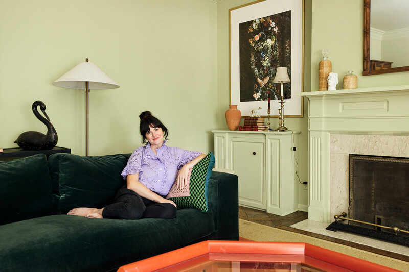
As an artist, designer, and lover of all things color, you’d expect my home to be BURSTING with color. And it is—in small doses and impactful accents.
For me, I’ve found that I like to have a mostly white backdrop against which I can bring in accents of color, pattern, and textiles. This allows my art, my work, and my creativity to evolve and not be too influenced by any bold color in my surroundings.
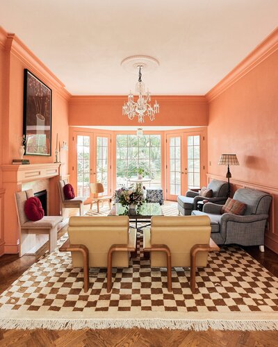
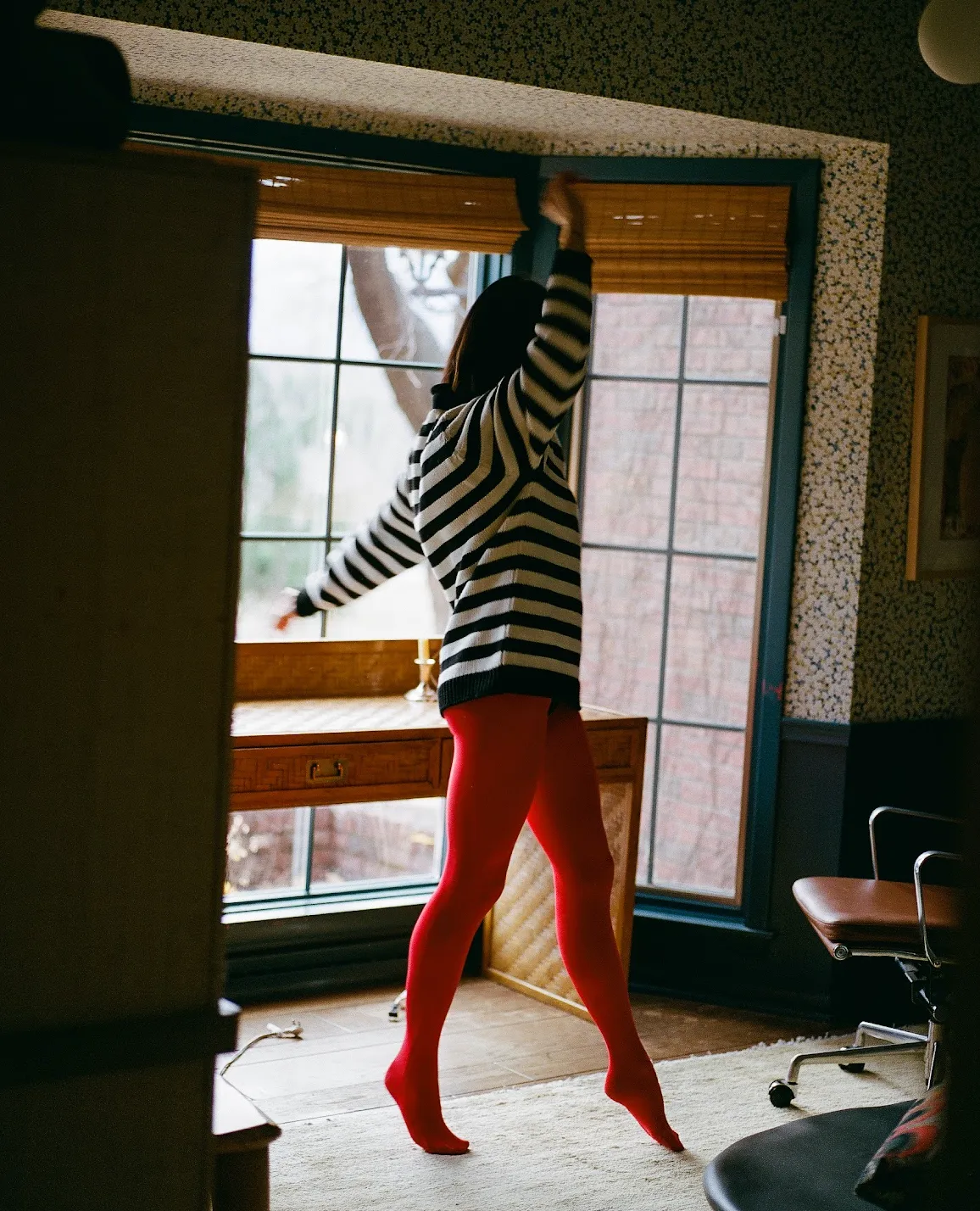
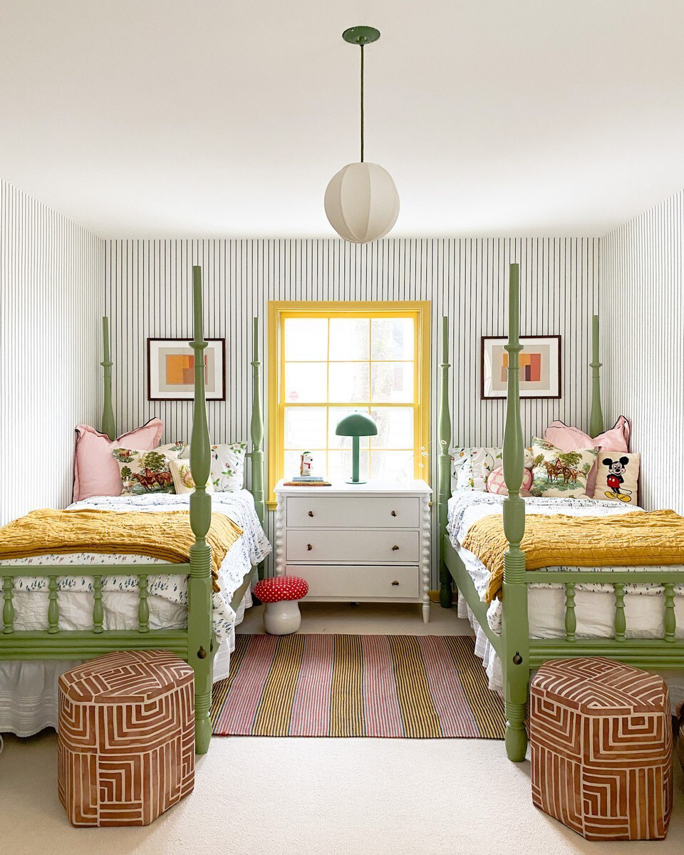
I’m a big fan of an accent wall, a bold rug, and impactful design elements that pack a big punch of color and pattern in just the right places.
Today I’m sharing my space and some of the ways we accent with colors and texture to set the vibe of our home: happy, calm, and creative.


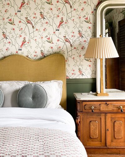
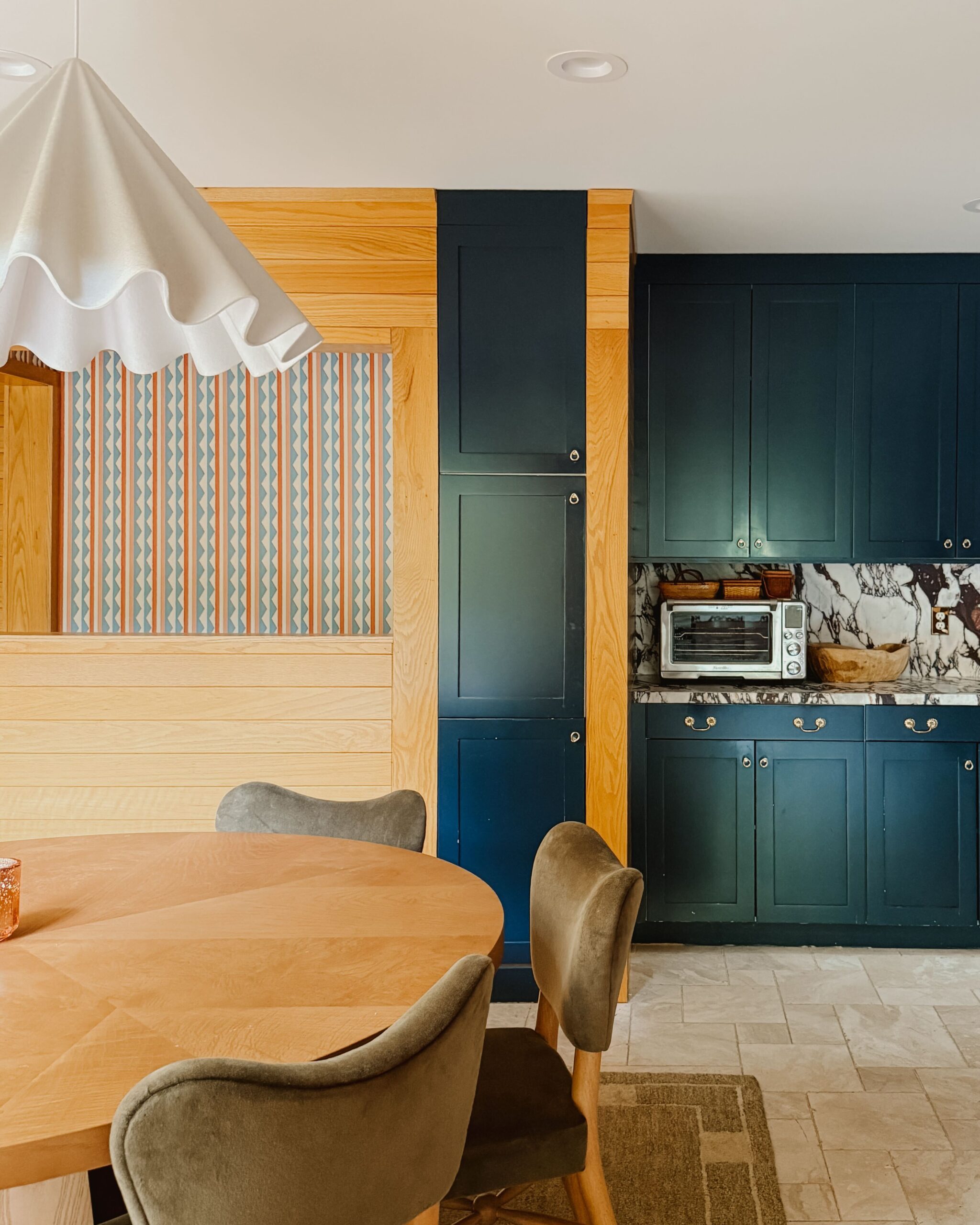
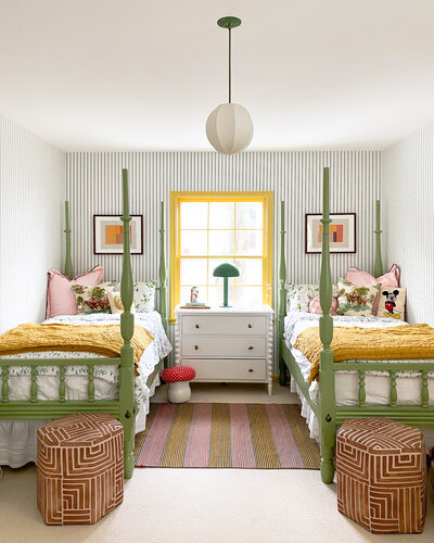
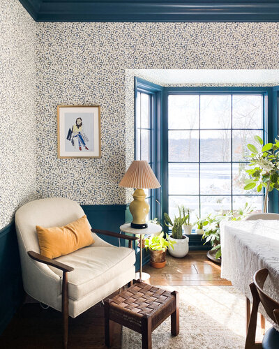
Paint or wallpaper a small room, accent wall, or ceiling.
While I’m a fan of an entire colorful room, often an accent wall or ceiling is just the right touch of color or pattern a space needs. The right shade or pattern can focus the attention on a key wall, make a room appear larger by opening up the ceiling, or just create an unexpected punch in an otherwise neutral space.


Infuse color through original art.
There’s nothing easier than adding some color through original art. You could get your art on and make your own large-scale piece. Pick a color palette and paint a large canvas in a single color, paint by number a thrift store find, or support a local artist by purchasing a print or original piece directly from them. A few faves of mine that pack a lot of color in a fun, happy way include the following: Dallas-based artist Molly Magill, Minnesota-based artist Ashley Mary, and Philadelphia-based artist Kendra Dandy.


Introduce or rearrange textiles/rugs/throws to accent a room.
I love to lay the foundation for color and joy right at your feet with a punchy rug. Tie in or accent the primary color of your rug by adding complementary throws, pillows, or other textiles to surfaces and seating areas to truly bring color throughout your space. For me, I accent our indigo rug with touches of pink, terra cotta, and red to offset the traditional feel of the blue rug.


Arrange books or objects in color stories on a focal shelf or surface.
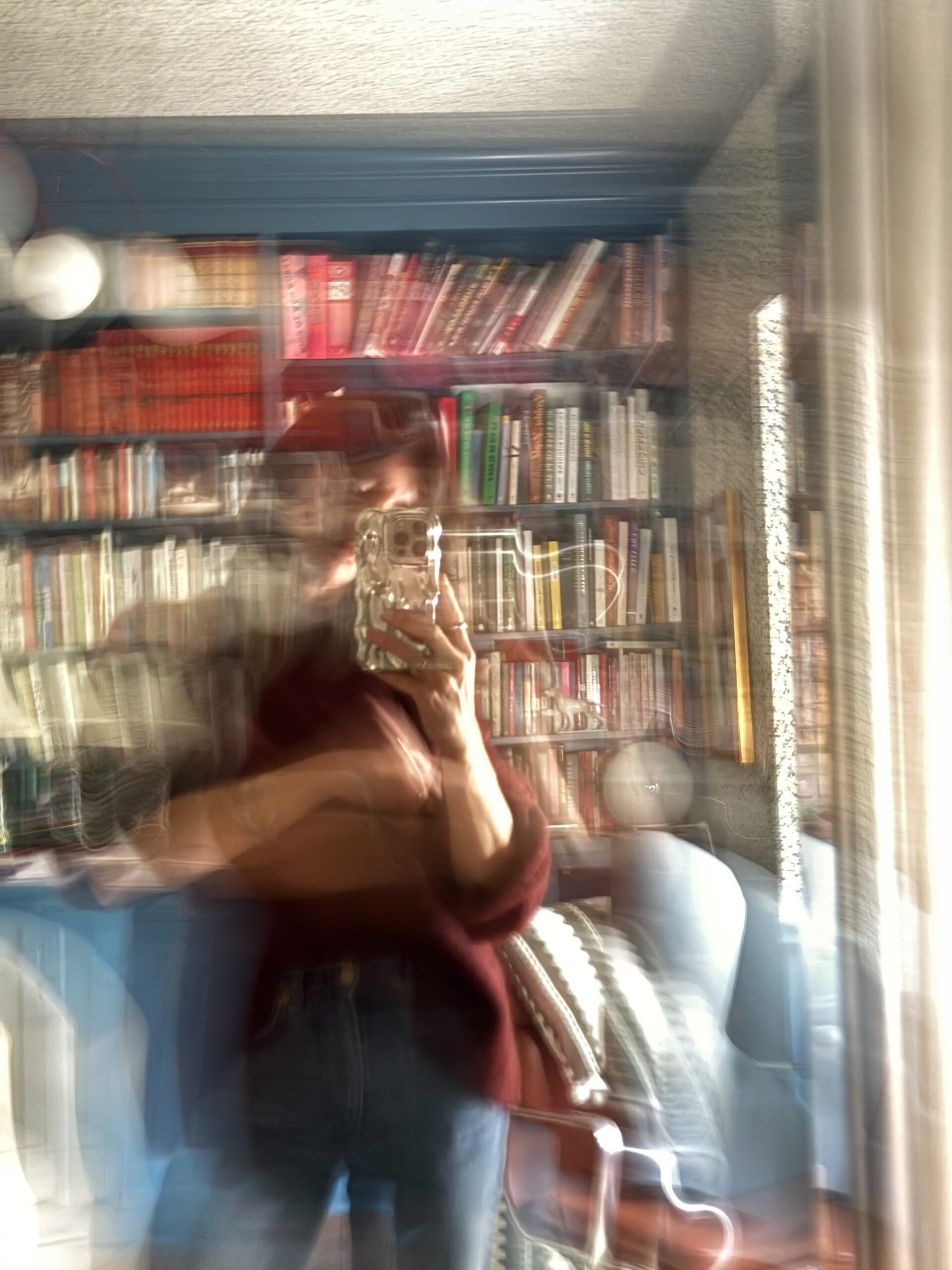
In organizing the way-too-many books we have in our space, I’ve found that displaying them by color creates a powerful visual punch AND allows my visual brain to be able to find a book quickly, as I tend to remember title and spine color easier together.
Bring nature in.
Use what’s naturally in your surroundings! Bring fresh flowers, branches scavenged on a neighborhood walk, and evergreen plants into your space to add some green and clean the air at the same time. I love turning to EyeSwoon and LAYER NY in my Insta feed for inspiration on how to display nature in all of its glorious beauty.
In this period of being home so much of the time, to the extent that we’re able, let’s all make sure our homes are our havens. Our creative retreats. Our safe spaces that wrap us in a hug, make us smile, and keep us cozy and inspired to live our best lives.
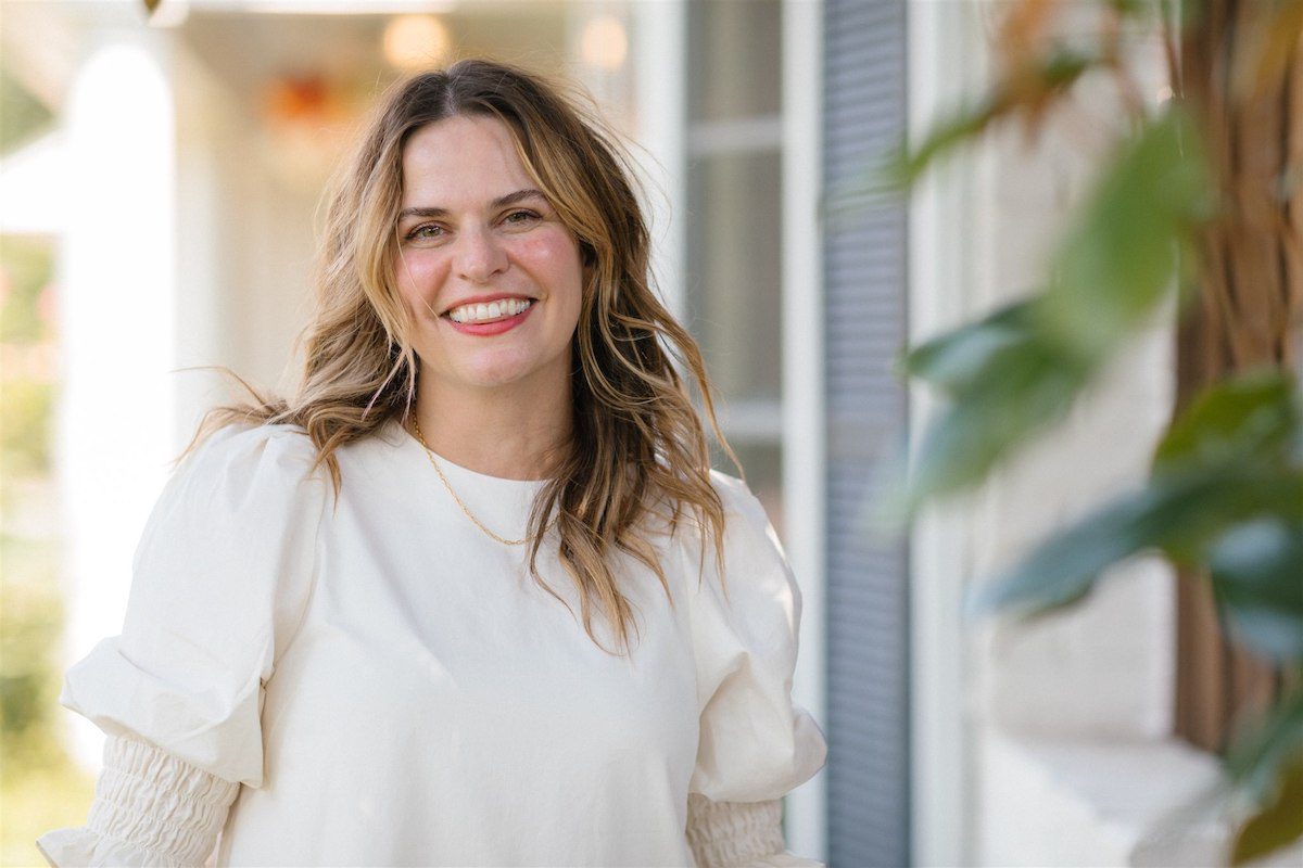

Jill Elliott is an artist, wallpaper designer and writer constantly seeking inspiration and balance. You can find Jill’s wallpaper and original art at Color Kind Studio. She can often be found making art and messes alongside her daughter and puppy.
BY Jill Elliott - October 4, 2020
Most-read posts:
Did you know W&D now has a resource library of Printable Art, Templates, Freebies, and more?
take me there
Get Our Best W&D Resources
for designing a life well-lived


Thank you for being here. For being open to enjoying life’s simple pleasures and looking inward to understand yourself, your neighbors, and your fellow humans! I’m looking forward to chatting with you.
Hi, I'm Kate. Welcome to my happy place.




This color make our life more interesting! I will make it for my home!
Lots of great ideas here on injecting colour in the home. And I agree, pops of colour are instant mood-boosters, I’d love to have a feature wall like the blue in the first photo, it transforms the space!
Interesting!!!! I absolutely like the idea of infusing colors and the use of textiles that adds to the beauty of the home decor.
Jill thank you for sharing. I am inspired!
Great Aesthetics. Love the minimalism and use of colors! Keep it up!
The pictures supporting your article are absolutely stunning. Especially the picture of “orginal art”.. most beautiful.