

All photos by Chelsey Werth, unless otherwise noted.
I’ve never seen my kids agonize over the “right” blue when drawing. If they are drawing a happy picture, it’s full of lemony yellows and peachy oranges. A sad photo has blues and grays. It’s all about gut instinct with them. When I sit down to color with them, I spend far too much time debating between green-blue and blue-green (there is a difference, btw).


When did color get to be so complicated?
Our last house was neutral by design; a sea of neutrality that felt right and grown-up. Various shades of greige covered the walls. We kept the ROI in mind (and the Insta grid, if I’m completely honest). There is nothing wrong with white or gray if that is what moves you. The problem was, it didn’t move me. It was me making the safer choice; it was something that I thought I wanted.
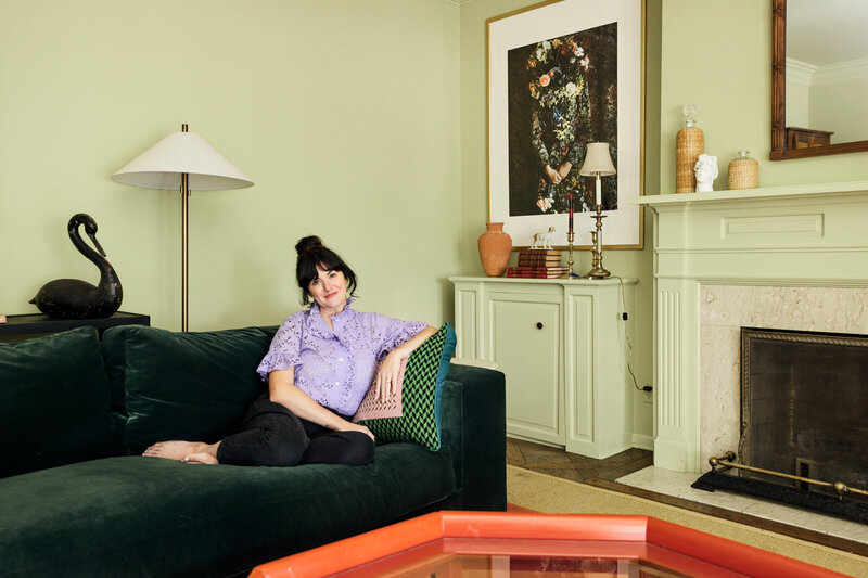
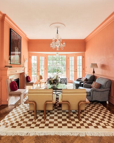
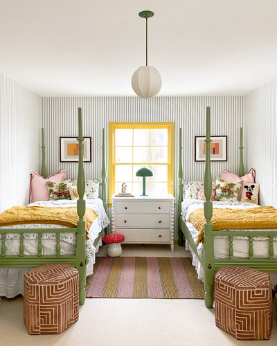
When we first looked at our current house, “intense” was thrown around quite a bit. While walking through each of the technicolor rooms, I made mental notes of which tonality of warm white I wanted to use. Not long after we moved in, I started to look forward to the morning sun peeking into the peach room and making everything look rosy—the intense yellow wall balanced out the massive gallery installation.


At some point during lockdown in the spring, we fell in love with color in spite of ourselves.
It was as if something had awoken inside of us that lay dormant in our last house—the eureka moment. I didn’t have to care whether the next owner would fancy the color on the walls or the fact that I haven’t been following a specific interior design trend. All that mattered was that we liked it.
How would we continue to embrace this newfound love of color while making the house our own? How could I make a decision that was so out of my comfort zone? I knew the basic principle of a harmonious and cohesive balance—focal points and accents—but this new house had me stumped.
HGTV HOME® by Sherwin-Williams has done all the hard work for me (and you); they have created 16 foolproof palettes to select the perfect play-nice-together shades. Color theory 101: Select a focal color and balance it out with accents.


Focal points and balance and a palette of colors that complement each other. Easy, right? There is a method to color theory, but there is also a HUGE X factor that’s individual to each person, and that’s a feeling. It goes back to watching my kids select a color; it’s all about conveying an emotion via color.
What did we want this house to feel like?


Photos by Kate Arends
We wanted the house to feel full of life and energy that was reflected in the environment. Having lived in the house, we knew we wanted to keep some of the colors as-is. It wasn’t a scientific process selecting which rooms we didn’t want to change but more of that gut feeling. The peach room, which initially shocked us, had perfect energy and vibrant color throughout the day, but other places, like the pink library, weren’t quite right.
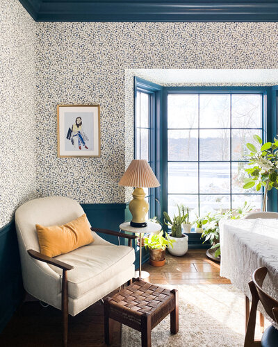
You may remember the great blue vs. plum debate early this year (I totally concede to Joe’s decision!), and we painted our formerly pink room the lovely shade of Bunglehouse Blue (HGSW0048). The burst of bright colors made us feel energized and honored the reasons why we fell in love with this house in the first place. After agreeing on Bunglehouse Blue, we decided to use the Vintage Finds Color Collection from HGTV HOME® by Sherwin-Williams because we knew that any color in that collection would look dynamite with our new library color.
Now that we had our focal color, it was time to select an accent color. To balance out the vibrant blue, we chose Choice Cream (HGSW4073) for the hallway. Choice Cream white gave a little visual breath of fresh air between the energetic room colors, not only in the library but also in the rest of the house. Color theory is about balance and opposition, and bringing in a warm neutral like Choice Cream made the blue (and our other colorful rooms) POP. Feeling confident in our decisions, we dared ourselves to go one step further and paint our front door Talipot Palm (HGSW1272) green. It was a little scary, but it was so exciting to watch the transformation unfold in a single coat of paint.
So how can YOU use color theory?


1. Decide on the mood you want in the room, be it quiet, exciting, bold, contemplative, peppy, or something else entirely. There are no wrong answers.
2. Choose your palette. HGTV HOME by Sherwin-Williams has 16 palettes with a range of saturations and hues to choose from. Tip: Once you decide on your mood, hang up a bunch of palettes. If you wear glasses, take them off and squint at the broader palette. For some reason, this helps me zero in on which color palette fits the mood.
3. Once you’ve selected a palette, choose one focal color that best captures the feeling you want to create. A few things to keep in mind:
- White is a color! There is NOTHING wrong with classic eggshell white if this is what you want to convey. I had to live in a technicolor environment to give myself permission to be okay with color.
- If a big bold yellow room isn’t your thing, lead with a neutral.
4. Pick one or two accent colors. I’m a fan of no more than two; otherwise, it can start to look a bit busy. Remember that color theory applies to more than just the paint on the walls. If you lead with a neutral, go wild with a red couch or a lemony yellow piece of art. The colors you choose in your palette support and highlight each other.
That’s it.


Before photo on left by Kate Arends
Ironically, going bold with color has put us both at ease. Maybe it’s that we finally feel at home here, but we’ve both mentioned how much more relaxed we are in this brightly colored house. Our old home’s neutral walls felt right at the time, but maybe the energy in this new house with two growing kids, two rambunctious dogs, and two exhausted but overjoyed parents needed to be reflected in our day-to-day environment.
Editor’s Note: This post was sponsored by HGTV HOME® by Sherwin-Williams. The compensation we receive in exchange for placement on Wit & Delight is used to purchase props, hire a photographer, write/edit the blog post, and support the larger team behind Wit & Delight.
While compensation was received in exchange for coverage, all thoughts and opinions are always my own. Sponsored posts like these allow us to continue to develop dynamic unsponsored content. Thank you for supporting our partners!


Kate is the founder of Wit & Delight. She is currently learning how to play tennis and is forever testing the boundaries of her creative muscle. Follow her on Instagram at @witanddelight_.
BY Kate Arends - December 3, 2020
Most-read posts:
Did you know W&D now has a resource library of Printable Art, Templates, Freebies, and more?
take me there
Get Our Best W&D Resources
for designing a life well-lived



Thank you for being here. For being open to enjoying life’s simple pleasures and looking inward to understand yourself, your neighbors, and your fellow humans! I’m looking forward to chatting with you.
Hi, I'm Kate. Welcome to my happy place.







I’ve tried a lot of crazy colors in my own home and in the homes of people I love. Some worked, most were massive fails. (Purple rag painted bedroom, lime green bathroom, I’m sorry!). Thank you, Kate, for being bold, having the rooms speak to you, and for guiding through your process. I’ve read and reread this over and over and look forward to seeing how your spaces evolve.
Thanks for your comment, Sarah! Sometimes design decisions end up being about trial and error (unfortunately)…I’ve been there! Glad to have you following along through this evolution.
Great advice! I am finding myself wanting to add a lot more color to our current house and I think the reason has to do with the layout and the size of the rooms. The white walls are not making our small rooms cozy. I think color would help give that feeling. In our last home we had a very open floor plan, tons of southern facing windows, and 12 foot ceilings. In that home, it made sense to have white walls because it was such a large area within the house. Colored walls, in my opinion, would have been… Read more »
I definitely think your reasoning here makes sense! And ultimately, deciding what colors to paint your home is such a personal choice. Thanks for your comment, Lena!