

Color is a very powerful device in design of any kind. Especially when setting the mood and vibe of your home, color can communicate so much personality, infusing your space with individuality and intention.
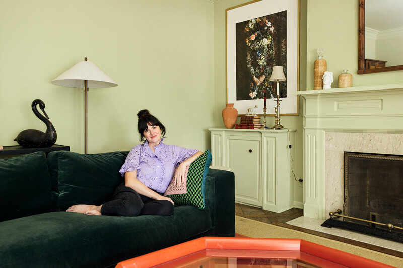
I, a self-professed lover of all things colorful, use it throughout my own home to add calm and joy to each room and space. Using select pops of color in big punches throughout the house, against a mostly white-walled backdrop, is my key to keeping the space consistent and calm—while infusing bits of happiness, play, and whimsy in varying doses.


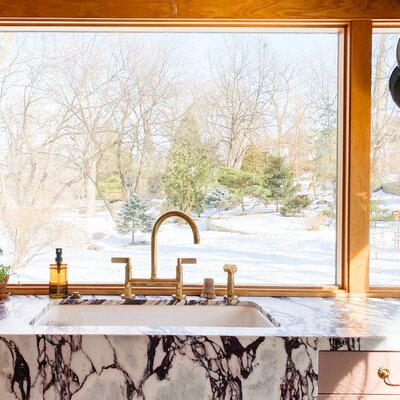
Our current home, chosen for its expansive windows and light-filled spaces, was an ideal backdrop to add and layer rich colors and textures. My approach to working with color in our space is simple, likely informed by years of design and styling training. I start each new home with a base palette of colors and use them consistently throughout our space.
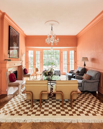
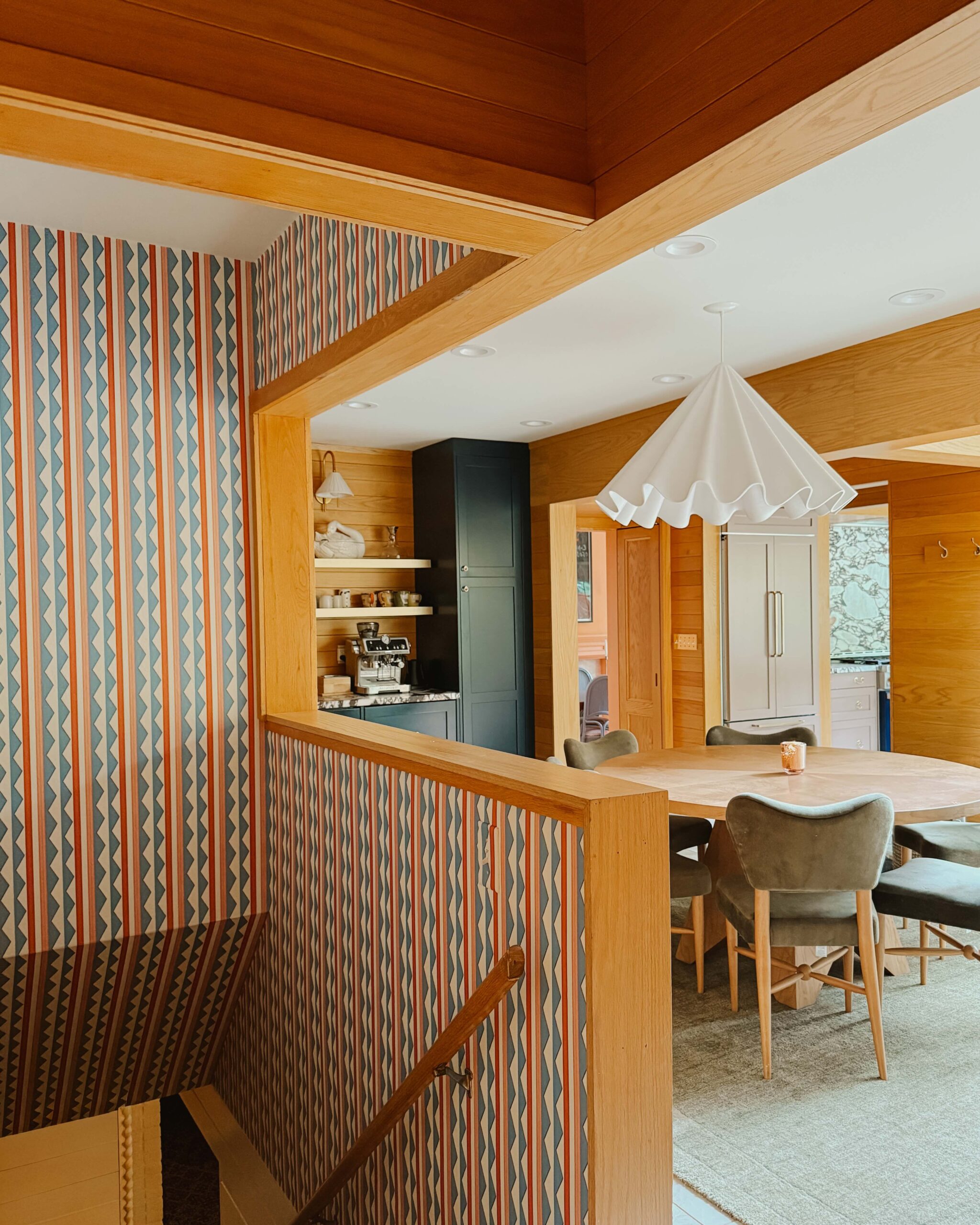
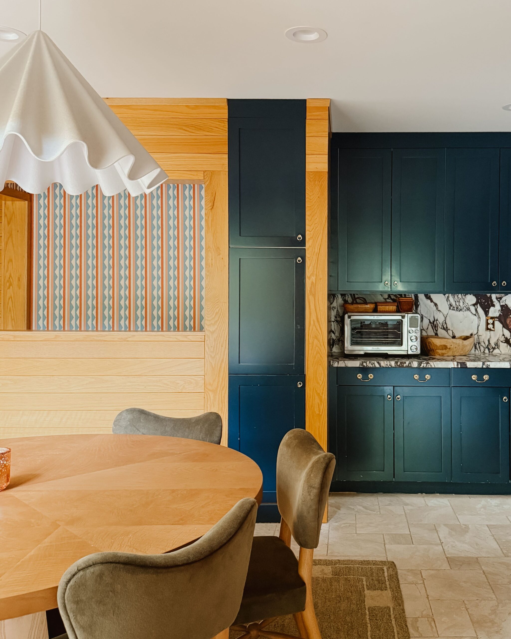
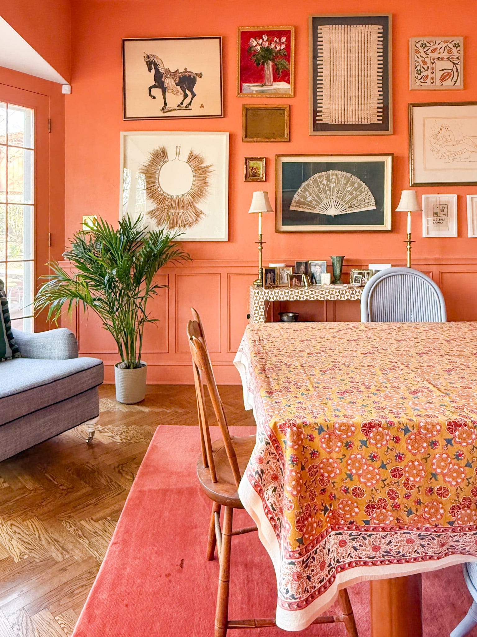
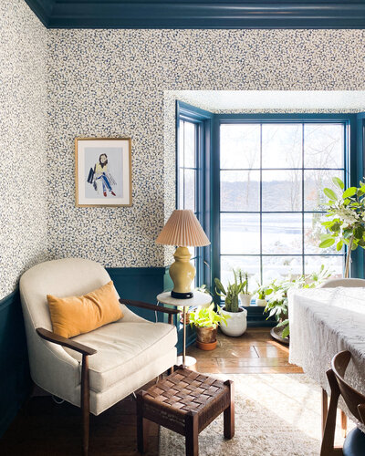
For this home, I’ve stayed pretty true to my all-time favorites—assorted shades of blues and greens, accented with hints of pinks, oranges, and yellows in varying degrees, depending on the purpose and feel of each room. The result is a happy, colorful home—one that has a consistent feeling of calm and joy throughout, allowing each room to infuse the story with its own unique palette and personality.


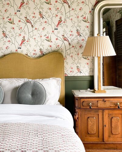
In most rooms, you’ll find bold indigos and greens grounding the space: a green velvet buffet in the dining room, a lacquered indigo campaign dresser in the main bedroom, and an overdyed cobalt rug in the family room. Keeping the focus on big pieces in intense colors leaves each space feeling warm and balanced. Secondary colors like dusty pinks, happy yellows, or rich terracottas add depth and light in accent furniture, wall colors, pillows, textiles, or art.
Using select pops of color in big punches throughout the house, against a mostly white-walled backdrop, is my key to keeping the space consistent and calm—while infusing bits of happiness, play, and whimsy.


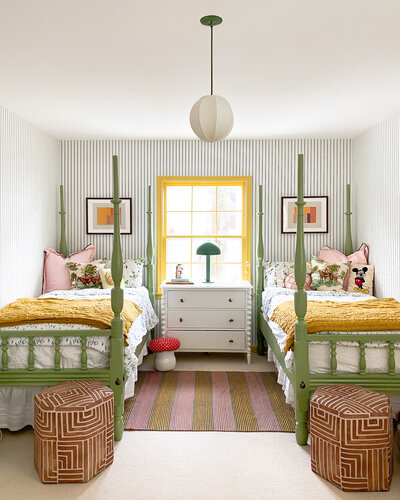
In my daughter’s space, we’ve carried the same colors throughout but lightened and brightened them to feel more age-appropriate by way of playfulness and whimsy. In this room, indigo gives way to cobalt, dusty pink becomes more vibrant, and the intense green softens to mint.


To me, each home is different. The light, the windows, and the mood you’re trying to create should set the stage for any and all design decisions that follow. I embrace that approach, letting each space have its own personality while keeping the overall design cohesive by maintaining a loose color palette throughout. The result is a home that feels calm yet colorful, consistent yet varied from room to room.


Jill Elliott is an artist, wallpaper designer and writer constantly seeking inspiration and balance. You can find Jill’s wallpaper and original art at Color Kind Studio. She can often be found making art and messes alongside her daughter and puppy.
BY Jill Elliott - July 13, 2021
Most-read posts:
Did you know W&D now has a resource library of Printable Art, Templates, Freebies, and more?
take me there
Get Our Best W&D Resources
for designing a life well-lived


Thank you for being here. For being open to enjoying life’s simple pleasures and looking inward to understand yourself, your neighbors, and your fellow humans! I’m looking forward to chatting with you.
Hi, I'm Kate. Welcome to my happy place.







Like what you see?
Share Wit & Delight with a friend: