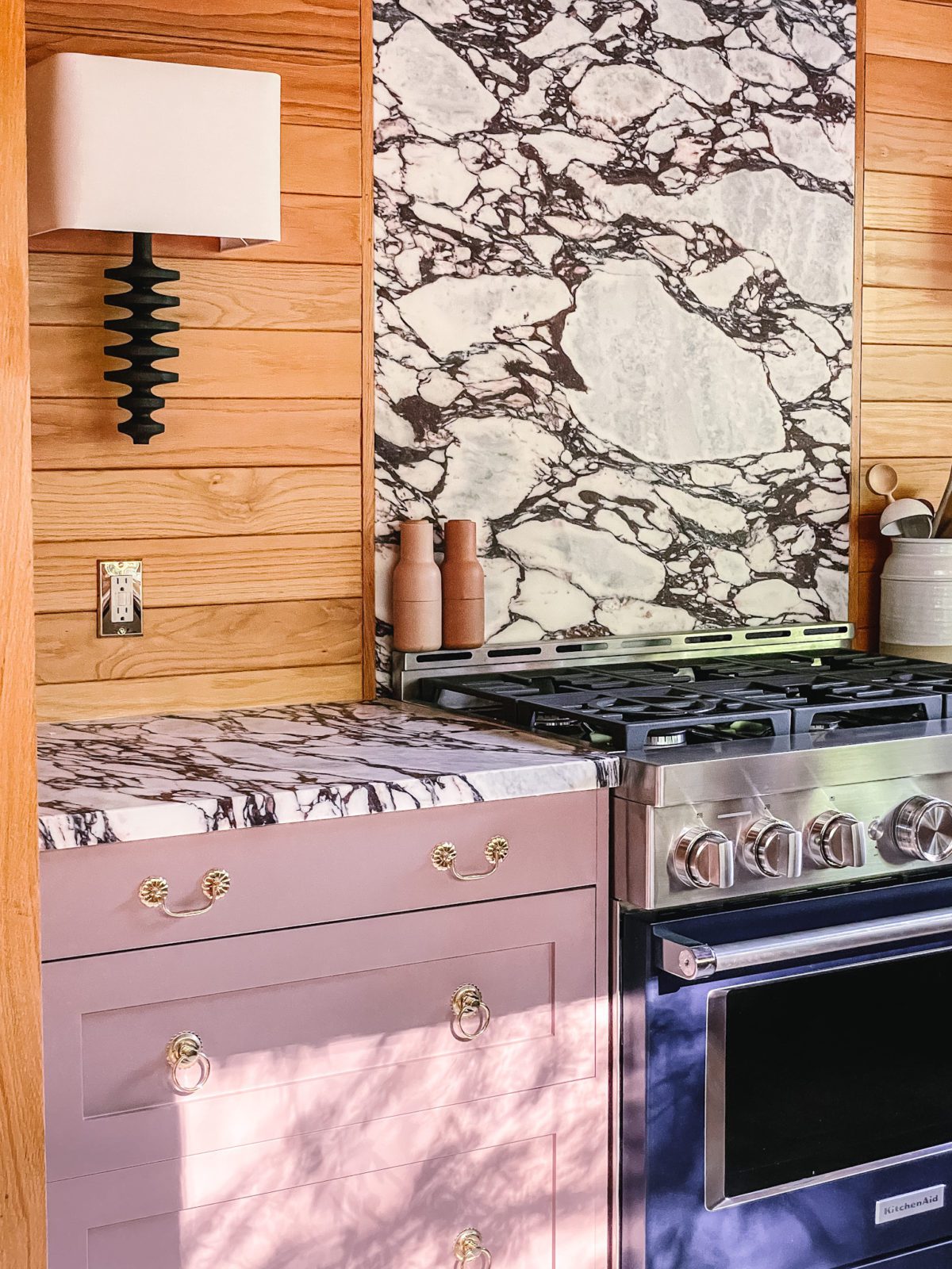
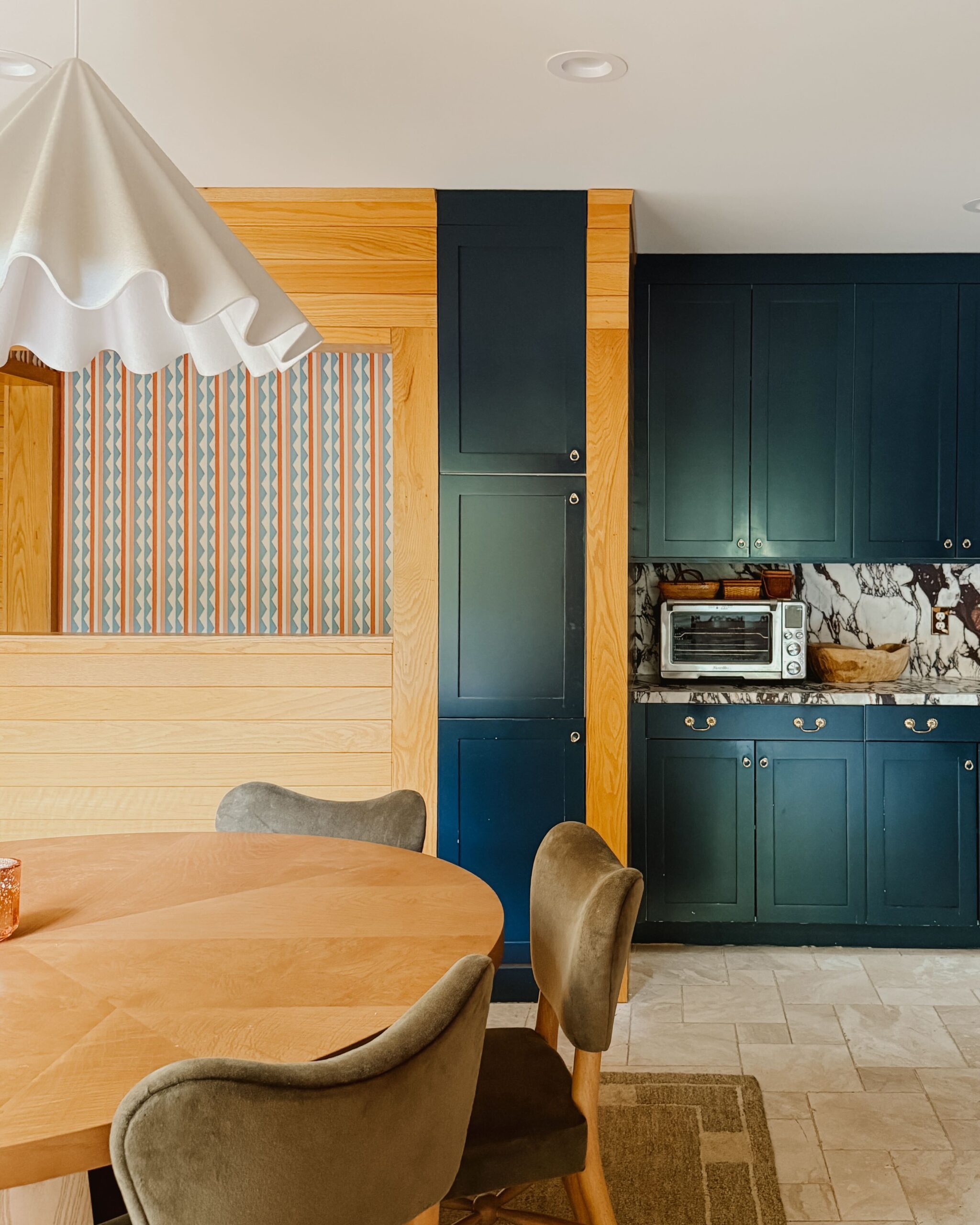
So many of you have been eagerly waiting to see what our remodeled kitchen looks like and today I’m so excited to share some photos of the space with you!
This kitchen is my favorite thing I’ve ever designed and also the most successful design in my opinion. I’ll share a bit about why that is below. It has been a long and slow process to get here—balancing our budget, logistics, and what was realistic for this space along the way—and I’m so happy to be back in our kitchen again.
Find part two of our kitchen remodel reveal here.
For reference, here’s a look at a couple of the before photos…
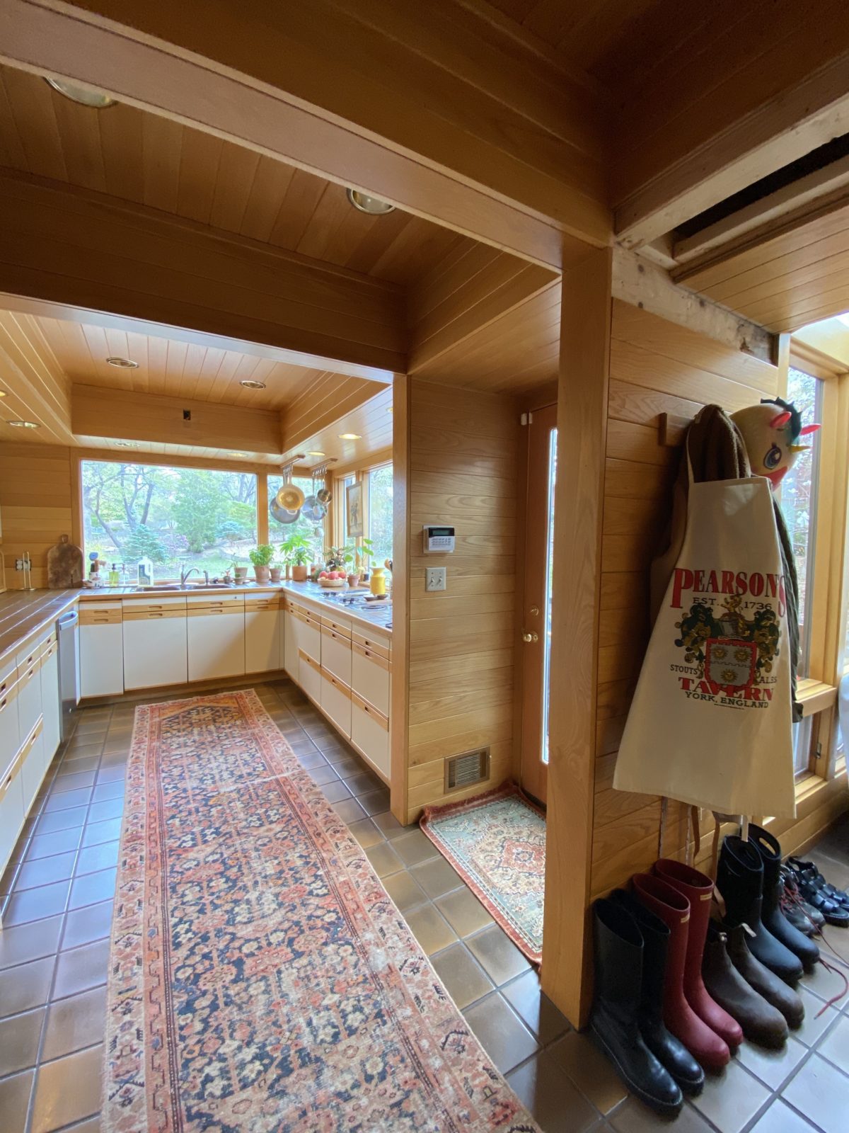
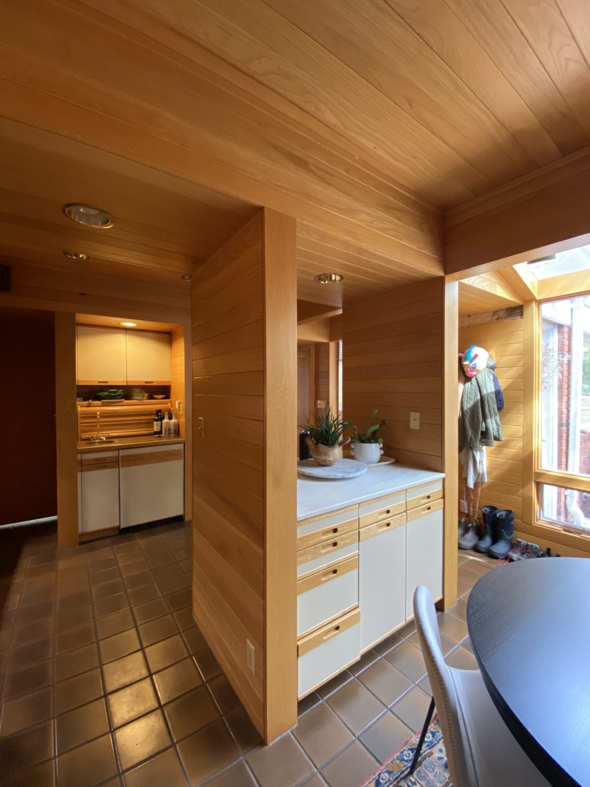
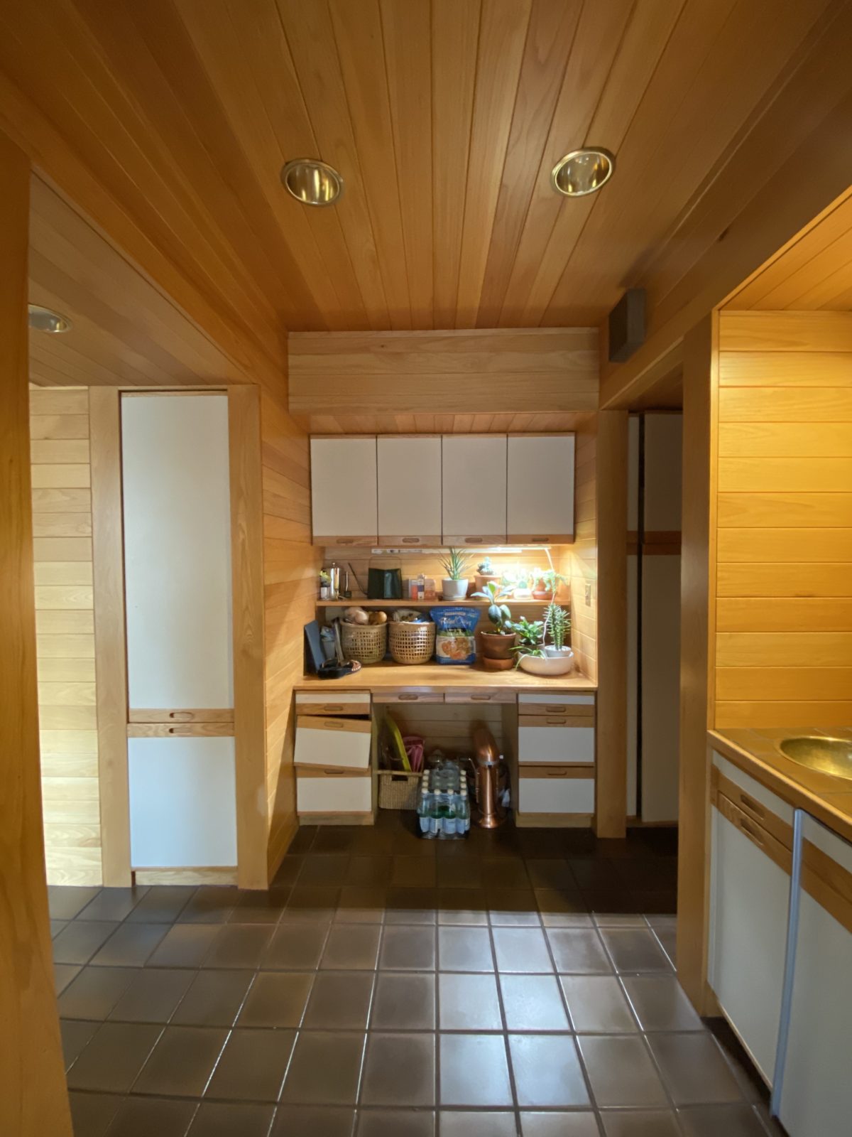
These are a few of the key design decisions we made in our remodeled kitchen.
Balanced traditional and modern elements
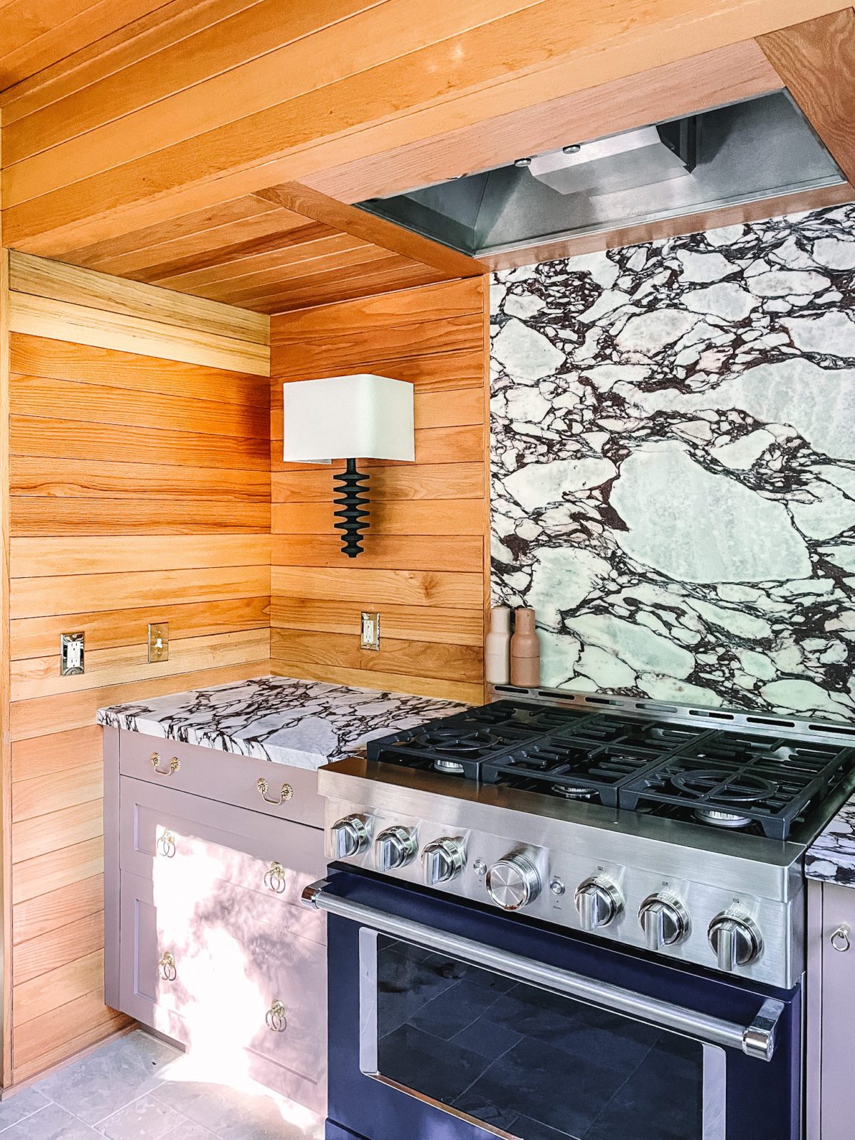
We worked on adding details that help connect the design of the kitchen with the traditional design of the rest of the house and that help balance some of the modern elements with more ornate touches (i.e., the modern nature of the wood paneling alongside the ornateness of the marble flooring). The entire design was an exercise in balancing those two elements.
We also considered durability in every element we added to this space. This kitchen was designed, first and foremost, to make things in and to use. While many of the finishings and products are high-end, nothing is too precious, and many of the materials (e.g., marble flooring, marble countertops, and lacquered brass shelves) are intended to weather beautifully over time.
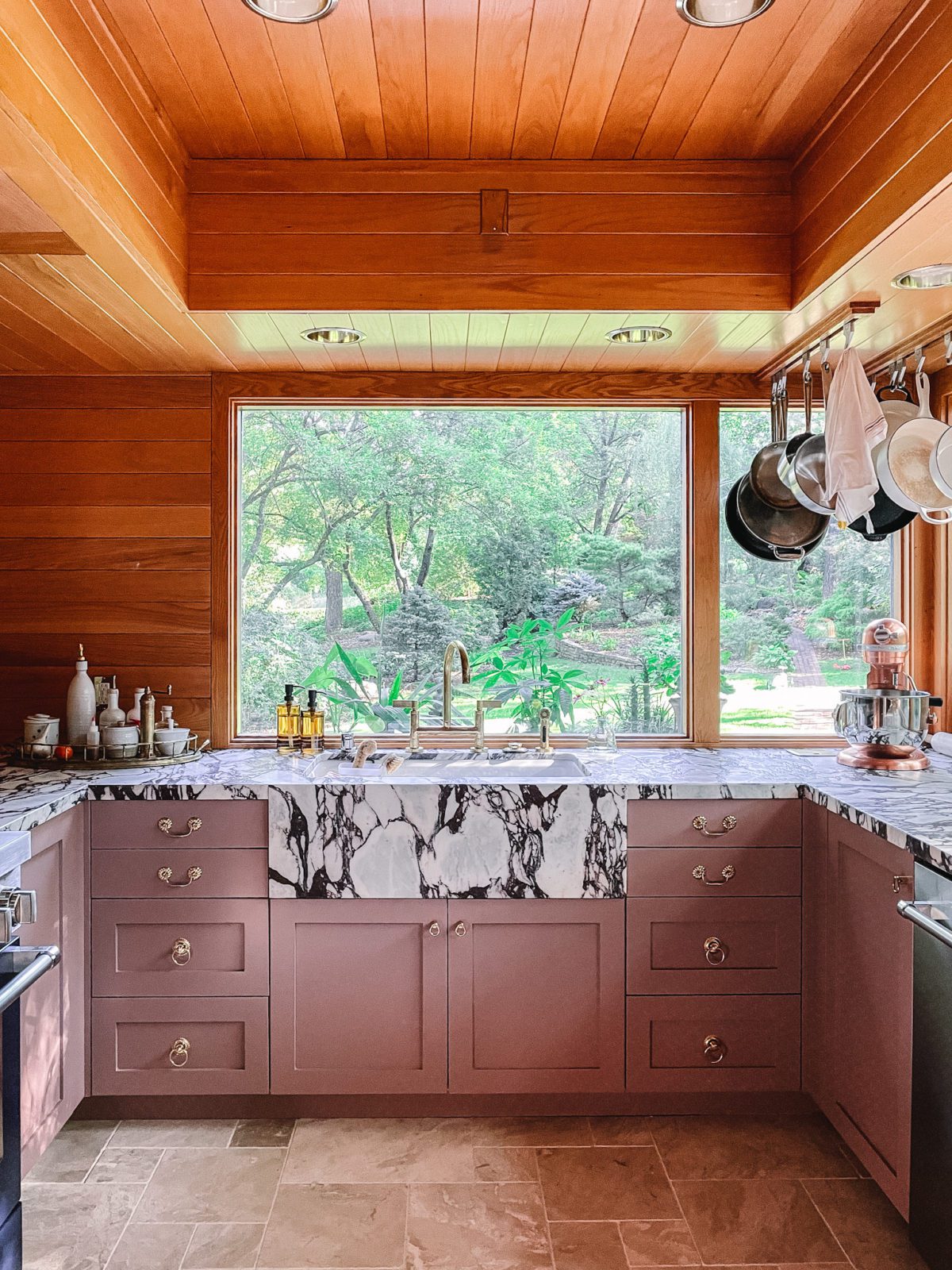
Added texture and color
We added varying textures (e.g., marble flooring and lacquered brass shelves) and colors to create an ambiance that has the warmth you’d find at a restaurant or a hotel but with the intimacy of a home kitchen. Throughout the design process, I reflected on different places I’ve been that used unique textures and colors to create a sense of warmth in their interiors—a hotel we stayed at while visiting Jackson Hole and a boutique hotel I loved in Paris, to name a few. I infused bits and pieces of design inspiration I’ve picked up along the way in this kitchen.
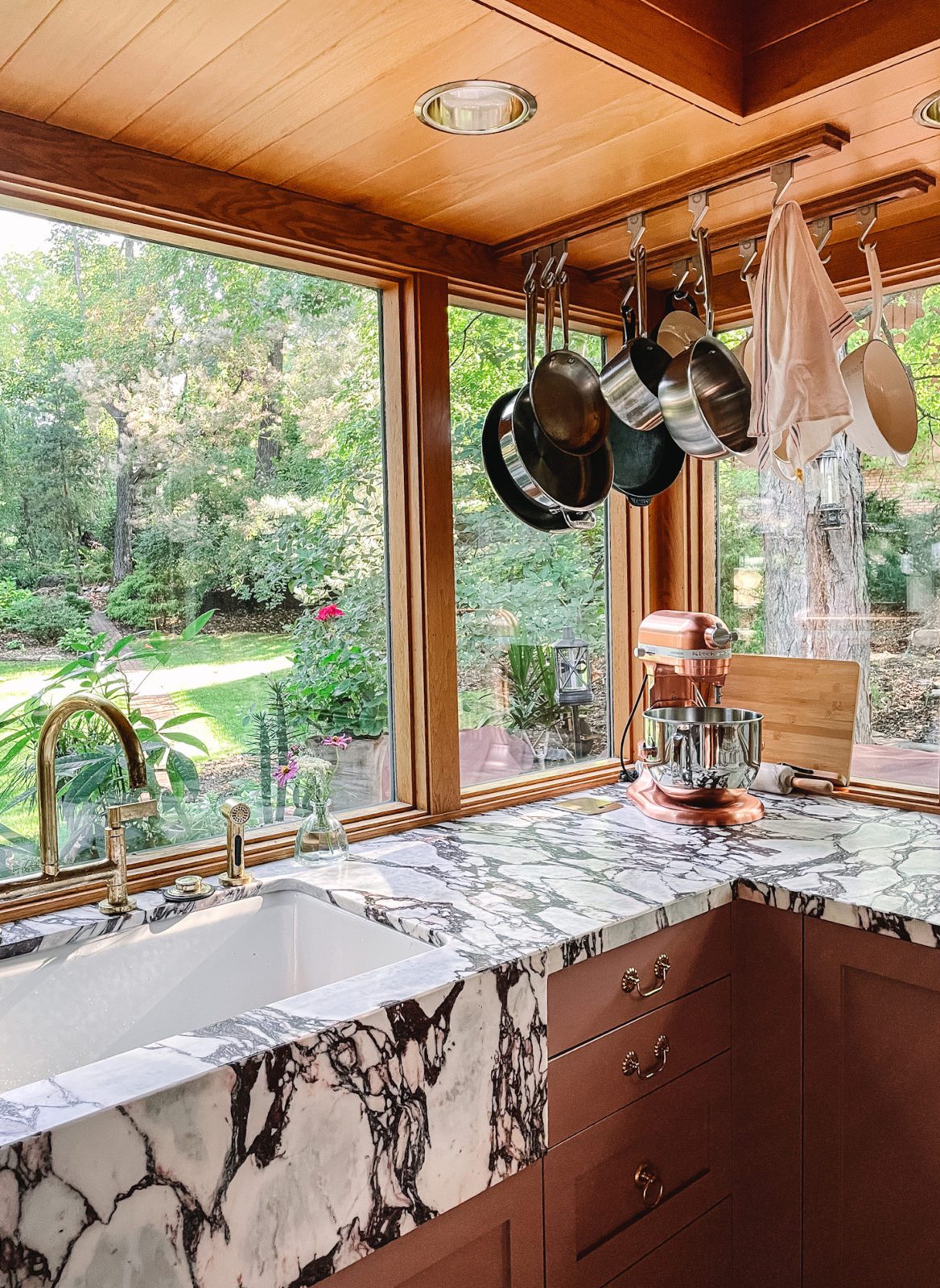
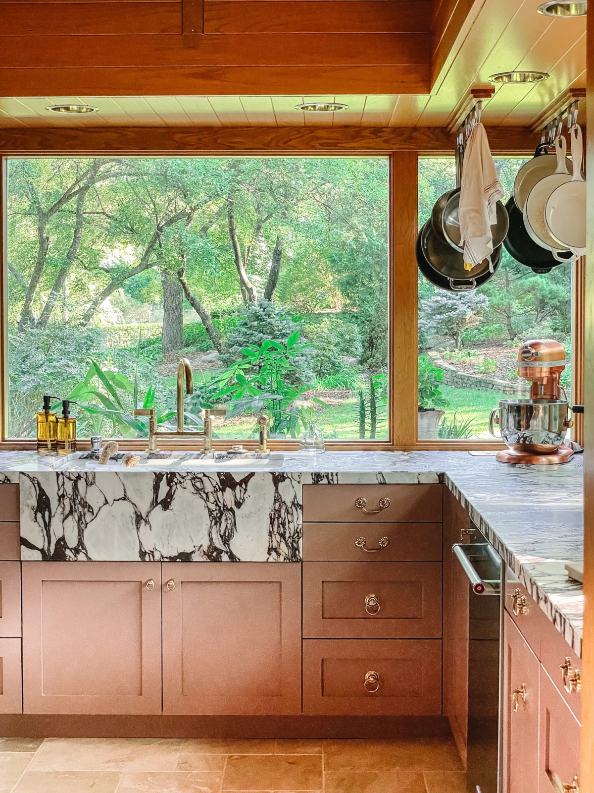
Worked with the existing oak paneling
The feeling of warmth also comes from what was already here—the oak paneling. I remember looking at the paneling at first and only thinking about how yellow it was, but now that I see it in the finished space, it’s clear that the tone of the paneling really makes the more traditional design elements pop. Through this process, I’ve realized you can change the way you think about design elements over time, and sometimes designing within existing constraints can actually be really beneficial.
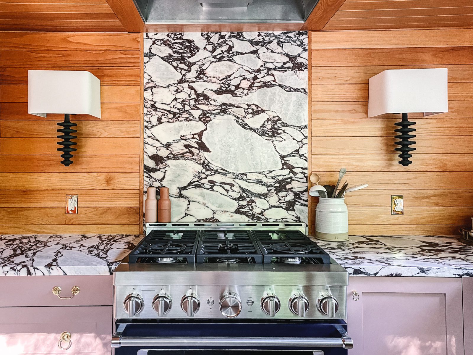
Your home is yours to design. Why not take some risks in the process?
The importance of taking design risks is one of the biggest lessons I learned through this process.
I think sometimes people (myself included!) need encouragement when it comes to making choices for decor that might not be so easy to visualize at the onset. Ultimately, if you’re interested in a design idea, it’s worth exploring it further. If you’re called to something, that’s enough of a reason to try, whether in a big or small way.
Here’s an example on a small scale: I’ve always been drawn to yellow decor elements but I didn’t know if they would work within the design of this kitchen. I tried out a couple of lemon-colored decor pieces and, much to my delight, they look so good. I’m eager to include a bit more yellow decor sprinkled throughout this space.
It’s ultimately about trial and error, but sometimes folks are so hesitant to try they never know what could have been.
Stay tuned for the full reveal of our remodeled kitchen…
We aren’t done revealing the process of this kitchen remodel and that’s for good reason! You may have seen bits and pieces of filming going on in our home over the past couple of months, and I’m so excited to finally share that we participated in a series called Design Minded with Vox and KitchenAid! The show will dive into the science behind why certain design elements work so well and will feature an in-depth look at our design process for the kitchen. The content launches today—watch it here!
Product Sources:
Flooring: Queen Beige Marble from The Tile Shop
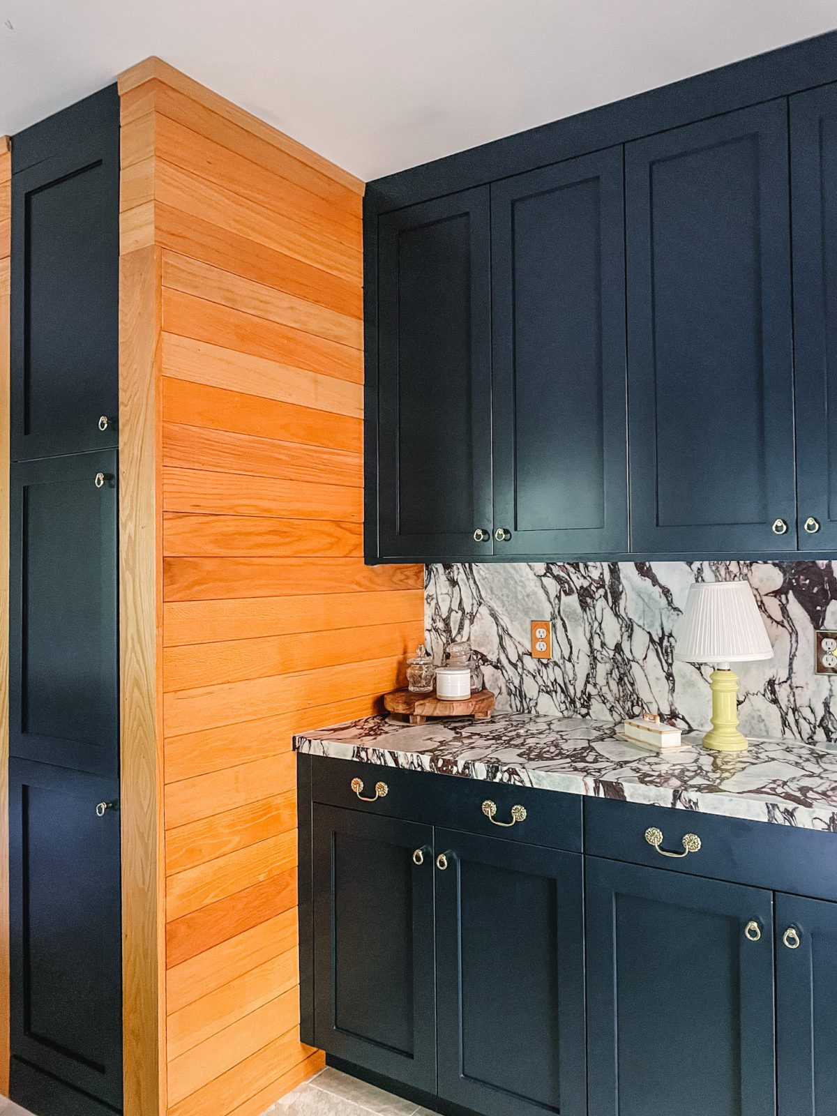
Countertops: Calacatta Viola Marble from Artistic Tile
Cabinets: Paintable Cabinet Fronts from BOXI by Semihandmade (The paintable version is in development and has not yet launched. We were one of the first testers for the product.)
Cabinet Paint Colors: Sulking Room Pink from Farrow & Ball and Hague Blue from Farrow & Ball
Cabinet Hardware: D. Lawless Hardware
Faucet: Deck-Mount Bridge Kitchen Faucet, Lever Handles from One™ by Kallista
Sink: Riverby® 33″ x 22″ x 9-5/8″ Undermount Single-Bowl Workstation Kitchen Sink from Kohler
Range: 36” Smart Commercial-Style Gas Range with 6 Burners from KitchenAid
Wine Fridge: Panel-Ready Undercounter Wine Cellar from KitchenAid
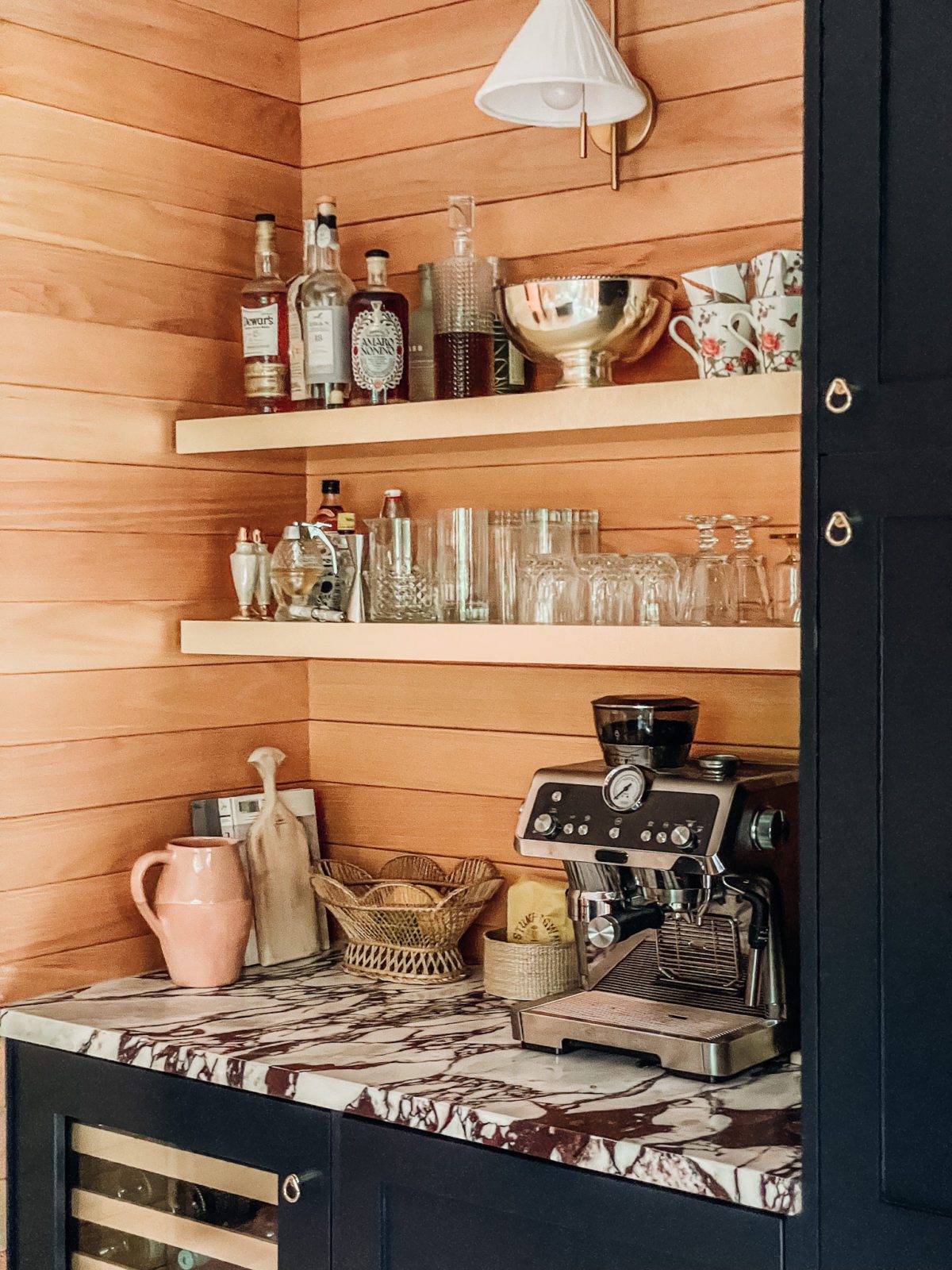
Brass Shelving: DIY project using BOXI by Semihandmade Shelves and IKEA Brass Panels
Sconces Next to the Range: Regina Andrew Fishbone Sconce from Lulu and Georgia
Sconce Above Bar: Pogo Brass and Cane Sconce from CB2
Brass Wall Plate/Outlet Covers: ENERLITES Style 1, Style 2, Style 3
Salt & Pepper Grinder Set: Norm Architects via MENU
Paneling: White oak from the original kitchen
Heated Floors: SunTouch
Layout Design: Skipp
Editor’s Note: This article contains affiliate links. Wit & Delight uses affiliate links as a source for revenue to fund operations of the business. Have a question or want to learn more about how we use affiliate links? Shoot us an email.

Kate is the founder of Wit & Delight. She is currently learning how to play tennis and is forever testing the boundaries of her creative muscle. Follow her on Instagram at @witanddelight_.
BY Kate Arends - September 30, 2021
Most-read posts:
Did you know W&D now has a resource library of Printable Art, Templates, Freebies, and more?
take me there
Get Our Best W&D Resources
for designing a life well-lived
Thank you for being here. For being open to enjoying life’s simple pleasures and looking inward to understand yourself, your neighbors, and your fellow humans! I’m looking forward to chatting with you.



I love everything about your kitchen. The colours are amazing and very unusual, and I like that you kept the paneling and that cool pot rack. but the marble is insane and I that sink/window/cabinet colour combination makes my heart sing. Really well done.
Thank you so very much!
I cannot believe more people aren’t commenting on the pot rack! It is the most perfect example of functional beauty I have ever seen. PLEASE tell me more – do you know anything about it?!? Any ideas where something similar could be purchased?
This is just so lovely, Kate!
Thank you!
Thank you so much for sharing! It looks like an amazing space & I’m looking forward to a post in the future to see how the design ages with your family.
YES. I can’t wait to share more over time!
Love love love the cabinet colours and how they enhance the original woodwork. Curious to see the layout changes as well! A triumph.
I’m so glad to hear it! More to come on the layout changes in the dining area of the kitchen…stay tuned!
Yes, yes, yes!! So lovely to see something so well designed and interesting and warm. Well done.
Thank you, Shelley!!
OH KATE! It’s sensational! Truly – exquisite! I am so so thrilled for you and selfishly excited for myself, so I can drool over it forever more.
Thank you thank you! More photos to come!
Truly unique & really, really beautiful— how refreshing! Bravo!
Thank you! I’m glad you like it!
I just love the structure of your kitchen. the views are stunning. Especially the window part of the kitchen is amazing. You can easily look around while washing the dishes. It’s looking lovely – the colours, structure, different marble. Now your kitchen is like the place where I can spend my whole day. I really like your ideas of kitchen remodelling. Appreciated!
Thank you!
My heavens this is gorgeous!! The bold, unexpected choices are inspirational!! Love your work! The marble, sconces, flooring, and cabinets work so well with the original paneling.
Thank you! I’m glad you love the way the paneling works with the other elements too!
Wow, this is so unique and gorgeous – love that you worked with the existing elements so it still fits into the house, while bringing in some truly gorgeous luxe materials and textures – very inspiring!
Thank you so much! I’m glad you love that design approach too!
I am so confused. I read HGTV magazine, and in the december 2020 issue I saw your “house”, the house that you said on this blog that you sold in april of 2020. In the issue, it said literally nothing about you selling said house.
I do love the kitchen reveal, it’s so pretty!! 🙂
I’m glad you love the kitchen!
Our previous home was actually photographed in early 2020 for the December 2020 HGTV issue, and in the time between the photo shoot and the magazine publication, we moved to a different home. Since the HGTV storyline centered around holidays in our previous home, I’m guessing that’s why the move wasn’t mentioned. Hope that clears things up a bit!
This is so beautiful!! Who is the photographer?
Thank you! The photographer is me! We’ll be hiring a professional photographer to take photos of the finished space but we’re waiting on a couple of finishing touches before then.
This is amazing. You know a space is a success when you just feel happy being in it. I feel happy just thinking about being in it. The windows and backyard, and every single design choice. It is warm and stylish and cozy. Not easy to get all that in balance. Enjoy it!
YES. That’s such a great way to think about whether a design is a “success”!
Your kitchen is very beautiful and so unique, but don’t you believe we ought to be moving past gas appliances? It just isn’t sustainable and induction works just as nicely as gas, but without fossil fuel or the low indoor air quality that comes with cooking with gas.
HOLY SH*T, KATE. It is sensational. WOW. I just love it.
Thank you!!
Love the cabinets! Did you use the existing boxes and just change out the doors? Or did you use new Ikea boxes?
Thank you! The cabinets are from BOXI by Semihandmade. The previous cabinets were in relatively rough shape so it made sense in this case to replace them entirely.
beautiful kitchen! love the marble & cabinet color!! question – I saw you previously had a lacanche but didn’t go that route in the new home. was there any particular reason you didn’t do a lacanche range again? I’m the brink of purchase so was wondering if it had anything to do with performance?! thanks! xx
Thank you! We loved our Lacanche range and the reason we didn’t go with one in this kitchen was budget restraints. It definitely had nothing to do with performance!
I am about to start a kitchen remodel, and I keeping our oak cabinets. I keep coming back to this post for design inspiration. I love it!
I’m so happy to hear that! Good luck with your renovation!
I too love the pot rack(s)! Can you give more details about the source?