

We get quite a few questions about our recently remodeled kitchen each week. I personally always find it really informative to hear what people think about their newly remodeled spaces after the dust has settled and they’re actually living in them, so that’s what we’re doing here!
Let’s dive into the eight questions I’m asked most frequently about our kitchen. If you want to know more, our kitchen remodel reveal posts (part one and part two) are always available to browse as well.
1. Why didn’t you paint the wood paneling?
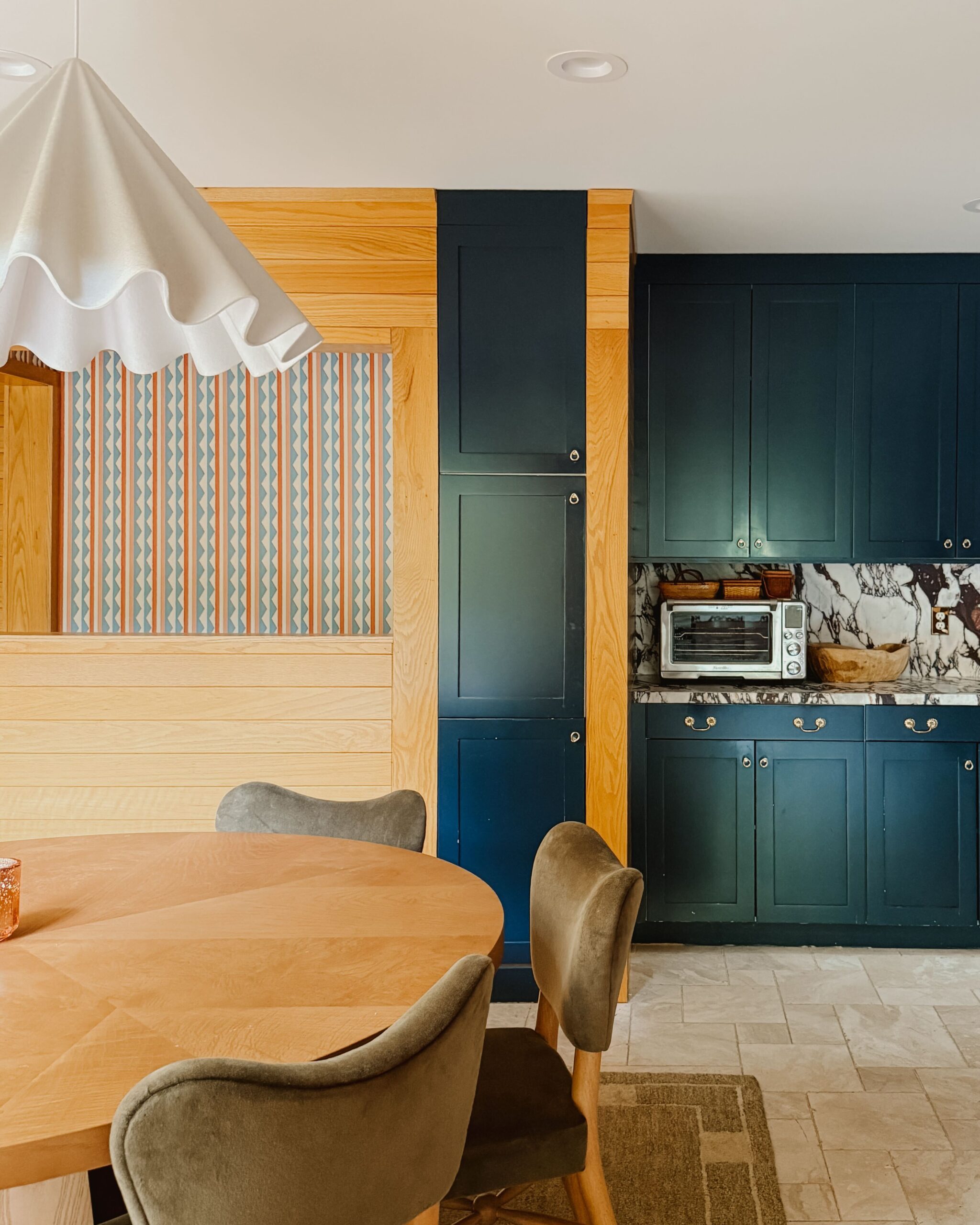
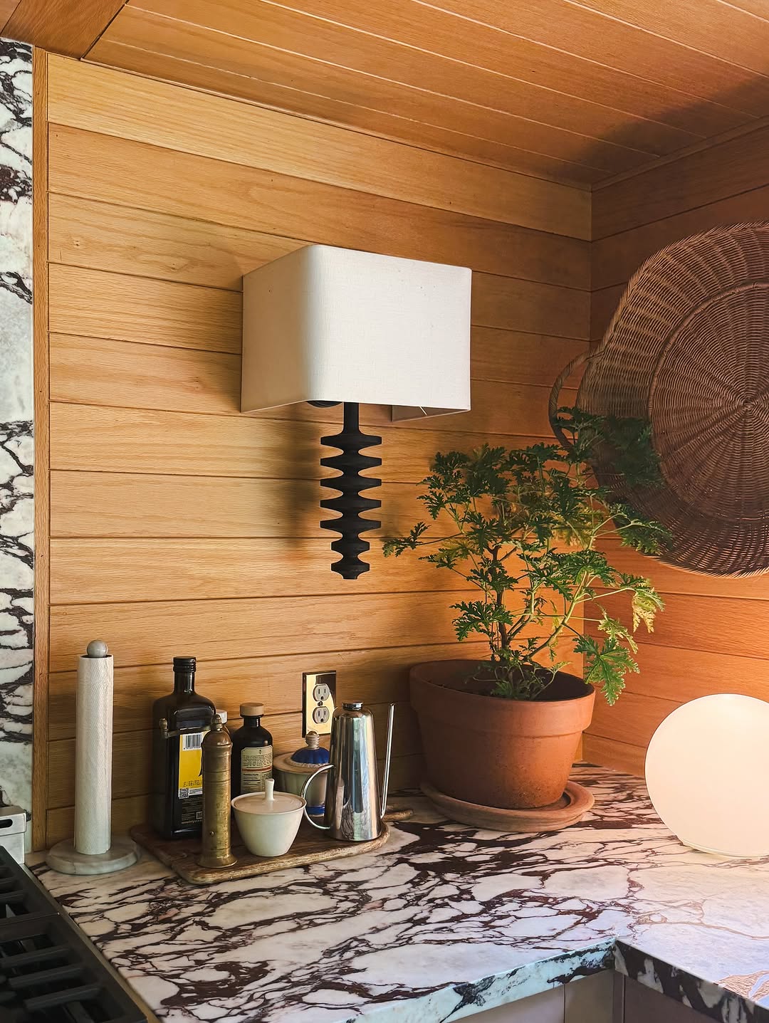
I’ve had so many people ask this question! They say painted paneling would make the design of the space feel more English country (which is definitely an aesthetic I lean toward) and they’re not wrong! The wood would look good painted, but it also looks good in its natural state.
I hemmed and hawed over whether to paint the wood for a while. Ultimately, after intentionally weighing the pros and cons, we decided to keep the original wood color. The paneling isn’t necessarily meant to be matchy-matchy with the rest of the space and I think that’s part of what makes the design really interesting. The paneling is also made of really high-quality wood that’s still in great condition, and the thought of having to take every panel off, sand it, paint it, and put it back up didn’t seem worth the effort (and cost) in the end.


2. The dishwasher is so far away from your storage cabinets! Why did you make this layout choice?
I wanted the U-shaped area of the space to be solely for cooking and prep work; having a quick, easy route to take the resulting dirty dishes to the dishwasher was key. We decided that easy dishwasher access while cooking was more important to us than having immediate access to storage while putting clean dishes away, so that’s the choice we selected. There was also plenty of space in the dining area of the kitchen to include cabinets for dishes, so it made sense in terms of the layout. We’ve gotten used to taking the short trips from the dishwasher to the cabinets and it doesn’t really bother us.


3. Tell us more about the cabinet paint colors! Are you still happy with your selections?
We still love the paint colors we chose, which are Sulking Room Pink from Farrow & Ball in the cooking area and Hague Blue from Farrow & Ball in the dining area. Given the natural light in the kitchen, the appearance of each color tends to change throughout the day; in the morning, the colors present as more of a gray tone, which then appears warmer as the day goes on.
4. Do you worry about scratches and stains while cooking on marble countertops?
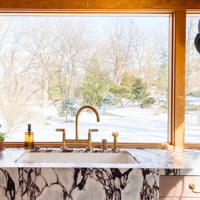
It seems to be a very American notion to think things should never look weathered over time. We chose these countertops because the style made such a beautifully dramatic impact that worked so well with the color of the wood and brought incredible visual interest to the space. Because there’s so much veining and texture, any small scratches or stains that occur aren’t really very noticeable.
That being said, while we’re not delicate with the countertops, we are cognizant of their tendency to scratch, so we’ll put a dish towel down before doing something that could potentially scratch them, like opening a bottle of wine or setting down a dish with a rough texture on the bottom.


5. You don’t have upper cabinets in most of the kitchen. Why did you make this decision?
I wanted the U-shaped space to feel larger and airier than it did before and I wanted to keep our view of the backyard intact. Because there was space for additional cabinetry in the dining area, it made sense to add upper cabinets there and omit them from the U-shaped cooking area. This choice also allowed us to move the stove away from its previous spot next to the window, which I’m glad we did.


6. Where did you find that pendant and why did you select it? I love it!
I’m asked about this light all the time (and, for the record, I understand why)! It’s the Menu Dancing Pendant from 2Modern.
When I was deciding on which light to add to the dining area, I wanted to find something that was modern and also very large to help frame the space. I really love the way it looks, although now I do sometimes wish it were a little more rustic.


7. Is there anything you would do differently now that you’ve lived with your kitchen for several months?
There are no major elements of our kitchen I would change! This is, however, following the approach of minimal structural changes; if we had been doing a “gut” remodel, the decisions we made would have been different. Because of that, this type of project was much different than our first kitchen remodel in our previous home.
These are a couple of the minor things I’ll likely update in the future:
- We didn’t put lighting under our upper cabinets in the dining area and it bothers me to no end.
- I wish I would have gone a little more traditional with the design of some of the light fixtures. I may eventually move the existing fixtures into other areas of the house, but I do still love them.
- We’ll likely add different stools to the dining area that have more traditional or rustic character.
- I don’t think I’ve quite gotten the sizing of the rugs “right” as they relate to the scale of the space, so we may also update these down the line.


8. What part of the kitchen do you love most and why?
I love the flow most of all. Everything has its own spot; it’s truly functional (special shout-out to our cabinet organizers!) and works really well with our family’s lifestyle. I can see everything I have in my pantry, my cooking process is seamless, and hosting here is just a joy.
In terms of specific elements, the countertops make me happy every day. I also love the range. It heats up really quickly, it’s so easy to control the temperature and keep a continuous simmer, and it’s also really easy to clean.


Editor’s Note: This article contains affiliate links. Wit & Delight uses affiliate links as a source of revenue to fund the operations of the business and to be less dependent on branded content. Wit & Delight stands behind all product recommendations. Still have questions about these links or our process? Feel free to email us.


Kate is the founder of Wit & Delight. She is currently learning how to play tennis and is forever testing the boundaries of her creative muscle. Follow her on Instagram at @witanddelight_.
BY Kate Arends - December 28, 2021
Most-read posts:
Did you know W&D now has a resource library of Printable Art, Templates, Freebies, and more?
take me there
Get Our Best W&D Resources
for designing a life well-lived


Thank you for being here. For being open to enjoying life’s simple pleasures and looking inward to understand yourself, your neighbors, and your fellow humans! I’m looking forward to chatting with you.
Hi, I'm Kate. Welcome to my happy place.





I love that you kept the paneling the natural wood color! It is stunning. As beautiful as white paneling can be, I think it’s a be shame to see all that beautiful wood covered up. I love that you worked with it!! I love it.
Thanks for your comment! I’m glad you love it too.
i love the combo of the wood paneling, the sulking room pink cabinets, and the bold movement of the marble countertops. even though painted panel would be beauty of a different kind, i love the combination of tones and texture you achieved.
Thank you!!
I’ll be tackling some reno this year in the Twin Cities, do you have a contractor you recommend?
We had a great experience with McDonald Remodeling!
Please don’t change out the lighting. The more modern style you chose is exactly perfect. It keeps the room feeling young and elevates the paneling to a deliberate choice rather than something you’re just living with.