

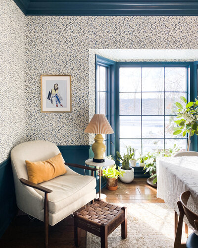
Welcome to our blue room! Over time, this room has had so many uses. It’s been a sitting room, a music room, a library, Joe’s office, and now my office. This space is where I sit down and have my coffee first thing in the morning on weekdays. It’s where I write, work, and have meetings throughout the day. It’s where Joe and I read the paper on Sundays.
One thing I’ve learned through the process of designing our house is that your home tends to surprise you over time. As you spend more time living in a space, you get to know which elements work best for your preferences and lifestyle (and which ones don’t). When you follow those instincts, that’s when your home begins to feel even more livable and enjoyable.
In today’s post, I’m breaking down how the design of this room has changed over time and what we might update in the future.
Before we get to the current photos, let’s take a walk down memory lane…
Here’s our blue room in its former pink glory in spring 2020, not long after we moved in.


In September 2020, we removed the wallpaper and painted the room blue!


Not long after, we added wallpaper in a punchy floral print.


We’ve tried a dozen different layouts in this room over time, including its stint as a music room, pictured below.


This brings us to the present day. Below is a look at the blue room as it is right now, along with my ideas for future updates.
Why We Made Updates to This Space Soon After Moving In
This was the second room we updated in our home, after the guest room. We designed this space so soon after moving in because it felt self-contained. I knew I could make updates here without creating the domino effect of needing to make updates to the rest of the house.
Given its somewhat small size (compared to other nearby rooms), it also felt like a good space to test out my new style while playing around with a few select design elements. Because of the size, it was easier to wrap my head around the updates and take some design risks.
Updates We’ve Made in the Blue Room
Painted the room
This room was a rosy pink color when we moved in. I wanted to change the color to something that was still bold but different. Yet I was feeling a bit shy about how to put my own spin on the space. The blue we went with has a nice amount of pigment that doesn’t feel too dark, which was exactly what I wanted!


Added wallpaper
I purchased thirty wallpaper samples for this room. It was excessive, but I thought that I would use whatever didn’t work in this room for other areas of the home… which I did! This little experiment is how I decided on the wallpaper for our kids’ room and the main bedroom.
The variety of styles amidst the thirty samples was so broad that the final selection came down to what I wanted to feel like in this room. I wanted to feel like I was stepping into an entirely different place when I set foot inside. I wanted to feel enveloped in texture and pattern, and both the size and scale of our chosen print offered just that.
Updated the light fixture
When I moved my office into this room, I realized I needed brighter overhead lighting than this space had before. As much as I like low lighting for dining areas, I needed something that was more of a task light. I found the solution in this red suspension light.


Updated the layout
I’ve tried many different layouts in the blue room. Some were more formal than others. What has worked best is leaving the space relatively open with a chair for reading, a chair for someone else to join me, a table for drawing, and room for the kids to play. The current layout is not my favorite, but for now, it works better than all the others we’ve tried.
Organized the bookshelf
I wanted to better organize the bookshelf so we can actually use it as a reference point. I decided I will never be the person who can keep our collection alphabetically arranged, so I decided to organize it by subject. I’ve since found myself referencing books for work more often, quickly looking for an image, recipe, or chapter with ease!


Design Elements We Might Change
Find the right desk
I love the desk I have right now, but it is a bit impractical for drawing since it is wrapped in a wide rattan weave. I would love to find one that is comfortable for drawing and writing and has drawer space for all my bits and bobs. The plan will be to keep this desk as a side table either in the kids’ room or in our guest room.


Add blinds
The sun can be really bright during most of the day, especially in the winter, so blinds will be really important to add. I still want some diffused light to come through in the summer when the trees are thick with leaves and only dabbled light comes through in the afternoon.
Update the layout
I’d like to figure out how to make the best use of this room’s layout. I definitely want to keep the bay window as a place to sit and write. I’d also love a little table where I can have meetings, and where August and Birdie can sit while I’m working.


Swap out the wallpaper
As the design of the house evolves, we might eventually update the wallpaper to better flow with the rest of our home’s design. Given that the existing wallpaper style is a little more retro, I may want to swap it out for something more traditional. Right now this is low on my priority list, since I do love the way the current wallpaper is applied and the feeling it helps create in this space.
My Favorite Part About the Blue Room
My favorite part about the room is that it even exists in the house. This is essentially a dedicated space to read, write, and be quiet, which is such a wonderful area to have in our home.
Blue Room Product Sources
Wallpaper: A Street Prints
Paint Color: Sherwin Williams Bunglehouse Blue
Swivel Chair: One Kings Lane
Gold Lamp: Safavieh
Rug: ECARPETGALLERY
Eames Chair and Ottoman: Herman Miller
Overhead Light: Mooielight
Floor Lamp: Mooielight
Desk: Antique
Desk Chair: Thrifted
Curtain: Thrifted
Wicker Side Table: Thrifted
Round Table: Facebook Marketplace
Green Table Lamp: Thrifted
Side Table With Shelves: Thrifted
Editor’s Note: This article contains affiliate links. Wit & Delight uses affiliate links as a source for revenue to fund operations of the business. Have a question or want to learn more about how we use affiliate links? Shoot us an email.


Kate is the founder of Wit & Delight. She is currently learning how to play tennis and is forever testing the boundaries of her creative muscle. Follow her on Instagram at @witanddelight_.
BY Kate Arends - February 21, 2022
Most-read posts:
Did you know W&D now has a resource library of Printable Art, Templates, Freebies, and more?
take me there
Get Our Best W&D Resources
for designing a life well-lived


Thank you for being here. For being open to enjoying life’s simple pleasures and looking inward to understand yourself, your neighbors, and your fellow humans! I’m looking forward to chatting with you.
Hi, I'm Kate. Welcome to my happy place.




The constant battle between form and function 🙂 I love how you’ve created a space that works for how you want to live it in! Can’t wait to see it continue to evolve too.
TRULY. It’s always a push and pull. Thanks for following along with the process!
Gosh, I just loved the pink, but it’s not my home, so…
It was definitely a fun color!