


Paint has the power to transform any room, and there’s a world of paint colors at our fingertips. Choosing a paint color can feel like an overwhelming process—but it doesn’t have to be!
These are the primary things to keep in mind when choosing a paint color for any room.
1. The Amount of Light
First things first: consider lighting. Here are a few questions to get you started:
- How much natural light is coming into the space?
- Which direction do the windows face? North and east-facing windows will give the coolest light, while south and west-facing windows will give the warmest light.
- How much light is coming from existing overhead lights or lamps?
Your answers to these questions will help inform your paint selection, especially when you’re also considering the mood you want in the room, which brings me to my next point.
2. The Experience You Want to Create
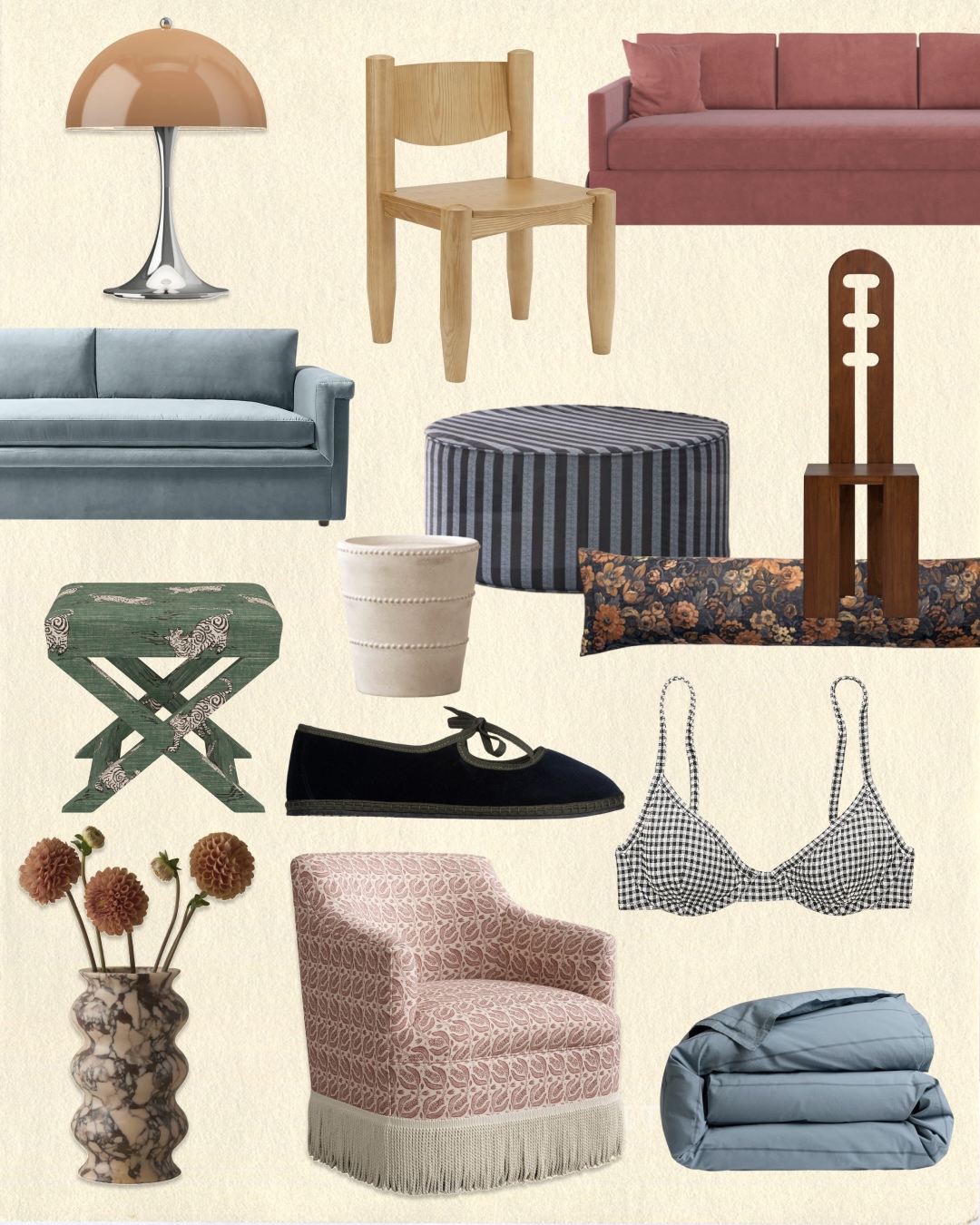
When choosing a paint color, something else I keep in mind is how I want the room to feel. Do I want it to feel intimate and cozy? Or do I want it to feel airy and expansive? To create a space that’s intimate and cozy, consider colors like muted pink, chocolate brown, or creamy beige. To create a space that’s airy and expansive, consider colors like cerulean blue, crisp white, or buttermilk yellow.
These ideas are just a starting point and they can be dialed up or down in a number of ways. For instance, buttermilk yellow is just a step more intense than an off-white color, and inky blue would add a bit more depth than a chocolate brown color.
There are paint colors to match every kind of experience. . . . You do not have to play it safe with your color choices, nor do you have to extend beyond neutrals if you don’t want to—it’s entirely up to you.
There are paint colors to match every kind of experience. Consider whether you want to stick with colors you’re comfortable with or expand a bit beyond them. You do not have to play it safe with your color choices, nor do you have to extend beyond neutrals if you don’t want to—it’s entirely up to you.
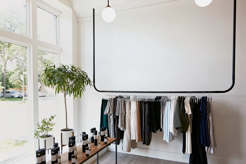
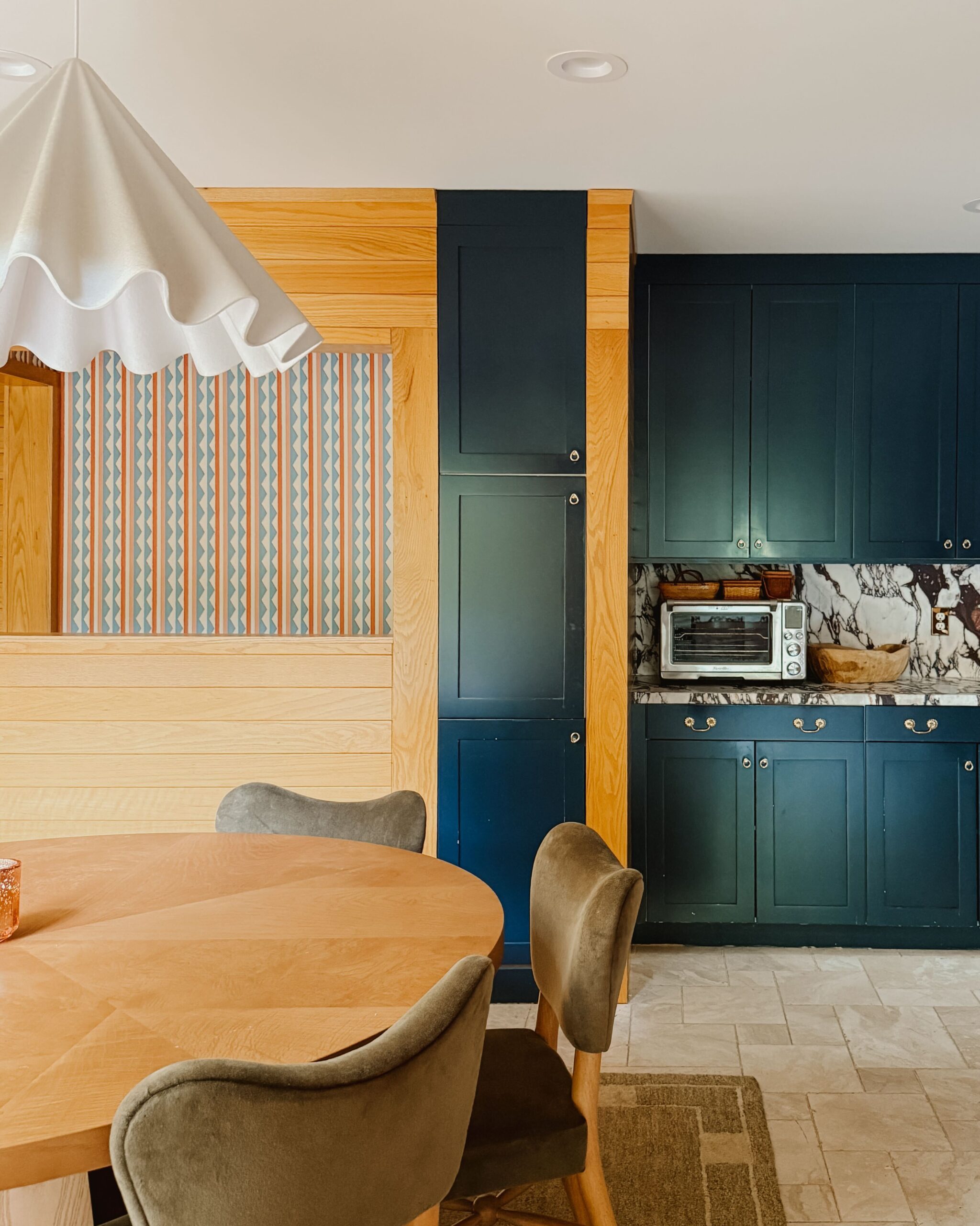
3. The Existing Materials
Don’t forget to consider the colors of any existing materials in your space—the floor, the ceiling, the trim, and any architectural details. For instance, if the trim in the room is a crisp white color and you won’t be painting it, you may not want to choose a warm paint color for the walls.
This is where it may also be helpful to create a simple mood board, to give you a better understanding of how existing elements will play with various paint colors. This process can be done by hand or digitally using a tool like Canva.
4. The Design of Adjacent Rooms
While the main floor of our home is a generally closed-concept floor plan, most of the main rooms open directly into one, two, or even three adjacent spaces. That’s why it’s been particularly important for me to consider adjacent rooms throughout my design process.
Each color in a home’s palette should generally feel like it’s coming from one cohesive, overarching scheme. If you have huge swings in saturation and tonality from one room to the next, you might want to rein in your color palette a little bit. For this reason, I think it’s important to keep paint swatches of every color you’ve already used in your home, to give yourself a clear idea of the palette as a whole.
5. How Colors Evolve Throughout the Day
Once you’ve considered the above points and have your paint color options narrowed down, test them out in the room. I think the hardest part of choosing a paint color is understanding how it will look in the space throughout the day. That’s why I think it’s so helpful to test colors in the room—and to go beyond the tiny swatch.
Instead, paint a big poster board and put it up on the wall. Leave it there for a few days and pay attention to how the color changes over time. Depending on the shape and size of the room, you may want to consider testing out paint swatches (or painted poster boards) in more than one area, since different walls will receive different amounts of light throughout the day.
I hope this information is helpful the next time you’re choosing a paint color for a room in you’re home! If you’re designing a particularly challenging space and want individualized advice, consider booking a consulting call with me. You can find all the details right here.

Kate is the founder of Wit & Delight. She is currently learning how to play tennis and is forever testing the boundaries of her creative muscle. Follow her on Instagram at @witanddelight_.
BY Kate Arends - March 13, 2023
Most-read posts:

Did you know W&D now has a resource library of Printable Art, Templates, Freebies, and more?
take me there
Get Our Best W&D Resources
for designing a life well-lived


Thank you for being here. For being open to enjoying life’s simple pleasures and looking inward to understand yourself, your neighbors, and your fellow humans! I’m looking forward to chatting with you.
Hi, I'm Kate. Welcome to my happy place.


Nice info, would be great to add what to do if the light is cool or warm. Considering it doesn’t mean I’ll know what to do about it. My living room is long and narrow and faces east onto a covered balcony. Direct light gets in a few feet for only about 3 hours. After noontime, or in winter, it’s much darker in the living room. Would warm or cool paint colors look good?
This is such a good question. I’ll answer more in-depth soon!
Excellent post! Playing with colors and textures can affect the perception of the size of a space. For this reason, it is important to consider those colors that multiply the spacious effect of natural light, such as light tones and soft textures on the walls and furniture.