

Most of our renovation projects didn’t involve much drama. I was beginning to think all those HGTV shows were designed to freak people into thinking they would open the walls of a new home and subsequently empty their bank account. We found McDonald Remodeling and felt so much more at ease. I should have remembered this when we decided to “DIY” our upstairs bathroom without them. I’ll give you a hint on how this ends: we called McDonald and they saved our butts on this bathroom makeover project.
In all seriousness, there were real issues with the upstairs bathroom. The lack of water pressure in the shower, the hot water wouldn’t turn on in the sink, the lack of storage. All small things that added up to the utter decimation of the upstairs bath. Looking back, perhaps eliminating the only full bathroom in the house with an infant and two busy adults, wasn’t the best idea. But if not then, when? There is never a great time to start a DIY project, so we just jumped right in. We found the perfect partner in AllModern, as they quite literally have everything you need to complete a DIY makeover with tons of my favorite brands. I had pulled so many images of bathrooms I loved on Pinterest, I started to become obsessed with the idea of sprucing up the bathroom ASAP.
The space was small and we wanted to keep the same footprint. Just give it a bit of a makeover with everything on the surface. NBD, right? Here’s what the space looked like before we started the demo:
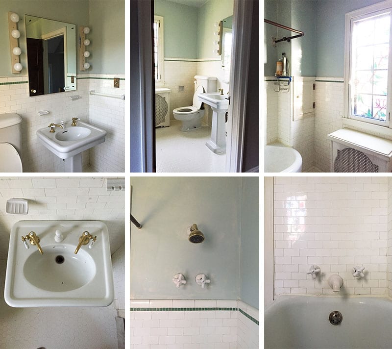

And so the designing began. First I wanted to try encaustic tile in the bathroom.


We ordered all our pieces from AllModern and started construction. That’s when we realized we were in over our heads. The bathroom had no subflooring, all the pipes had been set in concrete (WTF) and the toilet was connected to a flange that none of us had ever seen before.


I got out my phone and called Jim McDonald. He came over and we talked about what we were dealing with. I explained we only wanted to make a small update to the space to make it more enjoyable to live in, but since we had discovered we wouldn’t be able to put it back together, we should discuss the bigger issues at hand. It was the only bathroom on the main floor and there was no way more than one adult at a time could fit in the space when bathing kids. Because we wanted to have more children when living in this house, the thought of having more than one child in this cramped space worried me. Jim mentioned that we could extend the bathroom into the closet behind the shower and that he’d be happy to pull together some sketches.
This is what they came up with:


I mean, WOW. Joe and I decided it was the right call in the long run, and we’d have to forgo a few other things this year to make it work for our budget. In hindsight, the failed DIY attempt was a blessing in disguise. Not to diminish any effort to save money by doing the work yourself, but it’s a good lesson in calling a professional if you are in over your head. Thankfully, our friends at AllModern loved the idea of taking on a bigger project and worked with us to design all the details. Here’s what we pulled from AllModern’s selection:


AllModern Products
Floor Tile: For the floor tile, I chose a honed marble mosaic tile in white and gray. I love the white and gray combo, which adds texture and character to the bathroom floor.
Backsplash Tile: I wanted a clean and white backsplash to give the bathroom that new, clean vibe; this white subway tile really accomplished that.
Vanity: I love the rustic look of this Laurel bathroom vanity, paired with the clean and smooth lines of the rest of the bathroom, the vanity makes the space feel cozier.
Medicine Cabinet: I like the straight lines and minimalistic style of this medicine cabinet, a nice contrast to the rustic vanity.
Sink Faucet: I love the purist widespread bathroom sink faucet from Kohler; it gives the rustic vanity a more sophisticated touch.
Towel Ring: This purist wall mounted towel ring is also from Kohler and goes together nicely with the sink faucet.
Lights: These Leadville wall sconce lights add a quaint and charming touch to the room.
Shower Fixtures: I chose shower fixtures with sleek lines that pair well with the modern subway tile, for an overall contemporary feel in the shower.
Tub: I love the simplicity and shape of this soaking bathtub, it’s the perfect way to relax after a long day at work.
Tub Fixtures: I felt this Champagne Bronze single handle floor mount looked best paired alongside the tub.
Toilet: I like the elegance, detail, and character of this toilet, which is the perfect addition to this modern yet classic space.
Toilet Tissue Holder: This purist pivoting toilet tissue holder is made by Kohler and matches our sink faucet and towel ring.
Baseboard Tile: For the baseboard tile I chose a glossy black Thira ceramic trim that acts as a great contrast to the white and gray tile throughout.
Trim Tile: For the trim tile, I chose a ceramic pencil listelo accent tile in Nero Brillo.
Basket: AllModern has a great selection of wicker baskets that are functional for storage, but also make any space feel more down to earth.
Towel Hooks: I love how sleek these are!! We added four in a row instead of using a towel bar. There wasn’t an obvious place to put one, so the hooks were a nice solution.
Now we not only had (hot water!) but we were designing a space that could double as an in-house relaxation spot. I know how this sounds, bathrooms are already a destination, but I wanted a place that would seem as if I wasn’t home. My traveling for work has slowed down a bit, which quite frankly, is a bit of a relief, but what I did miss was staying in hotels with bathrooms that invited you to take your time and enjoy a quiet moment to yourself. If I couldn’t actually be in a cool hotel, I wanted to at least evoke the feeling of luxury in one of the most used rooms in the home.
Working with AllModern was a great experience, especially because they had so many quick-ship items. We were able to emulate some of the luxe and sophistication of a hotel atmosphere without 12-week lead times. With a simple palette of marble, white and black tile, and warmth from brass and wood, the bathroom felt both classic, modern, and interesting. Check out AllModern Renovation page if you are interested in doing something similar! On top of all the lovely design details, I’ve been spending more time getting centered in this space and truly feel like it’s improved my ability to handle stress. I could finally imagine I was on vacation. And there has been more than one night spent soaking in the tub with a beverage after a long day of work; all that is missing is towel service and a fuzzy robe.


Editor’s Note: This article contains affiliate links. Wit & Delight uses affiliate links as a source of revenue to fund operations of the business and to be less dependent on branded content. Wit & Delight stands behind all product recommendations. Still have questions about these links or our process? Feel free to email us.


Kate is the founder of Wit & Delight. She is currently learning how to play tennis and is forever testing the boundaries of her creative muscle. Follow her on Instagram at @witanddelight_.
BY Kate Arends - March 22, 2017
Most-read posts:
Did you know W&D now has a resource library of Printable Art, Templates, Freebies, and more?
take me there
Get Our Best W&D Resources
for designing a life well-lived


Thank you for being here. For being open to enjoying life’s simple pleasures and looking inward to understand yourself, your neighbors, and your fellow humans! I’m looking forward to chatting with you.
Hi, I'm Kate. Welcome to my happy place.





Kate,
Your space looks amazing!
I can’t believe it’s the same bathroom. It looks like something from a swanky restaurant – I love it! The changes are incredible!
–
Charmaine Ng | Architecture & Lifestyle Blog
http://charmainenyw.com
Beautiful !!!
hoctiengnga.vn
This is beautiful! And I love the bath inside the glass-door-separate-shower piece. I am wondering what the square footage is? You mentioned this as a full bath + closet space. I’m currently looking at trying to redo my powder room to create a full-bath. I’m curious about how much extra space i would need. Thank you!
Hey Becky! It’s not big at all. I don’t have the total square footage but I would guess it’s about 5-6′ wide and 6-7′ long. The wet room idea was from McDonald Remodeling, they like to do this solution when you can’t fit both a bath and shower unit.
How does your bathroom work? After you take a shower is the tub wet? What if you want to take a bath after someone has taken a shower, is the floor wet.I have always wanted to know how this type of bathroom works on a practical level.
Hi gigi,
We haven’t really had a problem yet. The floor is wet, but you’re getting in and out of the tub, so I just leave my slipper outside the wet room and walk barefoot to the tub.
Beautiful bathroom! Would you mind telling us where those simple towel hooks on the wall in the wet area (same wall as radiator/stained glass window) are from?
Hi Jill! Of course! They are also from All Modern…https://www.wayfair.com/Amerock-Arrondi%E2%84%A2-Wall-Mounted-Robe-Hook-ZQTV1996.html
Adding them to the post 🙂
Lovely renovation Kate, Absolutely like to feel..
Jims sketches were fantastic and looking at them, and the colour of floor tile (white and grey), I cant wondering if the wall were painted light grey instead of green how would the bathroom look!
x
Germarie
http://www.homeology.co.za
* Absolutely like the feel..
Love it! Do you know what color grout you used on the wall tile?
I love the corner shelves in the shower. We’re renovating our bathroom right now and I’d love to add those in. Are they a product? Or custom? And are they secured to the wall behind the tile? Thanks!!
The failed DIY experience was a blessing in disguise. This space turned out so well. I love the simplicity of everything. The interesting tile and architecture that you added allows the space to look phenomenal without any home decor.
So beautiful! What program do you use to mock up your designs?
How did they do the corner shelves in the shower? We have limited space in our shower and this would be the perfect solution. Are they all handcut tiles? How are they secured to the walls?
Beautiful Bathroom!!
Man, that idea to expand into the closet and pick up that nice shower was brilliant.
[…] Image source […]
Where did you get the corner shelves for the shower?
Beautiful!
Can you share the source for the shower shelves.
Thanks,
Tara
Can I ask where you got the shower corner shelves? I’ve been looking for exactly that.
Thanks
I would also like to know where you got the corner shelves
I’m more interested in the shower mixer – are you able to let me know where this is from?
Many thanks 🙂
I need to add my comment to those asking about the corner shelves – I love the idea and look. We JUST finished updating 3 bathrooms and I would’ve preferred the shelves but we have nooks instead. It looks as though your shelves are an integral part of the tile installation though; is it your opinion that shelves could not be installed once the tiling is complete?
Those shower shelves are great! Could you tell is where you got them?
Hi Tracie,
Thanks! They are custom pieces created by our builder. Hope that helps.
Kate
Wow! Your bathroom turned out amazing! I love the gold finishes. I am in the middle of remodeling my kids’ bathroom and finding the perfect accessories has been tough!
http://www.westcoastjensens.com
[…] Fuente: Wit & Delight […]
[…] We could desperately use this corner shelving concept in our showers. Actually, we have one corner shelf in one of our showers, but I would love another two shelves. Source: Wit & Delight […]
Wow!! That finished product looks nothing like the original space! What an upgrade! Love the corner shelving and the way the tub and shower are in their own little separate space.
[…] Shower storage idea by witanddelight […]
Love the corner shelves in the shower! Any links to that particular product! I’m having a hard time finding something as simple, but beautiful as yours!
Thanks for your comment, Savanna! Unfortunately, I don’t have any links. They were custom pieces created by our builder.
Hi Savanna! I have the same question. Did you come up with any materials for corner mounted shelves?
Hi! Beautiful work BTW! Our new bathroom was inspired by your post. One thing I haven’t figured out yet…how did you mount your corner shelving in your shower and what materials did you use? Thank you in advance!
Thanks, Whitney, that’s so good to hear! The shelves were custom pieces installed by our builder, so I don’t have a ton of expertise in this area. I’m sure there are similar shelving options available online. Good luck!
Beautiful bathroom! Thanks!
Can you share the budget? I love this but would like to know what I’m getting into!
Hi, Megan! We had a $12,000 budget for this project but ended up spending $17,000. The extra cost was due to unexpected plumbing issues that needed the attention of an expert.
Ah! This is perfect, we have a teeny bathroom that needs redoing just like this! Thank you
Oh I’m glad you like it, Caitlin! Thanks for your comment!
Bathroom Renovation ideas is always hot topic. I love modern style with White. When you think about white and modern this is the kind of bathroom that comes to mind. Clean lines, white, and a few organic touches are all that’s needed.
This is so beautiful. I will add a Moroccan Rug or Pouf to this space.
http://www.craftszone.shop
Thanks, Jessica! I agree, either would make an excellent addition.
I would love to see a makeover for my own bathroom but I don’t know how much I needed. Do you have an estimate value for a small bathroom?
How can I find ordering information for the triangular bath corner shelving seen above?
The shelves were custom pieces installed by our builder, so I don’t have specific product info to share. I’m sure there are similar shelving options available online!
This is lovely And I love the bathtub in the glass-door-separate-shower piece I’m currently searching at looking to redo my powder room to create a full-bath. I’m curious about how lots greater area I would want. Thank you