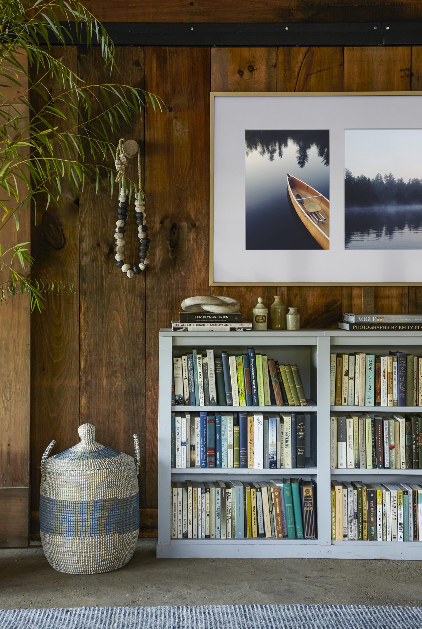
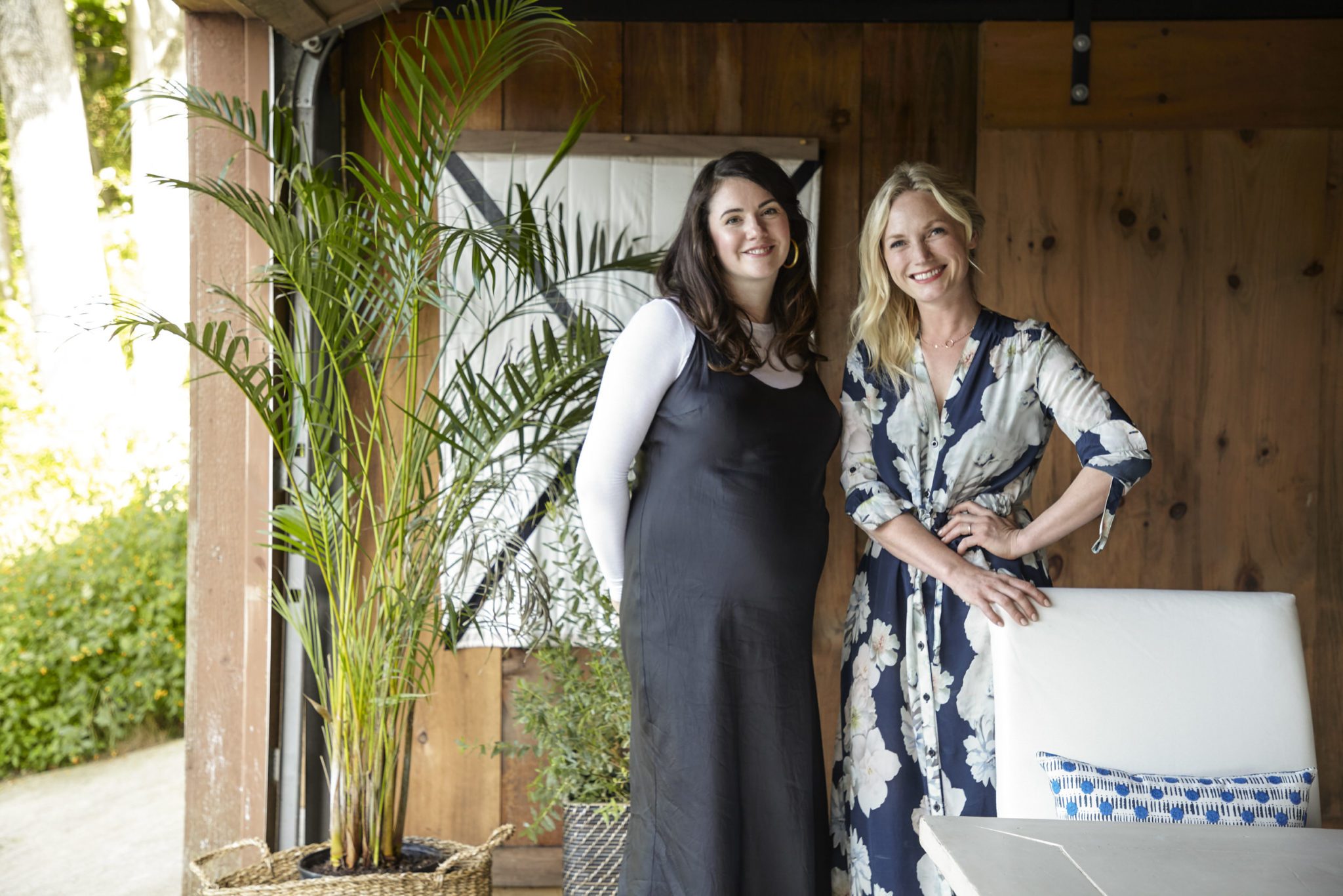
I’m so excited to reveal one of my favorite decor projects of 2017! Way back in August, Samsung reached out to see if we’d be interested in designing a space inspired by what they called “the most beautiful TV you’ve never seen.” Naturally, I was dubious, but I soon found out this client was not kidding.
Emily and I were briefed on making over a nearly 100-year-old boathouse in upstate New York. The space was an empty canvas, and it was our job to dream about the ways we would want to use the space if it was our place to call home. Life near the water is very much part of raising a family in Minnesota. I had just spent Labor Day weekend with our friends Eric and Cory up at their family’s cabin on Lake Vermillion and was totally inspired by the way we adapt our lifestyle to different parts of the country.

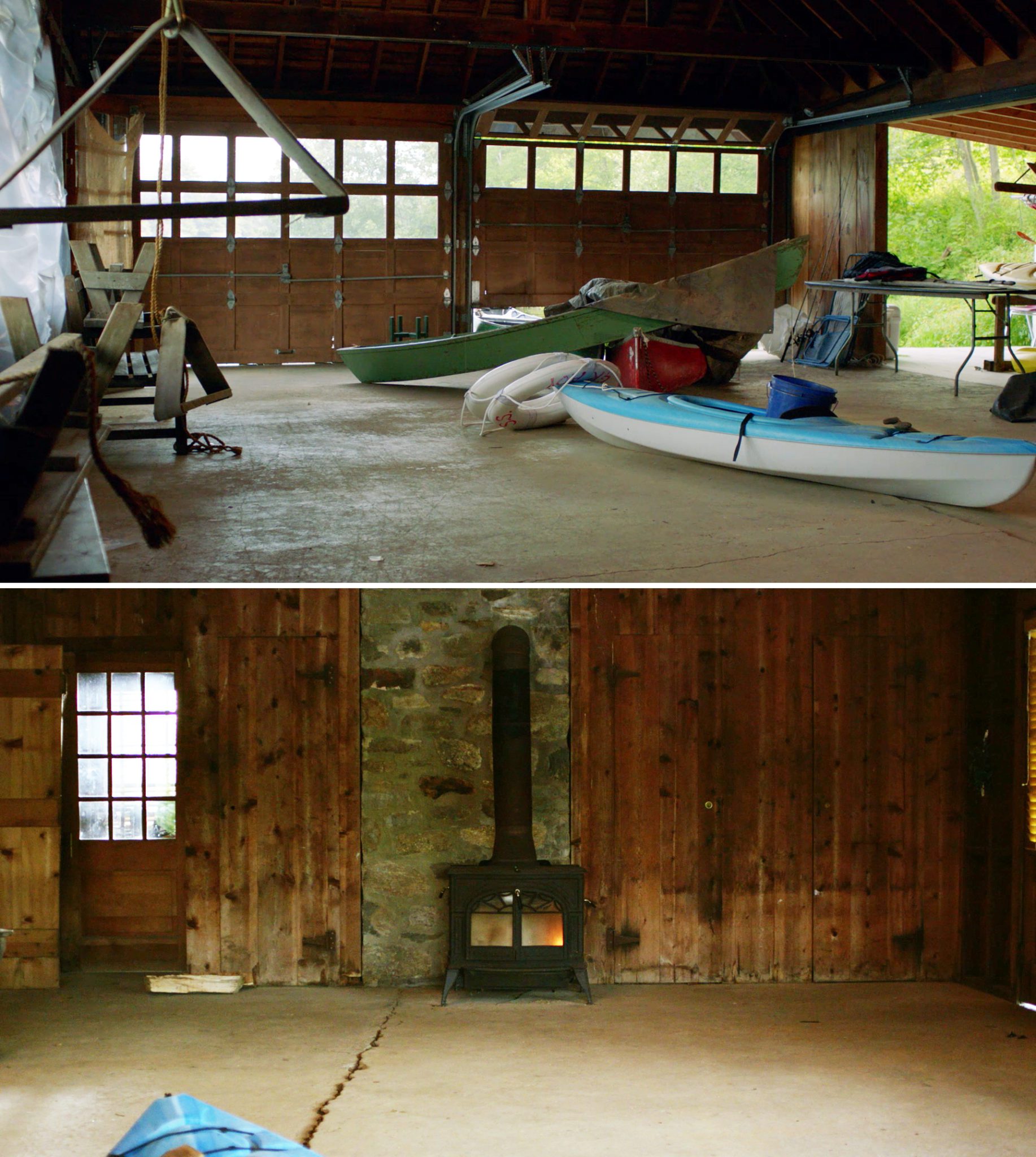
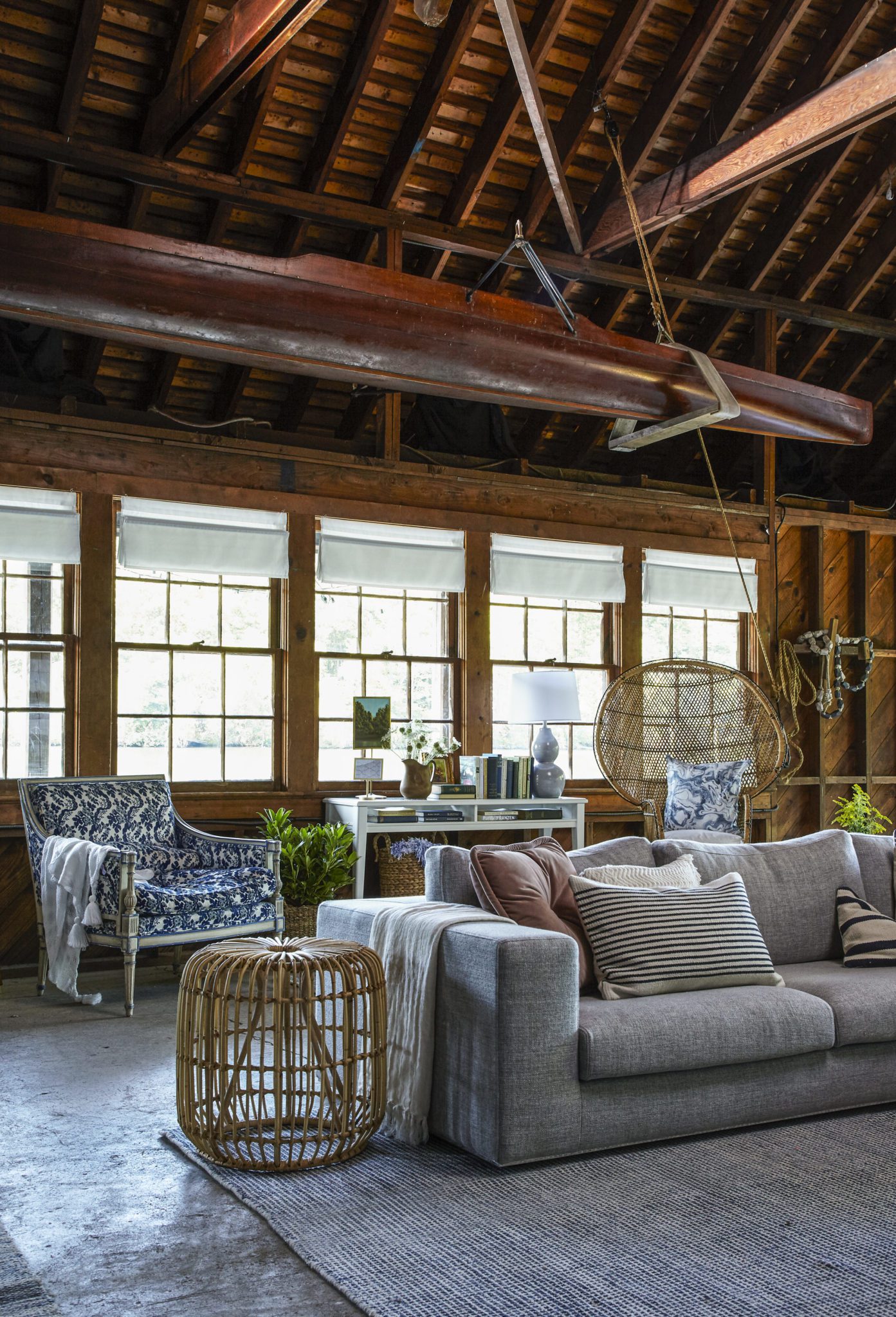
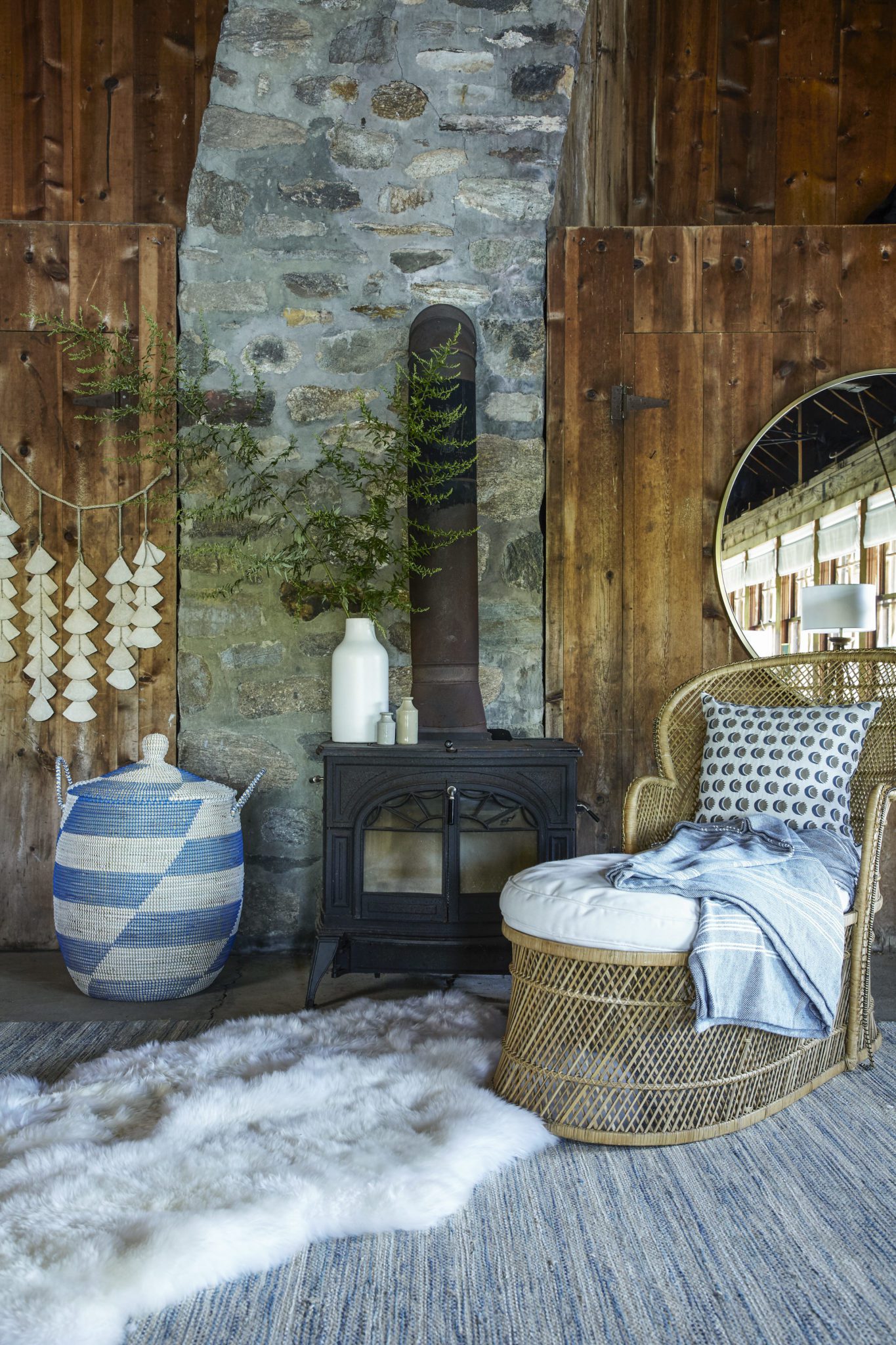
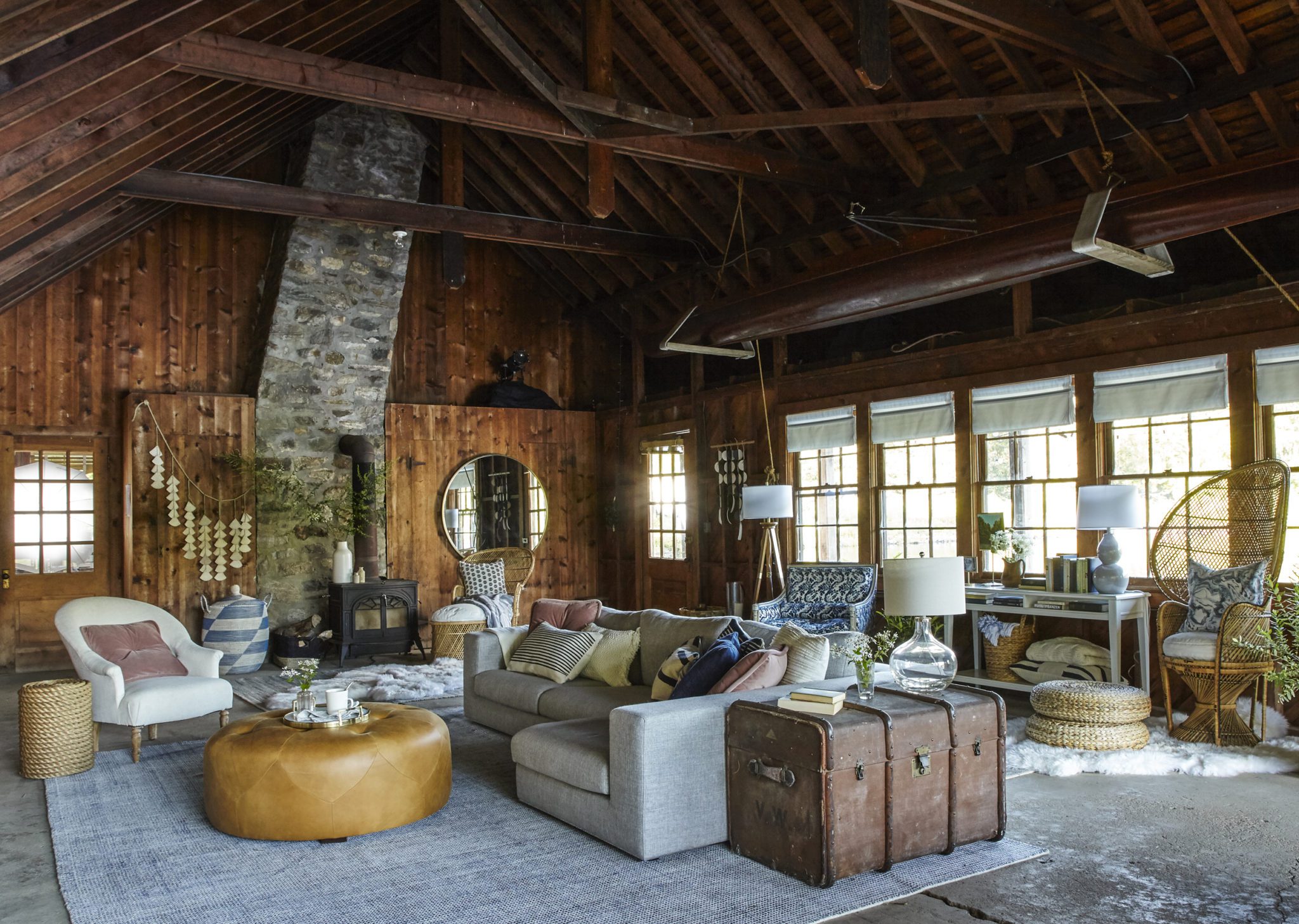
The boathouse itself was pretty rustic. There were large garage doors that opened right up to the water, pulleys to lower and raise kayaks and canoes, a wood burning fireplace and a large set of windows that overlooked a porch just big enough for a couple seating areas. My favorite feature was the huge vaulted ceilings and all the gorgeous warm wood.
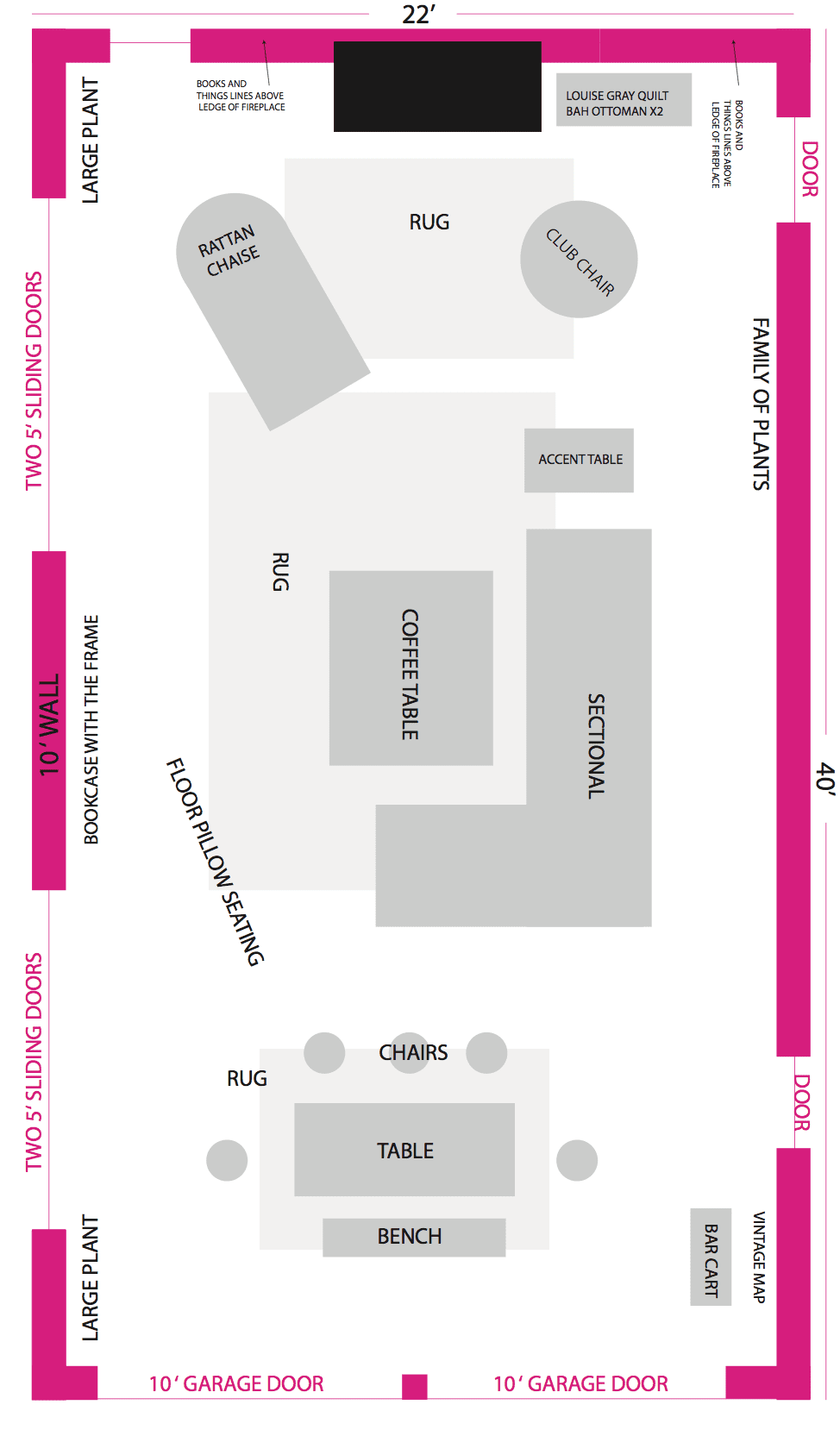
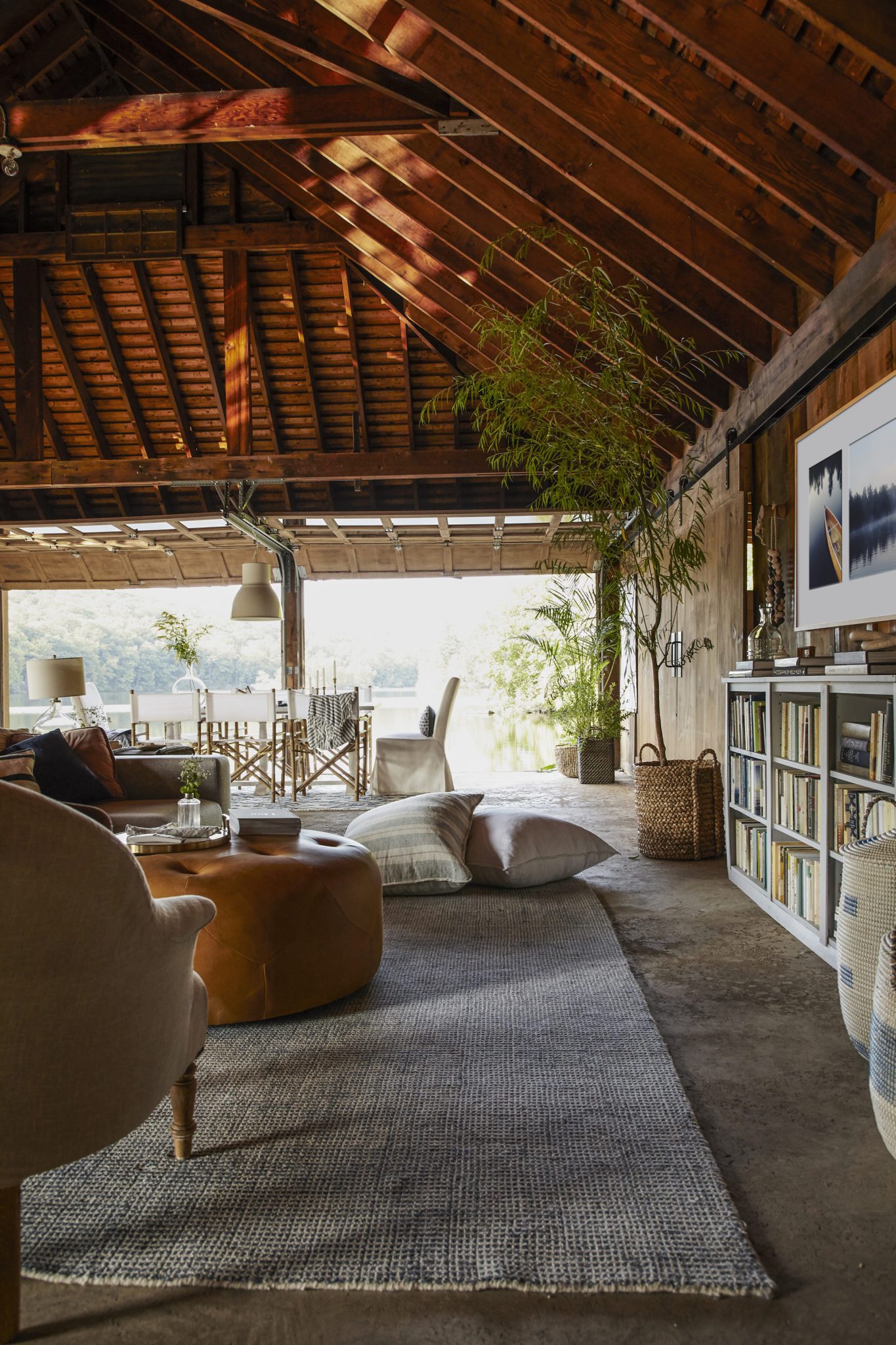
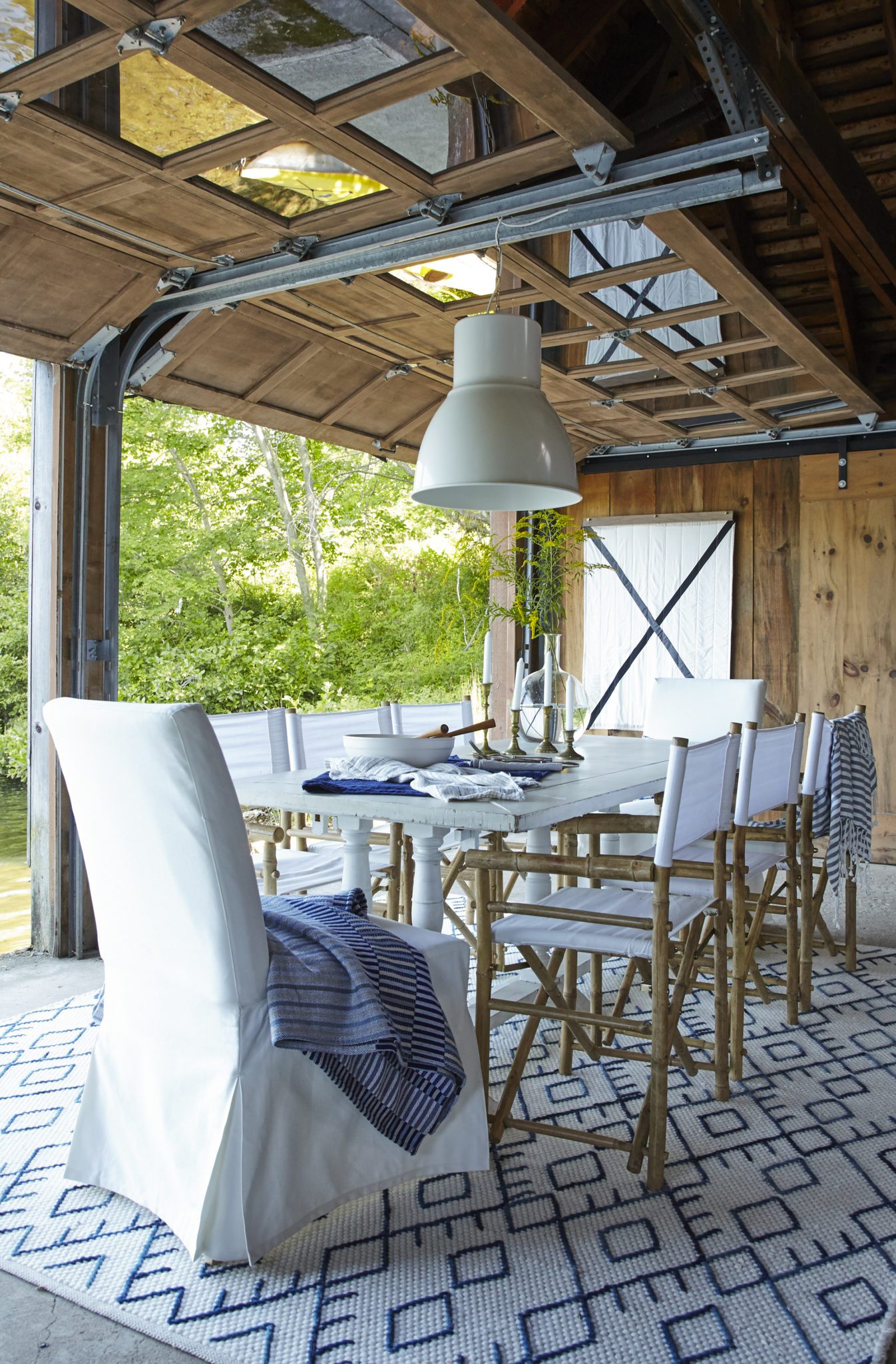
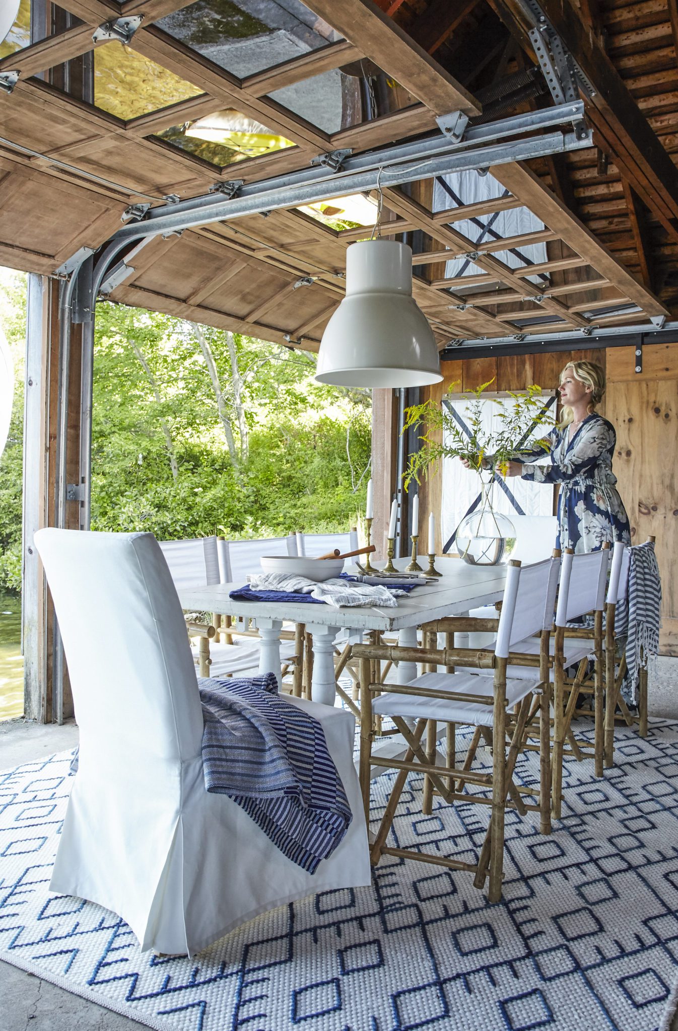
With a space this big, we decided to divide it up for two different uses: a big seating area for family to watch TV, enjoy the fire, read, and entertain, and a dining area for family meals. Here’s the layout I shared with Emily as we began planning:
I also included some mood boards to help guide the crazy amount of pulling we had to do in three days! After a couple of design iterations, this is what we landed on:
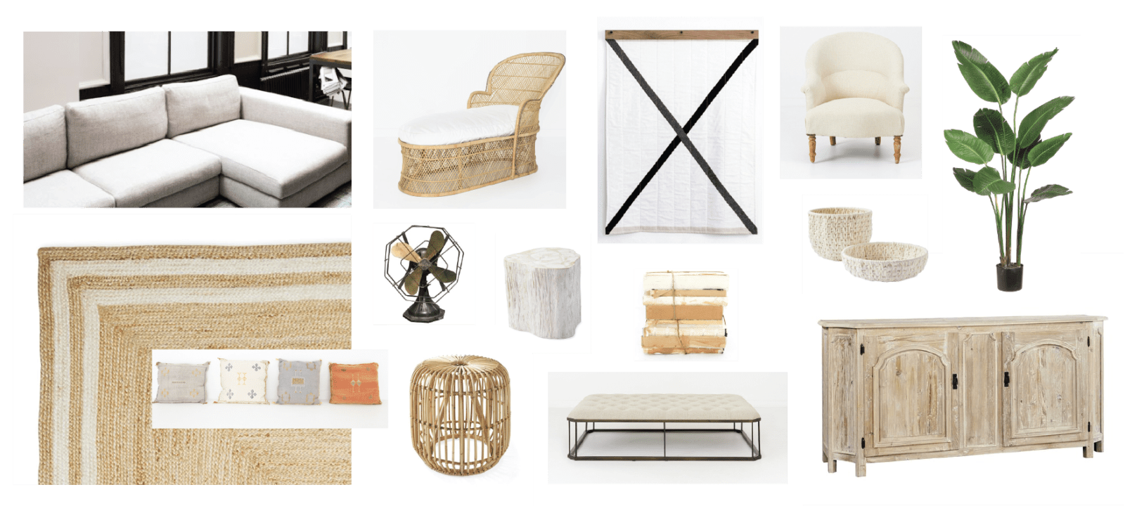
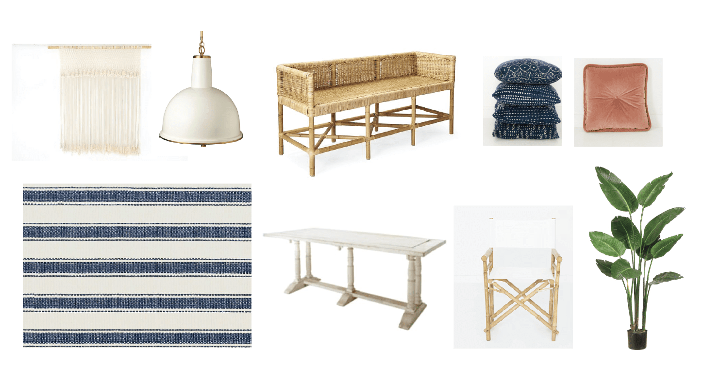
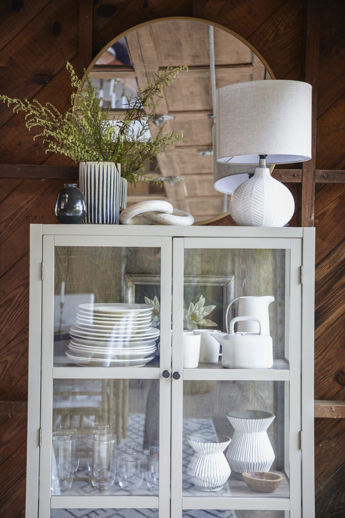
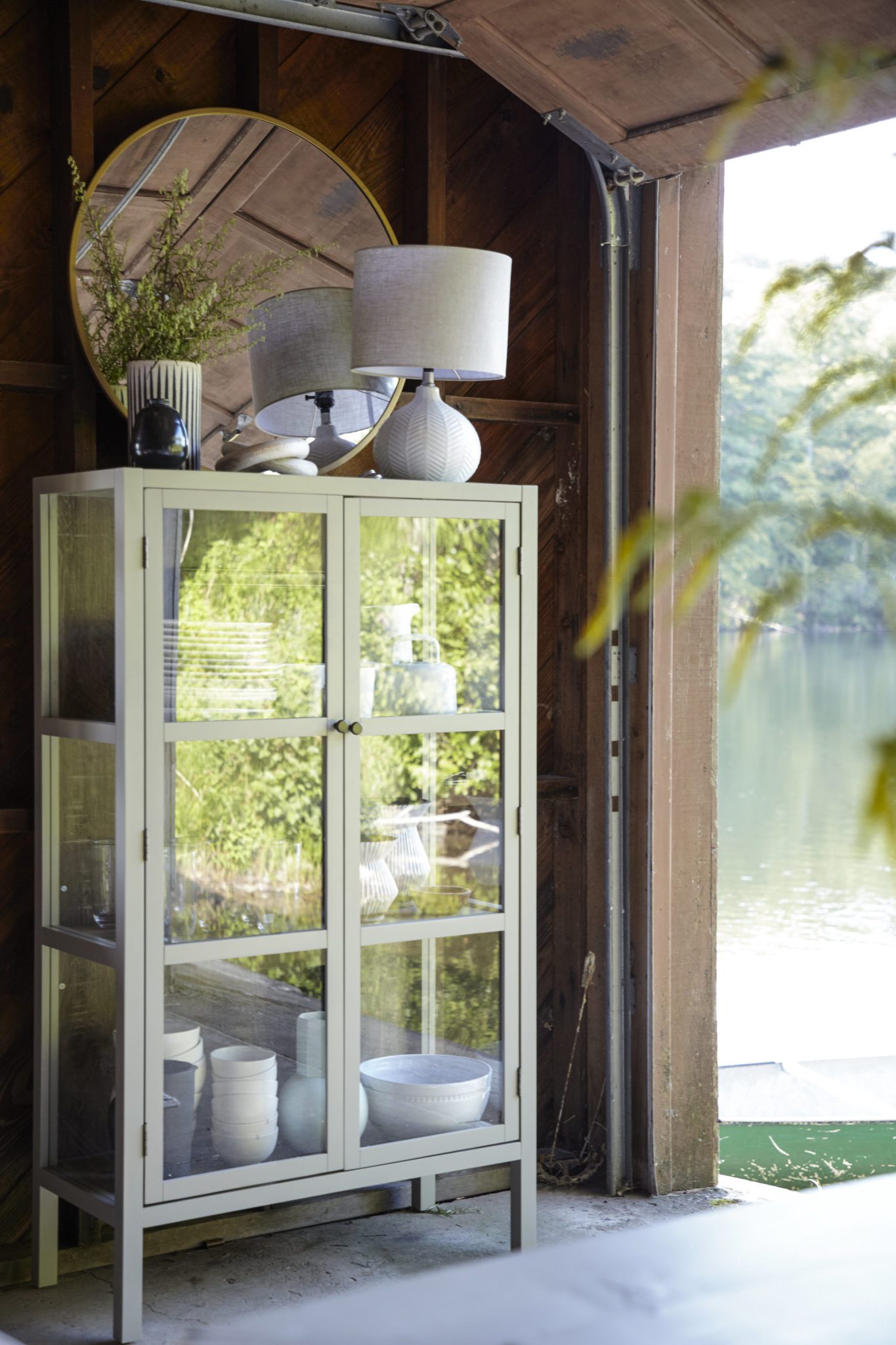
We brought in TONS of light and airy pieces that had enough weight and size to fill the space. We wanted it to feel inspired by the location but not overtly nautical… we decided if we kept one of the beautiful canoes hanging from the ceiling we didn’t need to overdo it with any miniature boats, seashells, or anchor motifs!
The space was officially “designed” less than a week before I was due to fly out to New York, and Emily and the team were already on location working on the others spaces (you gotta check out The Greenhouse and The Barn!!) so we collectively did outreach, pulling from our favorite vendors and we begged and prayed the pieces would arrive in time to film!
After watching Emily juggle everything that week, I’m thoroughly convinced she is some sort of super human.
Once I arrived on set, the crew cleaned out the space so we could get a good look at what we were dealing with. Here’s how the space cleaned up after hauling everything out and giving it a good clean:
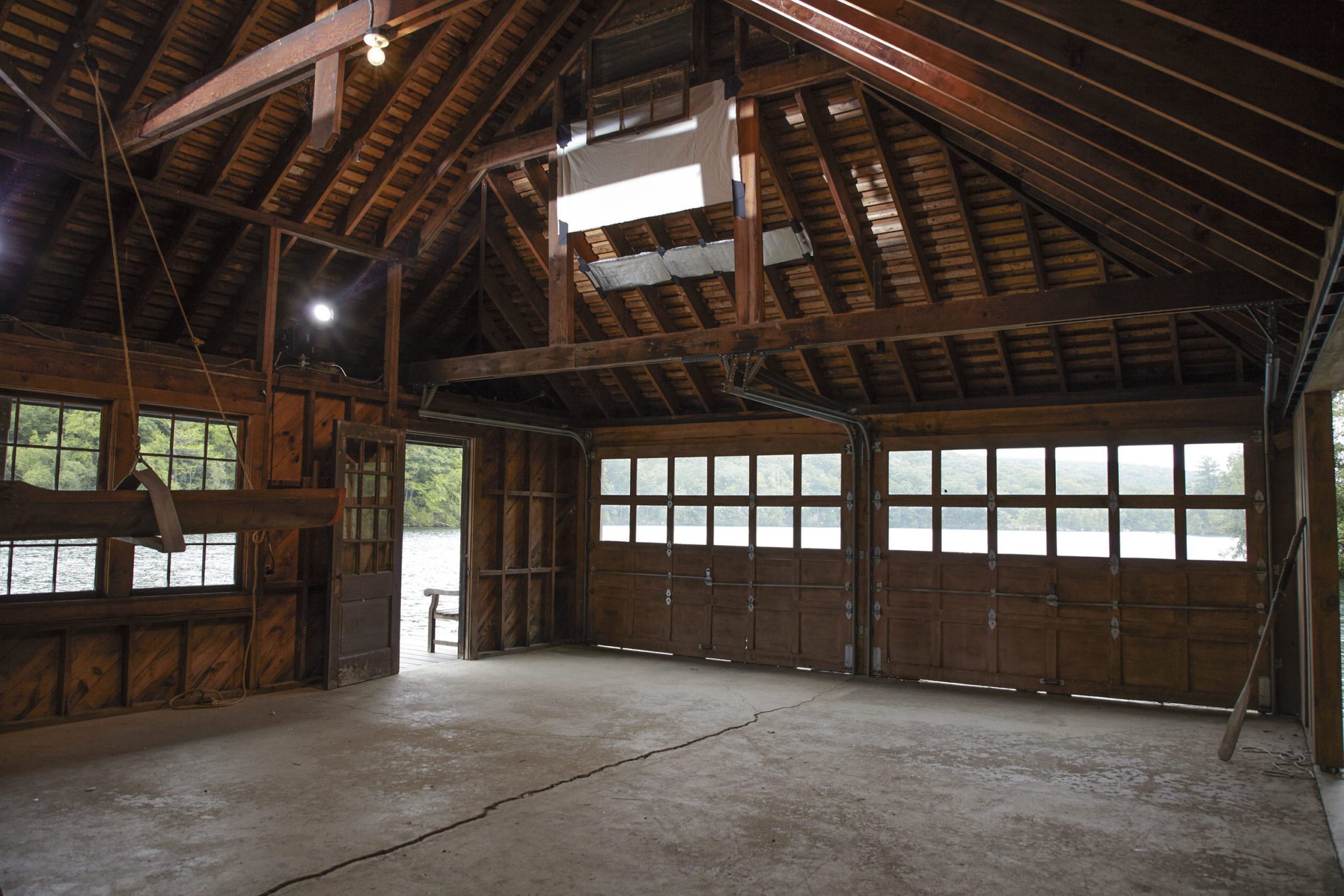
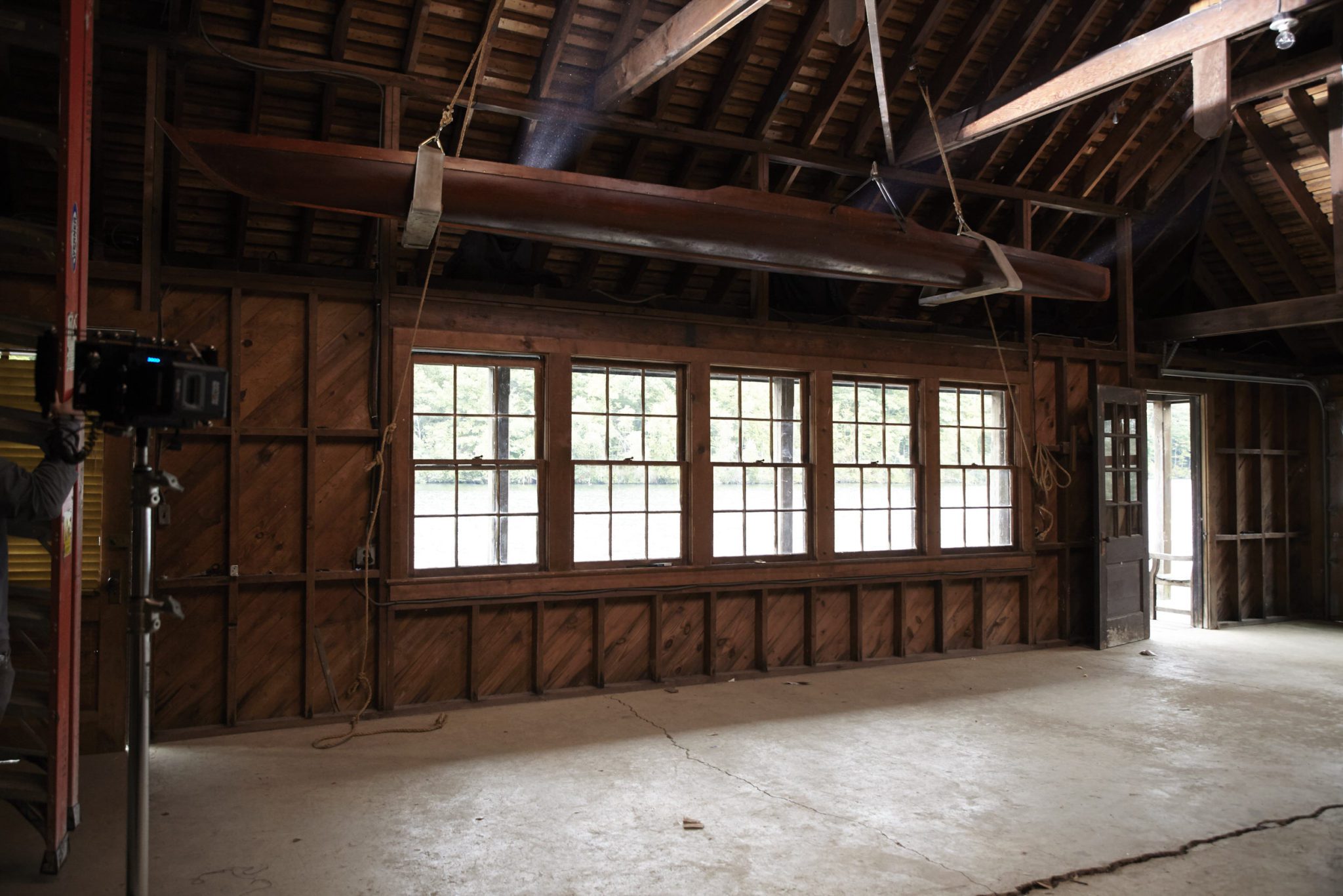
So pretty!!! Once the space was clean, Emily and I went to work. Here’s a great time-lapse video of us bringing in pieces and props. It was so fun to collaborate with her on bringing everything together. I know just enough about interior design to be dangerous and left this experience with a new appreciation for her vision and ability to think on her toes.
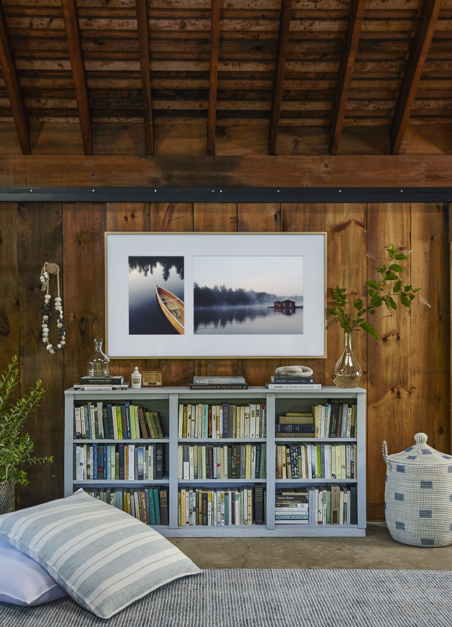
The final space was designed with The Frame in mind. We decided to anchor the TV in the center of the room so it would be visible for everyone visiting the space, no matter where you were sitting. What was really cool was I was able to showcase some of my favorite photos from northern Minnesota on The Frame! These were taken on my phone, so you can see you don’t have to have a fancy camera to frame your own artwork. With the Smart View app, you can even customize the color of the matte, orientation of the collage (between 2 to 3 images) and upload everything right from your phone. A must-have option for someone like me, that is constantly changing the look of a room.
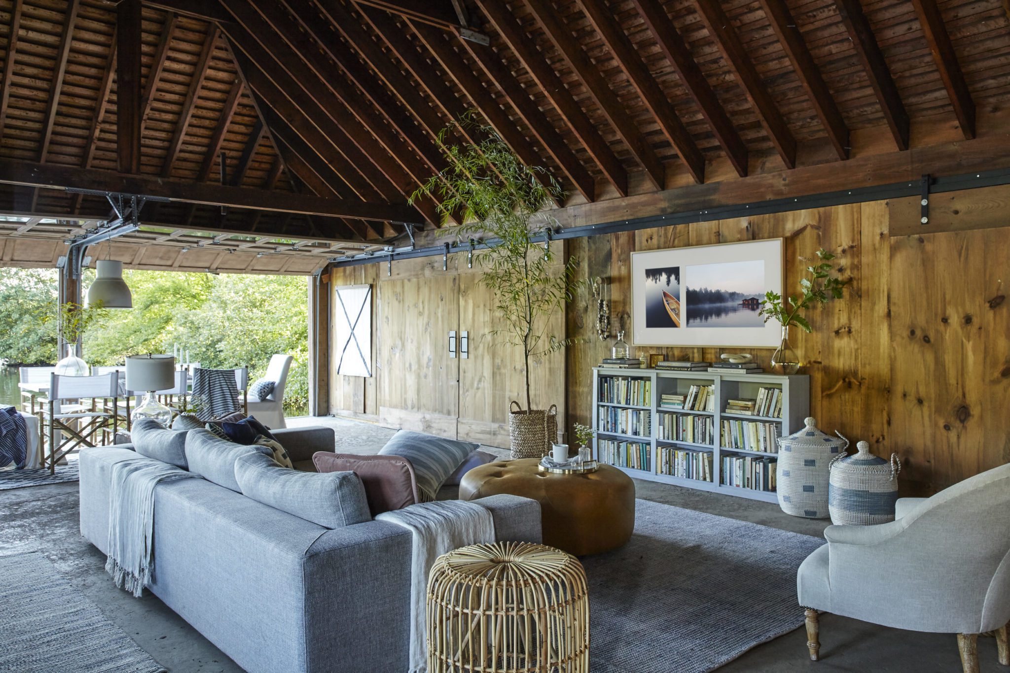
The whole space feels warm and cozy, nautical but not too theme-y, and totally functional for a large family.
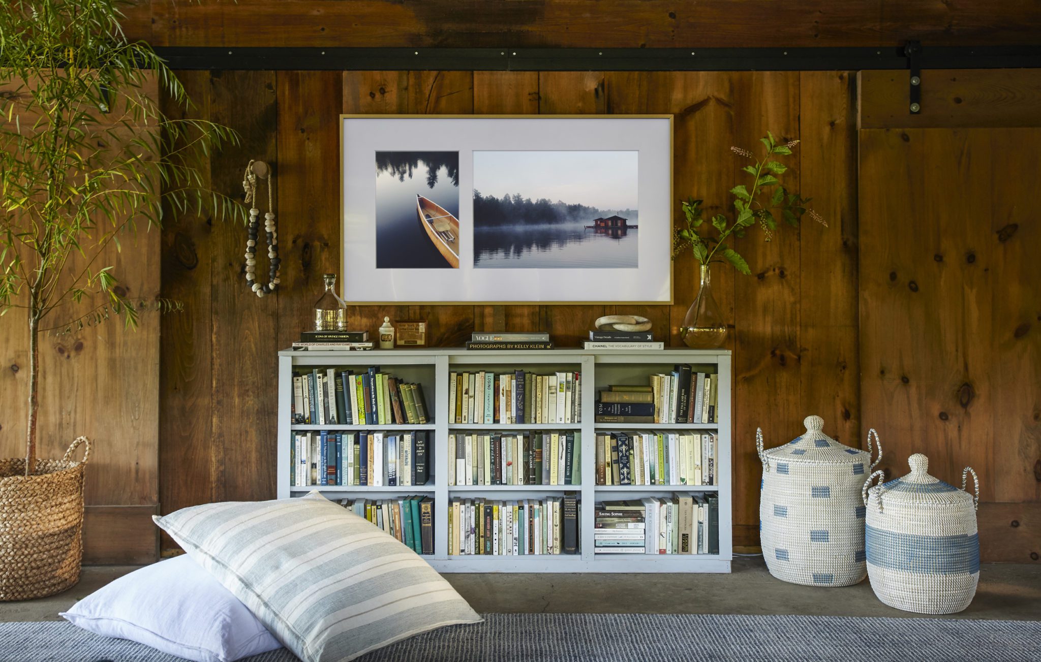
OK. So for those of you who want the DEETS on The Frame, here’s the 411, per the series Emily is hosting:
- The Frame comes preloaded with one hundred pieces of curated art for you to choose from. There is also the option to purchase hundreds more, plus they are constantly adding artwork selected by curators. It includes every medium and style – drawings, paintings, illustrations, and photography.
- YES, you can upload your own art or family photos – like I did with my phone photos.
- The Frame doesn’t turn off like your regular TV, so say goodbye to that big black box in your living room. The power button goes from Art Mode to TV mode. If you WANT to turn it off, versus allowing the motion sensor to turn the TV off after you’ve left the space, you simply push the power button twice.
- You bet it’s a normal Smart TV. 4K definition and can play everything from live events to Netflix marathons.
- You have 4 customizable frame options: black (standard – how it comes), White, Beige Wood and Walnut. I have Beige in my living room, which is also featured here.
- It sits flush to the wall like a picture frame. This is my favorite feature. Unlike most wall-mounted TVs that stick out 4-6″, this rests on the wall just like you’ve hung a piece of art.
PHEW! This was such a big, cool project and believe it or not, my space was one of FOUR spaces Emily designed with different creatives. You don’t want to miss her handy work in these amazing spaces: a Greenhouse, a Barn, and a Barge! She did it all in 11 days, too. Ridiculous!
To learn more about the project, visit Emily’s recap here. We’ve also shared her mood board and final links of the pieces used in the space below. All the sources can be found on EHD!
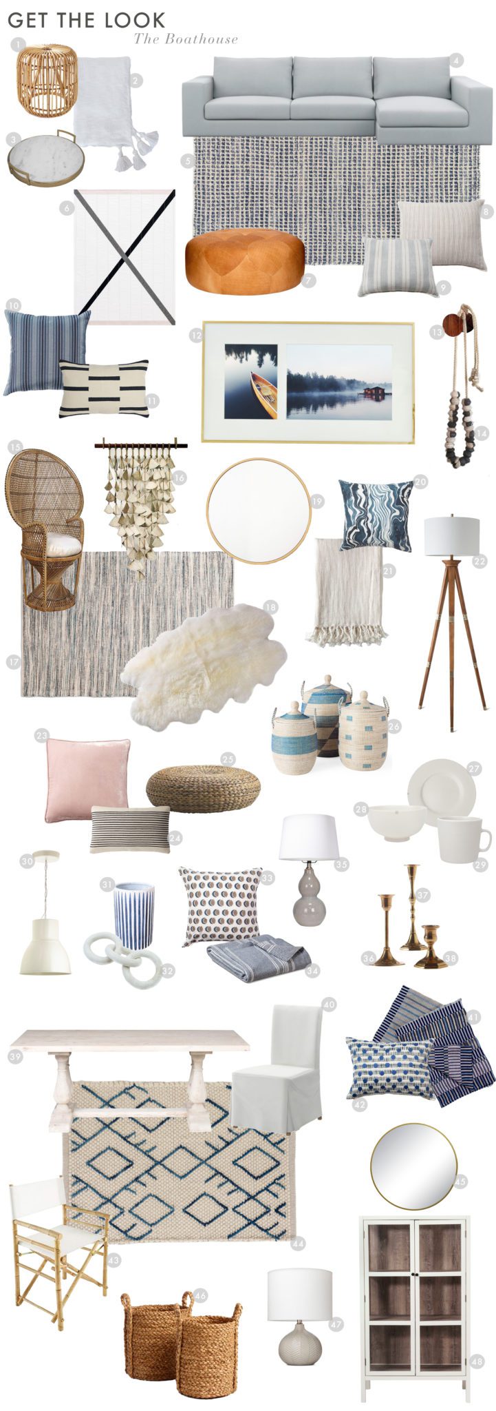
1. Rattan Side Table | 2. White Tassel Throw | 3. Marble Tray | 4. Sofa | 5. Homer Rug | 6. ‘X’ Quilt | 7. Leather Coffee Table | 8. Natural Stripe Floor Pillow | 9. Blue Floor Pillow | 10. Blue Ombre Pillow | 11. Dash Stripe Pillow | 12. Samsung The Frame | 13. Wood Hook | 14. Ceramic Beads | 15. Peacock Chair (similar) | 16. Ceramic Wall Hanging (similar) | 17. Blue Woven Rug | 18. Sheepskin | 19. Large Brass Round Mirror | 20. Marble Stripe Pillow | 21. Natural Throw Blanket | 22. Wood Floor Lamp | 23. Pink Velvet Pillow (similar) | 24. Stripe Lumbar Pillow | 25. Wicker Stool | 26. Blue Wicker Basket Set | 27. Dinner Plate | 28. Bowl | 29. Mug | 30. Pendant Light | 31. Blue Stripe Vase | 32. Ceramic Links (similar) | 33. Sun and Moon Pillow | 34. White Stripe Throw | 35. Gray Table Lamp | 36. 6″ Brass Candlestick (similar) | 37. 9″ Brass Candlestick (similar) | 38. 3″ Brass Candlestick (similar) | 39. Dining Table (similar) | 40. Fabric Dining Chair | 41. Stripe Throw | 42. Dot and Dash Pillow | 43. folding bamboo director chairs (similar) | 44. Tan Rug | 45. Brass Mirror | 46. Wicker Basket | 47. Herringbone Table Lamp | 48. Library Cabinet
——
A huge thanks to our favorite brands that helped make this project a reality by loaning us their beautiful products. Thank you, Serena and Lily, Dash and Albert, MQuan, Pom Pom at Home, Canvas Home, Louise Gray, Interior Define, Article, Rejuvenation, West Elm, Rebecca Atwood!
—
Ed. note: This post was sponsored by Samsung. The compensation received in exchange for placement on Wit & Delight is used to purchase props, hire a photographer, write/edit the blog post and support the larger team behind Wit & Delight.
While compensation was received in exchange for coverage, all thoughts and opinions are always my own. Sponsored posts like these allow for the development of additional dynamic content to be produced, unsponsored. Thank you for supporting our partners!

Kate is the founder of Wit & Delight. She is currently learning how to play tennis and is forever testing the boundaries of her creative muscle. Follow her on Instagram at @witanddelight_.
BY Kate Arends - December 11, 2017
Most-read posts:
Did you know W&D now has a resource library of Printable Art, Templates, Freebies, and more?
take me there
Get Our Best W&D Resources
for designing a life well-lived
Thank you for being here. For being open to enjoying life’s simple pleasures and looking inward to understand yourself, your neighbors, and your fellow humans! I’m looking forward to chatting with you.


Wow, I love the outcome. Such a beautifully-designed space. Congratulations! 🙂
–
Charmaine Ng | Architecture & Lifestyle Blog
http://charmainenyw.com
What a beautiful space, and what a beautiful interior! It’s easy to go a little too nautical in these sort of spaces but the balance is just great.
I watched the YouTube video and was completely amazed and you and Emily turned the space around. Plus, I now have the Frame tv on my wishlist. 😉
Beautiful. I especially love the blue bookshelves under the TV–I’m assuming because they’re not listed they were a vintage or used find?
What a transformation!
Thank you sharing this amazing makeover of a boathouse. It truly looks amazing. The wooden paneling gives off a cozy and warm vibe. It is the perfect place to hangout with friends and family and have a impromptu picnic. I totally love the rugs and the throw pillows. I can’t wait to see more makeover updates from you.
Such an inspirational makeover. Thanks for sharing it! Great choice of wooden paneling cos it gives such a cozy and warm vibe. I totally love the rugs and the throw pillows. Looking forward to next transformations from you.
Nice, Great website Thanks For Sharing You have described all this well. That’s what I meant, revelation!