

Originally published in July 2020
If you’re reading this post from the comfort of your home, take a look around your space. (If you’re not, envision what it looks like.) What do you like most about the space? What don’t you like about it? Is there anything about the broader design elements and structure of your home you want to change?
Now ask yourself this: Why do you want to change those things? Beyond the smaller decor decisions that are easy to update relatively swiftly, what is it about the overall design of your space that makes it beg for change?
So much of what we think we know about design is based on what we’ve heard from other people. It’s based on advice from design experts, glossy magazines, and even the pages of this website at times. That’s not to say designers don’t have valuable expertise—they absolutely do. Instead, it’s to say there’s no one exact right way to design a home.
Moving into our home has made me rethink a lot of what I previously thought I knew about design. It’s made me see the beauty in working with what you have before (and if ever) you make major changes.
I’ve been thinking about this topic a lot lately—the difference between what’s labeled as “good” and “bad” when it comes to home design. Moving into our home has made me rethink a lot of what I previously thought I knew about design. It’s made me see the beauty in working with what you have before (and if ever) you make major changes. No matter the style of the home you live in right now (unless it’s in need of updates for safety or functionality reasons), there are ways you can work with your home as it is currently to make it a delightful space for yourself.
Today I’m sharing a few ways you can approach design from a different lens and love your home as it is right now.
This post is not a declaration to stop making the changes you want to make to your home. By all means, please continue to do what works best for you! Rather, it’s a reminder that not everything that falls outside of “standard” design advice is something that needs to be changed. It’s a reminder that it’s perfectly okay to embrace things that may be considered slightly out of the ordinary, slightly dated, or slightly imperfect.
Consider this post as a starting point, full of the ideas that are currently front of mind for me. If you have additional ideas on the topic, please share them in the comments below!
1. Let it be.
First thing’s first! Let your home be.
Whether you’ve just moved in or you’re only now getting the itch to make changes to your home, allow yourself the time to pay attention to the look and feel of the space before making any updates. Even if it’s a home you’ve lived in for years, if you haven’t actively been paying attention to its intricate characteristics, it’s possible there’s something you may have missed along the way.
Since moving into our home, I’ve been continually surprised by how much I’ve grown to love things I used to think I wouldn’t like.
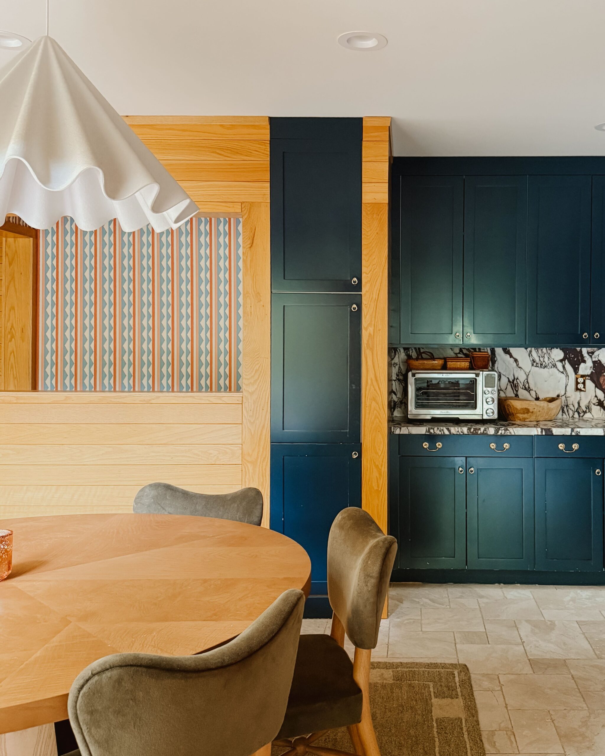
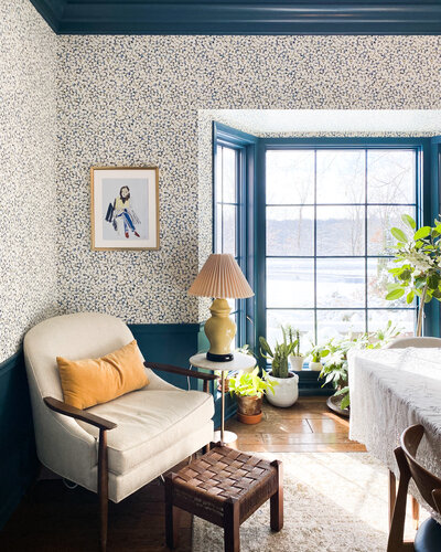
Bold colors on all four walls? Big fan.
Interior shutters in the bedroom? They’re oh-so practical, and we’re actually planning to keep them in the long run.
Even the closed-concept kitchen and main living spaces are things I’m growing to love, after years of being fed the message that open-concept is the only way to go.
Before you paint, before you switch out lighting, before you embark on a remodel, consciously pay attention to how the spaces in your home look and how they change throughout the day and night. Focus on how you naturally use them, so if and when you do make design changes in the future, you’ll have a really clear idea of what you would like to update to optimize your home for you.
2. Accent, accent, accent.
One of the best ways to create areas of interest in your home is to design around spaces that are already natural accent points.
Add a runner to accent a long hallway that connects the main living areas of your home. Or, if you’re looking to hang a gallery wall or paint an accent wall, consider choosing a wall that’s already organically highlighted through the structural nature of the space. Maybe it’s an alcove in your entryway or a slanted wall leading up the staircase.


If you can’t immediately pinpoint these features in your home, take a moment to consider the following. When you walk into a room, where is your eye naturally drawn? What wall or other structural feature stands out immediately? Instead of being overwhelmed by a large space or a somewhat blank canvas, first focus on highlighting the area that most immediately captures your attention, then design around that.
3. Work with dimension.
Depending on the feeling you want in a particular room, you can work with the existing characteristics to create a specific design approach. Here are a couple of examples of this in action.
If you want to make your space feel bigger:
- Hang a mirror or two to reflect light throughout the day.
- Utilize light paint colors throughout the space.
- Consider furniture pieces that have visible legs. The open area below the furnishings will visually open up your space a bit more.
- Add a bookcase, tall plant, or floor lamp—pieces that draw the eye up and “fake” the illusion of height. Or, hang artwork higher on the wall to direct attention upward.
- Hang curtains higher and wider than the height and width of the actual window, to open up the space even more. Additionally, choose light, gauzy window coverings to let in more light.
- Consider incorporating clear pieces, like a glass or acrylic side table, to take up less space visually.
If you want to make your space feel more intimate and cozy, do the opposite! Go for dark paint colors, keep accent pieces slightly lower to the ground, and use fewer mirrors in the area.
4. Experiment with the layout.
If you’re feeling like the layout of your space isn’t quite working, before rushing to buy new furniture that “fits” better, consider whether there are ways you can shift the layout to flow more easily and be more functional.
Start by actively paying attention to what it is about the existing layout that does and doesn’t work well. Are you able to move easily throughout the room? Does your current layout optimize the activities you do most in the space?
Next, feel free to experiment with different layouts on your own. As an example, when we first moved into our house, we put the TV over the fireplace in our family room. After a few weeks, we decided to move the T.V. to the wall that’s to the left of the fireplace. After we spent some time using the room, we realized that was the flow that worked better for us. Plus, placing the TV on a larger wall allowed me to hang a gallery wall that spilled out around it. It was a creative experiment with a result I love.


5. Amplify your home’s design traits.
Do you live in a vintage walk-up? Or a home with influences straight out of the ’80s? Why not bring in a piece or two that pays homage to the home’s existing style? Instead of relying solely on new buys, try your hand at shopping for vintage pieces. They have the power to amplify the already unique character traits of your house.
If your home has arched doorways throughout, consider bringing in an arched mirror or piece of artwork to echo the structural quality of the space. If your home has midcentury modern elements, consider bringing in a midcentury modern credenza or side table. Or, if your home has ornate structural accents like crown molding, consider adding an embellished frame or patterned furniture to accent its somewhat maximalist aesthetic.
There is no designated design guide that’s “right” or “wrong.” There’s only the life of your home and how you choose to embrace it and highlight its quirks.
The advice above isn’t the be-all and end-all for how to design within the existing characteristics of your home. Rather, it’s an invitation to start thinking differently about how you approach your spaces. There is no designated design guide that’s “right” or “wrong.” There’s only the life of your home and how you choose to embrace it and highlight its quirks.
The best part about design, I’m continuing to learn, is that it’s a safe space for us to be creative. Design might at times feel like an objective endeavor, best done by following rules and guidelines. However, it’s actually a very subjective process—one that should be dictated by what works for you, your family, and the space in which you live.


Kate is the founder of Wit & Delight. She is currently learning how to play tennis and is forever testing the boundaries of her creative muscle. Follow her on Instagram at @witanddelight_.
BY Kate Arends - May 5, 2022
Most-read posts:
Did you know W&D now has a resource library of Printable Art, Templates, Freebies, and more?
take me there
Get Our Best W&D Resources
for designing a life well-lived



Thank you for being here. For being open to enjoying life’s simple pleasures and looking inward to understand yourself, your neighbors, and your fellow humans! I’m looking forward to chatting with you.
Hi, I'm Kate. Welcome to my happy place.







I love this article. We move shortly into our new forever home- an 18th century farmhouse and we have a long list of wants and must dos- one decision we have undertaken is to live in it first, feel it and see the house and then start making decisions . Great post
I’m so glad this article resonated, Debbie. And what an exciting move! I hope all goes well with the transition!
This is refreshing! I’ve been long bored with the “gut and replace with sponsored product” model of interior design that is common on blogs and results in everything looking the same. It pains me to see yesterday‘s designs scoffed at without acknowledging changing tastes. My own experience with many homes is that exceptional, unique and character filled homes can’t just come from buying vintage accessories. You need some vintage architecture, even dated finishes or quirky features. Due to lack of funds I’ve often had to live with what is, and have learned to love and appreciate the soul this can… Read more »
Thanks for your thoughtful comment, Jody! I’m so glad you find this approach as refreshing as I do.
So many beautiful accents in your home! Thanks for sharing!
Thank you for this post! We recently moved into a home built in 1957 and still has original cabinetry, Formica countertops, and lighting figures. People are constantly telling me to add this and remove that and I really just love it the way it is!
Thanks for taking the time to comment! People are always going to feel the need to give their input…try to listen to your gut and don’t change anything you don’t want to!
Are you able to share where you found the horse painting? It is exactly what I have been looking for! (My mother was a professional rider and lived on a farm, horses were her life so I am trying to incorporate them into mine:)).
Thanks,
Rachel
http://www.homesweethomestore.com
Hi, Rachel! I love that you’re incorporating horses into your life too, that’s such a sweet way to honor your mother. The horse painting is actually a rotating background on our T.V. (it displays art when not in use!) and unfortunately, I’m not sure of the artist. Thanks for checking!
Thanks, Kate Arends. You have mentioned all the points that are helpful in updating the home design. Yes, to bring high quality interior design, experimenting with the room layout gives a satisfactory result and it goes a long way according to our needs.
Please keep sharing interesting ideas with us
True story! I agree that design is so subjective. For me, it’s never right and wrong. I have to set up my new room and there are a plethora of options, but I am sure now that I am on the right track after reading your article as you mentioned about observing space and taking time before making changes. Thanks for sharing the information!
Thanks for your comment, Rashi! I’m glad you found the article helpful!
These were some very good tips. I am taking a small interior design course online and I will be definitely adding #2 to a space I am designing.
Thanks for your comment, Lauren! I’m glad you found the post helpful!
It is really impressive with your style of decoration. Home design can not be easy process for all people. Thanks for your ideas to make such process to be not so complicated.
https://homeia.com
This is really great advice I’ll be using when we move into our new home in a couple years 🙂
I’m so glad to hear you found the post helpful, Wendy!
Love this article. I had such plans when I moved into current house & ditched them after a few months. They would have completely killed the natural flow of the house. I’m still not completely SOLD on the kitchen being in the centre of the house but works – from there I could keep an eye on kids, dogs, visitors.. Have knocked down a few walls & turned some doors & small halls into cupboards.. Colour is an interesting one! Not sure where [how] I dreamt up my kitchen design. Everyone said NO! You can’t mix all those materials &… Read more »
YES. I completely agree that research and trusting your gut are KEY in designing the home that fits your wants and needs. Thanks so much for your comment!
I totally feel this. We are slowly DIYing our cottage home and garden. The original 1930s Norwegian style salt box home was added onto over the years, has many quirks, and was a poorly maintained rental before we rescued her. I jumped into painting bedrooms and bathrooms fresh pale colors but waited on the horrible grey living room as my husband was demoing an adjacent wall. During a week he was away some art buyers who missed my show requested a viewing. I washed the walls and tossed a gallery wall up on the hideous grey (initially to cover areas… Read more »
I love this story! This is such a great reframe. Thank you for sharing!