

Selecting the right paint color can be a daunting process, especially if you’re unsure of what you’re looking for. Before I had any experience working with paint, I would gravitate towards all neutral, unassuming colors in fear of covering my walls with something I would eventually get sick of or would clash with the rest of the room. I figured if I stuck to painting using soft greys and warm whites, I would be able to design and decorate with anything I wanted for years to come.
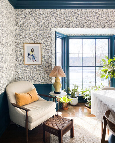
In some aspects, my theory wasn’t wrong, as choosing a neutral backdrop does indeed allow you to go a little crazy when designing the foreground. What I didn’t realize was that in doing so I was capping the potential of a space, relying too heavily on the influence of the furniture and decor. Once I finally gained the confidence to step outside my color comfort zone and started experimenting with new shades, I quickly learned how powerful paint is in establishing the look and feel of a space. Our home office is a perfect example, painted using a stately shade of deep blue. When designing the room, I knew I wanted to differentiate the look and feel from the rest of our house, making it feel like a true workspace. The bold color did exactly that, grounding the room while adding a fresh dose of difference.


Shortly after ringing in the new year, the Wit & Delight editorial team put together a round-up of 6 paint colors you can expect to see covering the walls of your favorite designers’ bedrooms in 2018. The eclectic mix of bold colors included peach, hunter green, cream, medium blue, terracotta, and saffron.
I don’t mean to toot my own horn, but we high-key nailed it; our forecasting was spot on. Saturated yellows fill my Pinterest feed daily and terracotta is no longer an adjective exclusive to creatives. If you still aren’t convinced, take it from paint powerhouse Sherwin-Williams®. Their Director of Color Marketing, Sue Wadden, recently announced July’s Color of the Month: Indigo SW 6531, a bold, deep shade of blue.


Historically known as the “world’s favorite color,” Indigo is vibrant, clean and full of energy. Paint color expert Wadden suggests pairing the ocean-inspired hue with whites or yellow-based neutrals to avoid competing with the vivid blue. This is a BOLD color, not unlike the blue office. Still not convinced to go BOLD? We’ve gathered some Pinterest-worthy inspiration that just may change your tune.


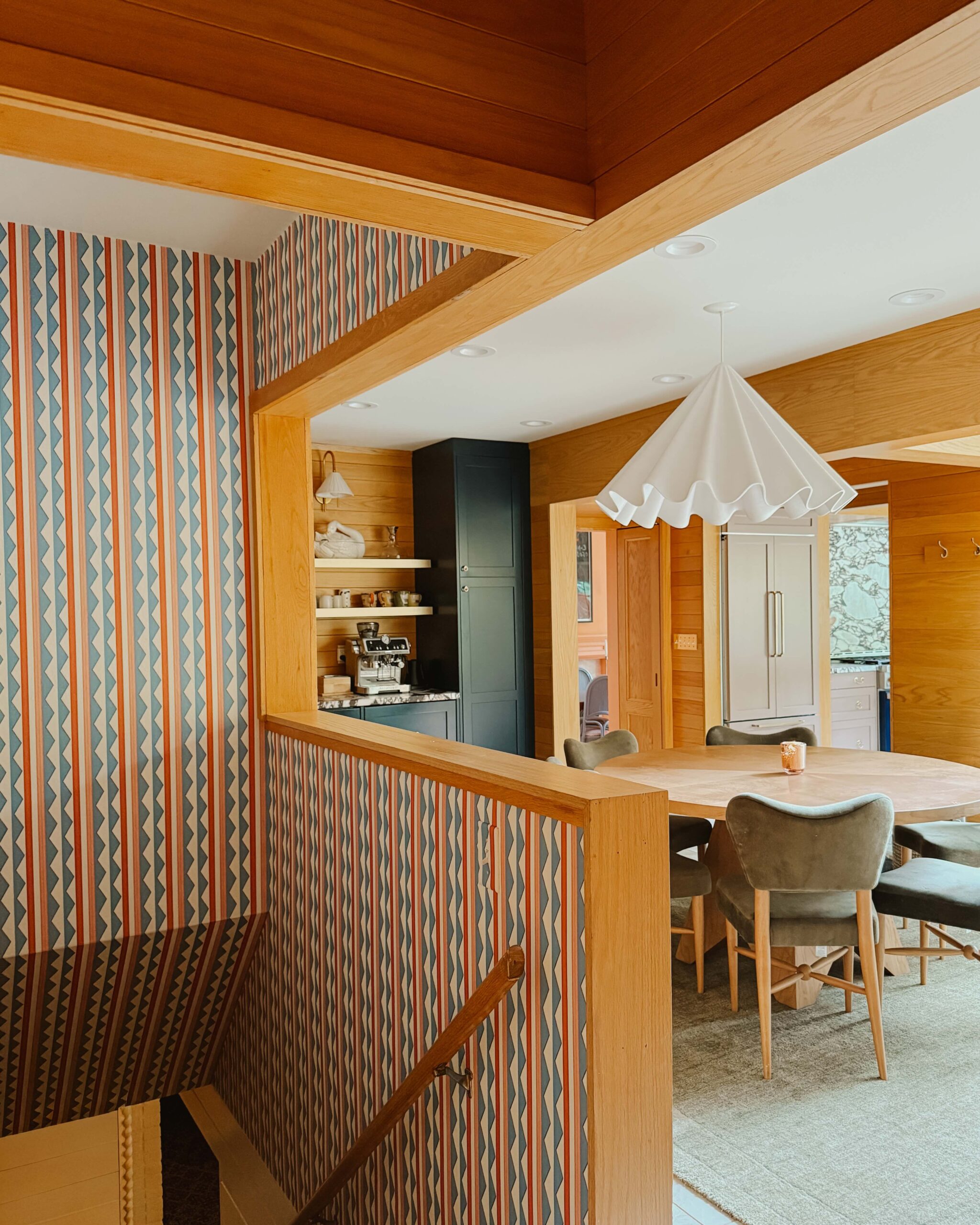
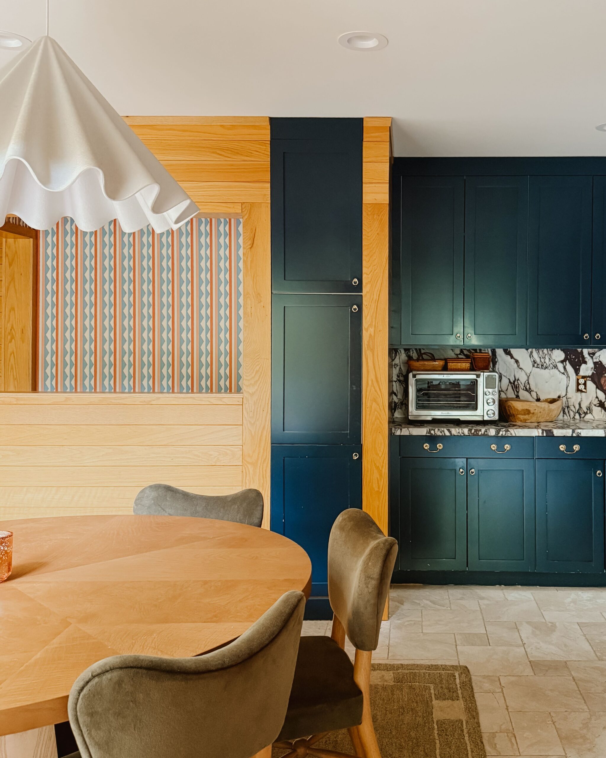
Always looking to share our design POV, we decided to work with long-time contributor Liz Welle, to refresh a space in her beautiful Minneapolis home. As someone who admittedly avoids change (don’t we all?), Liz expressed her fears about using a bold paint color. Although she was interested in switching things up, she also wasn’t ready to give up on the overall design aesthetic she has established since moving into the house. After some encouragement from yours truly, Liz decided to paint a wall Indigo SW 6531 in the sunroom inside her entryway. The decision felt right; Liz was making a brave decision that would bring fresh change, without the commitment of covering the entire interior.


The results: just as bold and lovely as we imagined. The added pop of color amplifies the overall mood, taking the space from good to great. Hey Liz, next girls’ night at your place?


Ed. note: This post was sponsored by Sherwin-Williams®. The compensation received in exchange for placement on Wit & Delight is used to purchase props, hire a photographer, write/edit the blog post and support the larger team behind Wit & Delight.
While compensation was received in exchange for coverage, all thoughts and opinions are always my own. Sponsored posts like these allow for the development of additional dynamic content to be produced, unsponsored. Thank you for supporting our partners!
BY Kate Arends - July 16, 2018
Most-read posts:
Did you know W&D now has a resource library of Printable Art, Templates, Freebies, and more?
take me there
Get Our Best W&D Resources
for designing a life well-lived


Thank you for being here. For being open to enjoying life’s simple pleasures and looking inward to understand yourself, your neighbors, and your fellow humans! I’m looking forward to chatting with you.
Hi, I'm Kate. Welcome to my happy place.








Well, I quite like the decor with the navy blue walls 🙂 xoxo
http://hiddeninbeauty.com
The picture and information given in the article are awesome. Thank you for the information about Interior Design
Thanks for those pictures, I just love this blue color combination. Great idea and amazing patterns.
This is such a nice post on blue shade. Thanks for the post !
OOOOH…that shade of blue is so pretty! I love the bookshelves. Also, they can add blue accent decor like decorative trays. Navy trays would be a great addition too.
its amazing how the blue created that space of its own…. i love the way accessories add quality to that space!
love the colour combination and the lighting in that room!
This room is beautiful! What is the gray color on the other three walls. It looks beautiful with the Indigo!
Very lovely color, it has a calming presence with the contrast between the blue and white. Very nice photos as well, taken at great angle that shows us the interior of the house nicely. Love it!
It will be useful for you to check https://writemyessay4me.org/blog/compare-and-contrast-essay-topics out before writing your compare and contrast essay. You can find the best topic for your essay here
Very lovely and cool color,