


Home has never been more important to our mental health than it is right now. For me, home is the place I can escape from the worries and fears of the unknown. And I guess the way I’ve been dealing with that stress lately is throwing myself into projects that scare me so much I forget about the real issues in the world for just a moment or two.
As I’ve mentioned before, this home was love at first sight for both Joe and me, and preserving its inherent quirk and charm has helped center us on the roadmap for all our design decisions. This design process has been mildly scary and definitely overwhelming at times, and on occasion, I’ve felt like I was out of my element, but I think that challenge is also what’s excited me most. One of the spaces where I’ve felt that design overwhelm most heavily is in our family room.
Without further ado, let’s move into the paint color reveal we’ve been waiting to show you for more than a month.

That’s right, what used to be the yellow room is now…the GREEN room. Or the yellow-green room. Or the Churlish Green room, if you want to get technical. Allow me to explain how we came to this green paint color for our beloved family room.
The Process of Picking This Green Paint Color

Working in the world that I do and seeing so much decor on a daily basis, I think I got really burnt out by thinking about what colors in this home would appeal to the majority of our readers. Perhaps when you try to please everyone, you lose track of your individuality (what a wild concept…).
I’ve always been a curious person, willing to try just about anything. So why did I feel so inclined to play it safe at home, when I I already knew I don’t get much joy from a design unless I’m taking at least a bit of a risk?
I’ve always been a curious person, willing to try just about anything. So why did I feel so inclined to play it safe at home, when I I already knew I don’t get much joy from a design unless I’m taking at least a bit of a risk?

The final four paint colors we were deciding between.
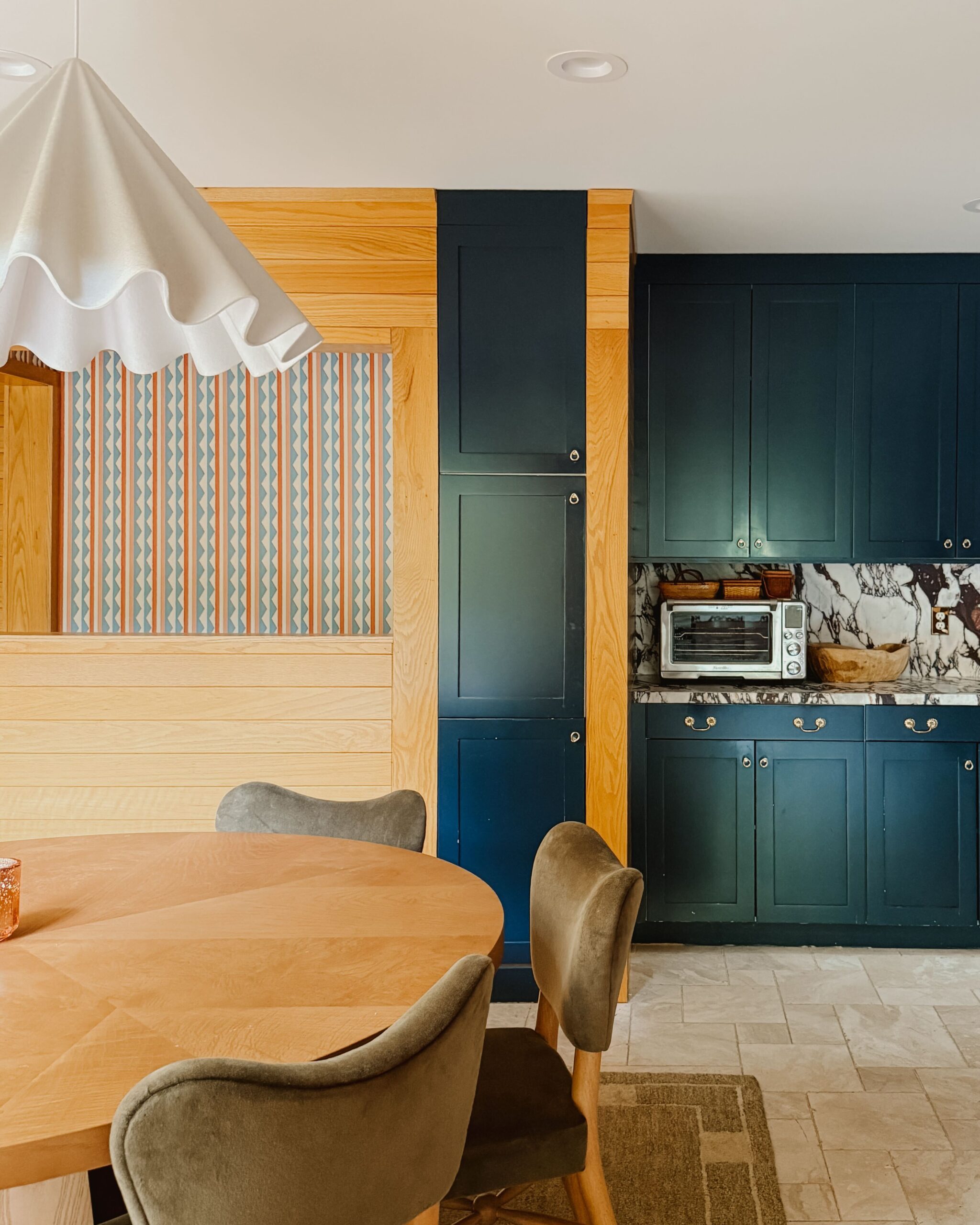
That framework is ultimately what led us to the color we chose for the yellow room: Churlish Green by Farrow & Ball. It’s a little risky but also deeply classic and familiar; decidedly green but with a heavy-handed dose of yellow to it; earthy without being too muddy; subdued enough to hold space for bolder accent colors.
We started off by adding the color to the walls only. We lived with that look for a little while, but ultimately the contrasting ceiling made the room feel smaller, so we decided to paint it green too (pictured below). We lived with that look for about two weeks, eventually deciding that the white trim in contrast with the green room felt a bit dated. So we followed suit with the rest of the house and painted the trim the same color, like the peach room, but in a full gloss finish. Sometimes it takes a little trial and error (and time) before you get to your final result!
How I Stopped Second-Guessing My Choice
When I showed our design consultant, Anne McDonald, the swatch amongst a sea of greens, she was a bit shocked. I had originally chosen Churlish Green as the color for our cabinets, and she called it “a bit out of left field” considering it was not quite yellow but not quite green at the same time. Would it look muddy? Would it play well with other colors? With other materials? With the tone of our flooring? We decided to test out a sample, and when we put it on the wall and started to look at the decor we were going to use within the room, we both grew to love the color in the space.

And then a little later on, when I got cold feet, Anne pointed out that I’d kept coming back to that swatch, over and over again. She said I shouldn’t discount that it continued to speak to me.
I kept coming back to this yellow-green color because it reminded me of being outside. It reminded me of being in Oxford in the spring. It reminded me of juicy ripe pairs, of melon, of the smell of cyprus lemon. It was emotionally and visually interesting, even if the idea of putting it all over one of the larger rooms in our home scared me.
When I reflected on it, I realized I kept coming back to this yellow-green color because it reminded me of being outside. It reminded me of being in Oxford in the spring. It reminded me of juicy ripe pairs, of melon, of the smell of cyprus lemon. It was emotionally and visually interesting, even if the idea of putting it all over one of the larger rooms in our home scared me.

It’s distinctly ours. An exciting color to play with. And a challenge I’m excited to take on.
Our Upcoming Design Plans for This Space
Joe and I have made all the decor decisions in this home ourselves, with a bit of help from Anne. Now that the room is painted, our next step is to finalize the design structure. We’ll be working on the layout of the room and deciding the direction we want to go in terms of the larger design of the space.

This space ultimately acts as our family room, and that’s the perspective from which all of our design decisions will be made. This room is where we relax, watch T.V., and do puzzles. It’s where we unwind at the end of the day, and I want the furnishings and decor to be a reflection of that.

Looking at the space, we decided we needed a really big sectional, and we’ll be purchasing a big velvet green sofa as the primary seating option. We’ll bring in a giant rug in a bright tomato red that will have a lot of energy and that will play up the color in the room. It’s unexpected, but these elements should work really well together. We’ll also bring in a giant light fixture in a natural material as the focal point at the top of the room.

And I know what you may be thinking, but I promise the design won’t feel “Christmas-y.” The green has so many yellow tones and the rug will have a lot of orange and brown in it, so the colors will feel different than those traditionally associated with the holiday.
Because we’ll be using it so widely, green will act as our “neutral” in this space, and we’ll still add pops of color on top of it. I think it’ll ultimately be a really beautiful design.
We kept this reveal a secret because it was such a personal choice. In other rooms we’ve designed, I’ve had a really clear vision of what I wanted. In this room, I felt like there were five different options that would have each been beautiful in their own way. I love imagining it in lavender. In light dusty blue. In a lovely warm cream.

In the end, if you take away anything from following this journey, I hope it’s that using color in such a bold way will always feel a little scary. It requires you to take a leap of faith, trust your vision, and see it through to the end.
In the end, if you take away anything from following this journey, I hope it’s that using color in such a bold way will always feel a little scary at first. It requires you to take a leap of faith, trust your vision, and see it through to the end.

We’re in the messy middle of this renovation, specifically when it comes to this room. I’m excited to be embracing the notion of following my heart, even if it takes me to unexpected paint color choices. After all, the heart wants what the heart wants!

Kate is the founder of Wit & Delight. She is currently learning how to play tennis and is forever testing the boundaries of her creative muscle. Follow her on Instagram at @witanddelight_.
BY Kate Arends - November 23, 2020
Most-read posts:


Did you know W&D now has a resource library of Printable Art, Templates, Freebies, and more?
take me there
Get Our Best W&D Resources
for designing a life well-lived


Thank you for being here. For being open to enjoying life’s simple pleasures and looking inward to understand yourself, your neighbors, and your fellow humans! I’m looking forward to chatting with you.
Hi, I'm Kate. Welcome to my happy place.


I love this so much Kate! Especially when you said: green will be our neutral in this room! Such a perfect way to re-brand what a neutral color MEANS!
Fellow color obsessed designer,
@theartemuse
xx
YES. Exactly. So glad you love the post!
Pistachio was the word that popped into my head when I first saw this room reveal! Absolutely love it both now and for the future plans you have for the room, especially how well it plays with the tone of the beautiful wood floors. Thank you for bringing us along on this journey. I continue to come back to this space to get a dose of something different in a world of interiors that seem so vanilla and minimal.
Pistachio! It’s exactly that. Thank you for following along! I’m so glad you’re here.
Congrats Kate! Looks so great and does evoke lots of memories and emotions! Can’t wait to see the rest of it come together. The sofa and rug plans sound exciting.
Thank you so much, Abby!
I’m obsessed with that color choice! It always jumps out to me in the F&B deck and I’m so happy to see someone use it in such an inspired way! Cheers!
Glad to hear it jumped out to you too! It’s such a beauty.
I love this color for this room! It has such good energy and life!
So glad you love it, Kylie!
Such an exciting reveal! It looks great (especially that photo looking from the library to the family room, it flows so so well!) and I’m giving myself a teeny pat on the back for guessing green in your recent question box. I’m not sure if you’ll go into this more, but I’d love to know about your decision to paint the ceiling, the mantle, and the moldings to match.
A very good guess! We got a couple of questions about this and added a bit of copy to the post too. Here’s some info for you on that front… We started off by adding the color to the walls only. We lived with that look for a little while, but ultimately the contrasting ceiling made the room feel smaller, so we decided to paint it green too. We lived with that look for about two weeks, eventually deciding that the white trim in contrast with the green room felt a bit dated. So we followed suit with the rest… Read more »
Aahhh! My guess was RIGHT! Haha OK, first of all it’s lovely. Second of all, it’s going to be so dang cozy with the red rug. I can totally see it. Amazing!
Good guess!! We can’t wait to add that red rug in (glad you feel the same way).
I’m looking forward to seeing the red rug in the space!!
It’s a revelation when you discover the most beautiful thing about a paint color isn’t the actual color but the way the color resonates with someone brave enough to embrace it. It somehow belongs to them once that happens.
I LOVE that way of framing it, Cary.
The view from the blue room into the green room is a dream! Love your vision for this house.
I love that view too. Thank you, Louise!
It’s beautiful!! I love this so much!! 😍
I’m so glad!!
Wow, stunning! I am getting very English vibes from all of this. What really sold me was the shot from the other front room that includes the entryway as well. Congrats to you on going with your gut and a little out of the box.
Yes me too! That was what made it really settle in and make sense! After seeing that shot, I went back to the initial ones of just the green room and I could “see” them better somehow. Really excited to see how the deeper green, the tomato red, and brown and neutral wood tones deepen the energy in the room!
Yes! The flow between rooms was something we thought about a lot. So glad to hear you’re excited to see more of the design!
That’s music to my ears, Courtney. Very glad you’re liking our approach in this house!
I love this! It’s not what I would have gravitated towards, but it absolutely works and I cannot WAIT to see it with that green sectional. That view from the library is really what convinces me you couldn’t have picked a better color—it’s soft enough to feel neutral but bold enough to be incredibly exciting!
So glad you love it, Ella!
I like this so much I’m leaving a comment which I never do. I LOVE IT! And I love the idea of the primary colors to use for the rest of the room. I love green and red and done right it doesn’t give off a Christmas vibe at all 🙂
Thank you for taking the time to comment, Madeline! Very glad to hear you’re loving the space.
This green sings. The shot of the rooms flowing together is amazing. It’s all so inspiring.
SO happy to hear that, Laura.
I LOVE it!
Thank you!
LOVE! can you remind me of the program you’re using to do all the planning with?
Yes! I used Illustrator and InDesign to put the mood board together. And I used floorplanner.com for the layout!
This reminds me of the color we had in our living room in St. Louis, “Betsy Ross House Moss,” which was in the historic color selection at Lowe’s. I love it!!!
I’m glad this color brought you back, Amy. 🙂 Thanks for your comment!
Love the color and bold choice. My mom had great design sense and had green colored ceilings in our family room in the 90s. When I see your design choices, I’m reminded of her and some of the bold decisions she took.
May I ask what are the dimensions of your room?
I love that. She sounds like a trailblazer. And yes! The room is 20’ x 15’.
Wow, this is so wonderfully unexpected! I love that you are being so bold and challenging yourself in this space. Being guided by how colors and decor resonates with you will turn this house into your home in such a personal way. Thank you for listening to yourself and sharing with all of us!
Thank YOU for following along with the process!
I just KNOW that I wasn’t the only one holding my breath for this reveal and it did not disappoint. That green, wow, what a gorgeous, soothing shade. (I also like how the name of the green is the opposite of what the shade evokes, so playful of the brand.) I love love LOVE the shot of the green room from the blue room – look at how lovely all those colours are together! I’ve always loved living in and around colours but following you on Instagram and W&D has made me embrace colours even more, which I didn’t know… Read more »
It makes me so happy to hear that W&D has inspired you to embrace colors even more. Thank you for your comment!
It’s so good. I can’t wait to see how you put it all together. It looks so pretty with the wallpaper in the room across from it too. I have always respected your design aesthetic, and it’s so fun to watch what you do in this new space.
Thank you, Mariah! That means a lot.
I can taste key lime pie looking at this room (that’s a good thing) and the shot from the blue room looking through is perfect 👌🏻
WHAT a way to phrase it. I love that.
I think this is a good reminder to do what you love. A room should be a reflection of the people that live there. It shouldn’t be a reflection of popular option. What works for you and your home, won’t and shouldn’t be what works in my home. We are all different and homes should each be different. Thanks for this reminder and reflecting you in your home.
YES. Exactly. So well said. Thank you for your comment!
I’ve been so inspired by how many design risks you’ve taken with this house! It has inspired me to reimagine my own space and find what I really love vs what’s popular. I can’t wait to see what else you do with this house! This home is so beautiful and colorful. I am enjoying seeing the process so much even if I wouldn’t make the exact same choices. So refreshing to see unique design like this.
THANK YOU, Kenzie. That means so much. Go with what you love vs. what’s popular always.
I love the direction you took this room in: totally unexpected but it just makes sense! I really appreciate you outlining the design process and trusting your gut on picking colors. We’ve been in our house for almost 5 years and we’re finally getting around to choosing more fun paint colors and wallpaper options (I’m thinking about wallpapering the ceiling to our home office) Thank you for continuing to be a source of inspiration!
I’m SO glad you’re finding inspiration here, Leah. Thank you for following along, and I hope you choose some colors you love for your own home!
I have to admit, when I first saw it, I was questioning it. After reading this whole post and seeing your design plan, I get it. The view from the library with all three rooms lined up is so freaking gorgeous. I can’t wait to see it all pulled together! I love that you’re going with your gut and going bold!
Thanks for your comment, Morgan! Glad to hear you’re along for the ride with us!
It is absolutely delightful, I am loving this journey. Very inspiring.
Thank you, Polly! Glad you’re following along.
Love your color pathway – I had a green kitchen that reminded me of fresh Spring grass and it made me so happy.
So glad you love it, Diane! There really is something about green.
Oh wow this is so beautiful! It’s so wonderful to see all the rooms starting to flow together. A someone who is three months into my first home, slowly working on transforming each beige and dingy space with bold colors this is truly inspiring. I have been slowly painting over old paint and have room by room convinced my partner that painting trim to match actually looks awesome, and painting the ceiling is next on my list of plans so this will probably go in the slide show I will present to argue my case!! It’s been delightful following along… Read more »
VERY glad to hear this may help you in your case for more color! Updating a home is definitely a process, but I’m glad you’re taking it in stride and finding inspiration along the way!
I scroll instagram for relaxation and inspo and your feed never disappoints because it is so DIFFERENT than everyone else. You have a design eye and you are ballsy which I think is the best compliment! I love this room and how it all flows. And I love how you’re letting the previous owners’ love of color influence you. So great!
Thank you so much, Joanne!!
Well, I absolutely adore this color! You had me at green room and then a puddle at your feet when you said tomato colored rug!
YES. I can’t wait to bring the rug in. I think it’s going to really ground the room.
It’s perfect! Bold and classic.
Glad to hear it! Thanks, Hayley.
I love love love this color! My kitchen is the same and it plays so nicely with the original 1951 wood cabinets/trim, stainless appliances, and white countertops. Through the years I’ve thought about repainting and I still come back to this shade of green. Classic!
Glad to hear this shade has had longevity in your home! Thanks for commenting, Kate!
It’s gorgeous! And so fun and calming. I want to hang out in there. Congrats on diving in!
Thank you, Sonja! We love how it turned out.
What is your opinion of F&B paint and did you use their primer? Love the room without the shell topped shelves, they were too fussy.
Glad you love it, Liza! We did not use their primer, and on the whole I really like F&B paint! We’ve had good experiences with their products.
Oooh I’ve had Churlish Green bookmarked for a while–love seeing it in your space!! It reminds me of a juicy pear jelly bean. 🙂
Glad I could give you a peek of how it looks in a room! We really do love the color.