

This is one of the rooms in the house we haven’t talked about a lot yet! And it is one I am SO EXCITED to design. Our kids’ bedroom.
First off, let’s answer one of the questions I’m asked most often: Do your kids share a room? The answer is yes. We had the kids sharing a room in our previous house too. We find that bedtime is a lot easier this way; also, the third bedroom is on the other side of the house and the kids prefer to be close to us. Plus, they’re best friends and really enjoy being with each other. I’m guessing we’ll have them share a room until elementary school.
Today I’m talking about the design of this room including what we’ve updated so far, what we like about the space, and what we’ll be changing in the future. Given that we haven’t shared this room a whole lot before, I wanted to give you a peek at what it looks like right now, before we make any big changes. Read on for all the details!
This is what the room looked like when we first toured the house. The door on the right is the entry, and the entrance to the kids’ yellow bathroom is opposite the entrance to the room, behind the closet in the foreground.


Here’s a wide shot that shows the layout of the space now.


Here’s what we’ve updated so far…
- We added antique beds from H&B Gallery (for locals, this is one of my favorite antique shops in the area!) and new mattresses from Avocado.
- We removed the ceiling fan and moved the chandelier from the library into the kids’ room.
- We added molding around the doors.
- We added new bedding from H&M, L.L. Bean, and Schoolhouse Electric!


What we love about the room currently
- The size. It’s a huge room and great for both kids. They have enough room to play and sleep, plus there’s tons of storage space.
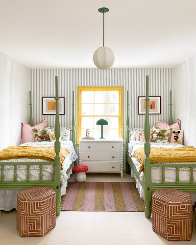
- The antique beds. The posts help them both feel like they have their own personal space.
- The bathroom! They have their own space and can get up and use it in the middle of the night without needing to wake us up.
Our design plans for the space
We ultimately want the design of this room to be whimsical, gender-neutral, a reflection of both the kids’ personalities, and something that makes sense within the design of the rest of our home. Below are the things we’re planning to update, sometime this year or early next year.


Wallpaper
We haven’t fully decided how much we’ll be updating in this room, but we know for sure the wallpaper will be coming down. The room has north and west-facing windows and doesn’t get a lot of natural light, and it needs some additional brightness infused.
In terms of wallpaper color, August wants blue and Bennett wants pink. I’m currently looking at all of the wallpapers in our home and samples I’ve collected along the way. I’d like to figure out how to create some cohesion between the green room, our room, and the hallway that connects each of the spaces (if you want a better sense of how these rooms connect, have a look at the floor plan at the top of this post).
Molding and Trim
We may add additional molding throughout the room to make it feel more polished, as it’s one of the only rooms in the home without a chair rail or molding.
Window Treatments
We will be updating these this month. Right now they are yellow metal blinds that don’t add much to this space. We will be adding relaxed Roman shades in a simple embroidered stripe.


Carpet
This is another element we’re still deciding on…we don’t know if we’ll keep the carpet or not! If we do, we’ll need a really durable carpet that will stand up to wear and tear from the kids and dogs.
Beds
I love the look of their antique beds, although we may eventually paint them. We’re also considering adding canopies to the beds to really give each of the kids their own individual spaces they can retreat to when they need alone time.


Organization
We may implement more organizational solutions as the design of the room comes together. For now, we have the closet, dressers, and a cabinet in the room to store their things in a (somewhat) tidy manner.
Stay tuned for more updates in the near future!


Kate is the founder of Wit & Delight. She is currently learning how to play tennis and is forever testing the boundaries of her creative muscle. Follow her on Instagram at @witanddelight_.
BY Kate Arends - May 12, 2021
Most-read posts:
Did you know W&D now has a resource library of Printable Art, Templates, Freebies, and more?
take me there
Get Our Best W&D Resources
for designing a life well-lived


Thank you for being here. For being open to enjoying life’s simple pleasures and looking inward to understand yourself, your neighbors, and your fellow humans! I’m looking forward to chatting with you.
Hi, I'm Kate. Welcome to my happy place.



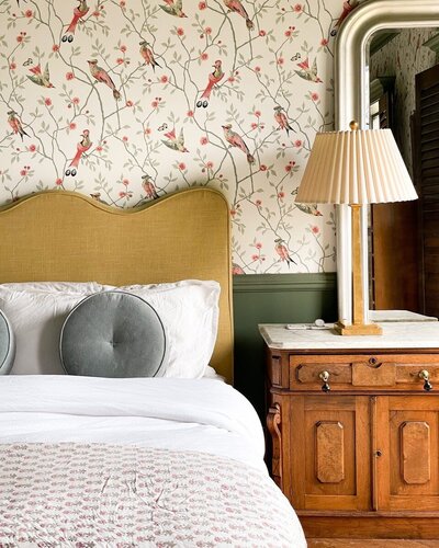



I have to say that I would be tempted to design around that amazing wallpaper! Excited to see what you will do. 🙂
It is a really fun print! I’ll be sure to share more as we make progress!