


Ignore the mess; focus on the potential. That’s what I’ve been telling myself during this latest round of our kitchen remodel. It will all be worth it in the end.
I’m already looking forward to the time when I will look back at all the inconveniences and laugh. (For instance, last week, when we had a photo shoot the same day as our contractors poured the floors. The team and I had to climb in through a window to use the bathroom.)
While there may be inconveniences, there’s also a LOT to look forward to, and this post provides a deeper look at what the kitchen will resemble in its final form. Today I’m sharing a first look at the materials and products behind the kitchen remodel, along with some context behind our decision-making process.
Backsplash
White Oak – Reclaimed and salvaged from the original kitchen
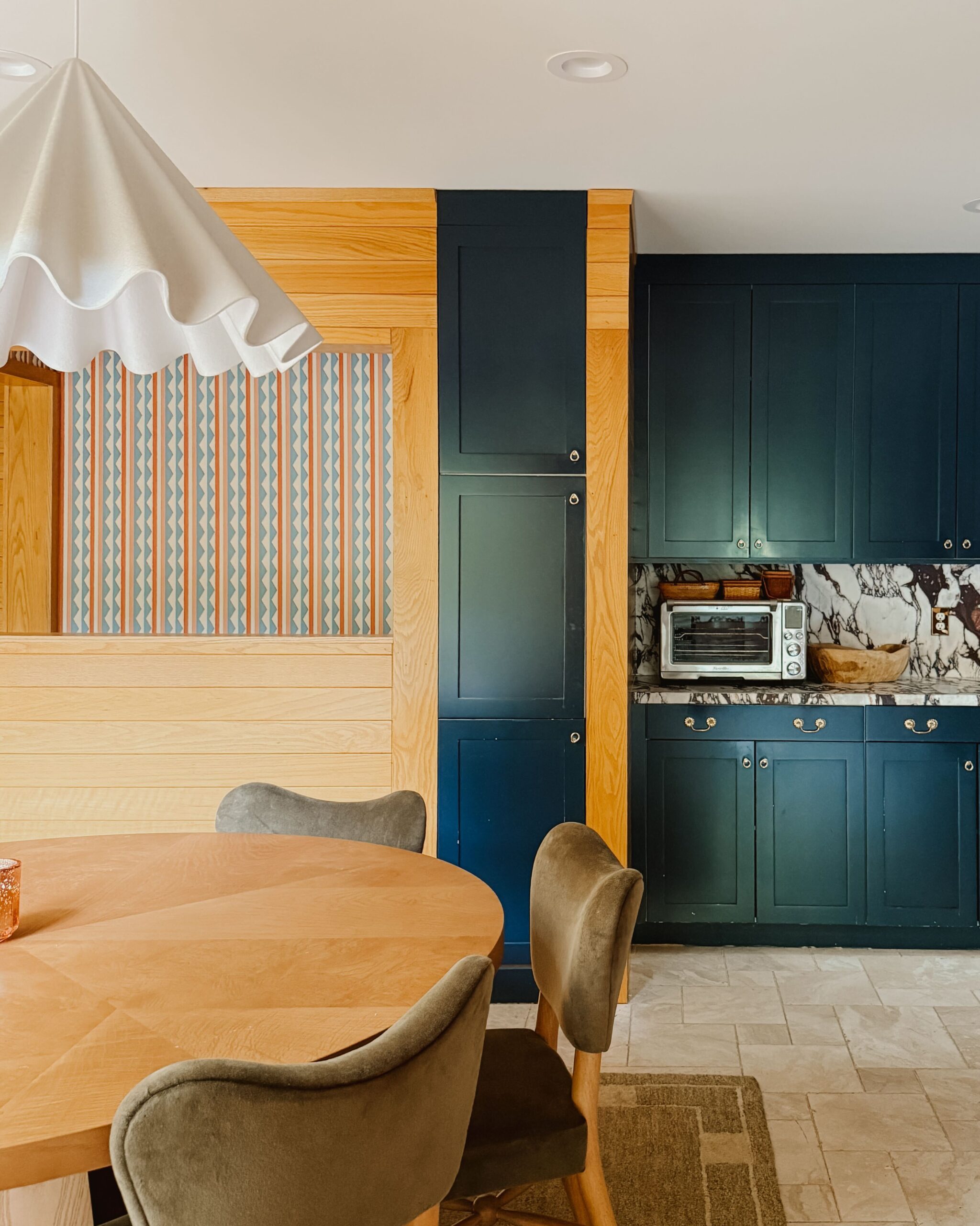
Joe and I loved the warmth and Scandinavian vibes of the horizontal white oak planks added to the original kitchen. We both teared up a bit at the thought (and expense) of ripping down planks, only to replace them with brand new ones in a smaller footprint. Not knowing a thing about demolition or labor, we asked our contractor if it would be possible to salvage the wood to reuse.
It’s not always possible to salvage items, but in this case, we got lucky because Kyle, our contractor, was open to the design challenge (this, my friend, is why you have to work with the right contractor for the right job). Despite the additional headaches and challenges salvaging the wood has caused, I’m SO glad we were able to reuse it! The salvaged pieces will be used as a backsplash in our cooking space in the new kitchen.

Flooring
Queen Beige marble from The Tile Shop
I have a soft spot in my heart for big, bold floors, and my first instinct was a dynamic pattern in rich colors. When I first started this design, I didn’t think that I’d go neutral with flooring (although, to be clear, neutral does not mean boring). The Queen Beige marble has character and is something to be seen and felt up close. It’s a natural stone (stay tuned in the future to read more about why I chose a natural stone) which means more upkeep, but the benefits are worth the extra effort. The Versailles patterning masks the unevenness in the floor (ah, the “charms” of old houses), and the stone’s natural variances conceal the dog hair on the floor. Win-win.
Countertops
Calacatta Viola marble from Artistic Tile
One of the first lessons you learn in design 101 is this: pick your focal point. In our kitchen, that will be the Calacatta Viola stone from Artistic Tile. It’s freeing to look beyond neutrals and go with a bolder choice in color than what I would’ve selected years ago. The Calacatta Viola stone is marble with pink and purple veining that nicely complements the warm honey tone in the reclaimed wood backsplash.
Our north-facing windows in the kitchen tend to mute colors (conversely, southern-facing windows make colors pop), so the pinks and purples that appeared so bold and bright online appear steely gray violet in place. I can’t recommend enough living with physical samples of materials before making any decisions. What looks great in a showroom or online can vary wildly under different environments.

Paint Colors
Welcome to the…..blue pink kitchen. (Side note: I so love referring to the rooms in the house by color; it feels like I’m living in a Wes Anderson movie.) I’m using color to delineate and define the two different areas that make up the l-shaped room using two separate but complementary colors.
I’m painting the kitchen cabinets a lovely shade of pink. Yes, pink. While it may seem like an off-the-wall color for a kitchen, Sulking Room Pink from Farrow & Ball perfectly complements the veining in our Calacatta Viola marble countertops.
For the dining area, we are going with Hague Blue from Farrow & Ball. Initially, we were planning to go with either a rich black or a warm white. After living with the materials and colors, both black and white felt too cold and too traditional. I needed a warm color that wouldn’t overshadow the pink but would instead make it pop, which is why we chose this shade of navy.
The kitchen area is relatively small but super functional. By painting the spaces two different colors, I can visually separate the rooms without altering the layout.

Lighting
From Lulu and Georgia and 2Modern
I love the idea of the kitchen being the heart of the house. The kitchen is where we spend most of our time and I want a room that’s more than a functional workspace to cook. I’ve noticed more and more designs incorporating sculptural lighting elements traditionally found in living rooms into the kitchen, and that’s what we’ll be doing here too.
When it comes to lighting in the kitchen, we’ll be adding a couple of sculptural sconces (one and two) and a large pendant light over the table—one that I have been coveting for years.
Additional Design Details
These are some of the additional products we’re planning to incorporate in the space (although our final furniture selections are still TBD). We’ll share more info on our decision-making process behind these products in the future. Stay tuned!
Faucet: Deck-Mount Bridge Kitchen Faucet, Lever Handles One™ by Kallista
Sink: Whitehaven® Undermount single-bowl farmhouse kitchen sink with tall apron from Kohler
Range: KitchenAid® 36” Smart Commercial-Style Gas Range with 6 Burners (We ordered the Misty Blue color, which is temporarily out of stock.)
Cabinets: Paintable cabinet fronts from BOXI by Semihandmade (The paintable version is in development and has not yet launched. We’ll be one of the first testers for the product.)
Sconces: Regina Andrew Hope Scone and Regina Andrew Fishbone Sconce
Pendant: Menu Dancing Pendant from 2Modern
Rug: Otti Rug BY Nina Freudenberger from Lulu and Georgia
Table: Embrey Dining Table from Lulu and Georgia
Chairs: Jude Armchair from One Kings Lane

Kate is the founder of Wit & Delight. She is currently learning how to play tennis and is forever testing the boundaries of her creative muscle. Follow her on Instagram at @witanddelight_.
BY Kate Arends - June 21, 2021
Most-read posts:

Did you know W&D now has a resource library of Printable Art, Templates, Freebies, and more?
take me there
Get Our Best W&D Resources
for designing a life well-lived


Thank you for being here. For being open to enjoying life’s simple pleasures and looking inward to understand yourself, your neighbors, and your fellow humans! I’m looking forward to chatting with you.
Hi, I'm Kate. Welcome to my happy place.


I am so excited for this!! I love the colors and mix of materials you’ve chosen. I can’t wait to see it all come together!
Thanks for being along for the ride!!
This is brilliant! I cannot wait to see the finished product!
You and me both!
I love the choices!!! I’m enjoying watching the journey.
I’m so glad!!
Time to add these to my shopping list so I can copy your project once you’ve finished! hehe
This is so gorgeous, excited to see it! Have loved watching your house transformation.
Thank you for being here!!
Loved this transformation. I am so excited to see the final out. Thanks for sharing.
Just gorgeous!!! Cannot wait to see it all together. Did you do polished or tumbled for the floor? And curious why one over the other?
Hello! We’ll be sharing more SOON. We went with tumbled, mainly because it makes the flooring grippier and less slippery when wet.