

The most consistent comment I’ve gotten about this bathroom is…”WOW, THAT’S YELLOW.” And yes, it is indeed a very yellow space. It’s also cheerful, retro, energizing, and absolutely adorable. I’ve written before about why I love the idea of embracing bold bathroom tile, and I’m so glad we decided to do that here.
When looking at ways to make this very 1950s tile feel at home in a rambler that at times haphazardly mixes traditional and midcentury designs, we went with a starkly traditional wallpaper pattern to carry on the history of saying WHATEVER to staying period-appropriate.
Read on to learn more about our design decisions in our yellow bathroom.
Before we get to the current photos, let’s take a walk down memory lane…
This was the photo of the bathroom from the listing, in all its paisley glory.


We lived with this space for nearly a year before updating the wallpaper, hanging up samples on the wall as we went to test out what we thought would work well in the small space.


Then, finally, at the beginning of April, the new wallpaper was installed! Hello from me in the bathroom mirror.


This leads us to today. Below, you’ll find photos and details on our finished yellow bathroom. Without further ado, let’s take a tour.
Here’s what we changed…
Wallpaper
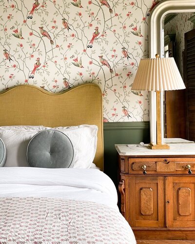
You won’t find yellow in our wallpaper selection, but you will find complementary colors that tone down the bright yellow. I think the pattern provides a bit of a sophisticated twist, something Sanderson wallpapers are known for. You can read more about my wallpaper selection process in this post.


Decor
With the addition of a traditional pattern, we kept the accessories whimsical and on the modern side, like the striped rug and the shower curtain from Schoolhouse. I love how the scale of the patterns complement each other. I also added a couple of thrifted pieces, like the coral decor atop the toilet and the blue Matisse print. I think the playfulness of the blue frame helps pull out the blue of the wallpaper a bit more.
Door Molding
We added molding to all of the doors on the main floor, including the closet and entry door in the adjacent kids’ bedroom. When we moved in the doors were basic and blank, which felt a little unfinished to me, especially given the traditional details throughout the home. Adding the molding helped tie together the architectural details and made the overall design of the house feel a bit more cohesive.


Here’s what we kept the same…
Yellow Ceiling and Door
Honestly, it was purely out of convenience. We know we can change this if and when we address the rest of the trim in the house in the future (more on that below)!
Fixtures
We initially wanted to add a midcentury light fixture to replace the current one, but once it arrived we found it actually worked best in our pink bathroom. We may decide to swap the light and the shower fixtures eventually, but for now, they are not “offensive” to us! And, most importantly, they are in great condition.


Wall and Floor Tile
Obviously, we kept the wall and floor tile in this space. The flooring is not my favorite part of this room, but since it is the same color as the wall tile, it sort of just blends in and isn’t as noticeable to me.
Do we have future plans for a phase two update?
Eventually, we may paint this room blue—something that would work well with the existing tile and wallpaper. At some point in the future, we may update the trim throughout the house to help create a more cohesive visual flow, which is when a new paint color would be considered for this room.
This room won’t undergo any intensive updates unless we make bigger changes to the layout of the entire home. This would only happen if we decided to add a second story… a small possibility that would be years down the road!


Product Sources
Wallpaper: Sanderson
Shower Curtain: Schoolhouse
Editor’s Note: This article contains affiliate links. Wit & Delight uses affiliate links as a source of revenue to fund the operations of the business. Have a question or want to learn more about how we use affiliate links? Shoot us an email.


Kate is the founder of Wit & Delight. She is currently learning how to play tennis and is forever testing the boundaries of her creative muscle. Follow her on Instagram at @witanddelight_.
BY Kate Arends - June 14, 2021
Most-read posts:
Did you know W&D now has a resource library of Printable Art, Templates, Freebies, and more?
take me there
Get Our Best W&D Resources
for designing a life well-lived


Thank you for being here. For being open to enjoying life’s simple pleasures and looking inward to understand yourself, your neighbors, and your fellow humans! I’m looking forward to chatting with you.
Hi, I'm Kate. Welcome to my happy place.





I LOVE IT
It’s lovely! So fresh with the change of wallpaper. Love that you kept the yellow tile it’s a very happy color = )
Thank you!
LOVE that you leaned into the home’s history and kept that fabulous vintage tile!
Glad you love it as much as we do!
I LOVEEEEE the update. The wallpaper is so cute.
Isn’t it wonderful? Thanks for your comment!
Such a great update. Love that you kept the tiles. They seem to be in good condition and are adorable. I like it a lot.
Thank you! Glad you like it too.
Personally I’m SO happy to see vintage tile preserved and celebrated. It pains me to see beautiful old tile ripped out of homes in favor of basic, white blah.
Love how to wallpaper elevates the whole space and gives it some sophistication! Great job 👏🏻
Thank you so much!!
You luck girl! I would love to have that vintage bath with yellow tile walls and floor. I often fantasize of having one done with black accessories and a Jean Nate theme for purely nostalgic reasons. The closest I came was choosing to paint my new townhouse bath the same shade of yellow, but sadly the Jean Nate theme wouldn’t have worked with the rest of the modern home. Well played.
I love that theme idea! A yellow-painted bathroom is an excellent compromise.
I LOVE this. Your house reminds me of my grandma in the best way. She was an incredibly stylish midwestern woman, and every room in her house had a color theme (the blue room, the pink room, the wood basement, etc). My grandpa was mayor of a small town and a furniture shop owner by trade, so she took full advantage of the furniture shows in the big city – Minneapolis. I only have the best memories of going to visit her and cherish the pieces I inherited. Thanks for sharing your process & home!
Thank you so much for sharing! Honored to hear our home has a resemblance to hers.
Wonderful!! Such an interesting choice in a perfect bathroom. Love it!!
Thank you!!
I love this wallpaper, and LOVE that you kept the cheerful yellow tile. Hooray for original design elements.
Thanks for your comment. I’m glad you love it!
Tell me about the wall mirror! I love that idea. I am just now starting to plan an update to our little yellow bathroom in our master. I can’t get rid of the tile—it’s so precious!!
The wall mirror was here when we moved into the house. I hope you enjoy the process of updating your yellow bathroom!