

There has been many a message from readers regarding rooms in our house that remind them of references across a broad spectrum—from hotels to historic tourist attractions. The one place I find them most often, however, is in film!
I thought it would be fun to do a post comparing each room with its counterpart, so we can look at what elements of each space share the same vibe as these memorable cinema moments. Let’s get into it …
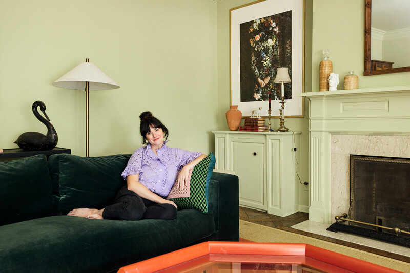
Room 1: Family Room (Green Room)
Looks like … Emma or the Featherington home from Bridgerton


For one, there is the COLOR. Going so big with a light green, pistachio paint color creates a memorable backdrop in each of these films for the scenes and character development that take place in the foreground. For a while, we had a floral sofa with a very traditional look in our green room, which contributed to the likeness.
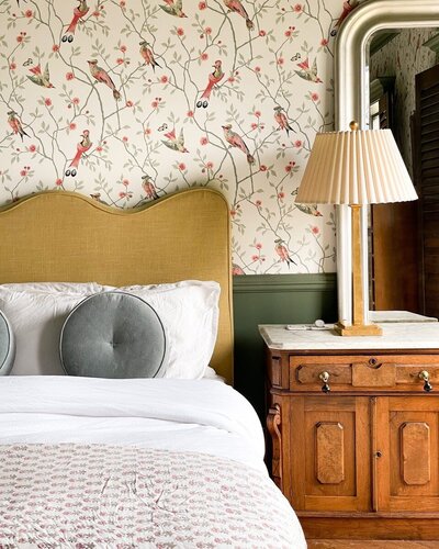
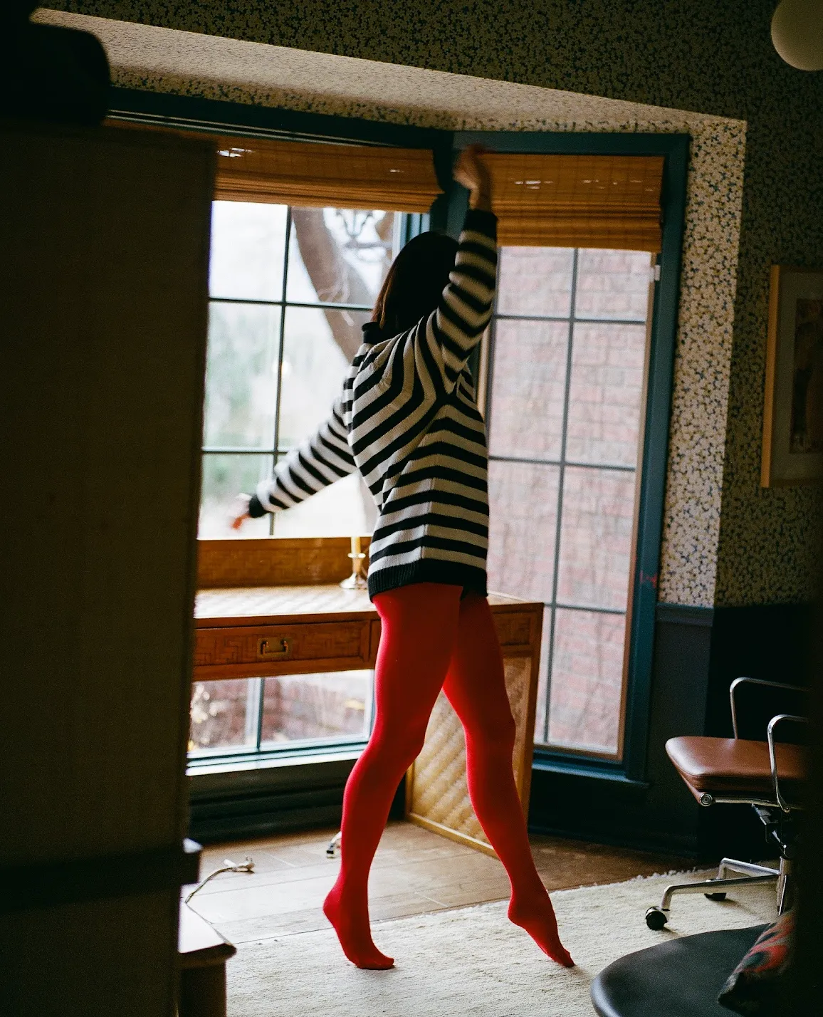
Room 2: Main Bedroom
Looks like … Home Alone


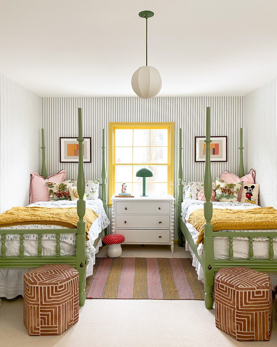
AH! I love the Home Alone house. I remember each room so vividly, and it felt so REAL and lived in. The parents’ bedroom was full of half-wrapped presents and wrapping paper, a big four-poster bed, and bold, patterned wallpaper with a deep red bedspread. I read that the decor in the home was meant to be an explosion of Christmas colors.
While we don’t have an explicity green and red-themed room, the painted ceiling and chair rail definitely give it a similar vibe, along with the patterned wallpaper and our old four-poster bed.
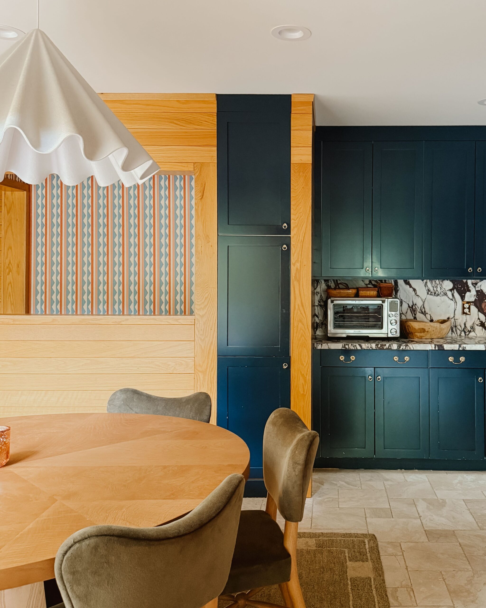
Room 3: Kitchen
Looks like … A Single Man


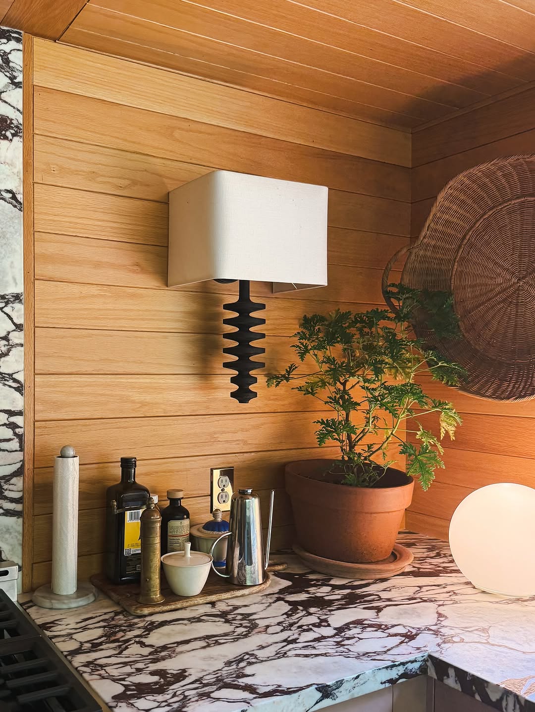
The clean lines, the large windows, the honey oak? It is all there. I LOVE the decor and fashion in this very memorable movie.
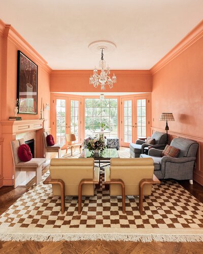
Room 4: Dining Room (Peach Room)
Looks like … the London house in The Parent Trap


I love the London townhouse in The Parent Trap so much! And given how much of my design inspiration is coming from English interiors, this reference feels spot on. From the large fields of coral peach to the traditional accents, readers who spotted this reference have a great eye (and great taste in movies, IMO!).
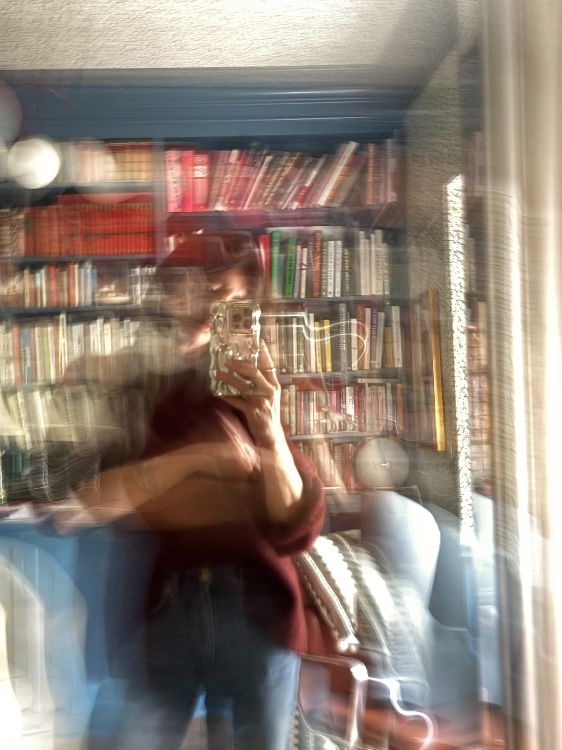
Room 5: Library (Blue Room)
Looks like … The Queen’s Gambit


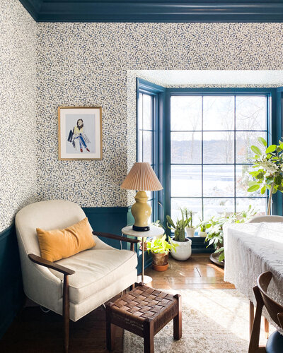
Oh what a visual delight this series is! I watched it twice—once to soak in the plot and the second time for the fashion and interiors. While Beth redesigns the home after her adoptive mother’s passing, I love how the original decor blended midcentury accents with traditional patterns.


Kate is the founder of Wit & Delight. She is currently learning how to play tennis and is forever testing the boundaries of her creative muscle. Follow her on Instagram at @witanddelight_.
BY Kate Arends - July 26, 2021
Most-read posts:
Did you know W&D now has a resource library of Printable Art, Templates, Freebies, and more?
take me there
Get Our Best W&D Resources
for designing a life well-lived


Thank you for being here. For being open to enjoying life’s simple pleasures and looking inward to understand yourself, your neighbors, and your fellow humans! I’m looking forward to chatting with you.
Hi, I'm Kate. Welcome to my happy place.






What a fun post!!
I’m glad you liked it!!
I just love this! One of my great joys is discovering shows for their set (and/or costume) design. A recent favorite is Agatha Christie’s Poirot series for the absolutely extraordinary art deco design.
Oh good to know! I’ll have to check out that series.
damn! they’re all true! I love this.
Thanks for your comment!!