

Editor’s Note: This renovation and blog post was sponsored by brand partners Cambria, Delta Faucets, Hygge & West, and McDonald Remodeling . The compensation and product received in exchange for placement on Wit & Delight is used to write/edit the blog post and support the larger team behind Wit & Delight.
As always, all thoughts and opinions are always my own. Sponsored posts like these allow for development of additional dynamic content to be produced, unsponsored. Thank you for supporting our partners!
I can’t tell you how nice it is to have a shiny new place to take a shower in this house. For being built in the 1920s, the bones are great, but the plumbing… not so much! When we bought the house we had only one measly bathroom on the third floor and an, ahem, “open-air” throne in the basement next to the laundry. Fast forward to our renovation last summer, and we now have a basement that acts as our family room, a powder room for guests on the main floor, and after some additional dust and debris, now an extra full bath in the basement!!


Now, we’re really saving our pennies to go full out on the bathroom on the 2nd floor. But the basement bath is all about getting the most bang for our buck with great quality materials and design decisions that make an impact without spending thousands on tile work. Still, I wanted the space to feel anything but builder grade!


This bathroom was originally inspired by this blog post. We ended up moving away from the idea of black fixtures and decided rather to connect the design palette with all the choices we had already made throughout the main floor and basement: keep it light, bright, and fresh. It is, after all, a basement with few windows! After our first round of design inspiration, we had this rendering from McDonald Remodeling.


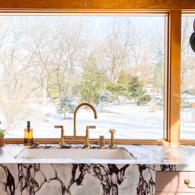
And here she is, all finished!! By opting for a couple of high-end materials, you can achieve a really luxurious feel. My favorite aspect of this bathroom? The Cambria countertop and backsplash. I love the smooth, bright white surface. Makes me feel fresh and energized when getting ready in the morning!


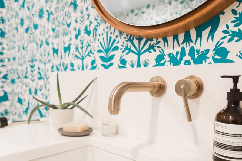

A couple of notes about our product selects! We worked exclusively with a couple of our favorite partners on this bathroom.
Plumbing Fixtures: Delta Trinsic™ Collection, and the Delta Classic 400 shower set. We selected a Delta Trinsic™ fixture for the kitchen upstairs and really love the look of the fixture and the affordable price point. It made sense to bring the design language into the basement considering it is a small house and we’ve kept the floor from kitchen to the basement fairly open. These fixtures feel like the perfect accessories to a great everyday ensemble. Stylish yet practical!
Single Handle Wall Mount Lavatory Faucet Trim // Single Handle Wall Mount Lavatory Rough // Push Pop-Up With Overflow Drain // TempAssure 17T Series H2Okinetic Shower Trim // MultiChoice Universal Tub and Shower Valve Body – Universal Inlets/Outlets // Drain – RP7430CZ // Delta Classic 400, 48×34 Acrylic Shower Wall Set // Delta Classic 400, 48×34 Shower Base
Countertops: Cambria White Cliff™: Just a fantastic material to use. I love the luxurious feeling of quartz, and since we decided to go with a more practical rough-in shower kit to save for the upstairs bath, this piece of material works hard to add a nice natural texture to the space. Cambria is durable and more resistant to surface damage than other stone, which is why I love using the material in my home. I partnered with Cambria for my kitchen countertops and I was really excited to incorporate one of their classic designs into my bathroom.
Walls: Hygge & West Otomi Wallpaper in Turquoise: I just can’t help myself! Bathrooms are the best place to have a little (or a lot) of fun with print, color, and pattern. We went with a pattern Joe absolutely loved from Hygge & West. It’s a happy print and you definitely don’t feel like you are in a basement bathroom while in this space.
Floor: We used a basic 2″ white hex tile with dark grey grout. You can get a fantastic graphic finish for a low cost if you up the contrast!
Lighting: Schoolhouse: Ellerbe Sconce: Lovely and elegant. These sconces have the same design language as our pendants in the kitchen but are decided different. We decided to hang these with the bulb facing downward and they help with task lighting. Joe gets ready for work in this space, so it is nice to have good lighting for him while shaving.
Hardware: Faced Knobs from Anthropologie: I had some of these guys left over from the kitchen renovation. Made sense to use them here!
Mirror: Floating Wood Mirror from West Elm: This space really needed some warmth. I love a white bath, but without some earthiness it can feel a little too sterile. This mirror is a fun oversized scale and plays nicely with the quartz and hexagon tile we selected. It’s the focal point in this space.
Vanity Paint Color: White Dove by Benjamin Moore: Again, keep it simple and keep it economical! The previous home owner used this color on the trim and we carried it through our remodel and down into the basement. It’s a lovely creamy white, not as sterile and stark as pure white shades.
Contractor: McDonald Remodeling : A huge thanks again to McDonald Remodeling for working with us on another great renovation. I can’t say enough about this team, their attention to detail, and willingness to go above and beyond. Things happen during a remodel and we always feel like we’re in the best hands with them.


Kate is the founder of Wit & Delight. She is currently learning how to play tennis and is forever testing the boundaries of her creative muscle. Follow her on Instagram at @witanddelight_.
BY Kate Arends - August 29, 2016
Most-read posts:
Did you know W&D now has a resource library of Printable Art, Templates, Freebies, and more?
take me there
Get Our Best W&D Resources
for designing a life well-lived


Thank you for being here. For being open to enjoying life’s simple pleasures and looking inward to understand yourself, your neighbors, and your fellow humans! I’m looking forward to chatting with you.
Hi, I'm Kate. Welcome to my happy place.






Love, love, love! Also, where did you get the bath mat?
Hi Michelle! It is from Target!
So good! I’m curious about the source for your vanity as well. It’s perfect. Thanks! -Lindsay
Hello Lindsay! So sorry for the delay. The vanity was designed and built by our contractor McDonald Remodeling. They’re fabulous!
So crazy in love with that wallpaper !
http://www.brunna.co
I love the wallpaper! And those floor tiles are lovely 🙂
I just picked the same tiles for my bathroom renovation. They look so great in this space!
This is so beautiful! My husband and I just purchased our first home and I am so excited to start designing it as our own! Love the inspiration you’ve given me!
XO Helen | http://www.KaleidoscopeSpinning.com
Bathroom – important room in the house. Great finds for renovate of bathroom! Thanks for sharing!
Sincerely, Stacy
My Sewing & DIY Blog
I think the wallpaper really makes the room… and I love it paired with the gold detailing and touches of wood here and there, lovley!
Thank you Lauren!!
I’m in love with the wall paper and details of your renovation! If I walked into that bathroom in the morning I wouldn’t even need coffee- the brightness would wake me up!
Xx, Tiffany | http://www.moderndaydreamliving.com
Hey Tiffany! The wallpaper is from Hygge & West. They’re my favorite source for really incredible prints, colors and patterns! timeless and modern. We chose this one because it make this space feel less like a basement bathroom!
[…] W&D Renovates – A Pattern Happy Basement Bathroom […]
I love that you were brave in your bathroom and went with a statement pattern. I’m still sourcing the accessories for my bathroom, but a while back I chose the colour and painted it. I went with a really loud, statement green because, why not? It’s great to see bravery in interiors.
[…] Adding a bathroom. While storage is always a premium, there was a lot of value in adding a full bathroom in the basement. With a plumbing line already in place, it was identified the perfect spot for it. […]
Who makes the shower door?
[…] wit & delight. […]
[…] wit & delight. […]
[…] Image via Wit + Delight […]
Truly liked me post.
[…] blue print wallpaper and White Cliff™ are a fresh combination in this bathroom reno from Wit and […]
We sell and install wool sisal jute sea grass stair runners https://carpet-for-stairs.cabanova.com/ for stairs hallway runner and matching area rugs of any size you are looking for staircase runner. Tiles are available in a range of materials and styles, from small and artistic mosaic tiles to terrazzo, stone and ceramic tiles. It feels warm and comfortable underfoot, and when temperatures outside are cold, it slightly improves the R-value of a floor and helps a home retain heat. Paying attention to wear and quality will help you to determine the best carpet for your home and family.
[…] Our favorite post: https://witanddelight.com/2016/08/wd-renovates-ll-bathroom/ […]