


This post is part of a series called W&D Renovates. We’ll walk you through the ups and downs of our First Floor & Basement renovation project with McDonald Remodeling. Look for the series to continue through the end of 2016 and into 2017!
Welcome to the most important part of our remodel. It’s not the most glamorous part of our home, but it’s the part of our remodel that turned this house into our home. It’s the design decision that made this 1,500 sq ft home more than enough space for our growing family.
The more time we spent living in here, the more we realized our 1925 English Tudor was custom built for more “formal” entertaining, despite its small footprint. The living room is long and narrow, designed for smaller clusters of seating in front of the fireplace and near two sets of iron windows. It wasn’t designed for modern living, which really does require a “family room” for watching TV, playing with toys, or letting the dog run loose. McDonald Remodeling played a key role in figuring out how to transform the layout of our basement to make it work as the hub of our home.
When we moved in, the room was divided into four small rooms. Our mechanical equipment, which was in excellent shape, was taking up a lot of valuable space. We had a large rec space and while the ceilings were high, pipes make the space feel small and cave-like.


Here are some super glamorous before photos:


After walking through the space with McDonald, we identified our top priorities:
- Opening up the wall between the Rec Room and Laundry Room. This required a lot of structural work, including a steel beam that ran across the space.
- Consolidating our mechanical equipment and move our laundry room. This work would maximize our living space.
- Adding a bathroom. While storage is always a premium, there was a lot of value in adding a full bathroom in the basement. With a plumbing line already in place, it was identified the perfect spot for it.
- Making it pretty. Basements can be a bit of a design drag. Jim saw a diamond waiting to be polished in our staircase, and we found the nook beneath our staircase to be the perfect place to reuse the cabinets from the main floor.
This is what the layout looks like now:


And here are the after photos!


The ceilings are the single reason the basement feels more like a family room and less like a basement rec area. If you are considering a basement remodel, it’s worth the spend to hide all the pipes!! We added a big leather sectional from Article down here for lounging. Lots of floor pillows make the space cozy and inviting.


Here’s a detail shot of the staircase. It’s one of my favorite design features in the entire house. A reminder to think about how you can retool what already exists in the house!


Here’s a detail shot of the cabinets from our original kitchen. We had them painted white and added a white oak countertop and simple faucet from Delta Faucet.
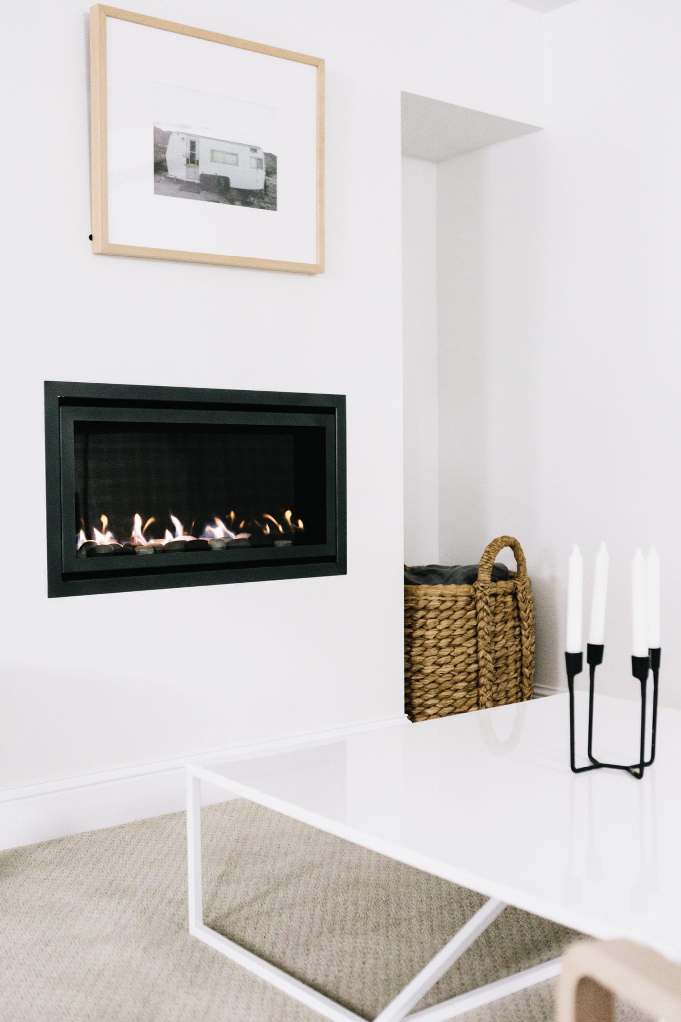

Another way we made this space feel more inviting was adding a gas fireplace. The rest of the house was designed to pay homage to the home’s original design features, but the basement needed something clean and modern to make it feel light and inviting. You can read all about our decision to go with Heat & Glo here.


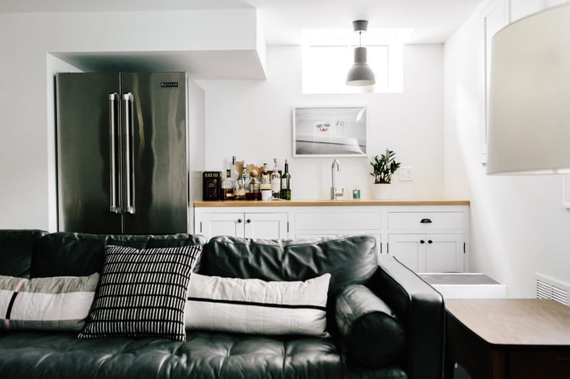

The basement kitchenette acts as extra storage and a mini buffet when we have family over for pizza and movies.


For more storage solutions, we built this Ikea unit for our entertainment center. It almost feels custom!
What you don’t see here is the drain tile and sump pump we added. If you’re going to invest in finishing the basement, I’d recommend going the extra mile to protect that investment. If you have any additional questions about this portion of the project, please comment below!
Images courtesy of 2nd Truth Photography
Decor Sources: Sven Sectional by Article, Marble Top Table — West Elm (Similar), Blu Dot – Toro Chair, Blu Dot – Strut Coffee Table, People I Loved – Wink Wink Pillows, Ikea – Entertainment Unit, Artwork by Tappan Collective, Candle Holder from Unison (similar), Schoolhouse Electric Candle Holders,


Kate is the founder of Wit & Delight. She is currently learning how to play tennis and is forever testing the boundaries of her creative muscle. Follow her on Instagram at @witanddelight_.
BY Kate Arends - October 20, 2016
Most-read posts:
Did you know W&D now has a resource library of Printable Art, Templates, Freebies, and more?
take me there
Get Our Best W&D Resources
for designing a life well-lived



Thank you for being here. For being open to enjoying life’s simple pleasures and looking inward to understand yourself, your neighbors, and your fellow humans! I’m looking forward to chatting with you.
Hi, I'm Kate. Welcome to my happy place.







Wow! What a transformation. Well done!
Rachel
Thank you Rachel!
BEAUTIFUL AS ALWAYS!
You are too kind 🙂
This is gorgeous! Your taste is always impeccable!
XO Helen | http://www.KaleidoscopeSpinning.com
Thanks Helen!
Holy smokes! How did you get so much light in a basement?! Probably I should just read bc you explained, but I’m too stunned to be reading right now.
Hi Carrie! We added one casement window for safety reasons. It really helps get more light down there. Other than that, keeping the paint white really does help make the most of what little natural light we have.
Love, love your style and the basement renovation! Motivates me want to tackle my unfinished basement.
So inspiring! We have the same kind of 1920’s home and are looking to maximize that extra square footage. This makes me want to start the reno tomorrow.
Sounds like a fun project! I think I want to make it my life mission to resurrect old homes.
This is beautiful and perfectly cozy and modern. I have a quick question about the wallpaper used in the bathroom – did you install this yourself or leave it to the contractors? I have purchased Hygge and West wallpaper and I am quite nervous about installing it myself as it so spendy.
Hi Brandy! Thank you so much. We had contractors install the wallpaper and it was totally worth it. Especially in a bathroom!
Hi Kate! Curious about your process for selecting (and/or coming to terms with!) carpet. Any tips there? I recently painted my finished basement floor a bright white, but mannnn, it’s a bummer when it get dirty in the more high-traffic areas. Did you go big box or a step up on your carpet selection?
We ended up going to with a mid-range brand our contractor recommended. Our contractor also recommended we go a shade darker than I wanted to to help hid dirt, but light enough that you wouldn’t see all the dog hair. And believe me, there’s a lot of dog hair. We plan on getting it cleaned this winter. FLOR squares are also a good option for high traffic areas!
I’ve never seen such a light-filled basement! Love the before and afters, thanks for sharing.
Thank you Kara!
This transformation was spot on! I especially like the kitchenette and in-wall fireplace. One of the best basement renovations I’ve seen, nice!
Thanks Genevieve!
Truly amazing!! No one can imagine that this basement used to look like those before pictures..
Thanks Simon! It was hard to envision it!
Hard to believe that’s a basement! Love that you re-used the cabinets!
oh my goodness.
i’m obsessed. i love every single detail. feels super cozy while being bright and clean, a hard balance to strike.
well done!
Looks stellar! Where can I find that ottoman?
i love that green sectional! what happened to the other sofa you had down there? where’d you put it. i think it was brown.
Beautiful basement!! Super boring question but I’m in the middle of our basement remodel and my current decision is what size and type of recessed lights. Our architect recommended 4″ LED. Is that what you used? What type of bulb? Light is so important but can’t take another evening in the home depot lighting aisle. 🙂
I love the amount of white in this design, it makes it so bright! It doesn’t look much like a basement at all. Amazing redo!
Hi Kate, this is simply gorgeous! Love your work. I’m obsessed with the pillow selections and the ottoman. Could you share where you got them (the lumbar, the black print, and the floor pillows) as well as the ottoman? Thanks so much!
This is your second sofa from Article, correct? i take it that must be a good sign? So afraid to pull the trigger
Yes! We are enjoying our Article sofas. One thing we have noticed is the brown couch gets a little bit more sun, and the leather has faded a bit. I think it’s natural, but we’ve noticed it more recently!
Hey there! I love your use of white paint throughout the house…can you tell me what brand/color you are using? It is same all over the house?
Thank you!!
Hi Christina!
We used Benjamin Moore White Dove on the main floor and Benjamin Moore Bright White in the basement. White Dove is definitely closer to a cream, so I would get a sample before taking my word for it! Hope this helps!
So inspired by your remodel! It is beautiful! I noticed in the plans that you wanted to include a murphy bed. Did you wind up doing that? How is it?
Hi there, this looks really great! How do you like the leather sectional. We are thinking of ordering it as well in the same color. It’s comfortable?
Thanks,
Peter
Hi, maybe I missed the info but I am loving those cabinets that you used for the bar area, where did you get them?
thanks so much and I love following your progress
Anne
Hi Anne! They are by Ikea. Thanks for following along!
Looks great! Thanks for sharing! Kate xx
It looks great! The high ceilings don’t make it feel like a basement at all. Thanks for sharing!
What is the brand and style/color of the basement carpet?
Hi! My husband and I are looking to refinish our attic space and have been having a hard time finding the right carpet! Yours looks so lovely! Do you mind sharing the brand/style of the carpet you chose?
Thank you!
Thanks for sharing. beautiful space and great basement renovation
Amazing. Look at this http://velshop.pl/, you can find here some inspirations.