

I know from experience that narrowing down selects and making decisions for a design project can be really exhausting. Today’s guide is about slowing down, being more intentional, and removing the decision fatigue from the design process. Whether you’re undertaking a remodel or simply want to give a room a refresh, the process I’m walking you through below will help you hone in on the details of your project.
This is the process I go through before starting any design project in our home. I hope you find it as helpful as I have!
1. Consider your why.
This step is about getting really intentional about your reasons for updating the design, beyond simply wanting the space to look “better. Try not to get stuck in the “Instagram impulse,” solely wanting to update your home because it doesn’t, in your mind, measure up to other spaces you’re seeing online. Seeing someone’s finished project can be inspiring, but that’s surely not the only reason you want to update your own home.
Consider why you really want to update your space (and actually put it down on paper too). Are you not using it as often as you’d like to? Is it because it’s uncomfortable or the layout doesn’t work or there’s not enough storage? In our most recent design project, the basement family room, our primary “why” is that the dark space isn’t very inviting and the layout isn’t working for our needs; we want to turn it into a place we’re actually drawn to spend time.
Try not to get stuck in the “Instagram impulse.” . . . Seeing someone’s finished project can be inspiring, but that’s surely not the only reason you want to update your own home.
2. Write down your goals.
Use your core “why” to determine your overall goals for the project, both in terms of aesthetics and functionality. Is there a specific feeling you want the space to embody? Is there an overarching design element you want to focus on first and foremost? Do you want to improve the layout or change the primary function of the space?
Try to keep your list to a maximum of 3-4 key goals for the space. Prioritizing what is most important will help keep you on track and make future decision-making less tiring! You can get into the details in the next section.
3. Get granular, then hone it in.
This step is about breaking down all of the tangible updates you’d need to make to meet the goals you decided on in step two.
First, list every single update that comes to mind. Then, return to that list and narrow it down, focusing on the updates that would be most effective in helping you meet your goals. Ultimately, these updates will help make your space both beautiful and functional.
Take our basement family room project as an example. Our primary design goal is to make the dark space feel lighter and brighter. To meet this goal, we plan to make the following updates:
- Paint the woodwork white
- Paint the ceiling white
- Paint the remainder of the brick white
4. Decide on your budget.
For some, this step may come earlier in the process (depending on whether you want the budget to inform the scope of your project or the project scope to inform your budget). I recommend putting together a budgeting spreadsheet to keep everything organized in one place.
Having a budget in mind will help keep your project on the rails as you go. I use our budget as an important guide for any shopping I do that relates to a specific project. If you’re online shopping, handy filters on many websites help show you what is affordable and realistic for your space and pocketbook!
5. Rank priority.
Take all of the updates you decided on in step three, then rank them by priority to help determine the order in which you’ll make the updates. Doing this should help the project feel much more approachable.
6. Decide on your estimated timeline.
Having this timeline on hand will help guide you through your design process. Try to remember that, in most cases, there is no rush. In fact, I’ve found that taking things slowly usually helps me make more informed, thoughtful decisions. Be very realistic as you plan this out, considering things like your own capacity, budget, and possible shipping delays. Always pad your timelines!
7. Start a mood board.
No matter the scope of your project, you’ll want to have the overall vibe in mind, which is where the mood board comes into play. Having a mood board already started at the onset of your project will also be helpful down the line as you’re considering different design elements and furnishings you may want to purchase. You can easily swap out design elements on the mood board to see how potential elements would work together. I use InDesign to create these mood boards digitally, but if you don’t have the Adobe Suite, Canva is also an excellent (free!) option for easily creating a mood board.
No matter the scope of your project, you’ll want to have the overall vibe in mind, which is where the mood board comes into play.
With your project primed and planned out, you’re ready to begin! Happy designing, folks.


Kate is the founder of Wit & Delight. She is currently learning how to play tennis and is forever testing the boundaries of her creative muscle. Follow her on Instagram at @witanddelight_.
BY Kate Arends - January 10, 2022
Most-read posts:
Did you know W&D now has a resource library of Printable Art, Templates, Freebies, and more?
take me there
Get Our Best W&D Resources
for designing a life well-lived


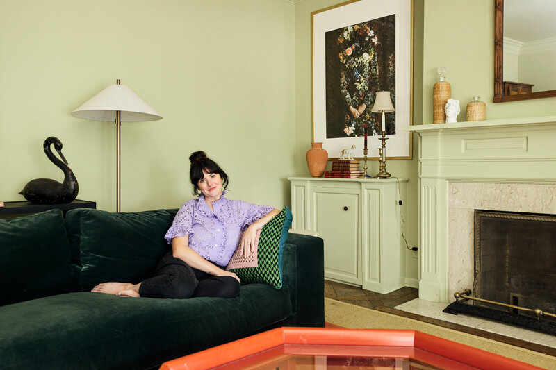

Thank you for being here. For being open to enjoying life’s simple pleasures and looking inward to understand yourself, your neighbors, and your fellow humans! I’m looking forward to chatting with you.
Hi, I'm Kate. Welcome to my happy place.








Amazingly helpful! Thank you!
I’m so glad!!
So happy to have found you, Kate!
Thank you for being here!
super helpful!
Thank you for reading!
Very helpful! How/what tools do you use or recommend for drafting designs for contractors. I don’t have Adobe and not a professional designer so looking for an online tool to help. Thanks!
I use Adobe to create mood boards and floorplanner.com to create simple room layouts, and I’ve also heard great things about Canva for creating simple mood boards. When it comes to creating a plan to hand off to a contractor, I tend to leave that to a professional, so I may not be of much help if you’re looking to draft plans yourself! We used Skipp most recently, to help us create the plans for our kitchen remodel.