
This post is part of a series called W&D Renovates. We’ll walk you through the ups and downs of our First Floor & Basement renovation project with McDonald Remodeling. Look for the series to continue through the end summer and into fall!
Hello, from our future kitchen! We’re excited to give you a tour of our old space and share plans for the new kitchen today. Before we get into the nitty gritty, I have to preface this post by saying there was plenty to like about our kitchen as it was before we tore out the cabinets and repurposed them elsewhere. The woodwork was beautiful. We had a cute little breakfast nook in the corner. There was some decent subway tile installed. Yet we didn’t buy this house thinking these pros would outweigh the cons: no counter space, awkward layout, outdated appliances. Joe couldn’t even sit comfortably in the breakfast nook.


Given we spend most of our time in this space, the kitchen was where we wanted to start our renovation. As you know from this post, we toyed with the idea of using the layout we had to save money and give the place a little face lift. But the more we lived here, the more we realized it would be a good investment to overhaul the flow of the kitchen completely.


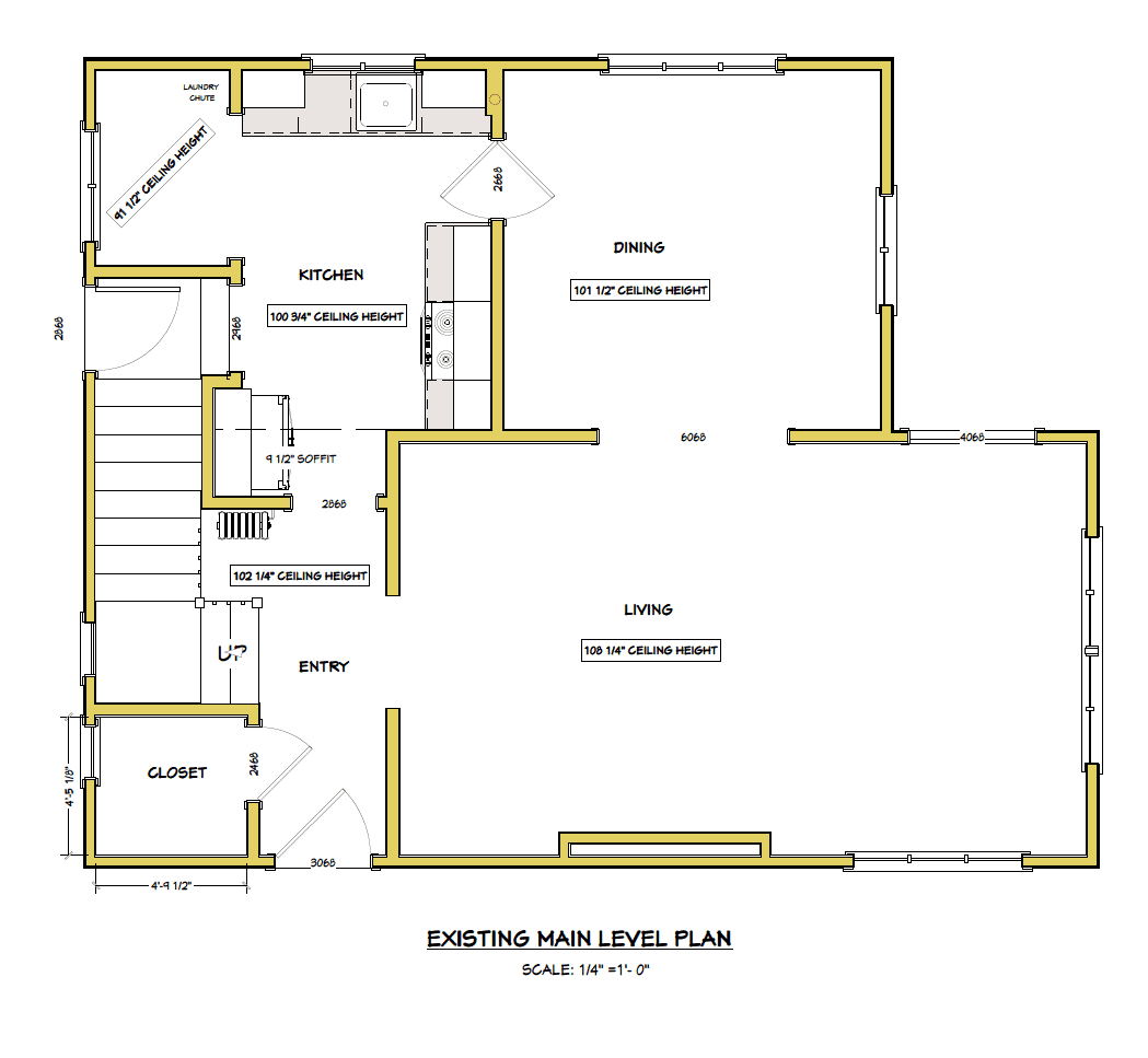
For reference, here’s the existing floor plan:

I thought it would be fun to post a little video to walk you through all the changes and show you some of the quirks we were living with. (Note: We shot this back in May before all the construction started!)
[KGVID]https://witanddelight.com/content/uploads//2015/08/WD-6.5.15.mp4[/KGVID]
After airing our grievances and deciding renovation was the best way forward, Jim McDonald and I sat down one day for a few hours and decided on a layout that would do the following:
- Increase our workspace in the kitchen. By opening up the wall between the kitchen and dining room, we gained a huge amount of prep space with a peninsula.
- Improve the overall flow of the house. By closing off entry ways and open walls to create more defined spaces, house would feel bigger than it actually is.
- Honor the time period the house was built without compromising on modern living. We kept with traditional cabinetry and finishes so house maintained it’s character. We injected modern touches through light fixtures, which can easily be updated and swapped out for something more traditional.
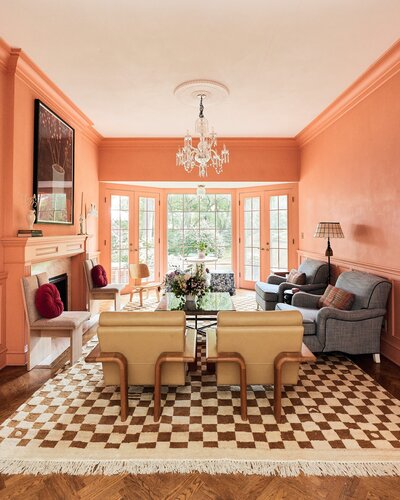
Here’s the inspiration I shared:


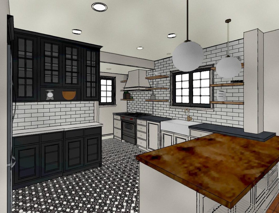
And here’s an initial sketch of the design:


Sources: Design/Planning by McDonald Remodeling // Benjamin Moore White Dove // Benjamin Moore Wrought Iron // Cement Tile Shop– Star // Quartz Cambria’s Marble Collection, Ella (Note: the sample looks more pink online than it is in person) // Lacanche Range // Blu Dot Hot Mesh Counter Stool


Kate is the founder of Wit & Delight. She is currently learning how to play tennis and is forever testing the boundaries of her creative muscle. Follow her on Instagram at @witanddelight_.
BY Kate Arends - August 30, 2015
Most-read posts:
Did you know W&D now has a resource library of Printable Art, Templates, Freebies, and more?
take me there
Get Our Best W&D Resources
for designing a life well-lived



Thank you for being here. For being open to enjoying life’s simple pleasures and looking inward to understand yourself, your neighbors, and your fellow humans! I’m looking forward to chatting with you.
Hi, I'm Kate. Welcome to my happy place.







love the little bar counter top thingy (who needs words) always wanted one. I really like the colour scheme, very simple and minimalistic, lovely! love the idea, hope it falls through well!xxx
https://justthatdiy.wordpress.com
I can’t wait to see how it turns out! The mock-ups are fantastic. Such a treat to see/hear you on video as well. You’re a natural.
Thank you Audrey!!
Beautiful! Love those light fixtures and especially that stove! Can’t wait to see the finished product. 😀
Prime real estate ! ☺️?
Would you mind sharing what brand of subway tile you used? I’m trying to match some subway tile to the white on the walls in my own home … Thanks so much!
*white dove
This has the makings of being both dreamy and functional. I would love to learn how you decided on the Lacanche range. I was nearly tempted to buy a house once for several reasons but chief amongst them, it had an Aga.
Love this! Can’t wait to see the final pics. We went through the same thing and it’s totally worth the wait.
[…] Kate’s kitchen remodel looks like it’s going to be gorgeous. (That stove!) […]
Your beautiful Fall breakfast breads will be wonderful in that new oven!! Dreamy!! So will frozen pizzas!! LOL!! Bon Appetite!!
Will you share the window details? Were they purchased black or painted black? Saw the sneak peek on insta and they are so gorgeous!
love your play between the shapes in the tile and the stools. can’t wait to see this reconfigured kitchen!
AH!!! love this video. wish it was a show i could binge watch when i get home tonight 🙂
Doing our first major kitchen reno as in down to the stud and opening a door into adjacent dining room so it’ll become one large room (10X27). Designer comes in 2 days. From you experience, should I present her with a DIY computer drawing I created for what I think I want? Or do I give her my must haves/punch list and let her create without the bias of what I’ve already drawn up?
[…] our home with McDonald Remodeling over the past six months. From selecting a contractor to planning our space, but we haven’t put together a post that shows all the updates we did to the house […]
trying again – have never received reply on any forum you are on… lease can you let me know kitchen window make/models? am looking for french casements and love these – well done & many thanks
Elena