

Article is offering W&D readers $50 off their first Article order of $200 or more. Click here to have the discount applied automatically at checkout.
The next time I talk about remodeling, I want someone to remind me what it’s like to live out of suitcases with little children. In all seriousness, I do love the end result of our home and making great use of all 1,700 square feet of our space (the main floor and upstairs square footage total combined). Since remodeling the sunroom and giving our kitchen a facelift, we’ve avoided making any additional updates to any other rooms in the house and wanted to settle in and simply LIVE in the space.
With the holidays rapidly approaching, and with my entire family joining us, I’ve been forced to confront the situation and rethink the layout of our dining and living rooms. The room was designed to be conducive to marathon breastfeeding sessions and late afternoon naps after all-nighters with the babies. Our sectional was comfortable, cozy, and invited you to stay for hours on end. While the space was great for relaxing, we wanted to make the most of our living room by opening it up to the dining area and keeping the layout flexible enough for the kids to run, while also allowing enough seating for our entire extended family when the holidays rolled around.


Forging straight ahead, Joe and I sat down and talked about how we wanted to use both rooms. After talking through our needs (and both agreeing on NO MORE CONSTRUCTION), we decided to start fresh by removing absolutely everything from both places. Knowing that this was now our forever home, I knew I wanted high-quality pieces that could hold up to lots of hard use (kids and dogs) without sacrificing style. Article has never let us down in the five years since we’ve been living on their couches so we connected with them on designing these two rooms from scratch. Article makes it so easy for us to find quality pieces that suit our style, and it turns out beautiful each and every time.
The only hard part was to now decide what pieces we wanted to include in this new layout. We both wanted to give the room a refresh, without completely rethinking the decor (if anyone has ever repainted a room, and noticed how the rug no longer looks good in the space, you know precisely what I mean). When we considered the pieces, we wanted to establish a classic-vibe, while still showcasing a ton of style. I’ve never been a “matchy matchy” type of person, and even less so after children. Article’s collection offers a range of styles that work seamlessly together which made our decision a lot more simple. By mixing styles and fabrics, the room feels like real life, not a furniture showroom.
Ok. Let’s break it down by room.
The Living Room
We tried to make the current sectional (another Article piece, not surprisingly) work by breaking it up into two couches, but it still felt inflexible and conducive to lounging around and watching TV. No shame in lounging and binging TV (The Crown season three is now available!), but with family coming, we wanted to build a space that had less emphasis on watching and more emphasis on encouraging conversation.
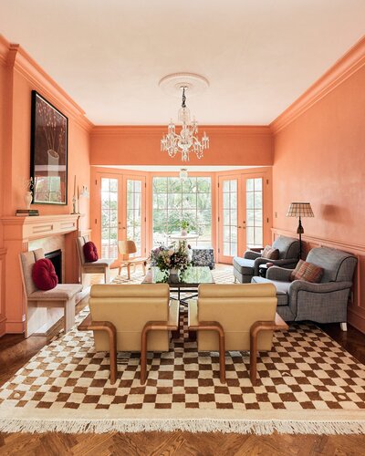
So, I got out my trusty measuring tape and realized we could easily fit the Texada sofa in Taos Brown & Oak, a full-size leather couch, and two Otio lounge chairs in Mist Gray, facing one another.
When I’m laying out a space with new furniture, I like to do everything I can to envision the flow of how everything will fit. If you’re not as adept at eyeballing, you can filter sofas on Article’s site by size, making it easy to find the perfect sofa for your home. Once I figured out what would fit in the space, the question that remained was which layout combination would work best.
One piece of advice I have for people living in small spaces is to think about how you can transition your room by simply rearranging your furniture. By specifically choosing pieces from Article that “play well together”, it made rearranging and refreshing a space so much easier. Mixing the leather of the Texada sofa with the gray upholstery of the Otio lounge chairs, the room instantly feels put together and more functional as our needs change. The small color contrast and third textile layer from the velvet Macca ottoman adds a small “glam” moment. I can’t wait to see how it looks when we get the tree up!


The Dining Room
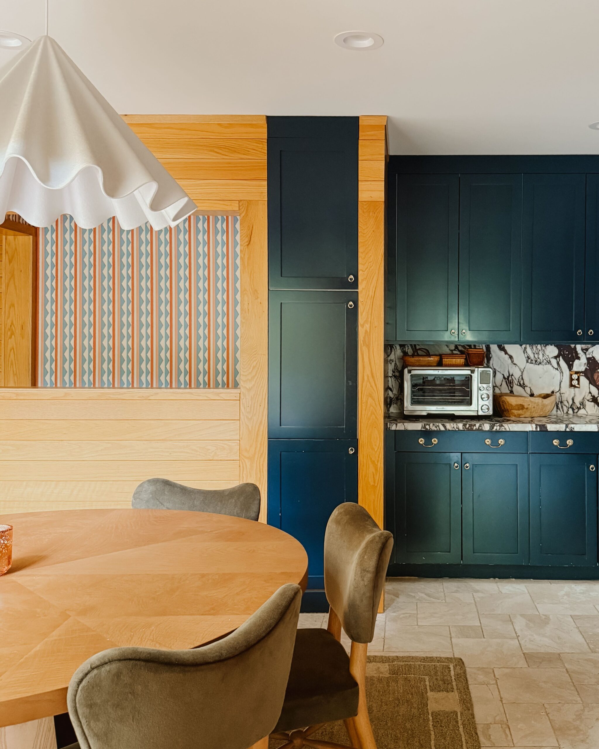
With our new living room layout, we now had the flexibility to look for a dining room table that could extend up to 110”, giving us enough seating for up to twelve people! The Seno extendable dining table in Oak has the warmth of white oak that I wanted in the space, and the width of the table gave us a couple of extra inches between the island and the table itself. We also needed chairs that could push all the way into the table, to save space given the narrow passageway between the table and island. The Kissa dining chairs in Canyon Tan/Light Oak were perfect. I wanted to bring in another texture to define the space as separate from the kitchen, and a change in materials was a great way to do just that.
I wanted to take a moment to note the quality of these new pieces because, honestly, they exceeded my expectations. The table is solid white oak construction and sturdy and elegant. The chairs come with a protective coating that helps water and dirt easily wipe up without damaging the leather. The pieces are sturdy, and if our previous (and most asked about) Sven leather sofa is any indication, they will last and get better with age.


At the end of the day, we need furniture we can live with and that will continue to look good long after the holidays are over. Over the years, and as our needs have changed as a family, we’ve trusted Article to always have high-quality, comfortable (seriously, the Sven is the PERFECT napping couch), beautifully-designed, long-lasting pieces. After our great experience with the Mello leather sectional (currently living its best life over at Studio 125), we knew these new pieces we chose from Article would do just that. Refreshing a space shouldn’t be painful, and I personally find it cathartic to see the room from a new perspective.
This post was sponsored by Article. The compensation received in exchange for placement on Wit & Delight is used to purchase props, hire a photographer and videographer, write/edit the blog post, and support the larger team behind Wit & Delight.
While compensation was received in exchange for coverage, all thoughts and opinions are always my own. Sponsored posts like these allow for the development of additional dynamic content to be produced, unsponsored. Thank you for supporting our partners!


Kate is the founder of Wit & Delight. She is currently learning how to play tennis and is forever testing the boundaries of her creative muscle. Follow her on Instagram at @witanddelight_.
BY Kate Arends - November 25, 2019
Most-read posts:
Did you know W&D now has a resource library of Printable Art, Templates, Freebies, and more?
take me there
Get Our Best W&D Resources
for designing a life well-lived



Thank you for being here. For being open to enjoying life’s simple pleasures and looking inward to understand yourself, your neighbors, and your fellow humans! I’m looking forward to chatting with you.
Hi, I'm Kate. Welcome to my happy place.












Would you share where the blinds are from? They’re beautiful!
wow i like it what a beauty……