

My love for interiors started young.
I can remember admiring the styles of hotel rooms as a kid, I was always lurking around the corners of my grandparents’ house to admire their treasures, and I began designing my own bedroom in middle school. So when it came to designing my kids’ room, I wanted to create a place where they’ll feel imaginative, playful, and at home all at the same time.
Today I’m sharing the wallpaper and trim color we selected for the kids’ bedroom! You’ll find ALL the design details below.
Before we get to the current photos, let’s take a walk down memory lane…
This was how the room looked when we first toured the house…


We added in antique beds, dressers, and a new light fixture…


We spruced up the space with some fresh decor details…


And THEN, only recently…the wallpaper came down. This LIME green color was what waited for us behind it. Behold, in all its neon glory…


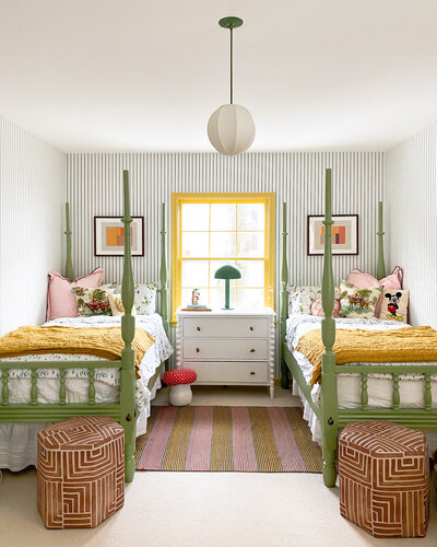
Without further ado, let’s take a tour of the space as it stands currently.
Let me walk you through the two main changes we’ve made in this room lately…
Swapped the wallpaper
I wanted to find a wallpaper that was bright, cheerful, and appropriate for a kids’ room that also felt like it lived within the overall palette of the home. The kids had their own colorful and patterned rooms in our old house, but now that they share a space, I wanted to make choices they’d both love.
I had my eyes set on this Sandberg striped wallpaper for some time, because the scale and thickness of the lines are unlike most of what is out there. It feels delicate without feeling too demure, graphic without feeling like it belongs in a cabana. The problem with a blue stripe is that it can sometimes look nautical, but the yellow we selected for the trim has more cream and gray in it, which plays off of the blue stripe really well.
We pulled a lot of the colors for this room from the kids’ adjacent yellow bathroom. I thought of doing a red striped wallpaper at first, which would’ve worked well too, but ultimately, I thought yellow and blue was such a classic combo that I couldn’t resist it. I figured if we stuck with a similar base palette between the bedroom and bathroom, we could get more eclectic with decor and other styling pieces. The wallpaper coordinates well with the other colors we’ll be using in the room, primarily the beds and bedding (more on that below!).


Painted the trim
I had saved this yellow paint swatch from the early days of looking at paint colors. It wasn’t right for the particular wall I was working on at the time but it kept coming back to me as a good option for the kids’ room.
We thought it would be a fun color to paint the trim because it’s slightly unexpected. The paint color has a bright pigment but it still feels like a more “grown-up,” muted yellow that will, hopefully, stand the test of time.
Here’s what’s next…
Replace the carpet
It was a last-minute decision to replace the carpet in this room. On its own, I love the idea of having plaid carpet, but since the kids have allergies and the colors look muddy with the new palette, we decided to swap it for a new wool carpet that is light and creamy, with just enough color to blend in with any accidents or stains.


Paint the kids’ beds
When we started thinking about how all of the elements of this room would work together, I was thinking about using the same yellow color as the trim for the beds. When I reflected on it more, it felt like that choice would have resulted in a more simplistic look than I wanted. We’ll be painting the beds either a tomato orange or kelly green color. The color palette of the room as a whole will be a muted take on primary colors. The kids’ bedding will be a more delicate pattern to offset the bigger pattern of the striped wallpaper.
Source new dressers
I still need to figure out what to do about dressers in this room. The kids were initially using our old IKEA dressers which have all but fallen apart after so many moves. My plan right now is to bring some warmth and texture into the space with some antique dressers, perhaps from my favorite antique store, H&B Gallery? More on that to come…
Add window treatments
We will update the window treatments once the rest of the major design elements are added to the space. I would love to do bamboo shades with long curtains flanking them in a fun, solid color, or maybe in a neutral with bright piping along the edge.


This room continues to be a work in progress, but it should be “complete” (save for the dressers and window treatments) by next month at the latest! I can’t wait for the kids to make a million new memories in their colorful room.
Product Sources
Wallpaper: Sandberg
Trim Color: HGTV Home by Sherwin-Williams


Kate is the founder of Wit & Delight. She is currently learning how to play tennis and is forever testing the boundaries of her creative muscle. Follow her on Instagram at @witanddelight_.
BY Kate Arends - July 19, 2021
Most-read posts:
Did you know W&D now has a resource library of Printable Art, Templates, Freebies, and more?
take me there
Get Our Best W&D Resources
for designing a life well-lived


Thank you for being here. For being open to enjoying life’s simple pleasures and looking inward to understand yourself, your neighbors, and your fellow humans! I’m looking forward to chatting with you.
Hi, I'm Kate. Welcome to my happy place.







I really like this trim and wall paper combination!
Glad to hear it!
Completely agree on the wallpaper & trim combo, it reads classic rather than nautical. I’m bookmarking that yellow color too! It really is the perfect balance between childlike and grownup.
It’s SUCH a good yellow. Hope it comes in handy for you on a future project!
Once again, I am in blown away by your fabulous and inspirational use of colors! I love learning from you.
Thank you for being along for the ride!!
It really is a perfect shade of yellow. Lovely update and digging the idea for beaut all curtains with a stripe of colour as well. Curious to see what you decide.
We’ll be sharing more in August…stay tuned!
I LOVE this color combo, Kate!!! so fun and different
Glad to hear you love it!!