

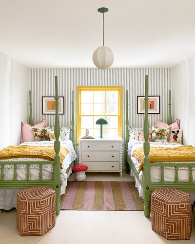
We’ve been working on bringing the design of the kids’ bedroom to life for months and I’m pleased to report that (save for a couple of potential tweaks down the road because, well, you know me) this room is effectively complete!
Our kids are quite independent and love pretend play, and this sense of creativity is something we want to continue to foster in them. Both August and Bennett have fallen into the “boys like blue” and “girls like pink” vernacular, despite our best efforts. I wanted this space to break that apart, open the kids up to creative play, curiosity, and whimsy, and let them create childhood memories apart from whatever pressures they may feel to conform from the outside world.
Today I’m sharing the final reveal of this cheerful space, along with my step-by-step process for layering a variety of colors throughout.
First, let’s take a final walk down memory lane to see exactly how much this room has transformed.
This was how the room looked when we first toured the house. Taupe on taupe on taupe.


As we got settled in the house, we added antique beds, dressers, and a different light fixture.


Then we spruced up the space with some fresh decor details. Find more photos from this era of the room in this post!


This summer, the original wallpaper came down and this LIME green color was what greeted us behind it.


Finally, the trim was painted a buttery yellow color and new wallpaper was added to complement it. Read more about these design decisions in this blog post!


We’ve made a number of changes to the kids’ room design in recent months! Below are the primary updates we’ve made. We:
- Swapped the wallpaper
- Painted the trim and doors
- Painted the bed frames
- Replaced the carpet
- Added a new dresser
- Replaced the light fixture
- Added new bedding


This is, without a doubt, a COLORFUL room. Below I’m sharing my process for mixing colors in a way that feels both bold and cheerful (and not overwhelming!).
First, we chose a dominant grounding color. In this room, it was a creamy white.
The foundational color in any room will be your grounding color. I almost always begin designing a room with this grounding color in mind (especially because of all the bold colors that already exist in this house). The grounding color will often be represented by the color of the walls or flooring (which generally take up the most visual real estate in a room) but it could also be the color of some of your key pieces of furniture.
In this room, we started our design musings with the creamy white color you see in varying shades on the ceiling, in the carpeting, and in the background of the striped wallpaper. However, grounding colors don’t necessarily need to be neutral! Rather, they are, generally speaking, the most broadly used color in any given space. In our main bedroom, the grounding color is a mid-tone green, and in the peach room, it’s, well … peach. Your grounding color will influence what kinds of accent colors you’ll bring into the space. In this room, since the grounding color is neutral, we wanted to bring in bold, colorful accents.


Next, we added a buttery yellow accent color for the trim and doors.
Bedrooms are supposed to be calming, but because this is a bedroom/playroom combo, I wanted to bring in a sense of whimsy that would also feel stimulating. To accent the neutral grounding color, we added a bold trim color. The trim was previously a muddy taupe that didn’t really work well with the overall feeling we wanted in the room (we would have needed to add a LOT of additional brightness to make the color palette work).


Next up, we added a wallpaper that makes a statement while not visually overwhelming the space.
I had my eyes set on this Sandberg striped wallpaper (no longer available) for quite some time before using it in this room. I went with the blue color because blue and yellow felt like such a classic combo, and it complements the palette in the kids’ adjacent yellow bathroom so well.
When so many different colors are at play in a home, it often makes sense to replicate color schemes used in adjacent rooms. Why reinvent the wheel when something is already working so well? (We applied this concept in our main bedroom as well, painting the ceiling in the adjoining bathroom the same green color that we used in the bedroom!)
Then, we added a complementary accent color to the bed frames.
I’ve seen painted four-poster beds before and have had the concept tucked away in my mind for years. Painting the beds in this room felt like another great way to add a bit of whimsy. The green we selected complements and balances the yellow trim and blue wallpaper really well. While the colors we used in this room are somewhat bold, they’ve all been taken down a notch in terms of tone which makes them more harmonious for the eyes to take in. (You can read more about how we chose the green color for the bed frames in this post.)


Finally, with our key design elements in place, we added additional decor to bring the room to life.
We layered accents in warm, white oak, some modern design pieces, and bedding in a playful, delicate pattern. We also added a piece of Picasso artwork I already owned—it has all of the accent colors in it and it feels like the perfect focal piece of art for the room.
I personally love a room with a bit of visual tension, which is part of why I chose the colors I did for this space. In my opinion, when you’re deciding on the palette for any room in your home, you’ll want to go with colors that both represent the feeling you want to create in the room (e.g., cheerful, inspiring, relaxing, etc.) and still flow with the overall palette used throughout the rest of your home. And remember, color doesn’t have to be incorporated through painting walls! It can come through in so many different ways that add texture, dimension, and dynamism to a room.
Sometimes combining multiple bold colors in a room can feel intimidating, but it doesn’t have to! I hope hearing about my process for designing this colorful room will make you feel more prepared to embark on the journey for yourself. Happy designing friends.
Product Sources
Wallpaper: Sandberg – Emilia Dark Blue
Trim Paint Color: HGTV Home by Sherwin-Williams – Afternoon
Bed Frames Paint Color: HGTV Home by Sherwin-Williams – Nurture Green
Carpet: Fabrica
Dresser: Crate & Barrel
Light Fixture: Beata Heuman Shoppa
Swivel Chair: One Kings Lane
Bedding: Biscuit Home


Editor’s Note: This article contains affiliate links. Wit & Delight uses affiliate links as a source of revenue to fund the operations of the business. Have a question or want to learn more about how we use affiliate links? Shoot us an email.


Kate is the founder of Wit & Delight. She is currently learning how to play tennis and is forever testing the boundaries of her creative muscle. Follow her on Instagram at @witanddelight_.
BY Kate Arends - August 23, 2021
Most-read posts:
Did you know W&D now has a resource library of Printable Art, Templates, Freebies, and more?
take me there
Get Our Best W&D Resources
for designing a life well-lived


Thank you for being here. For being open to enjoying life’s simple pleasures and looking inward to understand yourself, your neighbors, and your fellow humans! I’m looking forward to chatting with you.
Hi, I'm Kate. Welcome to my happy place.








I love the space!! Playful and inviting!
My thoughts exactly! So glad you love it.
Kate, this is stunning! I definitely would have to agree about creating depth in rooms through visual tension. Loving it all!
Thanks so much!