


White walls are a good thing.
It seems right now it is trendy to give neutrals a bad rap, and if I had anything to do with that—well, SHAME. They’re sometimes called boring, and some say there’s no life or personality to them.

Maybe you wouldn’t think that someone like me, living in what has been described as a “technicolor home,” would be an advocate for painting your room white. After all, in the past, I’ve written posts about utilizing big, bold colors in a room and how to use color theory in home design. What people sometimes forget is that white is a color, a powerful one at that, and it can change the way your space feels.
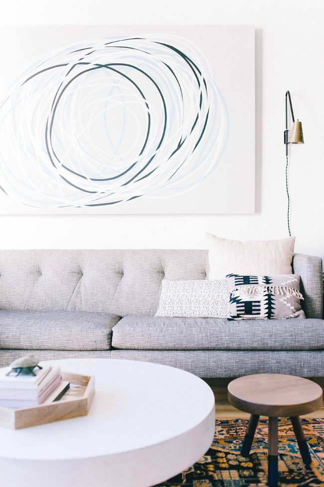
A solid neutral—like White Batten from HGTV® Home by Sherwin-Williams (HGSW 4003)—can make the decor in the rest of a room shine.


If you’ve been following along, this house is not the same house we moved into over a year ago. I’ve been methodically making changes to each room, practicing slow design, and letting each space evolve with us as our needs change. This room developed from a “music room” (complete with a never-played piano left from the original owners) to a “pass-through/dumping ground” room to its current iteration as our dining room.
All of the changes happening throughout the house over the past year led me to crave a break from the colors and patterns in other parts of the house. The linchpin for this change was seeing the transformation of the space when we replaced our dark wood floors with bright white tile. The space opened up and immediately felt brighter with the lighter floor color. I was fascinated with the idea of creating a monochromatic space; one where the color extends from floor to ceiling, which is why I decided to paint the entire foyer (walls, wainscoting, and ceiling!) White Batten from HGTV® Home by Sherwin-Williams (HGSW 4003).

This choice did not come without its challenges. I had doubts that this room would look unfinished compared to the other rooms; that it would look dull. If anything, this room feels the most dynamic in the house because of this choice. Any single item I place here, be it art, furniture, or my newly painted chairs, looks dynamic against the White Batten background. Using a single color in a room, especially a warm, bright white, makes the space feel bigger and more open, and complements the vibrancy of the colors in surrounding rooms.

The monochromatic color highlights the character in this room. The previous pale green of the wainscoting was lovely, but because of the contrast of light and dark, the woodwork itself wasn’t as clearly highlighted. The same effect happened with the pale green trim on the ceiling. Now, against the white ceiling trim, the breathtaking stained glass windows dare you to not look up in awe.

The one-coat coverage of Infinity paint by HGTV® Home by Sherwin-Williams made painting a breeze, and I could almost immediately feel the energy in the room shift. The warm tones in the White Batten make my newly rehabbed chairs POP (read more here). Even the spray of flowers grabs your attention more readily. Everything looks punchier and bolder on a white background.
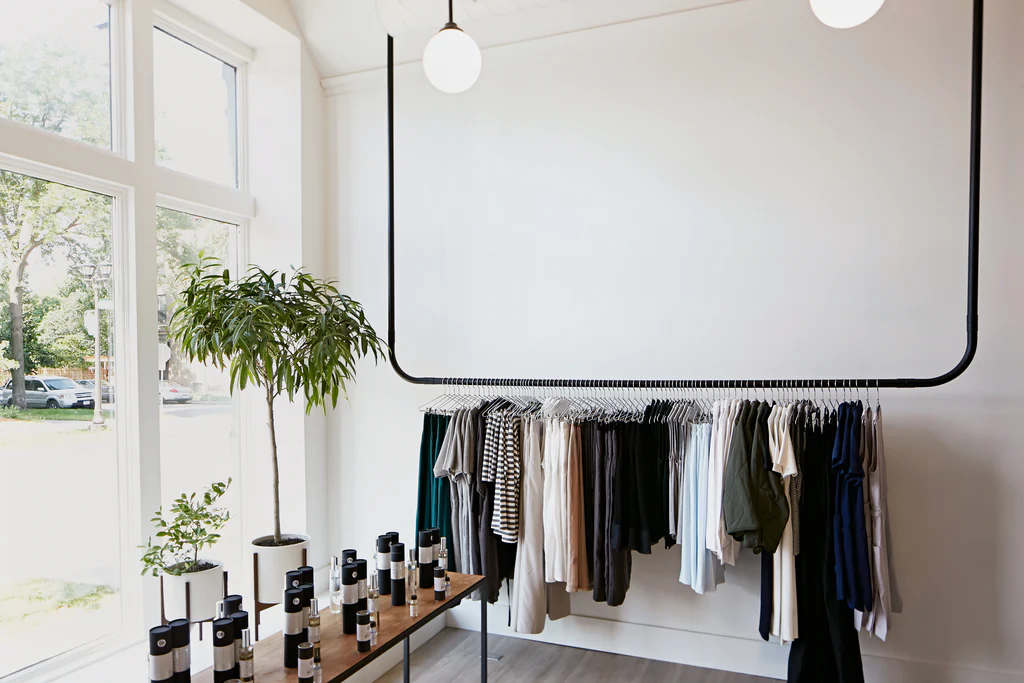
When you are considering paint colors, don’t forget about the neutrals. White walls can make a room feel bigger and can allow decor items such as rugs, furniture, and art to take center stage.
Are we done with this room? What do you think?
Editor’s Note: This post was sponsored by HGTV® Home by Sherwin-Williams. The compensation we receive in exchange for placement on Wit & Delight is used to purchase props, hire a photographer, write/edit the blog post, and support the larger team behind Wit & Delight.
While compensation was received in exchange for coverage, all thoughts and opinions are always my own. Sponsored posts like these allow us to continue to develop dynamic unsponsored content. Thank you for supporting our partners!

Kate is the founder of Wit & Delight. She is currently learning how to play tennis and is forever testing the boundaries of her creative muscle. Follow her on Instagram at @witanddelight_.
BY Kate Arends - November 30, 2021
Most-read posts:

Did you know W&D now has a resource library of Printable Art, Templates, Freebies, and more?
take me there
Get Our Best W&D Resources
for designing a life well-lived


Thank you for being here. For being open to enjoying life’s simple pleasures and looking inward to understand yourself, your neighbors, and your fellow humans! I’m looking forward to chatting with you.
Hi, I'm Kate. Welcome to my happy place.


I love this room and I think painting it white was the right choice. It feels like an anchor, a place where everything starts. All these colourful rooms lead from it and it lets them shine nicely on their own. It would have been very hard finding a colour to go with all them nicely but a good white clearly does that. And also makes that ceiling shine. And that art!!!! Beautiful room to have in the middle of the house.
Thank you! You hit the nail on the head!
I think this room would be great for losing weight. I’d fall asleep before I could finish my meal.
But why even comment something like this? Not only is it unkind, it’s also not even funny.
Where is your rug from? Tell me everything about it!! Looks like a Swedish Rollakan.
I purchased it vintage from Chairish!