

One of those opportunities came to me during an especially busy day at the studio. Our desks had previously been out in the center of the studio – we had groups working on a creative brief, a photo shoot occurring in another corner and a client meeting happening in the conference room. It was chaos – controlled, lovely chaos, but chaos nonetheless. I stepped out into the hallway for a breather and realized the space directly next door to us in the building hadn’t been leased yet. Within four hours I had contacted the landlord, set up a meeting with the building manager and contractors and began developing what is now Studio 125. Within two months, I took on a business partner to help manage Studio 125, designed an additional 4,000 square feet of studio space that included a full kitchen, a ‘walled-off’ office, conference rooms and a prop closet, and developed branding and marketing plans for an entirely new business. It is important to me to have a clear delineation between W&D and Studio 125 – while Studio 125 is reminiscent of the W&D aesthetic, the Studio (as it’s affectionately known around the building) is open to freelancers, clients and other creatives for photo shoots and events. I want guests of Studio 125 to feel at home in the space, and give others the opportunity to be creative in our space.


Once we signed on the dotted line to expand the space, we began to move really quickly. We wanted the space finished and available for clients to use within two months. Best laid plans, amiright? I reached out to vendor partners we had worked with to develop the first side of the studio to see if they would be interested in helping us outfit the expansion. We have built great relationships with some amazing vendors and I was excited about the opportunity to continue to grow these partnerships. The biggest undertaking from a design standpoint was the figuring out how (and where) to build a full kitchen. We wanted to have a cohesive look across the space, but I also wanted to flex my design muscles and have a little fun (and maybe take a few risks) with this kitchen. Relying on the expertise of our vendor partners helped ensure that the full kitchen was beautiful and functional. It’s now the focal point of Studio 125 and the most used gathering space for both clients and W&D employees alike.


Once we decided where we wanted to place the kitchen, we reach out to Cambria with plans to create a HUGE island in the center of the kitchen. If I’ve learned one thing from years of entertaining, it’s that groups always hang out in the kitchen, whether you want them there or not. So I might as well design a kitchen that basically invites guests to hang out, right? After deciding on the island, we decided IKEA was the best way to customize our kitchen. I had recently discovered an incredible company called Reform, who specializes in custom fronts and sides of the IKEA cabinetry to totally transform the look (more to come about the process with Reform in a separate post).


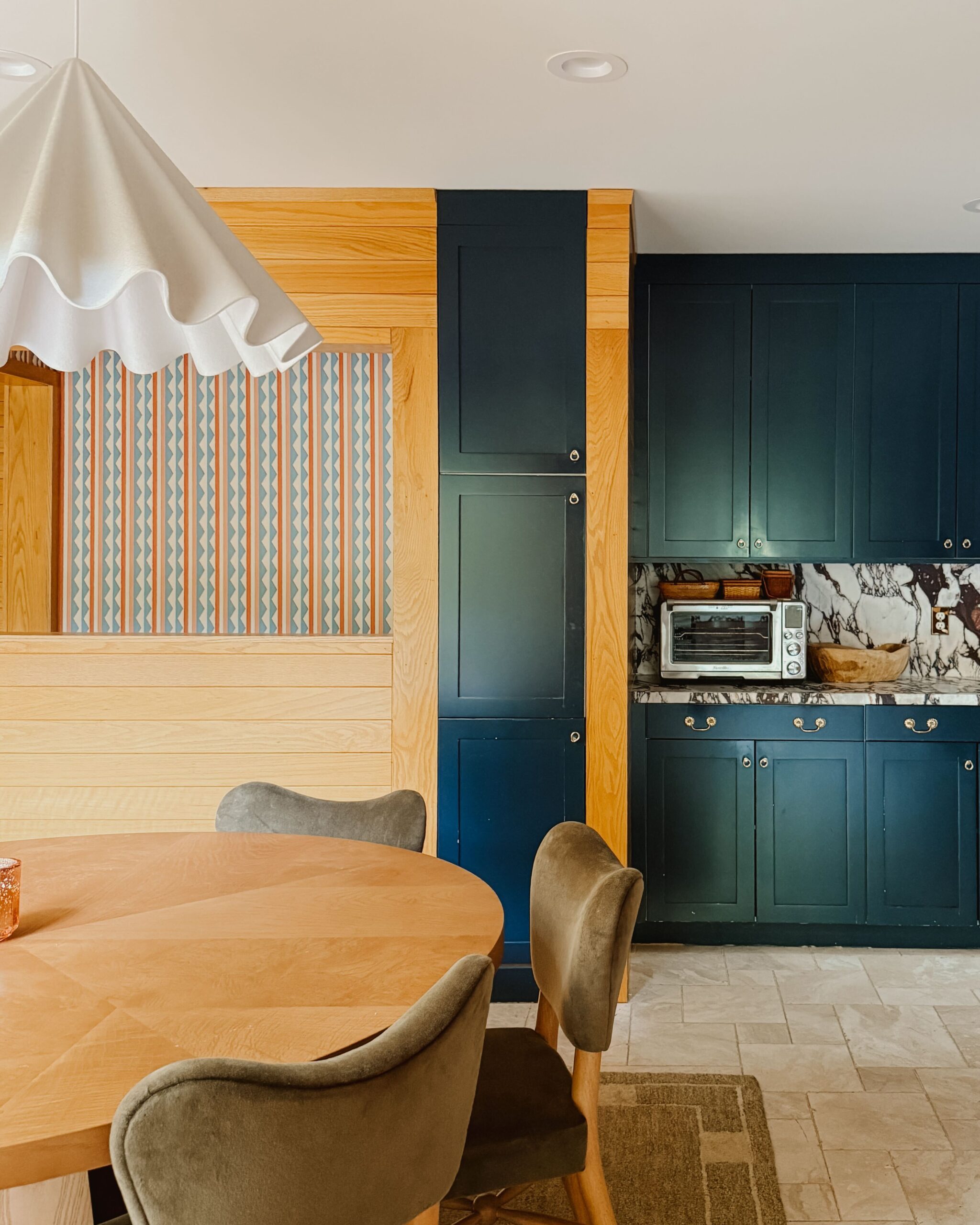
Since our navy hexagon tiles in the kitchenette became a crowd favorite in the original studio build out, we partnered with Fireclay again – this time, we used rectangle tiles, that we laid vertically – again in the navy color. For the backsplash, we took a bit of a design risk and used the Brittannica Matte Quartz from Cambria – the same quartz we were using for the island. Initially, I had designed the backsplash with tile – but the color and texture of this quartz look so incredible against the white IKEA sink, the gold Delta faucet and next to the Fireclay tile, we decided to move forward with a double placement of the same quartz. It’s my favorite aspect of the kitchen and really elevates an otherwise industrial space. Over the tile, we hung two floating shelves, similar to the shelves we have in the kitchenette. It breaks up the large tiled wall a bit and allows for us to showcase some of the beautiful kitchenware we have. I like to think of this space as our open china cabinet.


Finally for the kitchen – appliances. Because we aren’t able to have a gas hookup in the building, we needed to find an electric range that would be suitable for creating chef-inspired dishes. We worked with KitchenAid to outfit the entire kitchen with premium appliances in their new black stainless finish. The appliances, especially the refrigerator, really stand out and make the space complete. Who knew black stainless steel was so chic?


I like to think of lighting as the jewelry to an outfit… amazing lighting can take things to a whole other level. Rejuvenation had outfitted us with gorgeous lighting for the first side of the studio, so naturally, we worked with the team again to choose a few unique and gorgeous fixtures to place throughout the space. I had been fawning over their Hazel collection since it launched last year, and I was so pleased we were able to find a beautiful home for these handmade pieces. We placed five of their ceramic pendants, at different lengths and different colors, across the kitchen island, instead of one large chandelier – it was a last minute decision that led to a few electrical cost increases, but I’m so thrilled with the outcome and how the lighting really ties the kitchen together.


We also worked with Rejuvenation to light our entryway, as well as the waiting area. The waiting area has become a cozy spot to sit in with Rejuvenation’s linen drum pendant, prior to entering the doors of the office. And the entry light fixture, is without a doubt, a show stopper.


This globe pendant light is my favorite product in the space, without a doubt!
Finally, the biggest walled build-out in the new space was our office. We wanted a quiet space for the W&D team and our freelancers to work when the larger space was rented out for photo shoots or events. Because the space has such great light, I wanted to ensure that the offices felt nice and bright – so, instead of walls for the office, we installed glass garage doors that can be closed if the office needs to be a quiet place. We also worked with Reform to outfit our IKEA cabinets in the office with some beautiful blush fronts and cedar panels for the sides of the cabinets.


We are loving our Urbanears speakers, the newest addition to our studio space. They have great sound, come in fun colors and also sync-up throughout the entire studio to keep the music going.


This space is a dream come true. Never in a million years did I think we’d be working out of a space like this. While it’s wonderful to come to work here every day, the most rewarding aspect of opening a studio space like this is seeing what other people create when they come in. We’ve had some beautiful wedding, photo shoots, and parties here. Each time I see photos I’m totally floored. Above everything else, Studio 125 was designed for others to enjoy. We hope to see you here someday.
–
Images by 2nd Truth Photography


Kate is the founder of Wit & Delight. She is currently learning how to play tennis and is forever testing the boundaries of her creative muscle. Follow her on Instagram at @witanddelight_.
BY Kate Arends - October 12, 2017
Most-read posts:
Did you know W&D now has a resource library of Printable Art, Templates, Freebies, and more?
take me there
Get Our Best W&D Resources
for designing a life well-lived


Thank you for being here. For being open to enjoying life’s simple pleasures and looking inward to understand yourself, your neighbors, and your fellow humans! I’m looking forward to chatting with you.
Hi, I'm Kate. Welcome to my happy place.






It’s amazing to see how you, the W&D team, and Studio 126 have grown. Thank you for sharing the journey with us.
The space is so beautiful! I love it!
–
Charmaine Ng | Architecture & Lifestyle Blog
http://charmainenyw.com
I love this space! Where are the kitchen stools from?
The kitchen stools are from CB2!
everything about this space is mind-blowingly beautiful! I love it I love it!
Ohmygoodness! That quartz backsplash piece against the navy vertical tiles is so pretty! Love the design!
C’s Collection | http://www.chelseascollection.com
Such an amazing space! It surely does look like a dream work space!
Wow, love the navy horizontal tiles, the lighting and the garage doors are all such cool touches.
Now, that I live in MN, I’m hoping the W&D team will host a cool event that I can attend and see the space for myself!
This looks so beautiful. I love the runners in the desk area… if you don’t mind my asking, where did you find them? I’m always looking for good rug sources.
those runners in the desk area are from eCarpetGallery!
OMG this space looks so fun!! Ugh OBSESSED!
What an incredible transformation! You’ve created an amazing place to work in, and the open concept offers such a feeling of collaboration and creativity. Love it! Thanks for sharing!
Nice, really inspirational place. Amazing results. 🙂
[…] sources: 1 / 2 / 3 / 4 / 5 / 6 / […]
[…] Wit and Delight https://witanddelight.com/2017/10/big-reveal-expanded-studio-space/ […]
[…] Kate Arends of Wit & Delight also doubles up on farmhouse sinks and Cambria countertops in her Studio 125 in Minneapolis. Her kitchenette space features a porcelain apron-front sink paired with the subtle […]
[…] 125, a studio and event space from Wit & Delight, with a relaxed and inviting atmosphere and full kitchen and kitchenette featuring Cambria natural […]
[…] more: Learn all the details of the Studio 125 renovation from Wit & Delight. See the studio’s kitchenette with Swanbridge here, and Wit & […]