


As a person who loves interior design, there’s a thing I’ve noticed over time. There are certain design elements you’ll keep coming back to over and over again. It could be wallpaper, a type of flooring, a piece of furniture, or, in this case, a paint color.
For years, I’ve continually returned to a kind of light blue paint color. I’ve wanted to use it as the primary color in several rooms, both in this home and our previous one, but it hasn’t come to fruition yet. Lately, I’ve noticed it more and more in designs I love.
Today I’m sharing why I’m so drawn to this light blue paint color, where I’ve considered using it, and where I might use it in our home in the future.
Why I’m so drawn to this light blue color
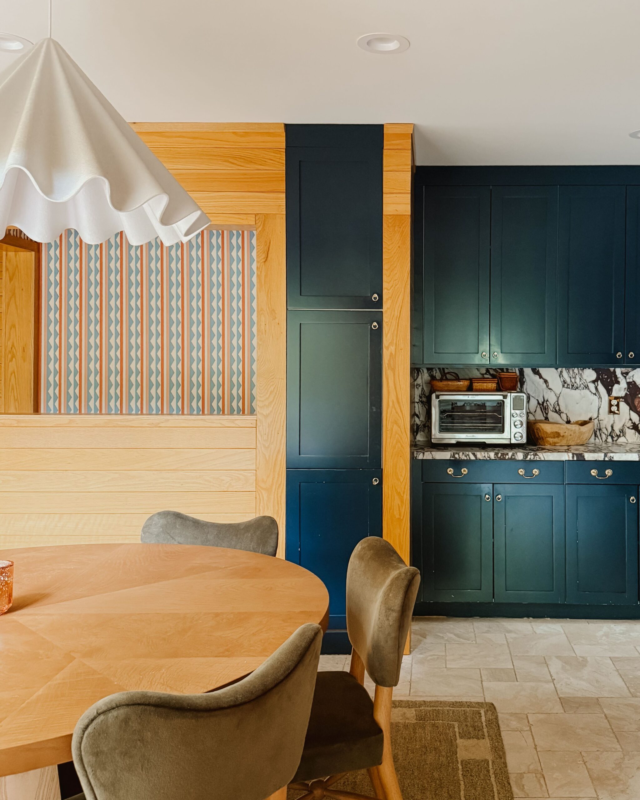
I remember one of the first times (but not *the* first) I was taken by this light blue paint color. The year was 2019. The color was in a kitchen filled with honey oak wood accents, featured in Architectural Digest. The way the honey oak and blue paired together felt so unique and timeless. Seeing it in this context gave me such a visceral feeling and I immediately knew I wanted to use it in my own design. (Note: Upon further inspection of the original article, it turns out the cabinetry color is actually gray, although it looks blue to me in the photos!)
When I dig a little deeper into what I felt upon seeing it, I realize there’s something so familiar about this color. It’s a perfect balance of warm and cool, with plenty of white undertones, leading to a color that’s both calming and happy.
The light blue sunroom that never was
The first place I really considered using this color was in the sunroom of our previous home. I wanted to use it on the walls, trim, and ceiling. I even had our designer create a mockup of this application for us (shown below). In a sunroom, design elements constantly evolve based on the angle of the sunlight. There’s something about this that invites you to have a different experience than in other areas of a home. I think color can be a wonderful way to lean into this unique quality.

I recently found the email thread where our McDonald Remodeling designer, Alisa, and I went back and forth about using either light blue OR light pink (Setting Plaster by Farrow & Ball, to be exact) in the sunroom. I was already leaning toward using more color in our previous home’s design, even though I ultimately became a bit overwhelmed by the thought of it and decided to go with the color we’d already used on the main floor (White Dove by Benjamin Moore). It was so fun to revisit these design conversations with Alisa. She completely GOT what I wanted for the space.
I think this goes to show you the potential lifespan of a design element you truly LOVE. Years later, I’m still thinking about what that room would have looked like had I gone with my gut.
I think this goes to show you the potential lifespan of a design element you truly LOVE. Years later, I’m still thinking about what that room would have looked like had I gone with my gut. I’m here thinking about this light blue paint color again and I’ve already used Setting Plaster in my home in multiple rooms (on the trim in the entryway and guest room). White Dove was not a bad choice—it was a great choice! But that sunroom could have been something completely different. It also helps illustrate why we were already primed to embrace bold colors when we moved into our current home.
Where I might use a light blue paint color in our current home
I’ve considered—and am currently considering—using this light blue paint color in various rooms in our home. When we did our kitchen remodel, I was drawn to using it on the cabinets, but we ultimately went a different route. Right now, as I’m thinking about broader design updates in our basement, I think it could be fun to use this color in what is the current playroom. This playroom may eventually become a secondary guest room. It has no windows and I think bringing a playful color to the walls would be a fun way to transform the space.
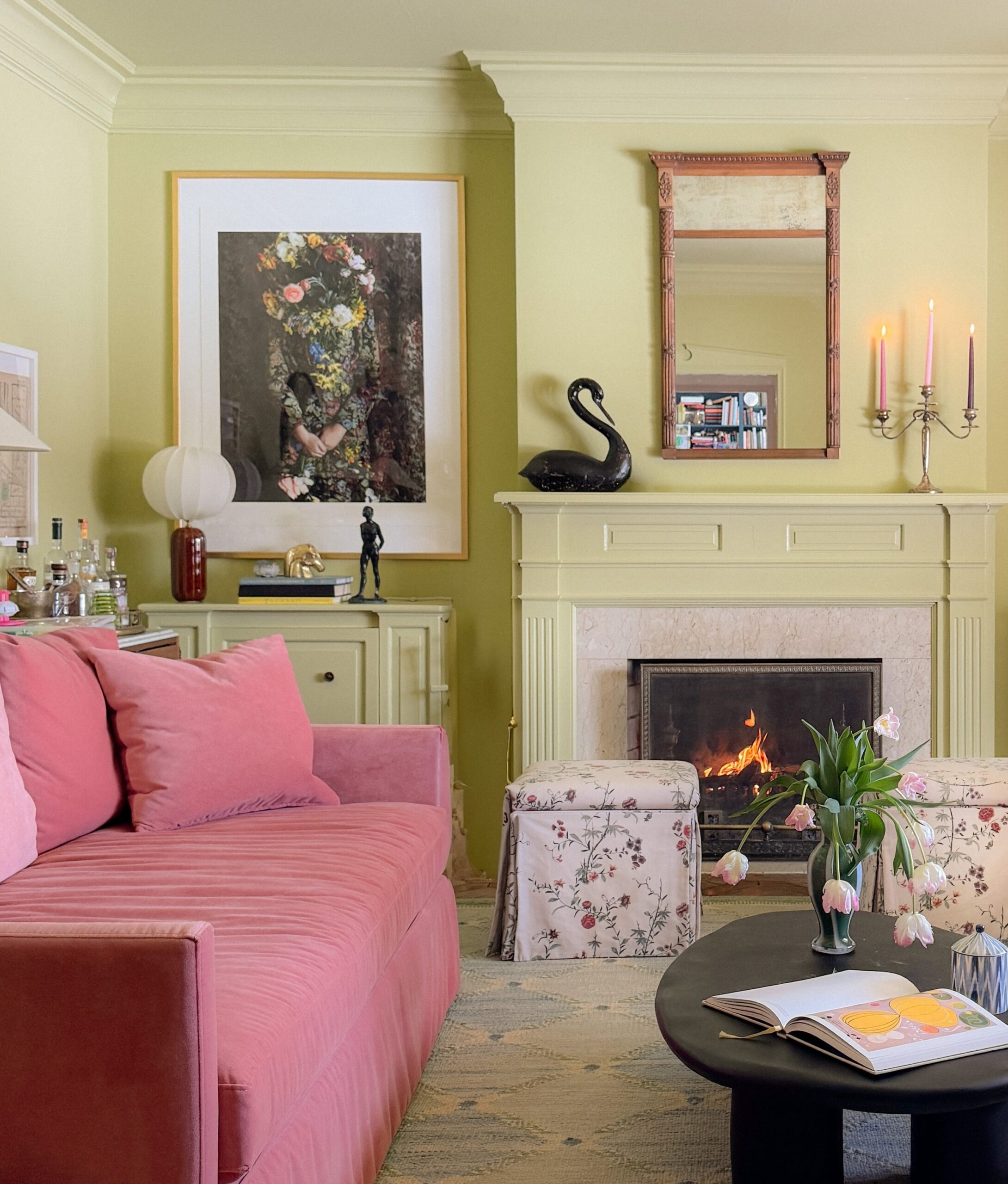
The ironic thing is that as I was writing, I realized I have used light blue in our home. It’s just not in the full-scale application I’d originally envisioned. We painted our dining room chairs the color (Aleutian by Sherwin Williams) I’ve been drawn to for so long. We also pulled in a similar blue color in the dining room rug (shown in the top photo). As it turns out, the things you’re drawn to have a way of showing up in your life. Keep an eye out for more uses of this color in our home in the future! I have no doubt it will show up again.

Kate is the founder of Wit & Delight. She is currently learning how to play tennis and is forever testing the boundaries of her creative muscle. Follow her on Instagram at @witanddelight_.
BY Kate Arends - October 27, 2022
Most-read posts:
Did you know W&D now has a resource library of Printable Art, Templates, Freebies, and more?
take me there
Get Our Best W&D Resources
for designing a life well-lived


Thank you for being here. For being open to enjoying life’s simple pleasures and looking inward to understand yourself, your neighbors, and your fellow humans! I’m looking forward to chatting with you.
Hi, I'm Kate. Welcome to my happy place.


I thought that color looked familiar. I painted our dining room with Aleutian and I’ve never been happier. It’s got a stormy weather vibe that makes me feel cozy like the Oregon coat, or Scotland. I hope you find a place to use it in your home.
*coast
I love your description of this color’s vibe! I hope I find a place to use it too.
Kate, I used a color from Hirshfield’s called Cool Elegance 0517. It is the most beautiful, changeable blue I have ever seen. On their site it looks grey. Here in Savage, MN it goes from light blue to lavender to smudged mauve(in the corners) depending on the light.
Good to know, thank you for sharing!