


One of the most frequently asked questions about our home is this: “What’s the name of that paint color?” I wanted to put together a comprehensive list of all the paint colors in our home, to serve as a helpful guide for future reference.
Below you’ll find (nearly) every single paint color in our home. I only left a few rooms off the list (like our guest bathroom and several rooms in the basement) that were painted in white before we moved into the home.
Here are all the bold paint colors (and a few neutrals) in our house, room by room.
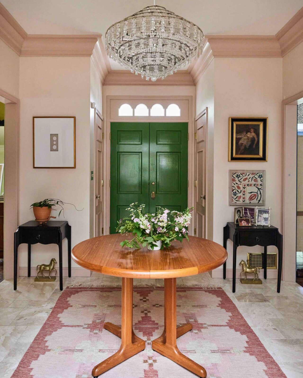
Entryway
The entryway walls are painted with the color Choice Cream by Sherwin-Williams and the woodwork is painted with the color Setting Plaster by Farrow & Ball. The front door is painted with the color Sherwin-Williams Talipot Palm. I love that at first glance the colors of the walls and woodwork read like neutrals. The pink color of the woodwork makes things interesting without being in your face. It’s like a little wink of pink.
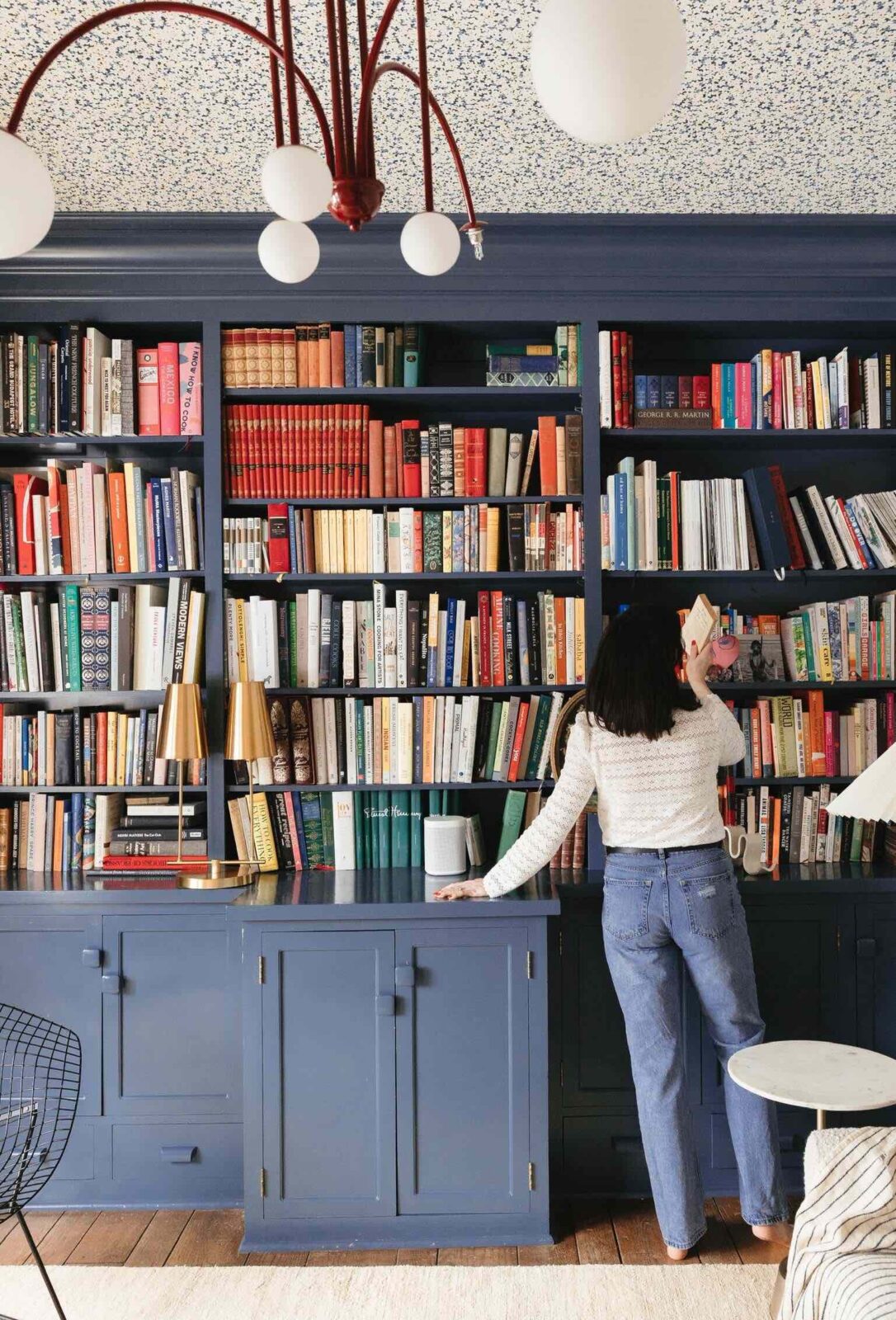
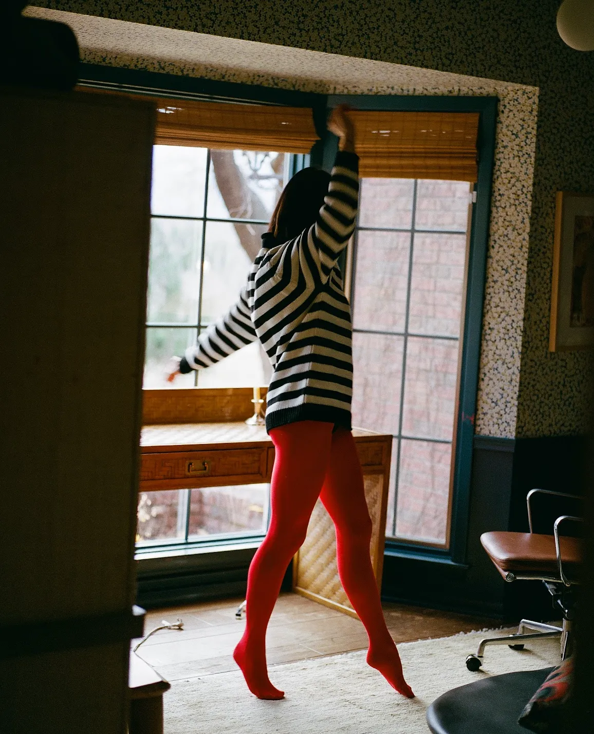
Office
The paint color of the woodwork in the office is Bunglehouse Blue by Sherwin-Williams. I love that this is just a slightly lighter and deeper blue than a navy. It’s pigmented and grounding. It makes for a lovely room to work in every day!
Read more about the design of this room here.
Family Room
The walls, ceiling, and woodwork in the family room are painted with the color Churlish Green by Farrow & Ball. The woodwork is painted in a full gloss finish. This is a challenging color to work with and definitely not for everyone. I am still thinking about changing up the decor and furnishings in this room in a way that adds more layers of muted colors to tone it down, mostly because the color reads a bit dark due to no overhead lighting. This is only an issue on cloudy days and in the evenings.
Read more about the design of this room here.
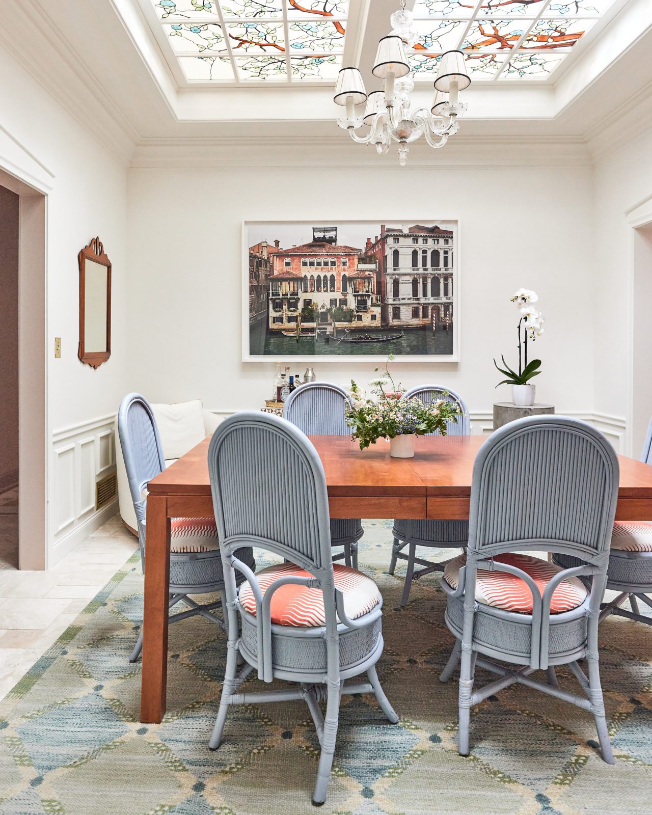
Dining Room
The walls and woodwork in the dining room are painted with the color White Batten from HGTV Home by Sherwin-Williams. This exact color doesn’t appear to be available any longer. The dining room chairs are painted with the color Aleutian by Sherwin-Williams. The color of this room is light and fresh but not too blinding or stark!
Read more about the design of this room here.
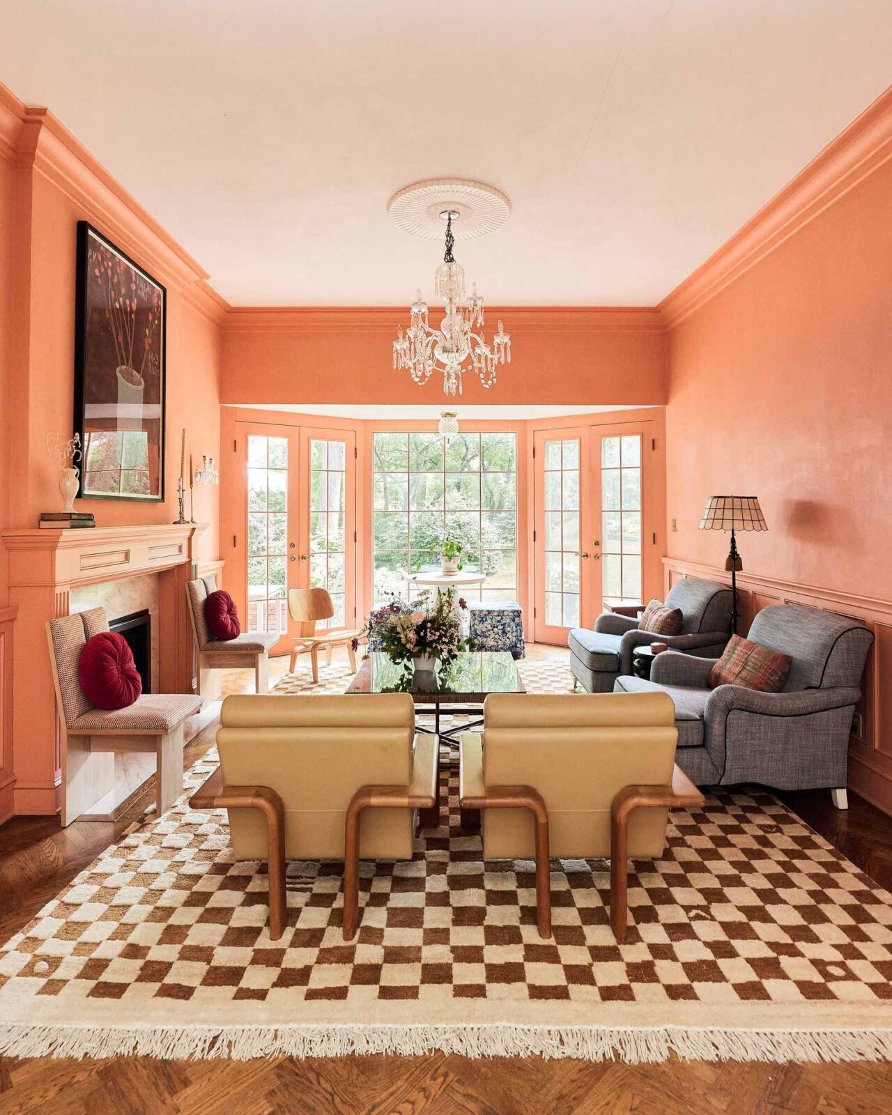
Peach Room
This paint color was existing in this room when we moved into the house. The closest match we’ve found is Tangerine Burst by California Paints. I would have never gravitated to this color on my own but it has taught me to expand my instincts and use color as a tool, not as something to box into my personal preferences.
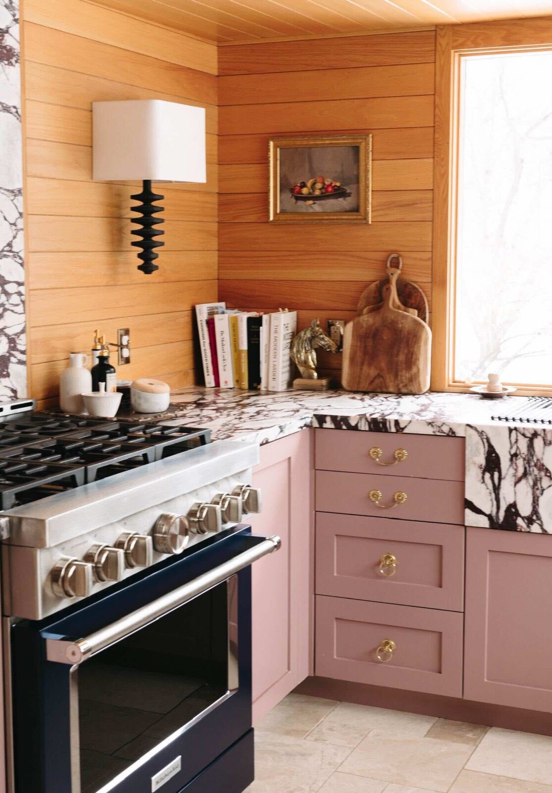
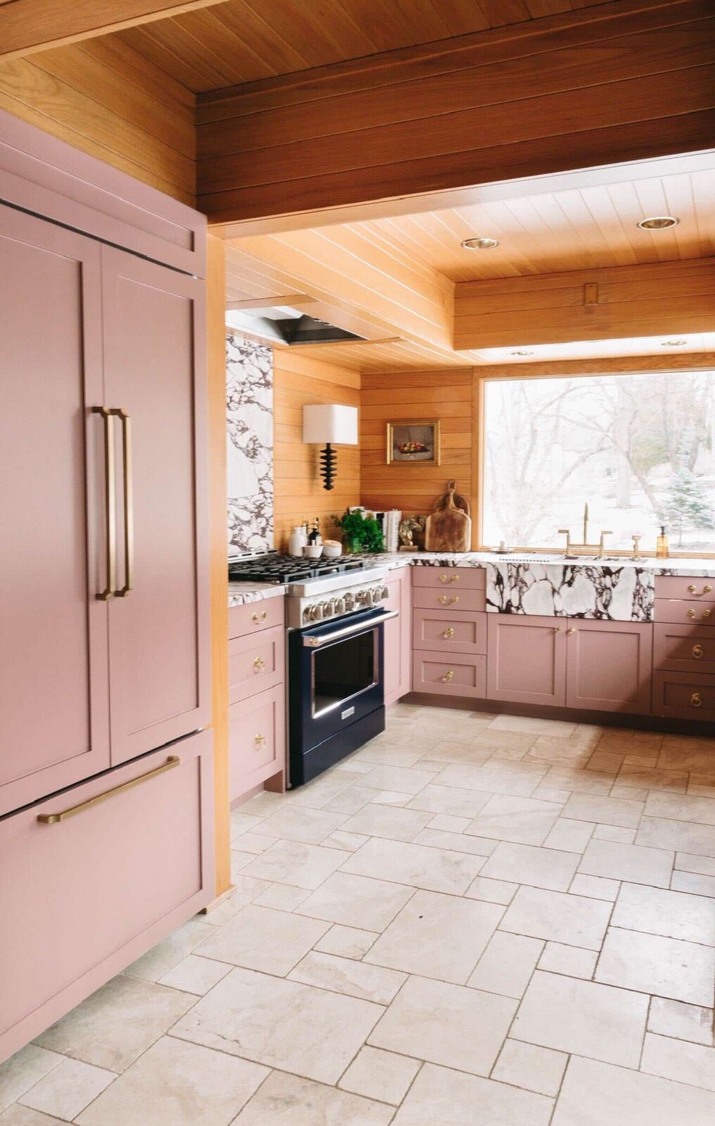
Kitchen
The kitchen cabinets are painted with the colors Sulking Room Pink by Farrow & Ball and Hague Blue by Farrow & Ball. Sulking Room is more of a mauve color than a true pink. Most of the time it reads as a putty-ish gray due to the north-facing windows. Hague Blue is a lovely inky navy that works as a richly pigmented neutral in this space.
Read more about the design of this room here and here.
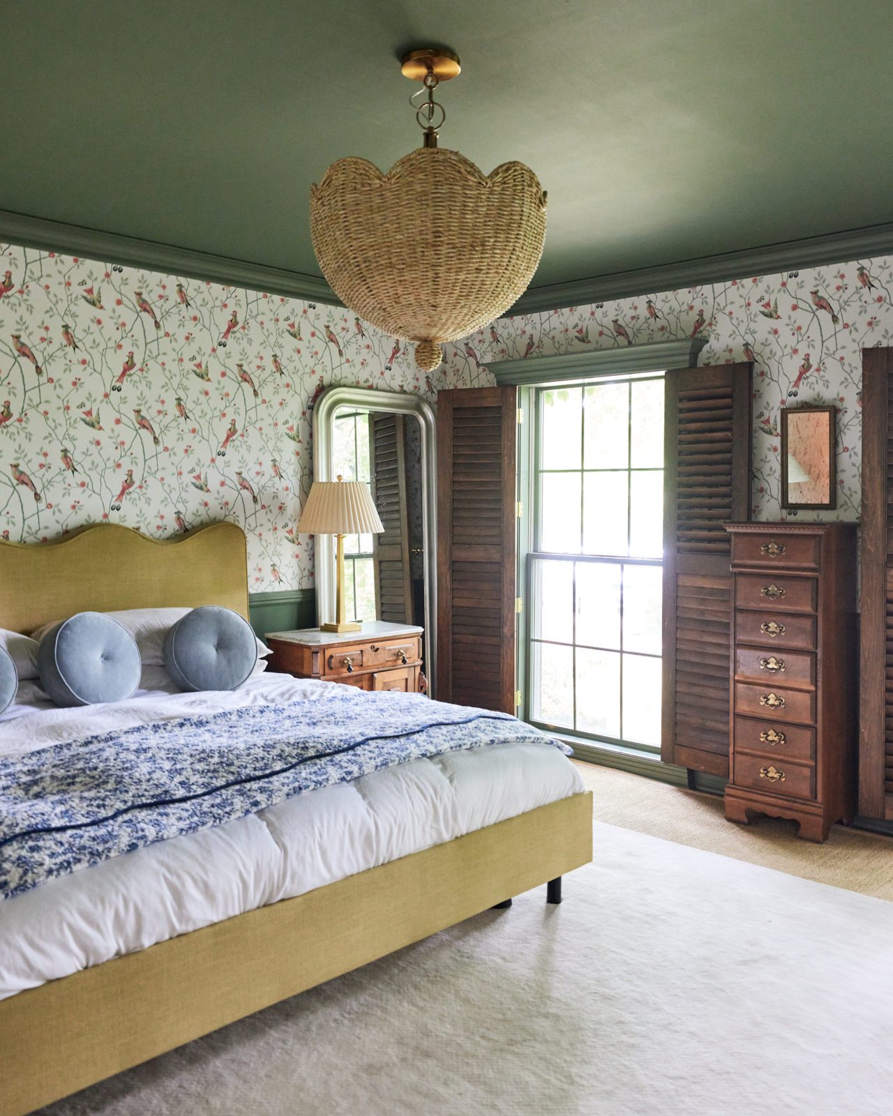
Main Bedroom
The paint color of the walls and ceiling in the main bedroom was a custom match to the existing color of the woodwork. It’s similar to the color Calke Green by Farrow & Ball. This is a medium-tone green with a nice balance of warm and cool tones. It’s soothing but doesn’t feel overly sweet or cerebral.
Read more about the design of this room here.
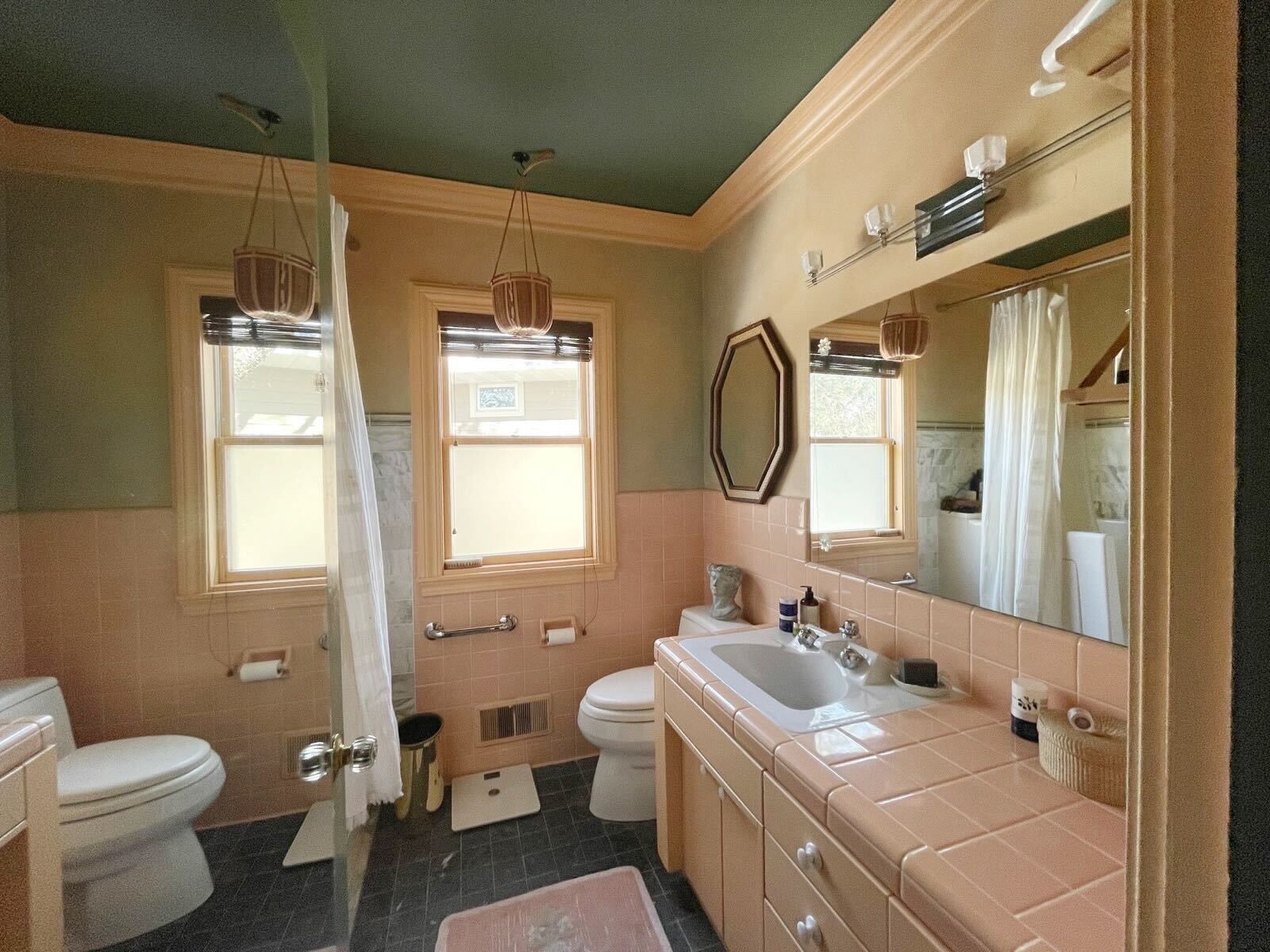
Main Bathroom
The paint color of the ceiling in the main bathroom is the same color we used in the adjoining bedroom, similar to Calke Green by Farrow & Ball. The paint color of the walls and woodwork were here when we moved into the house. I really dislike these colors in general but we just haven’t gotten around to updating them. The painted ceiling helps!
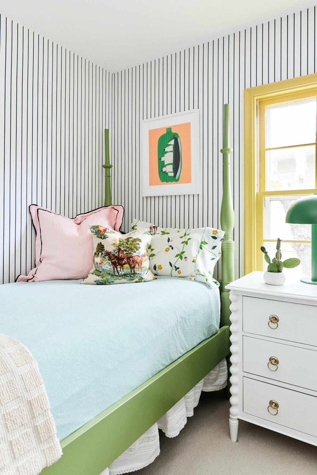
Kids’ Bedroom (Now August’s Room)
The paint color of the woodwork in the kids’ bedroom is Afternoon from HGTV Home by Sherwin-Williams. The bed frames are painted with the color Nurture Green from HGTV Home by Sherwin-Williams. I really wanted to play with colors that felt unexpected but familiar and kids’ rooms are a great place to do that.
Read more about the design of this room here.
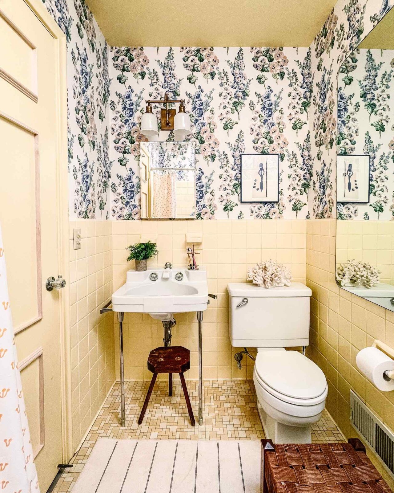
Kids’ Bathroom
The paint color on the ceiling and woodwork in the kids’ bathroom was here when we moved into the house. We found a wallpaper that made sense in this bright yellow space. The paint color is a great shade that sits between lemon and butter, with a nice amount of white in it to feel clean and not too dingy or gray.
Read more about the design of this room here.
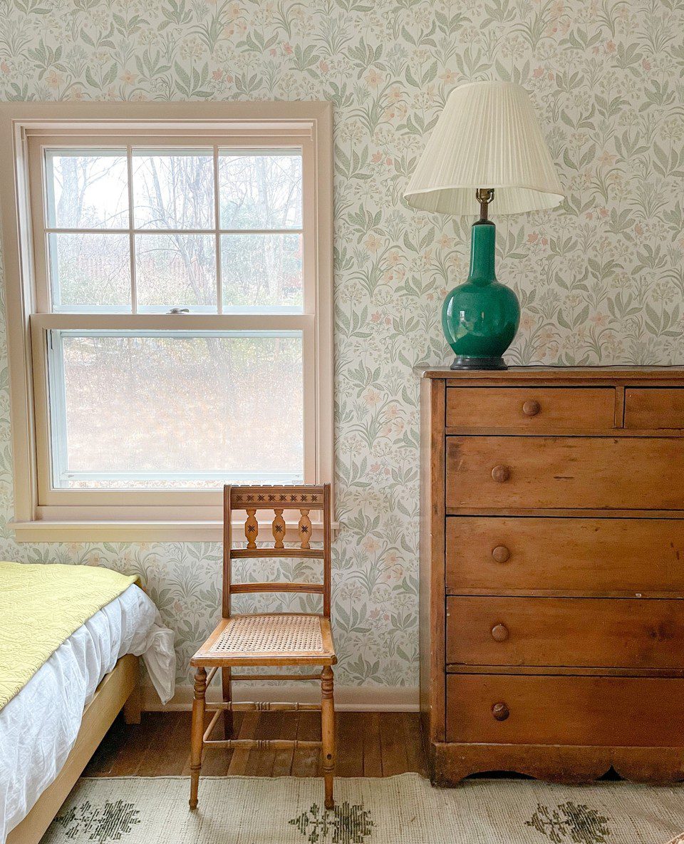
Guest Bedroom (Now Bennett’s Room)
The woodwork in what was the guest bedroom is painted with the color Setting Plaster by Farrow & Ball. I really felt the color of this woodwork needed to feel less sweet and girly after I installed the wallpaper. It has since become Bennett’s room and it works for her!
Read more about the design of this room here.
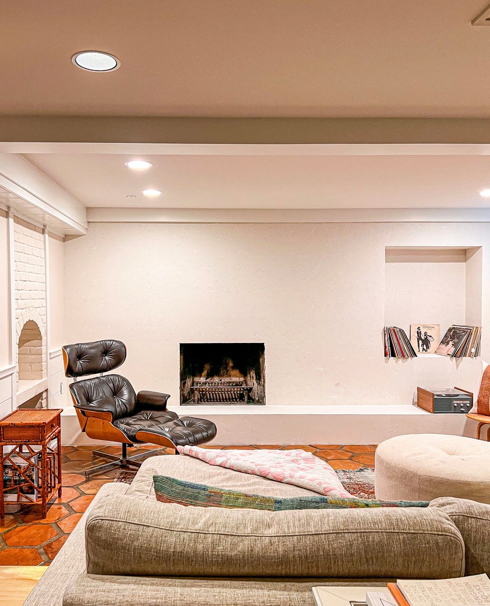
Basement Family Room
The trim, wainscoting, and beams in the basement family room are painted with the color White Dove by Benjamin Moore. The walls and brick are painted with the color Sail Cloth by Benjamin Moore. The plaster used on the fireplace was applied with a three-layer process. The first was white plaster, the second was a shade close to Sail Cloth, and the third was a shade close to White Dove to knock back the texture. I love that these colors feel bright and white but still have hints of depth that accentuate the woodwork and brick.
Read more about the design of this room here.
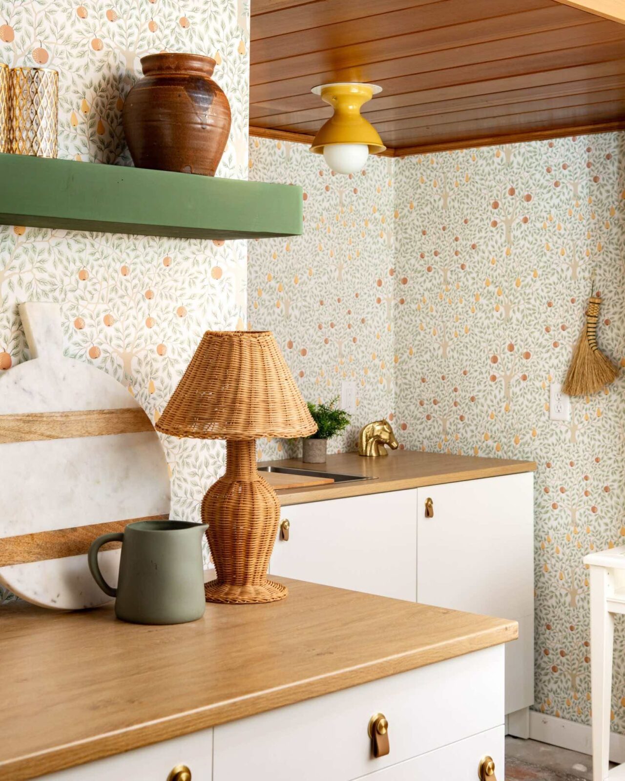
Basement Kitchenette
We used leftover paint from the main bedroom to paint the shelf in the basement kitchenette. The color is similar to Calke Green by Farrow & Ball.
Read more about the design of this room here.
Editor’s Note: This article contains affiliate links. Wit & Delight uses affiliate links as a source of revenue to fund the operations of the business and to be less dependent on branded content. Wit & Delight stands behind all product recommendations. Still have questions about these links or our process? Feel free to email us.

Kate is the founder of Wit & Delight. She is currently learning how to play tennis and is forever testing the boundaries of her creative muscle. Follow her on Instagram at @witanddelight_.
BY Kate Arends - May 8, 2023
Most-read posts:


Did you know W&D now has a resource library of Printable Art, Templates, Freebies, and more?
take me there
Get Our Best W&D Resources
for designing a life well-lived


Thank you for being here. For being open to enjoying life’s simple pleasures and looking inward to understand yourself, your neighbors, and your fellow humans! I’m looking forward to chatting with you.
Hi, I'm Kate. Welcome to my happy place.


Like what you see?
Share Wit & Delight with a friend: