
Neutrals are important colors in interior design, even if you tend to be drawn to bold colors. And there’s a lot to navigate when it comes to neutral paint color selection.
I wanted to share a few of the best neutral paint colors I’ve used in our homes, why I’ve been drawn to them, and what I think they bring to a room. In the list below, I’m including four very different colors: white, cream, light pink (which visually reads as neutral), and black.
If you’re deciding on a neutral paint color for your home, I hope this post serves as a helpful resource for you. This is also a great post to bookmark for your future design projects!
Here are four of the best neutral paint colors I’ve used in our homes…
1. White Dove by Benjamin Moore

Where I’ve used this color: The basement family room in our current home and the main floor in our previous home.
This is a crisp white that doesn’t feel sterile. It’s a warm color but because it doesn’t have too many yellow tones, it doesn’t read as cream. As design trends are moving toward warmer colors, this is a great classic white paint color to use.
2. Sail Cloth by Benjamin Moore

Where I’ve used this color: The basement family room in our current home.
If you’re seeking a light neutral color that has a bit more visual weight to it, Sail Cloth might be the color for you. It’s a warm color that’s a step more creamy than White Dove. If you want to highlight the contrast between two neutrals, you could pair Sail Cloth and White Dove together like I did in our basement family room.
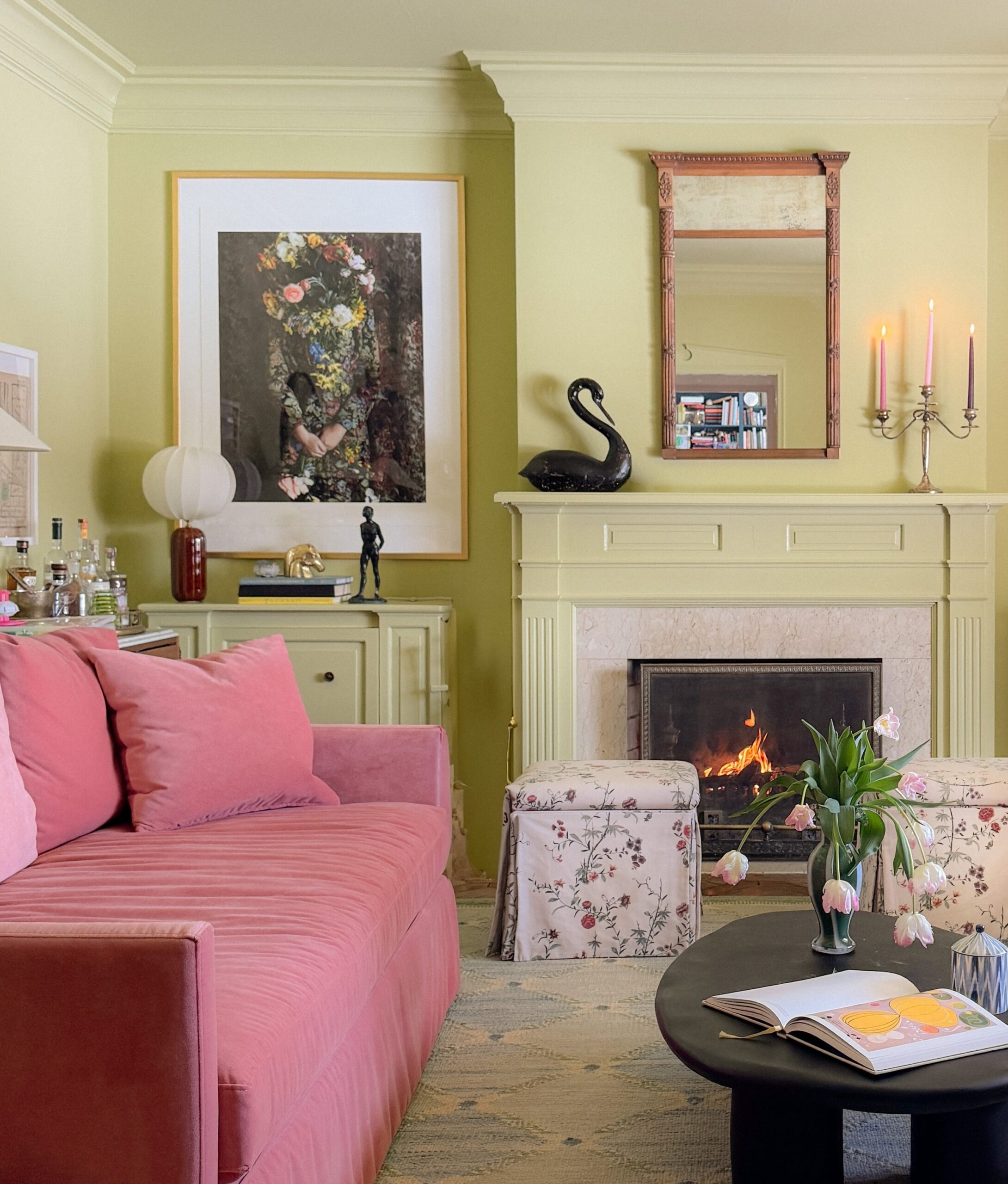
3. Setting Plaster by Farrow & Ball

Where I’ve used this color: The trim in both the entryway and guest room in our current home.
Setting Plaster is a great color to use if you want something a step beyond white or cream that isn’t too saturated. While it is light pink, it still reads as a neutral color and is a versatile option for so many kinds of rooms.
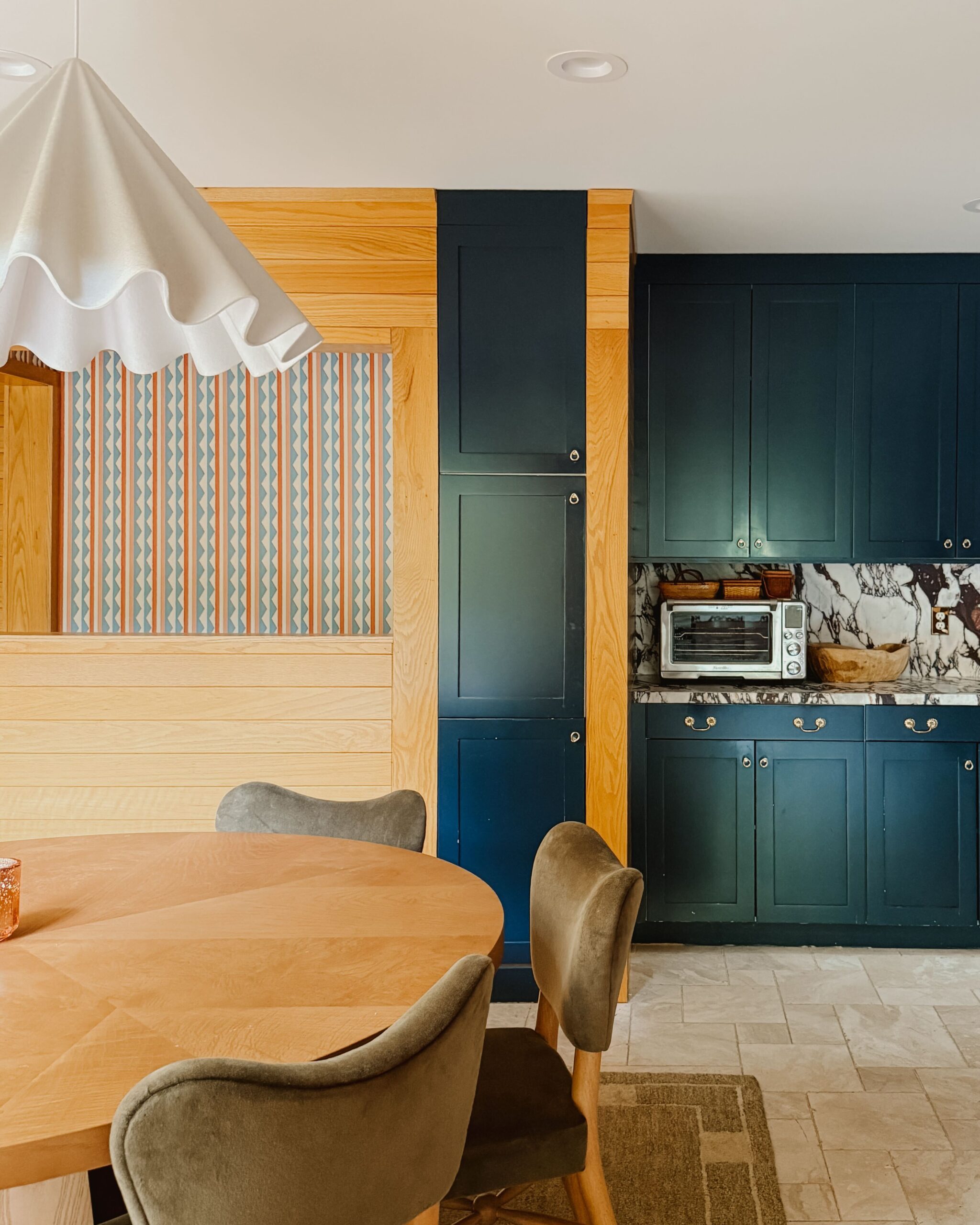
4. Wrought Iron by Benjamin Moore

Where I’ve used this color: The cabinetry in our previous home’s kitchen.
This is a beautiful black-gray color that brings depth without overwhelming an entire room. Sometimes, a really dark black color can feel so overpowering it dominates every other design feature in a space. Wrought Iron has a softness to it that I really love.
Editor’s Note: This article contains affiliate links. Wit & Delight uses affiliate links as a source of revenue to fund the operations of the business and to be less dependent on branded content. Wit & Delight stands behind all product recommendations. Still have questions about these links or our process? Feel free to email us.

Kate is the founder of Wit & Delight. She is currently learning how to play tennis and is forever testing the boundaries of her creative muscle. Follow her on Instagram at @witanddelight_.
BY Kate Arends - May 6, 2026
Most-read posts:
Did you know W&D now has a resource library of Printable Art, Templates, Freebies, and more?
take me there
Get Our Best W&D Resources
for designing a life well-lived
Thank you for being here. For being open to enjoying life’s simple pleasures and looking inward to understand yourself, your neighbors, and your fellow humans! I’m looking forward to chatting with you.







I love colour schemes like this; I feel like they are so adaptable and can be used in almost any room or in any way. I love the info and ideas here!
Thank you! I’m so glad you liked these.
Quite an interesting article it is.
What color did you paint the walls in your entryway? I love that combo with the trim in Setting Plaster.
The walls are Choice Cream by Sherwin-Williams!
Lovely colors. We go through A LOT of design changes in our home and paint is one of the funnest. I’m curious if you ever do your own painting, especially not just on the walls but trim/moulding.